Ruskin’s drawings

Ruskin was one of the most amazing people of his century.  His prose broke over his contemporaries like a great unstoppable wave, thirty-nine volumes of it in the great collected edition published soon after his death.  So his art got left behind and undervalued.   He put it to practical use, illustrating his lectures and books rather than giving it a free-standing existence.  Still, his watercolours and drawings remain the quickest, most immediately startling means of accessing Ruskin’s visionary perceptions of architecture, sculpture and the natural world. His interpretations of old texts are always original and usually astonishing and his perceptions of the natural world are overwhelming in their force.   Little studies he calls ‘fast sketches’ of seaweed, shown broken off and lying flat, still convey the movement of the sea, a sense of turbulence and change in the twists and struggle of their fronds and the surprising complexity of their colour.  The ‘fast sketch’ of withered oak leaves suggests a tragic development, of decay tending toward death but filled with energy, of youth consumed in a bonfire of bright colour, Baroque exuberance in the vagaries of how these leaves live their lives.  We have arrived at death, but the work is still all about life and the richness of interior spaces, such depths, such distances and shadows, discovered in a final burst of activity.

Ruskin is wonderful in his waywardness above all, pulled in contradictory directions that he must find ways to bridge.  There are two main poles in his thinking and interests.  He begins a defence of Turner, the great landscape painter of his era and, led by the subjects of the pictures, finds himself waylaid by the structure of the Alps and the meaning of clouds.

His next big project, after Turner and mountains, is to decipher the relevance of a great Gothic survival, Venice, a city and civilisation which Ruskin will approach through its stones, not just its buildings in the common sense of the word, but its spiritual sources in properly revered materials – marbles, brick, limestone, tufa — the relevance of these basic facts of traditional life to the estranged conditions of life in the new industrial cities of his homeland.   Looking at or being in Venice or Abbeville, Ruskin never forgot Sheffield or, at least, turned more and more to writing and drawing the history of Venice and its art to heal the wounds of the nineteenth century he lived in, though as soon as he was free to move himself, he left the city for the Lake District.

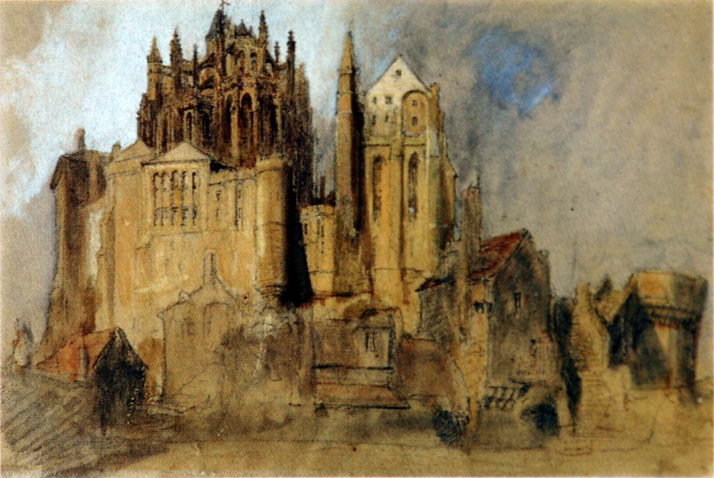
At times Ruskin liked to claim that Abbeville or Verona meant more to him than Venice, but the idea of a Stones of Verona to equal that of Venice didn’t get very far.  Abbeville, which had an even more circumscribed place in Ruskin’s map of significance, turns up in a fascinating episode that brings together his great themes of nature and art and time passing.  This is a sequence that starts from Ruskin’s photograph of the courtyard of a late Gothic house in the northern French town of Abbeville.  Leaving aside much surrounding picturesque detail, Ruskin singles out the convergence of leaves of living ivy and leaves of carved wood which form the structure which supports the ivy.  His earliest gouache of the subject reduces the leafage to a set of grotesque shapes of almost Japanese abstraction, arriving at an outcome like a paper cut-out, which dismembers the plant’s continuities in favour of a thrilling blizzard of scraps.

Ruskin’s next drawing thinks better of this and reintegrates the fragments until the leaves become chunky cabbages and the woodwork retains the only traces of the splitting apart.  Ruskin assigned these studies to his Elements of Drawing, where they became early stages in a student’s development, who learned to draw by taking familiar objects apart and putting them back together, after discovering their essential principles. 

The cluster of oak leaves keeps turning up in different guises, most notably in the last volume of Modern Painters where it appears in a more dignified form, now known as the Dryad’s Crown, an appliance in a ritual that looks like a piece of Art Nouveau metalwork, uncannily symmetrical yet unfathomably quirky in its forms, irregularity which comes from its origins in actual, not stylised leaves, which twist and turn in multiple movements hard to keep up with.   The entire figure, shown still growing round its supporting twig, also resembles a skull, as if it were the plant’s bony residue, missing its flesh but recognisable in eye-sockets and nose-hollow focussed on the spectator.

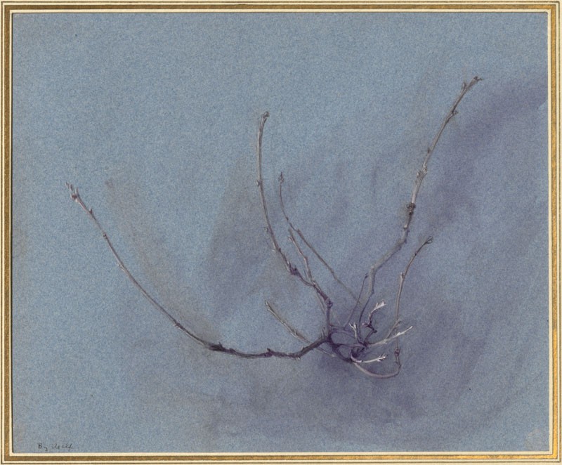
The text of Modern Painters doesn’t mention the dryad at all; only the names of the engraved illustrations carry this particular burden of meaning.  In further, more elaborated moments the dryad lays claim to the qualities or character of the branching plant.  ‘The Dryad’s Waywardness’ is the name of one of Ruskin’s most original drawings of the growth of oak twigs, which shows them exploding or growing, with us as their target, careening to the left as they lurch forward like a sailing boat cutting the water dramatically, a figure Ruskin actually uses to describe the evolving space we are pushed to imagine, arising from the plant’s desire.

 Though a wood sprite, the dryad seems a sedate figure, tying the natural world to the classical past, to poetry in forgotten languages. The drawings are anything but sedate, even ‘The Dryad’s Toil’ which Ruskin says is the most uninteresting view, lateral or sideways-on movement, from which the spectator has stepped aside and views analytically rather than being caught up in, as he was in the head-on view. 

Ruskin based a whole theory of perception on the contrast between frontal and lateral views.  Only by facing growing things head on can you understand growth and represent it truly.  Does the principle, or a version of it, apply to objects not capable of movement which we can actually perceive, like mountains or buildings?

As it happens Ruskin is often focussed on views of his subjects that suggest or intimate change.  One of his favourite forms is that of a crevice or cleft which can be a gentle hollow like the land-form of a mossy cushion grown over by the soft hair of wild strawberry, toad flax and primroses, or whatever these more fleshy leaves are.  This famous drawing is set apart by how lopsidedly it fills the space, leaving most of it bare.  This was drawn on paper bluer than it is now, stronger colouring which would have spoiled its purity, of a virginal feminine sort, which makes it easier to imagine as part of a large, soft human body.

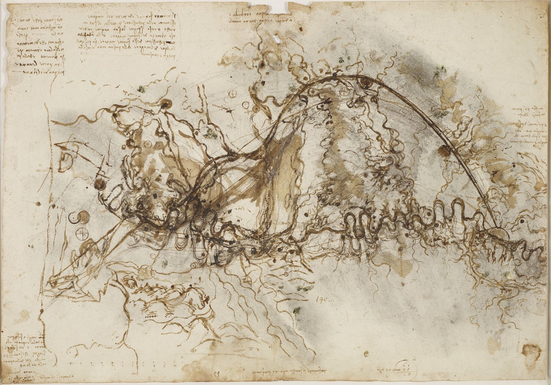
Mountain forms provide more powerful versions of the cleft or crevasse which also attracted Ruskin strongly.  Two of his strangest, most magnetic drawings depict a rocky ravine at Maglans in the French Alps seen from above, which makes the opening in the earth look like surgery, a violence practised on or erupting from turbulent depths.  Here not a single bit of the terrain is quiet and every inch heaves with forceful detail like scarring or splitting, writhing or shaking.  I can’t help speculating about how Ruskin found the vantage from which to see this sight, not a concern when looking at Blake or John Martin, but Ruskin makes you expect that he must actually be looking, not idly making things up.   And here again appears one of the signs of a fully equipped landscape, the little tufts of growth, in this case whole trees or copses, not the delicate tendrils crossing the mossy cushions.  In ‘Moss and Wild Strawberries’ we felt ourselves voyeurs, here we are adventurers, looking into depths precariously, then plumbing them and feeling effective.

Ruskin finds such dynamic ensnarled forms in unlikely places, in the carved arches over the doorways of San Marco, where by feats of eyesight he singles out whirlpools in stone which represent plants catching up birds in their movement and forming them into bosses or beautiful filigreed bumps, which Ruskin also finds at larger scale scattered on the ground, again wound up, sweeping different substances into unified movement which scatters itself profusely and unevenly.   What system can we see in it?  Impaction?  Construction?  A kind of anti-construction?  Richness, but why so satisfying?  Lessons of geology made palatable?

Is it a lesson?  It doesn’t feel like it, but perhaps it does get you thinking who is doing what to whom, trees resisting movements of stone, an invasion of stone.  Ruskin remained an inveterate animator of dumb creation, as earlier, when voicing the thoughts of developing oak twigs, their concessions, their escapes.

This scene is animated by the contending wills of rocks and trees, rocks brought here by a force, moving water in the form of ice, which has now disappeared but survives in the light blue-green wash that sweeps over the ground left free by the contending forces on a scale we could almost call domestic, like the sub-Homeric battle of the frogs and mice. 

Ruskin’s knack for grandiose names in many of his titles was matched by a corresponding openness to ludicrously humble ways of conceptualising his subject, on the one hand the Dryad of the oak sprig, and on the other, streaky bacon as the familiar deity of one of the most venerable Venetian palaces.  Tantalising references in his notebooks and diaries point us to a mysterious Bacon Palace named, we discover, for its beautiful panels of rosso di Egitto alabaster. This façade is known from a murky daguerreotype like something dug up from the sea, and a Ruskin drawing based on it, in colours made more complex by fading.  In reality the alabaster has faded entirely – it was removed in Ruskin’s lifetime.  The bacon of the bacon palace was already only a memory for Ruskin, another sign that Venice was becoming a ruin and a shadow right before his eyes.   Important and unimportant memories were hard to hang on to, a conviction just as visible in Ruskin’s renderings of rocks as in his records of buildings.

He was fascinated by glacial erratics that had been stuck for who knew how many hundreds of years but could still be rendered to suggest that they might again be washed away by forces we detect undermining them.

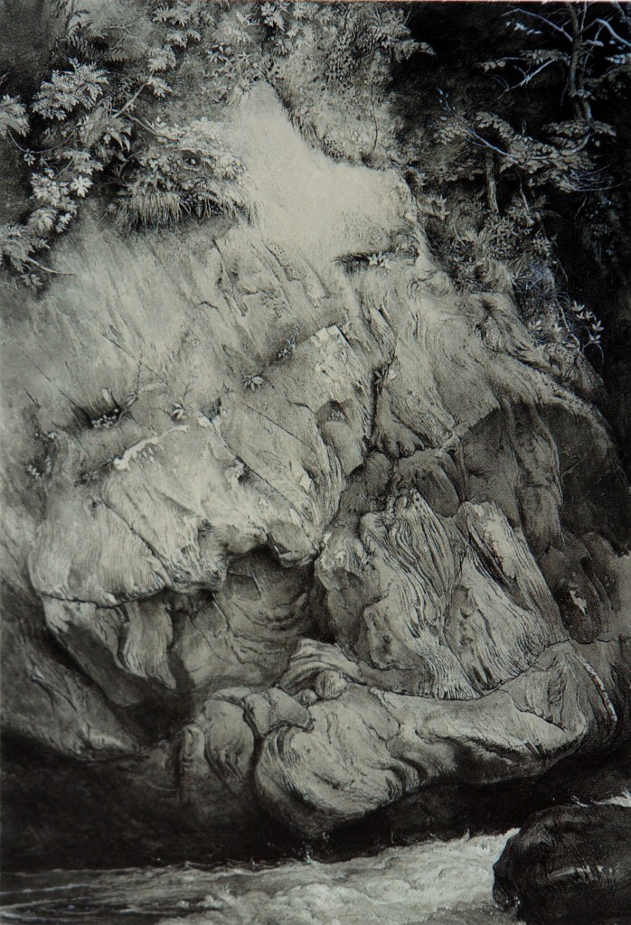
Even cliff-faces, the most imperturbable of natural surfaces, suggested fracture more strongly the longer we looked. I’ve read somewhere that gneiss (the oldest rock? another un-tethered memory) was Ruskin’s favourite kind of stone. Because it seems the most unchanging? or the most complex in variety of form and surface?  This great face is the blankest and most expressionless of all, or pure and infinitely changeable expression, loaded with emotions, but not human ones, so that we can crack our heads against it forever wondering what it is saying.  It is a face, with forehead, eyes, broken nose, laughing or yawning mouth, and beard, yet this is a travesty which one wants to un-see, what happens when one stares too long at a featureless subject.

This drawing is often reproduced in black and white, which levels it still further toward sameness.  There are many touches of bluish Chinese white, and there is also the pale brown or cream of the paper.

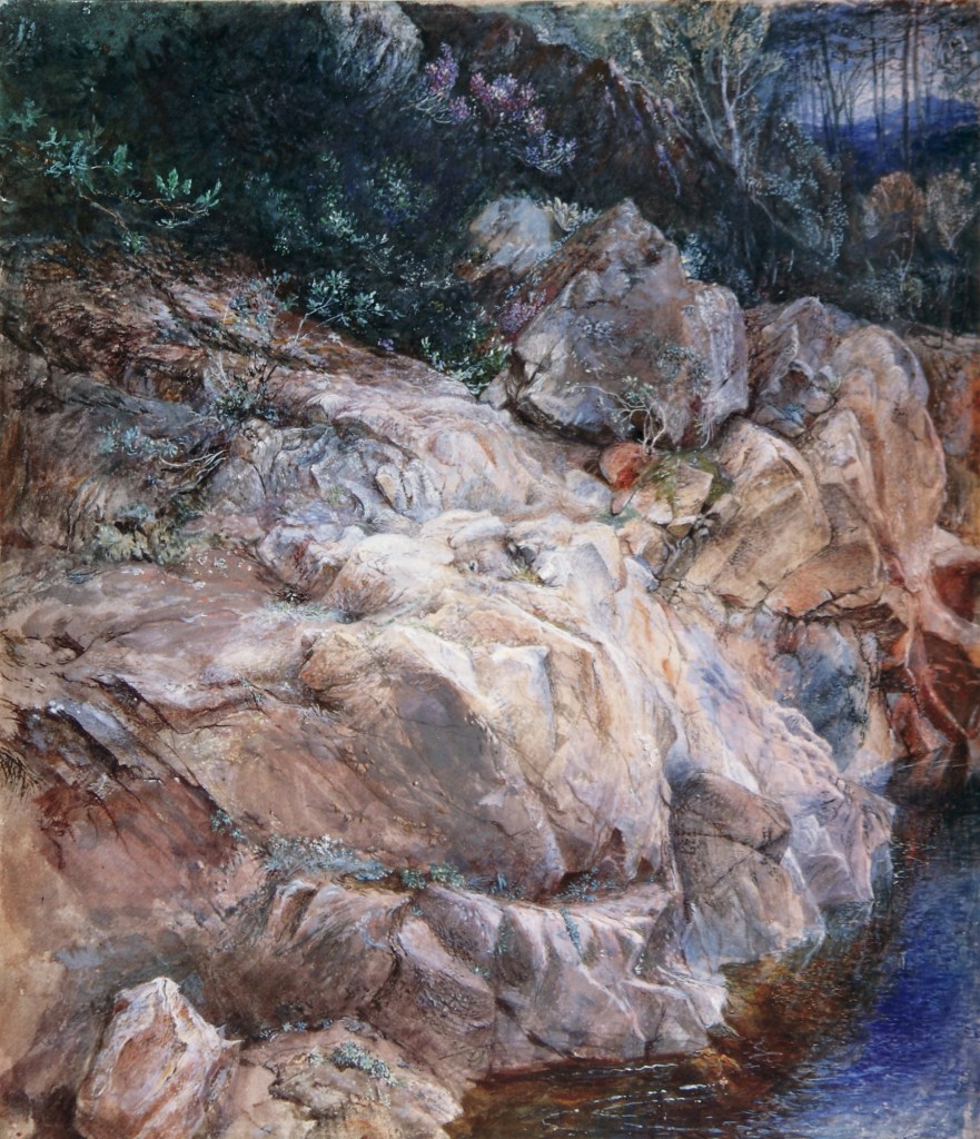
Another big lump of Scottish stone of a few years later displays more surface variety but suggests an inexhaustible world in a grain of sand less successfully.  Not that the close-up view in the Pass of Killiekrankie is trying for that effect, but the earlier Glenfinlas monochrome is more overwhelming, which must arise from its simplicity and unitary concentration, a preposterous claim for a subject which breaks into incalculably Many instead of the One you saw or thought you saw at the beginning.

There is an important class of Ruskin’s drawings that I would prefer to leave out, intense studies of single natural objects wrenched from their seating in a surrounding world.  The Glenfinlas drawing fills every inch aggressively, every microscopic pore of the paper surface, almost crowding any element which isn’t rock, including the crucial contrasting element of water, out of the picture.

The drawings of single specimens which I am thinking of sit in the middle of emptiness which is a true blank and not a real space at all.  The velvet crab on a vaguely velvety cloth is not an exception to this rule.  Even this creature’s name is a compliment to its refinement, a quality we appreciate, of which it is unaware.  All its mysterious colours and textures can’t overcome the subject’s lack of engagement with its surroundings.  The limpness of its minor legs gives away that it is not alive and makes it hard to imagine the movements of life. 

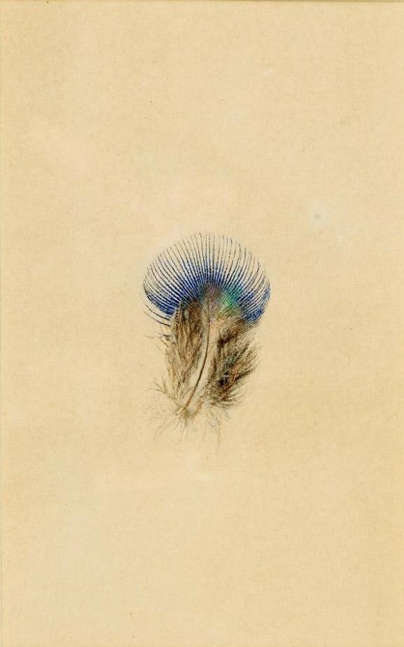
You might assume that the famous drawing of a single feather from a peacock’s breast would produce the same effect. What sense does an isolated feather make?  And this marvel of complexity is too reduced to be visible to our sense, a problem exaggerated by reproduction, like a further shrinking of the subject.  In a letter Ruskin gives a minute account of making the drawing, plugging on as long as he can without re-dipping his brush.  To get the fullest sense of the drawings nothing equals the richness that comes from catching Ruskin at work on particular drawings in his diaries or letters home to his parents, a thrilling integration of the drawing and its own circumstances, so that it too has its place in a human narrative and becomes a character.  Ruskin’s gift for dramatising his subjects is applied also to the works which embody his animating gift, an almost unimaginable doubling of our involvement, extending from the subject to the process of its capture.

The feather drawings are in one sense too stark for deep enjoyment.  The drawing of single rays of the breast feather leaves us unsatisfied, more a concept than a sensation.  We want instead the whole feather enlarged to this scale, which is more a comment on our voraciousness than on Ruskin’s failure to pursue his perceptions far enough.

When he turns to buildings we recognise the same perceiver who senses the developing processes of life and change in whatever he is looking at.   Like plants and mountains, buildings are growing and decaying, moving slowly or quickly towards their death, sharing the joys and hazards of mortality with everything around them.  

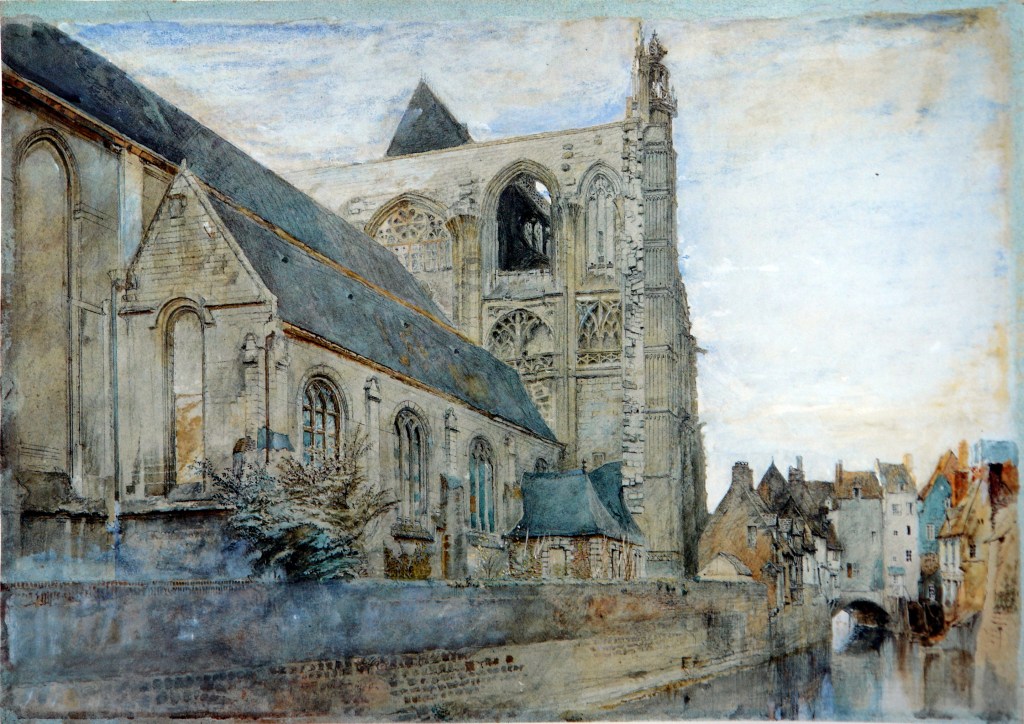
The wonderful view of St Wolfram Abbeville in its setting comes close to those views of rocky landscapes in how it chops off the view, which it approaches from behind and sideways.  Though he fills the sheet entirely, he gives us the subject unevenly, leaving out its most prominent features, its towers, which we can catch up with in other Ruskin drawings.

Even the parts which are included receive unequal attention. The main focus is the triangular stretch of transept wall with its motley assemblage of rich tracery, partly broken, or never finished, or worst of all completely punched out.  In fact, like many of the buildings Ruskin cared about most, this building is already a ruin though still in use.  The whole scene has suffered since in ways he couldn’t anticipate, though they might not surprise him.  The low domestic buildings to the right, which give us the scale of the church, disappeared in the brutal bombing of Abbeville in 1940.  The river, like those streams which rush past Ruskin’s cliffs, no longer passes the church, reminding it of subtle forces and the dissolution of solid things.   It has disappeared in post-war re-building. 

Ruskin writing in 1850 called Venice a ruin and a shadow.  This drawing is another witness to melodramatic warnings coming grimly to pass.  And yet . . .  it is also one of the most wonderful renderings of inconsistency as the ruling genius of architecture just as surely as it is of the natural world, in the ups and downs of that slice of tall traceried wall, in the variations of the boundary wall, in the precipitous shrinking of the whole view into the right-hand side of the picture, and of the life that Ruskin goes on finding in lop-sidedness.

His most finished works still manage to incorporate these pleasures, and there are also the many close-ups of architectural details which parallel the botanical or zoological specimens, and a fascinating in-between class, of architectural details presented in context and separated from context at once, like the portrait of two late-Gothic niches (or, strictly speaking, just their tops with gable forms and balustrades above them) from a building in Caen in Normandy.  This drawing is a work by the same man who writes a guidebook to Florence, the cradle of the Renaissance, that treats only Gothic sculpture on the base of the cathedral tower and two sets of medieval frescoes in Gothic churches at opposite ends of the city, that is to say of a man who delights in overturning conventional ideas of what is important and redrawing the map in a violently skewed form.

So we have the drawing of parts of two traceried niches, the sheet chopped off long before we reach the ground, leaving big and inconsistent blanks even in the part of the building there is room for.  But the intensity of attention to the parts that remain, there has never been anything else like it.  And to fill in the gaps between the flashes of high focus would spoil the rhapsody of having seen just these patches of richness.   The mind and eye can only focus this intently on a small stretch at any moment.   And then, the rhythm of the drawing wants to tell us, it moves on, and lights again, like a nervous bird, at another spot not too far off and applies its attention again.   The inconsistency of the drawing is a picture of the mind and eye’s progress across a surface, miles away from a strictly methodical progress.  The drawing enacts this in more than one way, in sudden darkenings and shadows suggesting depths or sub-moments of concentrating more deeply.  The message is, thrillingly and repeatedly, unevenness, variance continually, so at-odds with the supposed stability of architecture.   Yet in looking at other people’s books about Venice, one often gets the sense from how they defer to Ruskin for detailed reports on minor Venetian palaces, that no one since Ruskin has examined these buildings as thoroughly as he did.   Always inconsistently – the buildings he concentrated on are in the oddest corners and scattered all over the territory, a peppering of examples that seems to obey no pattern or rule.

Among all the minute details of Venetian buildings, I came across a drawing in coloured chalk purporting to be Ruskin’s but looking like an ideal illustration of a castle in a children’s story, a very un-Ruskinian kind of fantasy-building.  The chalk has got smudged since, an effect not intended but suitable, vanishing before our eyes like a dream-building not in its upper reaches but towards the bottom. 

The first drawing of Ruskin’s I ever saw, in the monochrome illustrations to Seven Lamps, showed San Michele in Lucca, covered in stories which charmed me by their wildness, various animals at odd angles mixed up with over-sized plants, like a child’s idea of all creation, much more random ungainly and full of life than anything Gothic, enhanced and clarified by its flatness so that it wasn’t sculpture, though made of stone, but picture, and true to his truthfulness, represented by Ruskin in all its wild strength and impulsiveness.   Just last week I came across Ruskin’s description of these stories in a letter home to his father, a description full of life like these bold mosaics which read very easily from the ground in spite of the damage which drives Ruskin incandescent with rage when he finds pieces of green serpentine infill from around the pale figures lying disregarded on the ground beneath, so that he calls his drawing ‘part of the destroyed church of San Michele’.

In the drawing the glare of the sun is powerfully rendered, and maybe the way Ruskin’s drawing trails off to the right even renders further levels of glare at different times of day in the same drawing.  The building’s mass is surprisingly caught at the outer edge, but even the way it breaks off marks it as a precious fragment, whose hallmark, the building’s not just the drawing’s, is inconsistency too, in types of pillar, of scenes and even of colours of the infill. Though maybe the orange is where the green has fallen out, rather than another colour of stone.

Other drawings of this same façade do it less savagely and more meticulously, showing the figured bulges under each arcade, left out in the folkish version and given a lovely glitter with white highlights that make it a different kind of building, drawn in a different mood by a different artist whose extremely variable moods are one of the strongest features of these letters.  Someday someone will meticulously key these letters to these drawings, or they already have.  Hundreds or thousands of pages of Ruskin’s diaries over a fifty-year period remain to be deciphered and published online, like the wonderful set of his Venice notebooks where one can switch back and forth at will between his handwriting and a transcription.  But that too is only another example of a human record too rich and complete for our powers to keep up with it.

In his enthusiasm for the crude energies of the Romanesque and the naiveté of its stories Ruskin was ahead of his time.  Likewise in his enthusiasm for the innocent narratives of Carpaccio, which snared him in ways we would like to head off before they really get hold of him.  St George and Ursula peopled his imagination too successfully.  His childishness and his seriousness, his love of saints and monsters and his susceptibility to reading himself into their stories is beautiful shading into treacherous from the beginning. 

There are photographs probably commissioned by Ruskin of the Pisano pulpits, especially of the caryatid lions eviscerating their prey, a subject which appalled and fascinated him, that could be Ruskin drawings, and make one think art aged differently in those days. 

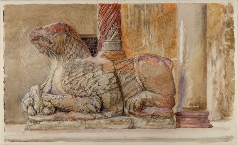
In his views of Romanesque buildings Ruskin often leaves architecture behind for narrative, as in the drawing of the Gryphon caryatid at the Duomo, Verona, a ruined fragment of a mountain, whose rents are as powerful as its continuities, whose textures are a commentary on savagery as part of life, whose hybrid obscenities are the more shocking for the damage they have suffered with the years.  The mouth composed of beak and jaw, the eye erased, feathers in several distinct guises joined uncomfortably, signs of much smaller prey inescapable, and finally stains of colour like a bath of blood with a result perhaps more demonic than intended.

Ruskin’s interest in mountains is an interest in structures grander than architecture, but continuous with it.  Mountains are the largest structures on the earth.  Ruskin saw architecture as obeying some of the same laws, and finally decaying in similar ways.  His ideas about ruin in architecture, and in cities and societies, derived from his experience of the natural world.  You don’t repair mountains, and Ruskin believed you shouldn’t replace original materials in old buildings with new ones, but let them fall down.   He hated restoration, which set itself in opposition to the laws of the universe.  Old builders knew better than present ones.  Ruskin inspired William Morris and the Arts and Crafts Movement with ideas of repair unobtrusive and very lovely when done well.   Carlo Scapa and Alvar Aalto are among the inheritors of this line of thought.

In some of his most interesting close up views of mountains, which aren’t always the most satisfying aesthetically, we see Ruskin searching for the underlying form of the mountain.   More than once the search yields an answer that looks as if it is taken from an extreme weather event, a whirlpool or a hurricane, an image of circular movement centripetal or centrifugal, one can’t always say which, because against all likelihood there is a suggestion that the mountain is flying apart.

One of the most interesting comes with a vague title and a teasing resemblance to more familiar mountain complexes, a close-up only in the sense that it feels crammed with detail, though clearly representing a patch of peaks stretching miles across.   It seems to push at the edges of the sheet and to show barely contained movement, hammered into shape until the main curve is made to return on itself without losing its powerful tension.  

I started out thinking that the next, more distant view is what the more uneasy one would be if it could, as if the second one’s grander, calmer bowl were the kind of crown or ideal that all mountains are unconsciously striving for, or that we are wishing they would.  It is a wonderfully complex as well as tranquil form, perhaps holding together a little unnaturally the geometrical perfection of the low snow-covered curve and the miniature ruggedness of the peaks like teeth at the top. Ruskin discovers here a satisfying symbolic form among mountains, of all places, but only the ghost of a mountain, or a mountain floating away, a mountain ending its life as a metaphor.

This piece began as an online talk for Leila Davis’s students at Anglia Ruskin University

On Long Works

How do you decide on the proper length for any work?  It’s not the same question as deciding when a painting is finished or considering the ways in which it can be left unfinished.  The interesting thing about very long texts can sometimes be how they got to be that long.  Finnegans Wake isn’t literally the longest book in the world, but how could you outdo it for intricacy, crucial for working out how long it will take to get to the end of it.

Among its other effects, the Covid epidemic has driven me to seek out long books, because I want things that will last a long time.  This hasn’t been a conscious plan until now, but perhaps its length had something to do with my gravitating for example to Vladimir Nabokov’s longest work, his 1000-page Commentary on Pushkin’s blessedly short ‘novel in verse’ Eugene Onegin.  Illogically, I group with Nabokov Jozef Czapski’s Lectures on Proust, a brief work about an enormous one, that drew me because he gave these lectures in a Soviet prison camp and never wrote them out.  They only exist because his listeners thought it worthwhile to reconstruct them.  I am beginning to wonder if they won’t project me into a reading of Proust, on which illness has pushed me to embark at least once before.

Reading about the circumstances of the Proust lectures reminded me of another prison-camp product, Varlam Shalamov’s Kolyma Tales.  I didn’t know until recently that there are 1300 pages of them.  The collections I read in the 1980s were just a sample.  How could you know what this writer really amounts to based on such a small selection?  Isn’t the most remarkable thing about this great act of recall that he pursued it so persistently, until his piercing little shards formed a single work as long as this?

At the beginning I thought I would write about Shalamov standing on the threshold (looking out from page 50, say) and imagining the vast expanses beyond.  Now it is too late for that; I have rushed ahead to p. 300 and lost the freshness of the first glimpse.  I’ve done the same with a poetic work of monstrous extent which I have also just taken on, Melville’s Clarel, a 500-page verse epic set in the Holy Land, taken on because I can’t believe that a writer as interesting as Melville would have persisted long enough to produce a poem much longer than Paradise Lost which wasn’t compelling.

In Moby Dick Melville is often at his best when he cuts freest from the narrative and submerges himself in the ocean of language.  It’s too early to say if Clarel bears out these hopes.

In the meantime, a film.  A film that in its different versions ranges anywhere from 145 to 210 minutes, the longer versions being the director’s favourites, the shorter ones obeying the dictates of the studio.  The plot of the film is absurdly or magnificently simple.  It is an extended car-chase (briefly pursued in a biplane by one demented group) down/ up? the Coast Highway of California.  The protagonists have been multiplied mercilessly to make space for about a dozen famous comedians who are each upstaging the others, crossing and tangling paths, getting lost and breaking down, fighting with each other.  It is a simple gag—what a strange expression, as if we might choke on laughter—painfully extended.  I saw the shortest version and can’t imagine how it could reasonably be lengthened—are there whole new episodes and stars? If 13 is good, won’t 14 be better? Or does the longer form just lengthen the pain of an existing awkwardness?  The most interesting comic writers and actors must often be pushing toward the limits of comedy, philosophical not in the deeply reflective sense but a sense abstract and not truly particular, escaping the limits of individuality into types of human potential.

When I started blogging I was pleased when the subject carried me unexpectedly to greater lengths, 1000, even 2000 words, though it seemed dangerous to let them go far beyond that.  Now I dream of a short one and It’s a Mad, Mad, Mad, Mad World doesn’t seem the ideal stimulus for this.

Except if you concentrated on one of the most inventive elements in the whole film, the credits by Saul Bass, ‘Saul Bass’ who was really a couple to which Elaine Makatura, the female partner made a key contribution.  These credits, which seem to go on forever and actually last two or three minutes, pack in a wonderful series of transformations, a globe from inside of which a saw appears, cutting doors and windows, out of which crowds spill, or via which gangs enter, a globe which becomes an egg by a quick dramatic stretch, brooded on by a hen, breaks open, spawns a chick, is tied back together, cuts loose as a balloon, flies, deflates, spits out a pile of words that clatter like dominoes and carry the names of important functions in the film, make-up, sound, stills etc.

So I thought I wanted to analyse this shifting poem of images, not in colour but in two-tone, a kind of harsh minimal vocabulary like a cartoon, sometimes violent like a cartoon, always moving.  So I sat down to follow these credits carefully on the screen of a laptop, stopping the action looking for stills which would make good illustrations, and found that none of them would.  When you stopped the frames, the life went out of them.  On top of that, they were all in widescreen, a weird invention of the 1950s or 60s when cinema was locked in a death clasp with television and had to find visual effects TV couldn’t duplicate.  By now TV screens are all widescreens of a kind and have lost their own battles with later sorts of display.

Some of Saul Bass’s most radical shake-ups make letters and words into beings or at least give them a kind of mechanical life.  I wonder if the designers were consciously harking back to when writing was pictures.  They brought about a poetic condensation of the two or three hours of material expanded and diversified in the film into 2 or 3 minutes of action drawn by the hand of the designer and projected at a speed or speeds that challenged the eye to follow it.  By comparison, the film that came immediately after seemed delightfully, impossibly old fashioned.

Moral: The antidote to a long work is a short one (and vice versa).

Beardsley the modernist

4 8 neophyte and how black art was revealed copy.jpg

The big Beardsley exhibition at Tate Britain was the first major exhibition that the virus kept me from visiting, and I got the idea that, using Linda Zatlin’s catalogue raisonné, I could stage a more comprehensive exhibition at home.  So I buried myself in her giant volumes and saw a lot I hadn’t seen before.  That was five months ago. Now the library has finally recalled Zatlin and sent me back to the topic from March.

Beardsley the Modernist, Beardsley the Pornographer, Beardsley the Puritan, Beardsley the Decadent, Beardsley the Teller-of-Stories or Beardsley the Burier of Secrets.

These strange appliances that continually recur, they must mean something else, because they are so exaggerated. Impossibly spindly candles burning away above the characters’ heads, consuming their own substance without end. They must be emblems of the temporary in spite of their inhuman stiffness and their appearance in phalanxes of three, impossibly near each other.   Beardsley learned that he had consumption, the nineteenth century name for tuberculosis, when he was seven.   He died eighteen years later in the South of France, a Catholic convert who sent desperate pleas home to burn his wicked work, which his friend and publisher disobeyed.   His room in France was a shrine to Mantegna above all, one of the most secular of classicists. His religious pictures are feeble. His favourite Gospel story, Salome’s unsatisfied passion for a saint she couldn’t corrupt (until death did it for her) was a favourite with Symbolists, who wrenched it away from the very idea of abstention. Beardsley’s drawings purporting to illustrate Oscar Wilde’s play, several of them completely re-thought to outwit censorship, had been calmed down perhaps, but were still lewd, if less directly.

1 j'ai baisé drawing 265 copy

How can it be that this grisly, even necrophiliac subject pushes Beardsley towards a purely two-dimensional abstraction?   One of his most revealing remarks, quoted by Linda Zatlin (who produced the invaluable catalogue raisonné) from an interview in the Boston Evening Transcript (previously familiar to me only via one of T. S. Eliot’s jokey early poems), was that his works were just as good when you turned them upside down.   Early abstractionists have described being pushed further by seeing their own designs upside down. Beardsley was trying to de-toxify his work with this suggestion and making a claim to seriousness for Art’s sake. I took him up on it and spent an inordinate amount of time holding Zatlin’s volumes upside down. This works better with some than with others. Seeing growth hanging down instead of sprouting up can be invigorating. Some of the temporal dislocations in Strauss or Debussy feel like musical phrases turned upside down to echo a character’s alienation.

Beardsley is a radical and perceptive theorist of line who realises what he is doing when he prescribes that you should maintain the same thickness of line both in foreground and background, rather than getting thinner as you go further away. It sounds like a narrow point, but he is discarding illusions of space for the realities of the picture plane.

2 The_Apparition,_Gustave_Moreau_1876-2 copy.jpg

Yet who has ever managed to look at Beardsley primarily as a formalist? Fifteen years before Beardsley, Gustave Moreau had been obsessed with the story of Salome in a whole series of paintings and watercolours of mesmerising richness, where a small company of onlookers provide sub-focii in the dense forest of detail, tile-covered walls, mosaic-encrusted vaults and flesh inlaid with jewels, from which Huysmans got the idea of planting gems in a live reptile’s shell, which would then grow around them, a description perhaps of the relation between characters and setting in Moreau’s frozen tableaux.

3a  climax cream beardsley-aubrey-aubrey-B20139-97 salome 15 copy.jpg

At this point in his career Beardsley is stripping away detail from his narratives. In a mechanically reproduced form of the drawing much of the filigree has to be sacrificed to pure line and pure contrast, black and white and nothing in between, where both became stronger in this poverty or isolation.

Something became stronger but it wasn’t the bodies of man and woman. In this Beardsley composition Salome is a ghost, and Jokanaan a metaphysical phallus, a candle flame burning itself out and a liquid dripping into a lake where it remains on the surface like an oil slick or the design on a carpet. Mysteriously it inspires growth, an erect and a wilted version of the phallus which seems to be the story of Jokanaan telling itself over again.

3b head on pedestal beardsley-aubrey-aubrey-B20139-96 salome 14 copy

This confrontation of the levitating woman (orgasm? the illustration is called Climax – or is that just my name for it?) and the decapitated head – the essence of the man, or an utterly emasculated form?   This is a confrontation that goes on occurring–next time or the time before he is presented on a platter like a dish you could consume, but at the end of a hairy post, so another phallic terminus, and now there is nothing delicate about the effusion of liquid, it’s a dark mess spilling off the edge in more than one direction.

5 beardsley-aubrey-aubrey-B20139-83 salome 1 copy.jpg

I thought I had to begin the story at the end because that is where Beardsley began it, but there is a sense in which these episodes do not take place in ‘real’ or ordinary time but in a world of archetypes which all exist at once. So you have a couple looking at the moon who has the features of Oscar Wilde (their author?). Are they John and Salome? They both look utterly inexperienced, like frightened children who hesitate.   Male underdevelopment often takes the form in Beardsley of childish genitals which seem to signify somebody who isn’t ready to embark, a spiritual as much as a physical condition, and hard to connect with Beardsley himself, however much we try, who was well on his way to producing over a thousand separate works in a career that lasted six years, much of which must have been spent in devoted labour.

6 beardsley-aubrey-aubrey-B20139-91 salome 9 w figleaf copy

As the moonscape is empty, this one is full, full of contending forces. Wilde is there again as a weird priest or impresario with the owl of wisdom functioning as a tribal headdress, ending in horns (a joke? Beardsley seems to treat him as fair game).   Herodias is bigger than the others who exist to serve her, including a foetus with what critics take for an unsatisfied erection pushing up through his clothes–if so, the most economical lewd reference ever.   Beardsley’s fascination with elderly foetuses must have a neo-Platonic explanation, the soul’s pre-birth and corruption occurring simultaneously.

Zatlin always plumps for Beardsley’s seriousness but goes on finding little erections all over the place, as if there could never be too many. Kenneth Clark surprises us with almost moralistic disapproval of Beardsley’s fascination with corruption. I can’t help seeing Beardsley as a kind of troll, offending Victorian sensibilities so plentifully that many references will escape. The effeminate creature who sports a vine-fig leaf formerly possessed a typically shrinking cock with feeble pubic hair. He got curtailed, while the delicate penis-candlesticks got waved through.

7 toilet beardsley-aubrey-aubrey-B20139-95 salome 13 copy.jpg

The Toilette which follows is one of the outrageous ones and was replaced by the most abstract and severe, without the bystanders or the upsetting jokes. Here exquisite appliances lend themselves to suggestive acts. The long tall extension of the stringed instrument, the strange dripping forms under the left-hand boy’s seat, the glances exchanged or not exchanged by the two nude boys, one with pubic hair and a hand that doesn’t look innocent – there’s all that ‘activity’, and then the amazing emptiness of Salome’s clothes which are no more than two extra-thin lines making a bounded place in which nothing is allowed to take place. These disparities are rich with irony and an almost philosophical appreciation of the void. The distancing around Salome and the coiffeur, who mixes hints of bats (his mask) and spiders (his hands), creates a whole other world.

8 beardsley how arthur saw questing beast 424 copy

Arthur and the Questing Beast is a step back into a different and earlier world still working itself free from William Morris and Burne-Jones’s medievalism and an earlier Victorian love affair with the Middle Ages. Beardsley’s drawing shows an encounter between a knight and a dragon, as you’d never guess, or not quickly, and not a heroic but an entangled one, which you settle into disentangling, which has set a hundred traps for comprehension.

Beardsley has equalled Moreau in density and also—without colour!—his own form of richness and of confusion, making things out of lines and vice versa. Turning things into other things obscenely, giving new meanings to the word, metamorphosis as anarchy and detail as madness—all of Beardsley’s themes tumbled together—gawky erections that disappear out of sight, snakes, spiders, satyrs from a different world of myth entirely, clothes as intricacy and prison, acting like tourniquets on the flesh. The overpowering sensation is the fickleness of matter, solid one moment and a beguiling scribble the next. Stringy birds deconstructing themselves into individual feathers, snakes made of curlicues slithering through viscous liquids, and really monstrous forms whose eyes are fringed with rows of tiny breasts like Diana of Ephesus, or tiny growths like leprosy or testicles, whose tufts of hair are like lines gone completely crazy, a trap for perception rushing everywhere or nowhere. Arthur looks sideways at the graphic riot as if it is all a hallucination he has had, not a comforting thought because it means he is trapped in the web.

8b beardsley lounging figure copy

8a beardsley lounging fig det copy.png

There was a way out via a simpler printing process that allowed you, if you gave up subtle differentiations of tone and texture and settled for black and white in their full crudity or purity, the chance to reach bigger audiences much more cheaply. Beardsley found his way there via his biggest project, a commission to illustrate Malory’s Morte d’Arthur with an incredible plethora of 350+ separate designs which became a laboratory for simplifying without giving up mystery and power, an effort which offered him a vast field for subversions, antagonising William Morris who accused him of plagiarism, seemingly unaware of how radically Beardsley overturned Arts and Crafts ideals. Beardsley’s knights set off a disruption like a flurry of shrapnel—leaves, shields and oversized thorny stems all slicing, chopping and piercing their way through the mellow world of the past.

9 DSC04192 beardsley malory 2 fighting knights Z547 copy.jpg

For the publisher of Malory he designed an icon based on a pun. Dent, the publisher’s name, became the dandelion’s tooth and in Beardsley’s hands the prong of a phallic explosion observed by an unlikely serpent.

10 512 dent title page icon 5246

Further unlikelihood in pagan youths, pure immaturity instructed by satyrs who only belong in Malory as general disruptors of Christian principles.

12 DSC04628 beardsley malory naked boy leaning on fountain Z687 copy

There’s a whole category, calligraphic grotesques., which Beardsley produced on demand for Dent in years overlapping with the work on Malory, mostly small designs which are some of the purest expressions of his kind of iconoclasm, images where every feature is senselessly perverted into something else–eye for mouth, eyebrow for moustache, lips for eyes, breasts for horns, leaves for hair, face for chest and curlicues throughout to undermine the last illusion of representing anything sincerely or consistently.

13 DSC04226 beardsley bon mots grotesque head breasts for horns face on chest Z709  copy.jpg

Reptilian foetus-forms keep it from seeming real play. Innocent designs are few and far between, and even they upset things by turning the lower half of a cheery face to opposed 3’s lying on their sides.

13a DSC04287 beardsley bon-mots calligraphic grotesque Z763 copy

13b DSC04251 beardsley malory capped head gazing at fish Z730 copy.jpg

Finally, we hit on a scrap of harmless peacock fluff, but it too conceals a plump Wilde-decadent.

14 DSC04284 beardsley bon-mots large peacock feather Z765 copy.jpg

The later Beardsley went through the most astonishing series of style-shifts. Each new commission seemed to provoke another twist of the late style: The Rape of the Lock prompted a fantasia on the Rococo, with a sub-species consisting of welters made entirely of dots, a new orthodoxy for rendering lace or reality at its most intricate, in tapestry, upholstery and foppish dress. Next come the Lysistrata illustrations where the erect penis finally has its day, in which all mystery has departed and the idea of flesh is flattened.

The last project Beardsley worked on was an edition of Ben Jonson’s bitter, disillusioned play Volpone, or the Fox about a miser’s corrosive progress. Beardsley took this as a chance to send up the pompous version of Baroque, piles of fruit as imposing as cannon balls, satyrs as thick as oak stumps. The single fresh note in this heavy world comes in a hypnotic design for the cover, which he drew first in black and white but always meant for transfer into its opposite, turning light to dark and vice versa.   The black and white version (which I only heard about when I had long known the gold on blue result) is much crazier, jumping with demented motion, a jitter missing from the printed cover.

16 volpone black white DSC05287

The cover, a brilliant disintegration of Baroque continuity, translates pomp into a storm of fragments, but feels as if, if you worked at it, you might be able to cajole all the confusion and repetition to fall back into its proper places. But why would you want to do that? Isn’t the lumbering old Baroque better as an explosion than as the symmetrical reassurance of the old order? Brilliantly, the new cacophony consists entirely of recognisable elements of old conventions, which Zatlin suggests Beardsley meant as the phantasmagoric flashing of the fox’s tail.

17 volpone blue gold DSC05290.jpg

And if you let yourself sink into it, you find there are even more frantic jitterbugging couples here, like the pair standing on V O L P.  It’s a fertile field for hallucination, full of birds, mammals (including sharp-nosed foxes) and who knows what else, filling all the left-over dark forms.

To get these effects you need to read the blue as solid forms, and the gold as background or surrounding void, as I forgot to say clearly enough.

Leonardo notebooks and drawings


1 912376 deluge copy.jpg

I have avoided falling under Leonardo’s spell until now. There was something I didn’t like in his relentlessness, his heartless dissections, his fascination with weaponry and destruction. And all that backwards writing, even though I’m left handed myself and once came across whole pages of backward printing I’d done before finding out it wasn’t allowed. How determined Leonardo must have been. Being self-taught helped, but only at the beginning.

Oddly it was the notebooks that lured me in, in a marvellous exhibition at the British Library which gave only a taste of this sprawling mass of material–7000 dense pages surviving, it is said–which he had hopes of organising into treatises and never did, as I’ve come wishfully to think, because they’re all pieces of an ever-expanding universe that one does a kind of violence to call even a temporary halt to.

The British Library exhibition interleaved two of the more than twenty surviving codices, 80 pages in total, which bristled with loose ends and overlapping, in spite of a clear overall conception.

003.jpg

The major part came from the Library’s Codex Arundel, published in facsimile in 1998, which put all the loose sheets, released from their misleading 16th century binding in the early 1990s, put them semi-miraculously in chronological order, using up-to-date knowledge of the evolution of Leonardo’s handwriting and detailed attention to what projects belonged to what periods of his life.    There is of course no such thing as a single chronology. Sheets are added to, annotated, rearranged as Leonardo returns to old subjects or looks over old notes. But there is some sense in trying to order his thoughts even when he didn’t, though what appealed to me most was the strong sense that he was always thinking of more than one thing at once and seeing unheard-of connections between, say, the facial expressions of horses, lions and men in extreme states of rage or fear.

3 912326 horse lion man.jpg

All the notebooks still loom there as an unsolved puzzle or treasure house in which words and images endlessly collide and feed off one another. But they led me almost at once to someplace else, to Leonardo’s drawings, visually richer than the notebooks but just as full of the strange leaps of thought and the dazzling range of subjects, which so often melt into each other before your eyes.

4 912283 combination.jpg

There is a famous sheet of nothing but fragments that is sometimes used to show the magpie-range of Leonardo’s interests. The centre or gathering point of the sheet, if there is one, is a set of geometrical diagrams, lightly traced-in across the centre of the page. This element escapes me almost completely, except as a delicate skeleton that joins up the bits that interest me more, joins them simply as unifying pattern, not as content or meaning. Perhaps the more you understood the geometry, the more it would interfere with appreciating the other unrelated bits.

These bits consist of the profile of an older man whose nose and chin are exaggerated, and verge toward each other uncomfortably. You will come to recognise this as a favourite motif of the artist, often given grotesque emphasis, and meaning what? At his waist there springs up a delicate tree whose bare upper branches merge with the folds of the man’s toga. This little tree is the minutest sample of an atmospheric subtlety of which only this artist is capable, here thrown away on a Dali-esque joke. Measured by the scale of the tree, the man must be 200 feet high.

5 6 912283 combination copy 2.jpg

To his right and one register lower is another botanical study, or part of one: two stalks almost intertwined, with leaves climbing and circling the stalks. The subtle crinkling of each leaf is similar to but different from the others. You feel like lingering, undeterred by a big ink-stain that cuts across the stems near their base.

The most beautiful elements of all are tiny clouds separate from anything else, one of which may actually be a copse, another of which looks like a series of mountain ridges that Ruskin might have drawn.   There are also decorative curls unfurling like petals, and serial frills like printers’ ornaments, also infused with vegetal life.

7a 912283 combination copy.jpg

One of the faintest elements is a tiny horse and rider, rearing and pushing his shield forward like a flat saucer.   Next to them a nude colossus making a tiny adjustment on an invisible surface. Both these groups are perched carefully on one of the circles ruled by a compass.

This sheet evidently works its magic on many observers. It was chosen for the title page of the catalogue of the recent exhibition of 200 Leonardo drawings from the Royal Collection. It’s only a rough impression that finely finished drawings are rarer in Leonardo’s production than in other Renaissance artists’ work. For whatever reason a number of these are plant studies full of quirky observation, yet completely untroubled and at ease.   The most beautiful in red chalk on red paper use seemingly methodical hatching to produce deep shadow and a kind of atmosphere under leaves and in a magical interior space at the heart of a cluster of berries.

9 912421 guelder rose.jpg

The simplest of all the botanical studies, a reed with burrs on one side of the page and a single bulrush on the other, are among the most astonishing for producing layers and depths within the reed-clump and for variety in the minute twists of the bulrush spikes, each a distinct existence. But the most hypnotic of all is a clump of star-of-Bethlehem with spiralling leaves looking like one of Leonardo’s drawings of whirlpools and eddies in a stream. Here different species are confused and overlapped, and a further instance is strewn in the empty space at their feet, which includes a sequence of this euphorbia’s seedpods, open, half-open, viewed from behind and after the enclosing shell has fallen off. Here red chalk deepens and clarifies the upper thicket where extra grasses thicken an already dense plot. Below, wider spacing allows the inspection of a sequence to take place.

11 912424 star of bethlehem.jpg

These seed-pods splitting call up the human embryo exposed in the womb, the most compelling seed-pod of all to us, an idea on which he plays a set of variations with the uterus as an exfoliating flower, and with other stages of the process taking the same form at smaller scales, and finally an empty sphere as the most perfect vision of unfolding.

12 919102R fetus in womb.jpg

Leonardo also finds a weird beauty in the emptied sphere of the skull sliced in half or with only the enclosure of the left hemisphere of the brain removed, allowing an inside/outside comparison of the lower parts of the skull.

The bony membranes which act as braces from centre to edge are astonishingly beautiful, in part through subtle lighting—imagine this theatrical glare and shadow inside the head!   Leonardo really seems a magician to have found this drama in these places, a triumph of materialism to bring out such depths in cartilage and bone. Much of the meaning hangs on what he shows and doesn’t show, on selective unveiling of mysteries which leaves other areas dark.

13 919057 skull sections.jpg

The famous section of a copulating couple is another selective dissection, which favours the male, leaving him his face and hair and a leading leg, only faintly present, but not stripped back to bare machinery. The curve which unites the couple consists in large part of nerves and tubes which depict an exploded theory of how the soul makes its contribution to the sperm, so it’s only partly an exaggeration to call the image a spiritual hoax.

14 919097V coitus.jpg

Investigating the nature and especially the movement of water had occupied much of Leonardo’s attention throughout his career. The British Library exhibition made this a major focus, and the drawings at the Queen’s Gallery included a rich selection of water flowing, swirling, breaking its banks and finally overwhelming the world of man in an apocalyptic deluge which Leonardo depicted over and over again, both grandly and minutely. His map of the course of the River Arno with his proposal for a canal cancelling much of its existing length between Florence and the sea is one expression of this consuming interest, and the final sign of the obsession is a series of cataclysmic explosions which he also rendered in words.

15 912279 arno.jpg

16 912579 water w old man.jpg

There’s a sheet which shows an old bearded man contemplating a river’s flow interrupted by obstacles placed in the stream. The two images—sage and stream—are not related, yet the old man contemplating time’s passage in water’s movement is a powerful idea. The other images of worlds overwhelmed by natural catastrophe are clear but troubling. It is as if the old man imagines his own approaching end as an avalanche that buries all.

17 912388 apocalypse.jpg


A Newly Discovered Bruegel

Bruegelsanmartin copy.jpg

A few years ago I stumbled across a reference to a new Bruegel which had been found in an obscure Spanish collection and, soon after its discovery, ended up in the Prado.

The first question was: could it be real? Could a very large painting by this painter go unnoticed for all those years?  Its subject was unheard-of and the composition inconceivably grotesque—it showed a tangled mountain of people glued together in an acrobatic mass. There were lots of them, of all different ages, trying to get their hands on wine squirting from a huge red barrel in a tiny stream, all the figures pushing forward a wide variety of containers, pitchers, bowls, hats, broken and intact, some just potsherds, the vessels a digest of the extreme human variety that jostled for space.

I was convinced almost at once of its authenticity and its large contribution to our knowledge of the artist. The painting is full of memorable poses, which fix themselves in the mind as weird but true snapshots of human types caught in extremis, stretched to the limit in pursuit of a clear goal near at hand. Typically, some of the best are seen from behind, a condition often treasured by Bruegel because it guarantees unselfconsciousness and thus a kind of authenticity. Maybe that is the main secret of the strange subject, that it combines people revealing themselves exuberantly while packed into unheard-of nearness, more like a nest of writhing snakes than any previously-known depiction of a human gathering.

Bruegel st martin detail.jpg

Bruegel has set himself an impossible, and, we might have thought before seeing how he would set about it, absurd, challenge—to build a multi-storey building consisting of human forms with no superstructure for them to cling to except the cradle on which the barrel is raised.

Bruegel uses a shifting perspective as he did in the Vienna Tower of Babel in order to show densely crowded figures viewed from above extending laterally and viewed head-on extending vertically. As in the Suicide of Saul it seems the most natural thing in the world for whole ranks of figures to be making the same gesture in series, reaching frantically upward to hold out their bowls toward the source of oblivion.

This is furthest from a still or quiet crowd–most of them are frantic–but there is also a complete spectrum of those turning away from the scramble because they are busy drinking, have already passed out or have noticed another goal, the knightly figure in the lower right corner, who is distributing something more valuable than cups of wine. St Martin on horseback has attracted a small crowd of cripples and the destitute anxious to get a piece of the voluminous cape he is slicing up with his sword.

In the distance are magical glimpses, caught as if through keyholes, of a rider at a gate and a scattering of tiny figures in the open space at the foot of the castle on the horizon. The most convincing and precious features of these sketched-in elements are the delicacy of the drawing and the transparent thinness of the paint.

One of the best discoveries of the magical enlargements on the Inside Bruegel website is seeing how often Bruegel puts the paint on so thinly it is like drawing itself and lets his underdrawing show through, invariably carried out with great confidence, without slips or mistakes.

bruegel wine of st martins day.jpg

The Wine of St Martin’s Day is painted on linen with something like tempera instead of oil, a technique known from both the beginning and the end of his career in the Brussels Adoration and the Naples Blind Leading the Blind. It looks (and is) fragile and evanescent, the colour more transparent and fleeting than usual. Why he used this frail medium in his largest painting by far – 2½ times the size of the otherwise largest Procession to Calvary — seems impossible to know.

The subject is the least substantial:  an experience of passing intoxication, another instance of religion subverted by folk indulgence, human beings behaving with the carelessness of may-flies, aptly captured in the dodgiest, most ravishing form, a work that is at once the painter’s most daring and most throwaway.

bruegel st martins day.jpg

Lee Krasner at the Barbican


DSC09787 bird talk 1955.jpg

Lee Krasner spent a lot of time and energy interpreting and promoting the work of her husband. In a real sense Jackson Pollock was worth it, but it was thrilling to see in the recent exhibition at the Barbican that Krasner was producing at the same time a rich variety of work not in the least cowed by or under the spell of the Dionysian Pollock.

It is work of great intellectual depth and force, of ceaseless searching and renewal, so demanding and various that one visit wasn’t enough to take it all in.

DSC09741 u 1947.jpg

The exhibition began with the so-called tiny paintings, small in themselves and full of further levels of tinyness, little knots of activity scattered over the canvas. Labels spelled out the theory of this organisation, that small things can become monumental depending on context and your own focus. So you grasped from the start that Krasner was a visionary who saw metamorphically, which set you up to expect transformations in which all is not what it seems.

DSC09754 nude study fr life 1940.jpg

Soon after, we came to her student work, charcoal nudes called life studies, that started looking like Michelangelo and moved on to Picasso-like fractures, a radically disruptive idea of taking dictation from nature. At this point did any of us dream that the end of it all would be the beginning?

After the impinging nearness of the nudes came unlikely wartime collages meant for window displays and populated by bombs, bombers, scientific instruments and scientists’ laboratories, full of fractious life. This was the period in which she met Pollock, as she oversaw a group of mainly male artists in a bold, practical project.

DSC09779.jpg

DSC09784 burning candles 1955.jpg

Soon after the war she is doing something even more imaginative with collage, slicing up compositions she is dissatisfied with and forming them into powerful explosions which still carry narrative force, bursts of light, tangles of undergrowth, tumult in the heavens. Unlike most of her contemporaries, she went on giving descriptive or allusive titles to her pictures, which told viewers to look for rich imagery in seeming abstraction. Not just ‘seeming’ perhaps, for Krasner shows that these canvases can be both pure construction and individualised narrative at once.

One of the best surprises was to move from one side to the other of the square donut of the upper storey at the Barbican, from the small, dense collages of 1954 to large, free Pollock-sized ones of the very next year.

Both sets, the small and the large, are among her best works, and those viewers who thought they saw suspiciously Pollock-like scribbles in one of the larger set called Bald Eagle were right. Here Krasner cannibalised her own rejected canvases and one of Pollock’s too, which plays the part of the bird.

DSC09789.jpg

In these pictures it’s more evident that new work is made from the ruins of the old, that new energy springs from the destruction of what went before, through ripping, shredding or cutting without much respect for earlier effort.

So certain colours have special meanings, and red is a kind of bloodshed in Bird Talk for instance (opening image). In this room Milkweed provided a measure of this—its cool colours seemed out of place.

Krasner’s best years in paint were difficult years with Pollock. One of the most exciting and disturbing rooms contained four violent paintings on bodily themes from just before and just after Pollock’s death, which occurred when Krasner had escaped briefly to Paris. You could fill a much larger room with the anguished work of that year and the next, among the most wonderful things Krasner ever did.

DSC09803 three in two 1956.jpg

This is where my attention finally wore out, after these pictures in flesh tones and grey, which might be evenly divided between anger and grief, but there’s nothing balanced about them. They are barely controlled, which makes them so uncomfortably exciting. They keep calling themselves back to order, and the canvas gets more and more crowded with colliding forms. They are sometimes said to derive from Picasso’s Demoiselles, to which they seem worthy rivals.

krasner cauldron 1956 cat p 110.jpg

Perhaps Krasner had already been shifting to soberer palettes in works like Cauldron (not in exhibition), but when we moved to the lower floor at the Barbican we were in a surprising new monochrome-world which might at first seem a diminishment, but resulted in a pair of masterpieces on a grand scale, a calm cloudscape or vast Northern expanse called Polar Stampede, and the wildest depiction of movement, The Eye is the First Circle, which incorporates whirlwind vortexes and heroic striding figures, a range of diffuse and focused motion which accompanies you as you walk past it. Did Krasner have in mind Pollock’s largest canvas, the regular/irregular Mural, meant for Peggy Guggenheim’s New York flat, Krasner’s seething crowd played against Pollock’s orderly procession?

DSC09817 the eye is the first circle 1960.jpg

The almost-grisaille effect of Krasner’s umber paintings lets the formal power of the composition come out more clearly, but there’s also a more prosaic explanation of the source of this unexpected swerve in her work. The larger canvases are possible because she has moved into Pollock’s much bigger studio at their Long Island house. And the absence of colour has its source in her insomnia—she takes to painting at night by artificial light, doesn’t like what happens to colour in these conditions and hits on brown as a tone unspoiled by them.

There are more new departures in the 1960s and 70s, ‘flower’ paintings like Through Blue of 1963, made with a broken right arm which left her manipulating paint with her fingers, leading to great density of surface, and a spate of cartoon-like canvases including Courtship and Mister Blue of 1966.

DSC09842 imperfect indicative 1976.jpg

The exhibition ended with a startling return. Rooting around in the studio, a British friend found a large cache of charcoal nudes from student days. Krasner meant to destroy them, but looking more closely, felt she was being directed to turn them into something new. Instead of tearing, this time she cut them up with scissors. Out of this destruction came remarkable and unnerving works, in part her revenge on a teacher she had both revered and resented. He had once torn up one of her drawings.

The results of the butchering are tantalysing and confusing, like a Baroque ceiling with figures tumbling out of the corners, like Michelangelo’s lounging or sprawling figures anchoring an indistinct turmoil of other figures, like a series of movements only beginning to clarify themselves, and suggesting as so often in Krasner’s canvases that much bodily business remains to unfold.

DSC09840 future indicative 1977.jpg


Writing: an exhibition at the British Library


DSC00104.jpg

Writing is so familiar that it takes a real effort of imagination to remember that it needed to be discovered or invented. The Writing exhibition at the British Library put us back in the time when writing lay in wait for us, before we had stumbled upon it. The early stages remain obscure, images on cave-walls that we find expressive, a handprint surrounded by dots, at Pech Merle in France, for which the book of the exhibition supplies a literal translation, ‘I was here, with my animals.’

DSC00099.jpg

That might be regarded as proto-writing. What does the earliest true writing look like, then? Little pictures scratched on the shoulder-blade of an ox and standing for what the cracks and fissures in the burnt bone are trying to say?—this is a widely shared idea of the beginnings of writing in China, written characters springing out of the same natural forces that reveal themselves in animal remains. So writing keeps a flavour of the divine and never loses, however abstract it becomes, its strong link with the visible world.

DSC00106.jpg

In Mesopotamia writing appears more mundanely in fixing boundaries and accounting for possessions. There’s a persistent effort (a wish?) to trace these beginnings to Egypt. In 1905 this little sphinx was found, on which a British archaeologist thought he saw the first inklings of an alphabetic order, an ox-head facing left who was an early striving toward the letter A. His theory was refuted, only to rise again, with new evidence, in the 1990s.

DSC00125.jpg

The contest between syllabic and alphabetic systems reappears periodically in the exhibition, one of the most striking outcomes being the Chinese typewriter of the mid 20c, which instead of 40 keys has 4000+ characters lying on a flat bed, which must be picked up individually, pushed against the paper and then put back. Twenty characters a minute is the maximum speed achievable in this language, which can’t easily be atomised.

DSC00126.jpg

Apparently, switching alphabets is easy.  Stick-on Hebrew, Thai and Tamil keyboards appeared in the exhibition. Above is an Arabic keyboard, which I cannot evaluate for completeness or attractiveness. It seems to double-up along different axes from the cap/ lower case mode of Roman keyboards.

The evolution of the letter A was traced through five stages, and we cheered them on as they got closer to the truth. We also delighted to learn that the last known inscription in cuneiform occurred in 75 AD and the last hieroglyphic text in 394.

The Vai language of Liberia and other parts of West Africa waited until the 1830s to find a written form, which was revealed to its discoverer Momolu Dwalu Bukele in a dream. This is syllabic not alphabetic; the text below tells part of a family history.

DSC00136.jpg

It is easier to believe that writing is intrinsically magical when everything about it is as foreign as it is here, but even Latin in cursive form, explained by the need to produce texts quickly, becomes mysterious again, all the more because it is clearly not fine writing striving for an artistic effect.   This comes from the record of a sale of property in Rimini in 572.  

DSC00109.jpg

Latin turns up again in coded form recording conventional material in 9th century shorthand, which again achieves prosaic savings of time and space. A slave of Cicero’s is credited with the invention of this system of abbreviations originally devised for preserving his master’s speeches. One wonders if the strange variety in the length of the strokes isn’t a form of play or mystification, throwing decoders off the track.

DSC00139.jpg

One of the most tantalysing exhibits was a Burmese album of tattoo designs in an intricate folding form.   The images, all in white on black, were often obscured or interfered with by inscriptions in gridded lozenges, one letter or character per compartment, which made the text eat up large areas of the image.   A horse-like animal’s head and chest were completely consumed by twenty-four characters in an 8 x 3 grid. Presumably the words that seem defacements to us were charms for which the whole project existed, and which only took effect when they were written on the body of the tattooee by a miracle-worker, equivalent to or more special than a priest.

eL-Seed-Perception-8.jpg

It is apparently a respectable theory and not just a Wordsworthian fantasy that the idea of the alphabet first appeared in the mind of a child. It is now a commonplace that the very young are most adept with the new forms of communication, which carry their oft-mooted threat to old forms of writing (by hand, for instance) or of dissemination (by printed books, above all).   These changes inspired the present exhibition, which reminds us of a long and precious history but isn’t blind to such thrilling new forms of expression as eL Seed’s (a version of a medieval hero’s name, el Cid) calligraphy on an urban scale, an inscription urging us to cleanse our sight that stretches over fifty buildings in a despised district of Cairo populated by garbage collectors.   The casual scribbles of teenage graffitists lie somewhere behind this enormous work, finally brought to pass in 2016, writing which transfigures the ruinous fabric of the city.

DSC00140.jpg

Another teenage ‘writer’ (the technical term in New York for a graffiti artist) was among the group of Syrian boy-graffitists whose arrest and torture for covering walls with slogans sparked off the Syrian revolution. Against this new outdoor form of writing we can put the old indoor, solitary form represented by an old white novelist, another breaker of moulds in his time.

DSC00141.jpg


Writing: making your mark at the British Library until 27 August 2019


Artaud’s notes from the asylum

0 DSC06952 nb171 tr6954 copy.jpg


the intelligible never existed                                                                                                                                             
 one does not understand anything or learn anything

 Antonin Artaud, a French writer whose parents were Greeks from Smyrna, is best known for his theories about a Theatre of Cruelty, which would be an assault on its audience, occurring ideally in a rough barn of a space, in which the audience would occupy the centre and the actors the edge, whose words would have the visceral force of mucus or blood. Artaud has a vision of the actor projecting a vein of air into theatrical space which makes it sound like a spout or eruption. Language, theatre, thought as commonly known do not go far enough; when art is authentic it springs from pain and inflicts pain, not arbitrarily but in pursuit of the real.

Most people’s first encounter with Artaud probably comes in an early silent film, Dreyer’s Passion of Joan of Arc of 1928, where he makes a striking appearance as a monk with an intense stare, whose silence suggests something more alarming than a technical shortcoming of the new medium of film. He had already been introduced to opium by a doctor who used it to deal with his patient’s longstanding mental instability, a combination of forces that led to his confinement in a series of asylums, after disastrous trips to Mexico and Ireland in pursuit of cosmic visions that would give meaning to his addiction.

6 DSC07261 nb351 copy.jpg

Under the tolerant regime of an asylum found for him by friends in Rodez, Artaud was given shock treatments which got him writing again after a long silence. Over the next four years until his death in 1948 he filled over 400 school exercise books with a torrent of poetry, curses, spells, boasts, complaints and addresses wrapped round or erupting in mysterious drawings in heavy black pencil on almost every page.

Through an initiative of the Cabinet Gallery in Vauxhall, a selection of around 80 of these notebooks (now kept in the Bibliothèque nationale in Paris) were brought to London and beautifully and confusingly laid out in the main space at the gallery.

DSC06939 artaud.jpg

Visitors were supplied with an elegant plan of this trapezoidal space showing seven large glass cases ranged irregularly in the middle of the room and 13 smaller ones lining the edges. The large cases (all but one of them) contained 6 notebooks each, the smaller ones three, each open on a pair of pages. The cases were numbered, but only on the handout. The notebooks are already numbered in chronological sequence, though Artaud didn’t always write in just one notebook at a time. These numbers were also found on the handout, but nowhere near the notebooks.

During most of the run, there was a parallel exhibition on the floor below of works inspired by Artaud, and for this another handout was supplied, with another clear plan of the space, but for some reason this plan was inverted, and its top corresponded to the bottom of the other plan, a puzzle it took me a while to work out, as it did to link the translations mounted on the walls to the notebooks far away in the centre of the room.

3 DSC07277 nb299 tr6968 copy.jpg

The link between madness and poetry was noticed by the Greeks, by Shakespeare and by the Romantics in the 19th century. Lear’s ravings on the heath are widely regarded as among the most profound utterances in all of literature, exposing the limits of ordinary logic and consecutive reasoning. But they are only an approximation, Shakespeare’s brilliant representation of what the speech of genuine madness might sound like. Artaud’s outpourings promise to be the real thing, their very voluminousness a warrant of their unstoppable, uncontrollable authenticity, compelled out of their transcriber like the endless stream of word-like sounds coming from a fundamentalist Christian speaking in tongues.

7 DSC07262 nb393 copy.jpg

It can’t be quite as simple as that. There’s something wonderfully unpredictable about where Artaud’s words will take him next, but they are usually words not gibberish, though it is true they often leave out accents, apostrophes and the like, and give signs of being put down in a frenzy of excitement. You soon come to feel that you need to see the original form of the page with all its illegibility, its crowding and bumping into a drawing, or sloping up to avoid it, the changes in size, the lines at right angles to others, but almost always it still looks like text, not random scattered marks. And there are nonsense syllables, generally spaced more generously, suggesting a conscious striving for effect, so you wouldn’t say the words break down into nonsense, but that they divert or erupt into it. You would like to hear how Artaud might read those parts—would he scream them, or roar them? He was famous for the bloodcurdling screams that punctuated his last public performances. Probably the nonsense syllables didn’t or weren’t meant to punctuate, but rather to disrupt and destroy sense for that moment at least.

4 DSC07267 nb313 copy.jpg

For Artaud the idea of speech as bodily isn’t just a metaphor. He goes on talking about needing to re-construct his own body himself, without help, or imagines that certain unnamed beings are stealing his organs or his food or gaining entry to him because the effect of heroin has worn off and left him open to being penetrated. The idea that bodies are not as separate or bounded as most people think is perhaps easier for the regular drug user to imagine, when he has just been introducing substances into his body which have noticeably violent effects, effects it does not feel that he is willing or controlling.

My encounter with Artaud has lasted much longer than I intended, but hasn’t been a descent into a dark night of the soul, but more like trying to solve a tantalising jigsaw puzzle, or chasing without ever actually laying hands on it, an unencompassable work of art, unfinished and unfinishable.

Part of the appeal of this work is how hard it is to get hold of, physically as well as imaginatively.  Matching the text and the images is the essential pursuit with Artaud, as it is with Blake, but so far it is only do-able up to a point. Only the notebooks from Artaud’s last year have been transcribed in the order of the books themselves, and published in a beautiful Gallimard edition in 2 volumes of 2342 pages, which omit anything that has already appeared elsewhere–including drafts of letters, the van Gogh text and much else, listed in an elaborate appendix to vol 2. Most disappointing of all, these volumes leave out the drawings, except for poor postage-stamp reproductions of a few pages from each notebook tacked on the end of each text (which is to say, in 173 separate locations). Even that much is welcome, but gives only a dim idea of the entanglement of text and drawings throughout the work.

2 DSC07268 nb296 tr6960 copy.jpg

The parallel with Blake seems obvious and essential, a parallel including the attempt to erect a private, homemade cosmology, more sustained and worked out in Blake, more fluid and intermittent in Artaud. Both of them end up sounding like the Bible or an archaic Gilgamesh-style epic when describing the hostilities that fill their entire mental space from time to time, much more obviously derived from passing subjective pressures in Artaud. Seeing the two of them together one can imagine filling in the missing stages between private obsession and old mythic material distorted into more personalised forms. Artaud externalises visceral agonies to combat them in what feels like an emergency. Blake has had the mental space or freedom to work his alarms up into characters with names and personal histories different from his. Nothing in Artaud ever strays far from parts of the self, and in his greatest leaps he seems to be personifying his own organs or internal sensations. Strangest and most modern of all, he reads or re-forms himself as various machines, not always whole machines but parts, as if staking out a kind of freedom in such alienated transformations.

This vision of the self as disarticulated parts or fragments bears a strange resemblance to the reader’s experience of Artaud’s enormous production, which can only reach us in bits, loaded with rebarbative apparatus. It seems that it is a book (though not really a book) which will always subsist as 406 sub-books, a disarticulation it will never shake off, which is in fact its proudest boast, that it has miraculously kept all its parts, but can never be detached from them and become a single entity. Someone could make a facsimile of all 406, not bound as one, but numbered and kept in a box. Next to it would sit the big volumes of a complete transcription, for no one would get far with Artaud’s intermittently legible words without that.

What a horrific vision. One does not want them accessible so cumbersomely. Better that the little notebooks should be scattered strategically across a big white space and that their sequence should be as hard to fathom as it was in Vauxhall.  One can only dream of working through those thousands of scribbled pages, glimpsed behind plexiglas. Artaud is one of the great exemplars of the beauty and freshness of the non sequitur, of the fertility of the fragment, and in Vauxhall, even with repeated sightings, one understood or rather glimpsed something, but nothing like the whole of it.

Plans of the two spaces in Vauxhall: Artaud notebooks, Works inspired by Artaud

artaud layout.jpg

basement layout.jpg

Previous images: Notebook 171, nb 351, Vauxhall display overview, nb 299, nb 393 single page w nonsense words, nb 313, nb 296

I was helped with some difficult pages of French by Irénée Scalbert.

Ruskin in Sheffield

1 DSC07329 wc charcoal bourges arches burgess 26.jpg

Ruskin is the most sublime and in his visionary way the most practical of the great Victorian thinkers. To call him just a thinker or a writer is a drastic truncation of his scope. He is the greatest writer on art in English, and he is also a great artist who left behind many hundreds of electrifying drawings of architecture, townscape, landscape and all aspects of the natural world, which have the potential to wake up human vision in a life-changing way, but remain to this day virtually unknown and seriously undervalued.

ruskin abbeville.jpg

He was a mass of fertile contradictions whose life took a strange turn from the 1860s onward—the ‘violent Tory of the old school’ (a self-description) became a radical socialist (or should one more cautiously say, the inspirer of socialists?) whose greatest work (so Tim Hilton his most serious biographer believes) is an unruly series of ‘Letters to the Workmen and Labourers of Great Britain’—that is the subtitle.  In its title proper, this book communicates Ruskin-fashion via a kind of incantation—it’s called Fors Clavigera.

A recent exhibition, which began in London in February and continues in Sheffield from 29 May, focuses on a single visionary scheme for changing all that Ruskin thought was unhealthy about the rapidly industrialising country in which he found himself. This was a plan to bring beauty to one of the most benighted of the mushroom industrial towns of England by forming a quasi-medieval Guild of St George, consisting of Companions (workers) under a Master (himself), and endowing it with a collection of paintings, drawings, casts of sculpture, natural specimens (gems, shells, minerals, birds’ feathers), illuminated manuscripts and books, which would be the means by which impoverished toilers would educate themselves, becoming an example which could spread to other deprived areas and eventually regenerate the entire country.

Ruskin’s own method in his books and drawings was intensely particular, maniacally focused on the physical presence of the Gothic cathedral or Alpine peak, pursued with a fierce and sustained attention never equalled by anyone else before or since.

To make such absorption in the greatest architecture, painting, sculpture and geological and botanical marvels possible in Sheffield, Ruskin had to bring Venice and the Alps, and Dürer and Carpaccio into the little rooms he’d acquired for the purpose in a nondescript street in Walkley, then on the edge of the city.

4 DSC07339 cast prudence cent arcivolt s marco 62.jpg

As anyone who knows his writing might have predicted, his means of achieving this was emphatically literal. The exhibition is most interesting for showing how Ruskin’s various methods collided with and reinforced each other. The goals remained the same; the routes for getting there were diverse and overlapping. One of Ruskin’s favourite methods, taking plaster casts of architectural details, seems quaint and old-fashioned now, but had been important to him from long before he ever thought of using it to instruct the workers of Sheffield. It was a way of hanging onto buildings he had to leave behind in Italy, a way of bringing back some of the most powerful bits of carving to be studied and absorbed at home. He had always singled out details in a way of his own, had turned figures inhabiting the arcades of the Doge’s Palace into his familiar companions, for whom he elaborated characters, traits and lives. It was a gift that could get out of hand. He had always been haunted by figures he met in art: eventually they populated his deliriums.

5 DSC07340 det cast prudence.jpg

Some of the most moving inclusions in the exhibition are the plaster fragments of St Mark’s in Venice, little bosses with birds and berries, and a large figure of Prudence from the central portal’s arch which would normally sit high over your head. Now it has its own case with a glass door, in which it is mounted crookedly, because it is a curving piece extracted from a larger whole, so its truncation is significant, the clearest sign that it has been singled out by Ruskin’s vision. But it remains ungainly, really too large to be turned into this kind of ornament, and obscured by the mechanism needed to mount it as a display. Yet when you get closer you see the point, the intensely three-dimensional presence of carving that has its own interior spaces, which constitute momentarily its own vineyard or forest whose thrust-out elements modulate the light in places further within.

oVBxe

Ruskin’s drawings of architectural details are among his most magical; these are under-represented in the exhibition, but there is a compensation, a selection of photographs commissioned or taken by him, including a wonderful close-up of carved foliage on a doorframe at Rouen cathedral. Ruskin’s own vision does somehow miraculously inhabit the images of things he wanted recorded. In this case a wonderful drawing by him of the top furl in this image survives, which must have been taken from this photograph; it’s unlikely he would have singled out just that, standing on the ground.

16 DSC07370 ruskin spray dead oak leaves 1879 166.jpg

This doorframe isn’t one of the most naturalistic bits of medieval vegetation, and we need to turn elsewhere to show how the connectedness of art and the natural world made itself felt to Ruskin. Art led him to study the growth of plants and the structure of mountains, but in the end which was the primary study, which a means to something else? Both the works of nature and of man occupied him wholly, and each continually illuminated the other. Ruskin’s famous drawing of withered oak leaves is one of the most striking in the exhibition, as is also the less familiar sketch of a spray of seaweed. Both of them are studies of rhythm and movement, strongly hinting at processes of decay and growth, and thus of life. His other botanical sketches also convey the tension in the bend of a stem or the torque implied by the disposition of separate thorns climbing the branch of the shrub. The thorn drawing looks boring at first, until one notices continual variation in what looked like sameness. This drawing isn’t Ruskin’s, but a task set by him to sharpen a student’s sight.

15 DSC07369 ruskin fast sketch seaweed 1879 165.jpg

He trained a group of younger artists to help him record monuments and townscapes which he feared were disappearing through neglect and, even worse, so-called restoration. The most poignant of these rescue-drawings shows an unremarkable set of tombs built into a wall in a Florentine square. It’s a place many visitors will know well, now a heartless and dreary expanse of smooth stone, but in the drawing of 1887 a vibrant stretch of carving full of life, before more recent mechanical replacement.

12 DSC07364 s m novella 3 tombs 1887 t m rooke 89.jpg

Mountains, coins and birds’ feathers also appear in Ruskin’s drawings in the exhibition and include the ten-foot long horizontal profile of an Alpine range done when he was 24, and an analysis of a feather from a peacock’s back enlarged many times, entirely out of everyday recognition. Which brings me to the image at the top of the blog, an architectural detail enlarged so it could be seen from the back of the lecture hall, a close-up which looks blurred when you are too close to it.

23 DSC07385 closeup d holdsworth acceleration structures 2018.jpg

The last word on mountains can be left to Dan Holdsworth, whose Acceleration of 2018 was an inspired commission by the organisers of the exhibition, combining many detailed records of three glaciers to make a video that lets you see them coming into existence and disappearing again, a new use for a new-old visual medium which would have delighted Ruskin.


John Ruskin: Art & Wonder  29 May to 15 September 2019 at Millennium Gallery, Museums Sheffield

Mantegna / Bellini


0 Mantegna crucifixion detail floor.jpg

This exhibition at the National Gallery in London boasted an assembly of surprising loans from all over, paintings which you imagined could never leave their permanent roosting places, but there they were in front of you, collectively illuminating ten or twelve of the National Gallery’s own pictures in startling ways, spawning effects that would long outlive the exhibition.

1 Titian Flaying Marsyas.jpg

I still remember a single painting from a long-ago exhibition that marked an epoch in my life, after which my idea of what painting was for had changed. The present exhibition included one of those at its heart, about which, more later. The painting from years ago was Titian’s Flaying of Marsyas, one of his last works, visiting London from somewhere deep in Hungary, a painting of which I hadn’t any inkling previously, that seemed to consist entirely of clumsy scrapes and smudges, which came mysteriously together into a hallucination of the cruelest suffering that was at the same time the most persuasive urging of the richness of the physical world.

That was the experience that Mantegna/Bellini rivaled, in spite of the fact that its two painters are an impossible pair, confusable at the beginning of their careers, miles apart at the close, so that any notion of parallel courses is a recipe for frustration.

1a mantegna presentation.jpg

When we first meet them, Mantegna is more assured, while Bellini is finding his way and leaning on the older artist, even so far as to trace Mantegna’s grouping for the Presentation in the Temple onto his own panel. The two paintings have never been in the same room before, and we expect a revelatory juxtaposition, but it is somehow disappointing, because Bellini is still struggling toward what will distinguish him as an artist, while Mantegna has already arrived, substituting a black background for the obsolete gold one familiar for so long with religious subjects, which has an immediate effect of secularising the scene by faintly classicising it with a new kind of artificiality. The half-figures form a frieze more like a shallow relief than a painting. Bellini’s group is already uncomfortable with sculpture as the model for painting, while Mantegna’s people look contented taking their places behind a stone frame within the frame, stone suggesting a kind of permanence to which painted figures can now aspire too. Mantegna’s muted tones, veil-like, institute a further distance, a further backing away from immediacy, which is not at all the way Bellini will move.

2 bellini presenta.jpg

Bellini’s figures are getting restive and beginning to break out of this planar order, which Mantegna’s are settling more comfortably into, as is most evident in a trivial sign: their halos are all in the same plane and collide with each other in unsettling ways. Bellini’s figures are springing into life, Mantegna’s are petrifying and turning to a more permanent material than flesh.

A fascinating if awkward further stage occurs in another pair, two Agonies in the Garden, both in the National Gallery, where Mantegna produces a pile of three sleeping bodies as a coagulate mass, which Bellini pulls apart, but doesn’t get the spacing right, and spreads them too far. This clumsy feature has always bothered me, until a painting in the exhibition fit it into a more inclusive sequence. The Resurrection from Berlin contains a brilliant breaking-open of the traditional soporific congestion of sleeping solders at Christ’s tomb. Bellini has split the three soldiers apart and spread them across the bottom of the picture, which hits the observer as a magical increase of light and air and makes them participants, not resistors, in Christ’s freeing from death. It felt as if I had stumbled upon a crucial clue to what Bellini is all about, and to the deeper significance of his opening up religious subjects into wider landscapes. Putting more space between the figures is following an unconscious urge toward a form of pantheism, a way of broadening Christian narratives into more inclusive unions with the external world.

4 Bellini Resurrection WGA01675 (2).jpg

In this Resurrection the tiered landscape makes me wonder if Bellini has seen those Chinese landscapes on hanging scrolls where extensive horizontal vistas are turned into vertical ascents followed up the picture surface by tiny pilgrims. In this Bellini, Christ rises through the gauzy clouds of a sunrise that seem to offer him temporary footing along the way. The familiar figures, three Maries and John, are making their way across the spreading landscape to arrive too late at the tomb. Everything is comprehended at once in a transcendent instant.

6a or 5a? mantegna christ in limbo.jpg

While Bellini is focusing on wider worlds, Mantegna looks with wonderful intensity at detail lying closer at hand, like the priest’s beard made of hundreds of separate curls and his brocaded cope, a whole universe of different shiny textures. As an instance of burrowing inward rather than expanding outward, we could set against the Bellini Resurrection Mantegna’s astonishing drawing of Christ breaking into Limbo (shown in Berlin but not in London). The foreground, a kind of landscape underfoot, shows a squared-off rocky shelf like architecture confused with or overlaid by ruined objects of human manufacture, wonderfully, even senselessly, complex, but also nothing more than the ineffectual door barring entry to this part of the underworld. In one compact display it sums up this artist’s fascination with the classical world and its survival into the present.

Bellini was captivated by this composition and copied it.  In Mantegna’s  Crucifixion now in the Louvre, we find the grandest example of paving underfoot raised to the level of landscape, even suggesting, through the magic of multiple vanishing points, infinite space (see opening image).

5 bellini christ w 4 angels.jpg

When Bellini deals with death and the deathly we are likely to get something like Christ supported by four angels, where torment is drowned in a surfeit of sweetness, where the angels’ almost-grownup bodies are delightfully small, and the astonishing conceit of showing one of them in motion and about to disappear altogether behind Christ breaks up the immobility of death conclusively.

One of the most telling juxtapositions of all matched this painting with Donatello’s Christ supported by five putti or angels from the V & A, who are tripping over their more voluminous clothes and most of whom practically disappear at first because they are carved in miraculously shallow relief. Bellini’s equivalent for Donatello’s fade-effects is extreme delicacy of contour and faintness in his colours, which comes closest to grisaille in the right-hand angel, and in the prevalence of flesh tones that are like non-colours, even as, or partly because, they are so good at recording shadows. This will not be Bellini’s last brush with sculpture as the model for painting.

6 donatello dead christ tended by angels.jpg

Mantegna’s versions of a similar subject, the Lamentation over the dead Christ, are among his most radical, one could almost say his most alienated, experiments. A painting noticeably missing from the exhibition was the Dead Christ from Milan which shows him stretched out flat with his feet pointing straight at the viewer.

7 mantegna lamenta prone dr.jpg
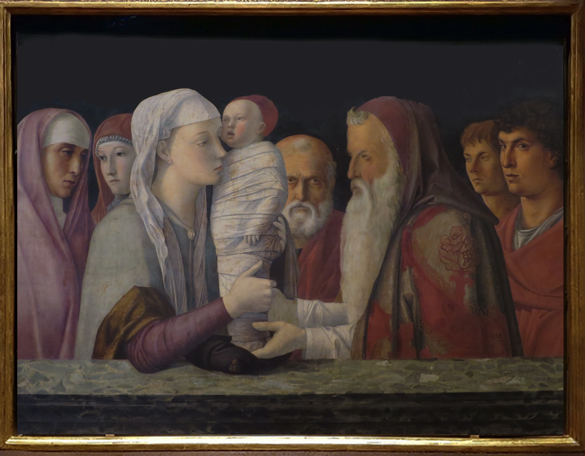
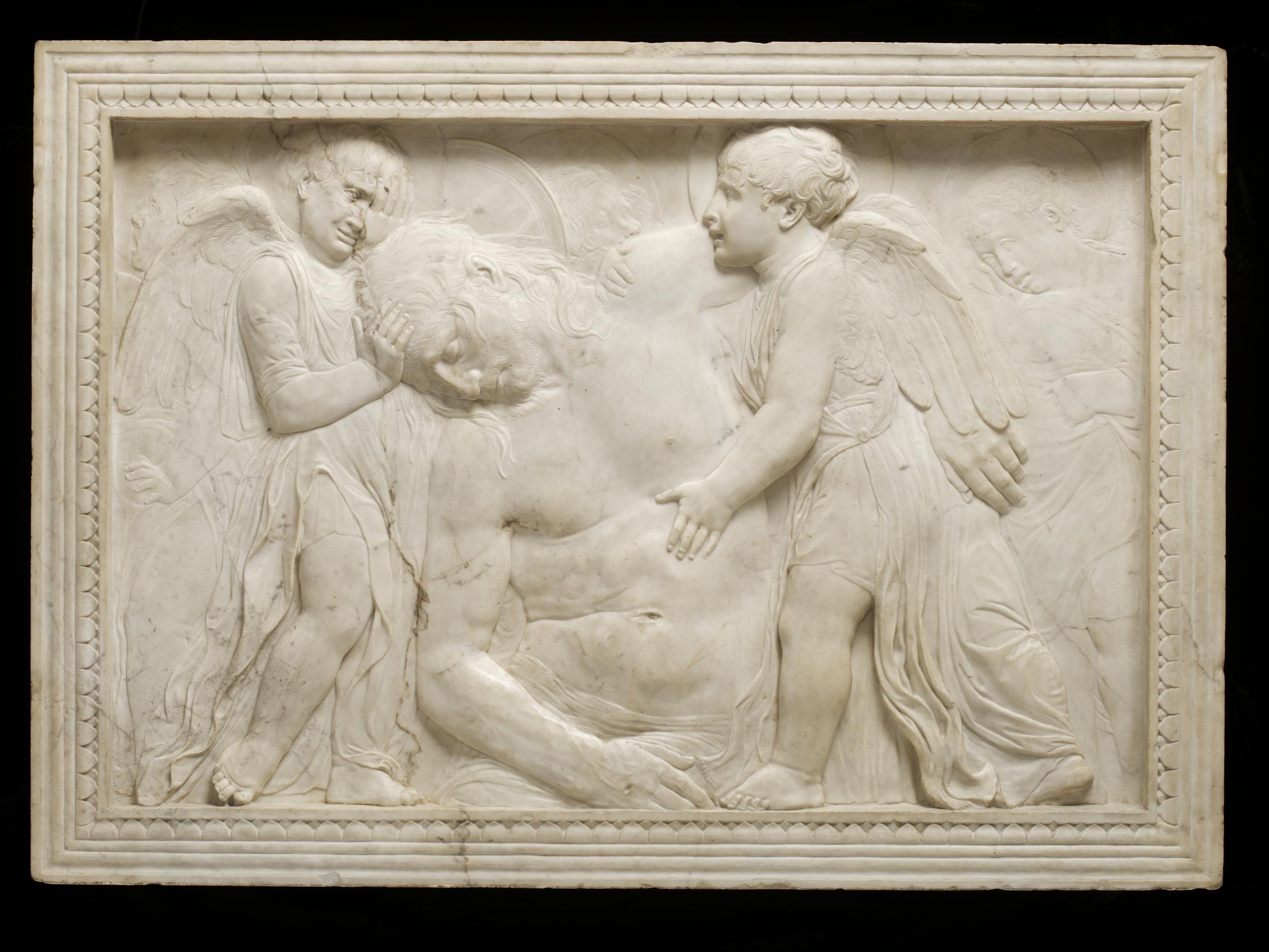
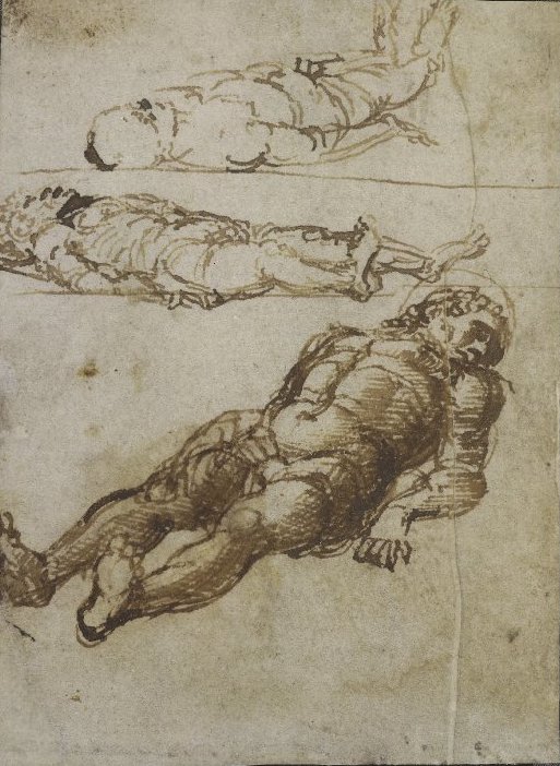
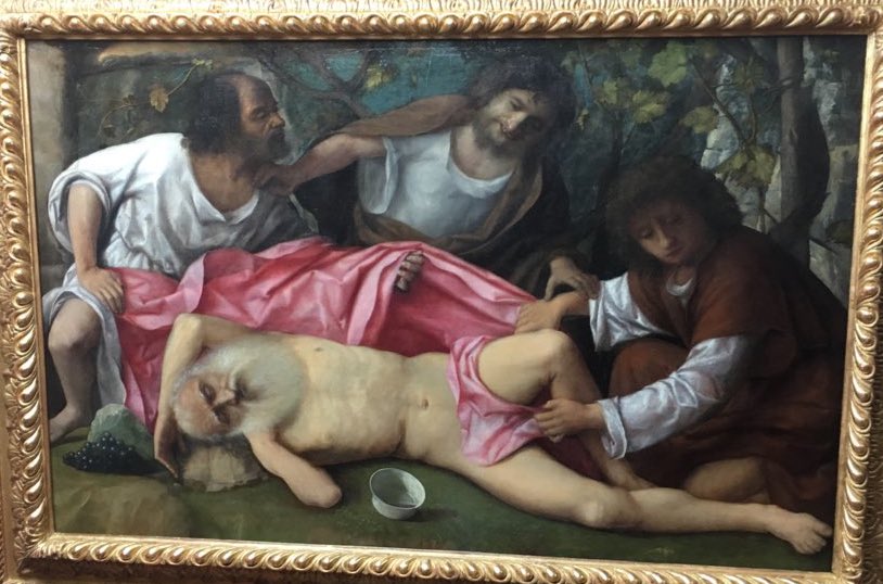
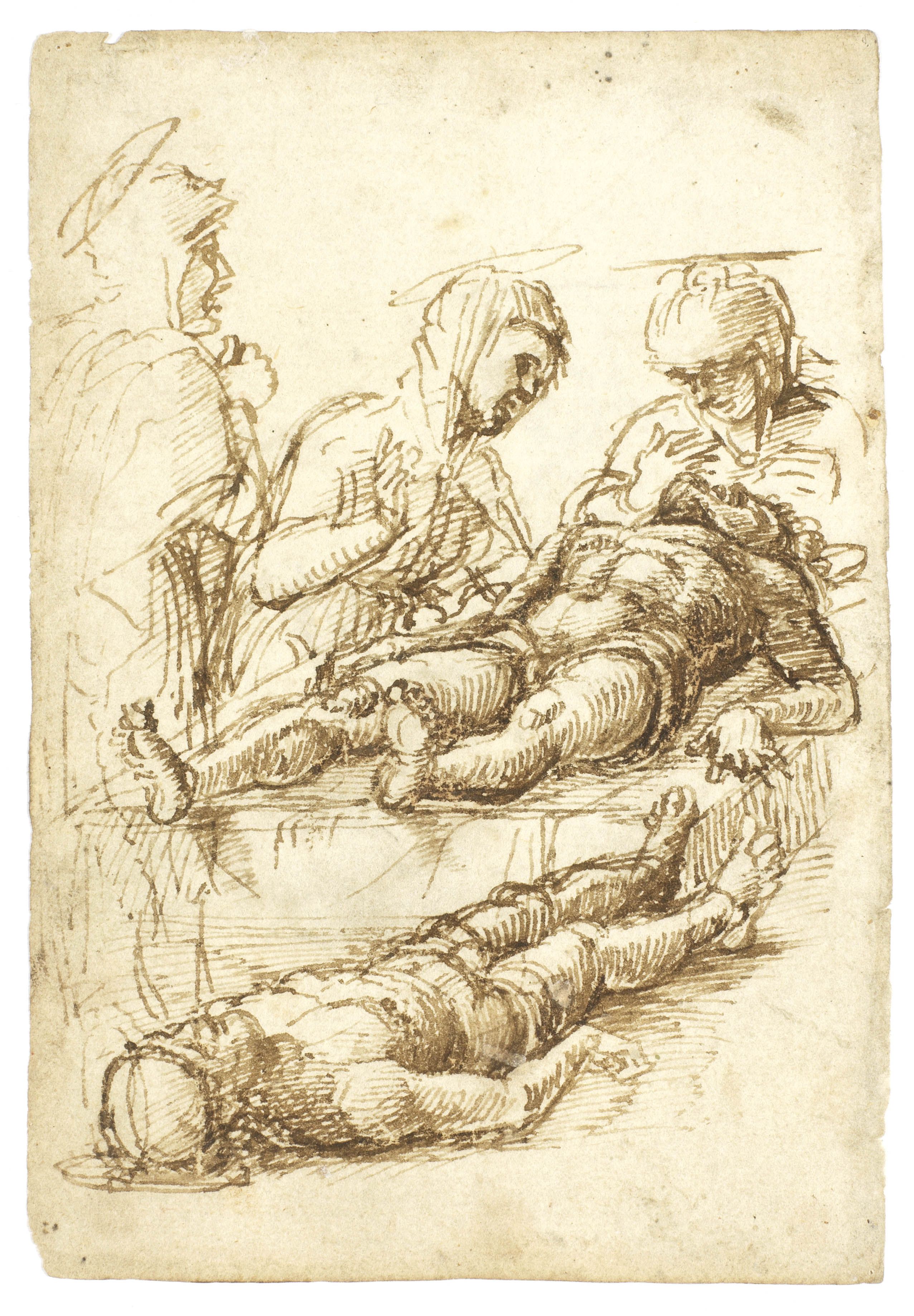
Two fascinating drawings stood in for the absent painting, one with the three Maries bent over the prone figure in something like the Milan position, with feet pointing toward the viewer (actually at c 25 degrees angled left). Then, most surprisingly, another Christ is included, pointing the other way, at the same deflection to the right. The two dead bodies are parallel and would touch if the one further away were not raised a foot off the ground the nearer body lies on. It verges on two bodies trying to inhabit the same space, or slotting together like a puzzle.

7c mantegna 3 prone brit mus.jpg

In the other drawing the figure is alone (with himself or selves) and identified as Christ by a halo on one of the three figures angled in a Z-sequence receding from the viewer and almost touching twice, when head meets feet and head meets head. It is a challenge trying to guess in which order they were put on the page. I would like to think the middle figure (the connecting one) was done last, but that would make the choice of location for the top figure unlikely, unless the sheet has been trimmed at the top. Certainly it all began with the lowest, largest figure. Why does this matter so much, and what does Mantegna’s fascination with this idea —as a corpse– mean?

8 uffizi bellini lamentation.jpg

Bellini’s Lamentation, in black ink using a very fine pen or brush on a surface painted white, was one of the most unexpected exhibits. For this artist to deny himself colour has a very particular significance, a penitential one perhaps? Yet the result is luxurious, even sensuous.  He is surrounded by a varied group, three or four of whom are not even looking at him, not because their thoughts are elsewhere but to take the pressure off, to open up what is usually a painfully monotonous occasion. This distraction of view or looking in different directions with different intentions can be seen as another way of letting in air and widening space. The picture shows these people sharing the same experience though not all inhabiting the same part of it at any particular moment. Maybe the essential separateness of individuals is most undeniable in such intervals of closeness. The oddest thing of all is that Christ does not form a strong magnetic centre. In fact he seems uncannily to fade from view, and the responses of others become the subject.

9 The Death of the Virgin.jpg

It is common for the Virgin to be overshadowed by the Disciples in depictions of the Death of the Virgin. Mantegna’s famous treatment of this subject goes further and overshadows both Virgin and Disciples by turning them into architecture, as if like a series of columns they existed only to demonstrate something about spatial recession. I thought I liked this painting, but in the context of this exhibition it gave out an alarming heartlessness, and all those halos, each teetering at a different angle, balanced on all those heads, what are we supposed to make of that?

10 bellini madonna meadow.jpg

I had in mind a perverse comparison, between Mantegna’s indoor scene with the Virgin swamped by attendants, and Bellini’s Madonna of the Meadow, alone in a wide landscape of which she becomes a another feature, as if she were a hill herself, the spirit of the place. There cannot be many visitors to the exhibition who thought at this moment of Potosí in Bolivia, but I did. That is where I first saw the amazing Virgin of the Mine, a representation of the mountain on the outskirts of town which accounted for Potosí’s being there at all and for its incredible wealth. This painting showed the Virgin as a mountain, her dress forming a pyramidal mound brocaded with sloping paths and dotted with shepherds and their flocks, monks, pilgrims, and of course miners trudging back with sacks of silver. The magical gradations of size in Bellini’s painting between trees, a town, tiny figures, hills and the pair of huge human figures made the idea of the whole earth as a gigantic female body seem momentarily inescapable.

13 bellini peter martyr.jpg

That seems a special moment of balance in Bellini’s work, but there are others, like the wonderfully restored Attack on St Peter Martyr where grisly violence including murder and chopping down trees is played against a landscape background, and the violence becomes part of the rhythms of the natural world and even in an odd way musical.

14 mantegna minerva expelling.jpg

The Madonna in a Meadow was paired with Mantegna’s Minerva expelling the Vices, by comparison a harsh and hard-edged picture which takes place in a formal garden, which is also a swamp full of monstrous distortions of the human form representing various vices. It is packed full of grotesque invention in which I formerly delighted, but now found horrific. Then into my head came a line of Alexander Pope’s ‘Trees cut to statues, statues thick as trees’, meant as a critique of the artifice in formal gardens, which can be read instead as an ecstatic summation of the pleasures and confusions of artifice in gardens, where nature and culture are forever changing places. In its way this intended put-down summons up a vision of metamorphosis just as unleashed and phantasmagoric as anything a Romantic could think up. Mantegna is a magician too, and his drawings of vices and ancient squabbles (The Calumny of Apelles) were among the best things of all.

15 mantegna triumph w elephants.jpg

The culmination of the exhibition included three of Mantegna’s Triumphs of Caesar, the final triumph of the individual detail, in compositions so dense and complex that trying to see everything they contain will keep you employed a long time. After all the stories of how ruined they are and what nightmares of misguided care they have survived, it was thrilling to see how fresh the paint remains for instance on the elephant’s ear and his embroidered cloak. Even on this scale (each canvas approximately 9 by 8 3/4 feet) Mantegna is still using egg tempera, an old fashioned choice by now.  Bellini had switched to oil decades earlier but Mantegna remained faithful to this medium which allowed a special sharpness and precision of detail and luminous transparency in the pigment visible even in the Triumphs. Incidentally, a recently discovered study for a Triumph on brown paper is an apotheosis of Mantegna’s insatiable thirst for ever finer, ever denser detail.

Matching these across the room were equivalent culminations of Bellini’s long quest, including a Feast of the Gods from Washington on which Titian is known to have collaborated. I tormented myself trying to see Titian’s changes or improvements in the figures and decided the fusion of the two hands was complete and I couldn’t see the joins. I resented Titian’s interference in Bellini’s harmonious clustering but the result was wonderful, more serene than any Titian, richer than any Bellini. Later I was relieved to learn I’d been barking up the wrong tree: Titian had only improved the wooded background, not the figures, making it darker and denser to match his contribution to the scheme it was meant for.

16 bellini noah.jpg

Bellini’s other piece of lateness was another scene of carousing, or its pitiful aftermath, The Drunkenness of Noah, a work of which I had no previous inkling. It too has just been cleaned, releasing some wonderfully cool but lush tones from the mellowness of varnish. Here is a picture of malice converted to harmony in a garland of arms and hands strung out along the embarrassing (except not) spectacle of the nakedness of an old old man.