Lee Krasner at the Barbican


DSC09787 bird talk 1955.jpg

Lee Krasner spent a lot of time and energy interpreting and promoting the work of her husband. In a real sense Jackson Pollock was worth it, but it was thrilling to see in the recent exhibition at the Barbican that Krasner was producing at the same time a rich variety of work not in the least cowed by or under the spell of the Dionysian Pollock.

It is work of great intellectual depth and force, of ceaseless searching and renewal, so demanding and various that one visit wasn’t enough to take it all in.

DSC09741 u 1947.jpg

The exhibition began with the so-called tiny paintings, small in themselves and full of further levels of tinyness, little knots of activity scattered over the canvas. Labels spelled out the theory of this organisation, that small things can become monumental depending on context and your own focus. So you grasped from the start that Krasner was a visionary who saw metamorphically, which set you up to expect transformations in which all is not what it seems.

DSC09754 nude study fr life 1940.jpg

Soon after, we came to her student work, charcoal nudes called life studies, that started looking like Michelangelo and moved on to Picasso-like fractures, a radically disruptive idea of taking dictation from nature. At this point did any of us dream that the end of it all would be the beginning?

After the impinging nearness of the nudes came unlikely wartime collages meant for window displays and populated by bombs, bombers, scientific instruments and scientists’ laboratories, full of fractious life. This was the period in which she met Pollock, as she oversaw a group of mainly male artists in a bold, practical project.

DSC09779.jpg

DSC09784 burning candles 1955.jpg

Soon after the war she is doing something even more imaginative with collage, slicing up compositions she is dissatisfied with and forming them into powerful explosions which still carry narrative force, bursts of light, tangles of undergrowth, tumult in the heavens. Unlike most of her contemporaries, she went on giving descriptive or allusive titles to her pictures, which told viewers to look for rich imagery in seeming abstraction. Not just ‘seeming’ perhaps, for Krasner shows that these canvases can be both pure construction and individualised narrative at once.

One of the best surprises was to move from one side to the other of the square donut of the upper storey at the Barbican, from the small, dense collages of 1954 to large, free Pollock-sized ones of the very next year.

Both sets, the small and the large, are among her best works, and those viewers who thought they saw suspiciously Pollock-like scribbles in one of the larger set called Bald Eagle were right. Here Krasner cannibalised her own rejected canvases and one of Pollock’s too, which plays the part of the bird.

DSC09789.jpg

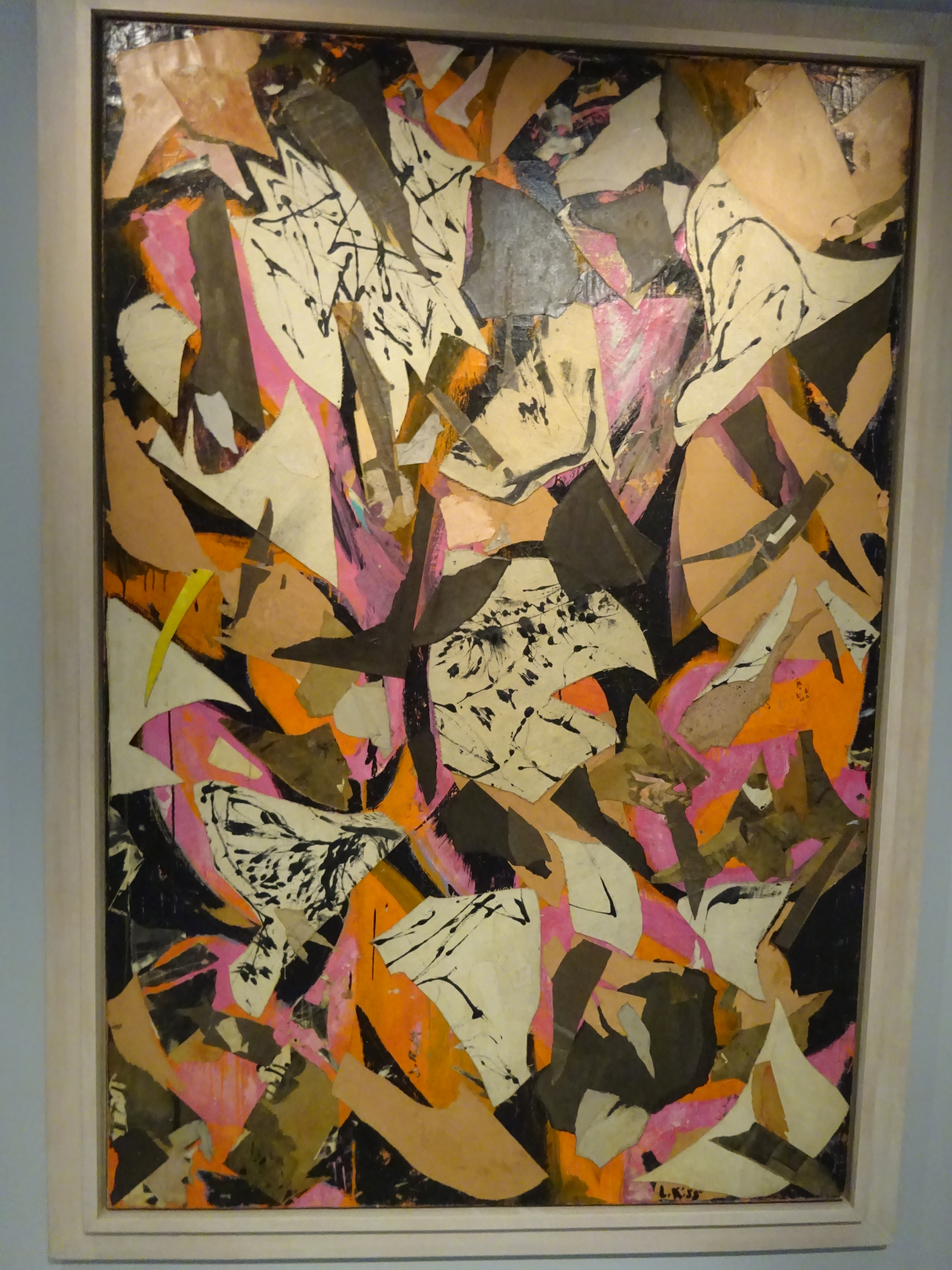
In these pictures it’s more evident that new work is made from the ruins of the old, that new energy springs from the destruction of what went before, through ripping, shredding or cutting without much respect for earlier effort.

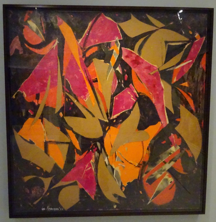
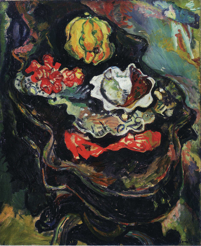
So certain colours have special meanings, and red is a kind of bloodshed in Bird Talk for instance (opening image). In this room Milkweed provided a measure of this—its cool colours seemed out of place.

Krasner’s best years in paint were difficult years with Pollock. One of the most exciting and disturbing rooms contained four violent paintings on bodily themes from just before and just after Pollock’s death, which occurred when Krasner had escaped briefly to Paris. You could fill a much larger room with the anguished work of that year and the next, among the most wonderful things Krasner ever did.

DSC09803 three in two 1956.jpg

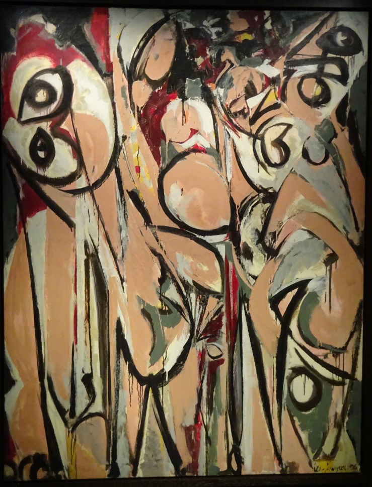
This is where my attention finally wore out, after these pictures in flesh tones and grey, which might be evenly divided between anger and grief, but there’s nothing balanced about them. They are barely controlled, which makes them so uncomfortably exciting. They keep calling themselves back to order, and the canvas gets more and more crowded with colliding forms. They are sometimes said to derive from Picasso’s Demoiselles, to which they seem worthy rivals.

krasner cauldron 1956 cat p 110.jpg

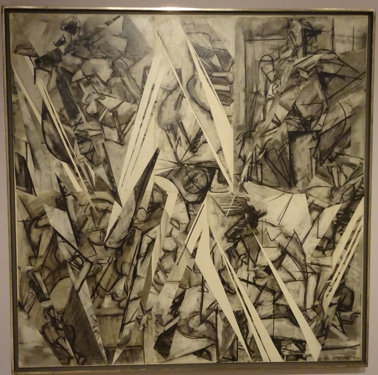
Perhaps Krasner had already been shifting to soberer palettes in works like Cauldron (not in exhibition), but when we moved to the lower floor at the Barbican we were in a surprising new monochrome-world which might at first seem a diminishment, but resulted in a pair of masterpieces on a grand scale, a calm cloudscape or vast Northern expanse called Polar Stampede, and the wildest depiction of movement, The Eye is the First Circle, which incorporates whirlwind vortexes and heroic striding figures, a range of diffuse and focused motion which accompanies you as you walk past it. Did Krasner have in mind Pollock’s largest canvas, the regular/irregular Mural, meant for Peggy Guggenheim’s New York flat, Krasner’s seething crowd played against Pollock’s orderly procession?

DSC09817 the eye is the first circle 1960.jpg

The almost-grisaille effect of Krasner’s umber paintings lets the formal power of the composition come out more clearly, but there’s also a more prosaic explanation of the source of this unexpected swerve in her work. The larger canvases are possible because she has moved into Pollock’s much bigger studio at their Long Island house. And the absence of colour has its source in her insomnia—she takes to painting at night by artificial light, doesn’t like what happens to colour in these conditions and hits on brown as a tone unspoiled by them.

There are more new departures in the 1960s and 70s, ‘flower’ paintings like Through Blue of 1963, made with a broken right arm which left her manipulating paint with her fingers, leading to great density of surface, and a spate of cartoon-like canvases including Courtship and Mister Blue of 1966.

DSC09842 imperfect indicative 1976.jpg

The exhibition ended with a startling return. Rooting around in the studio, a British friend found a large cache of charcoal nudes from student days. Krasner meant to destroy them, but looking more closely, felt she was being directed to turn them into something new. Instead of tearing, this time she cut them up with scissors. Out of this destruction came remarkable and unnerving works, in part her revenge on a teacher she had both revered and resented. He had once torn up one of her drawings.

The results of the butchering are tantalysing and confusing, like a Baroque ceiling with figures tumbling out of the corners, like Michelangelo’s lounging or sprawling figures anchoring an indistinct turmoil of other figures, like a series of movements only beginning to clarify themselves, and suggesting as so often in Krasner’s canvases that much bodily business remains to unfold.

DSC09840 future indicative 1977.jpg


Rembrandt’s prints

b 5 4 b78 self beggar rt angles AN00022116_001_l copy 2.jpg

Rembrandt is one of those rare artists like Michelangelo, Picasso and very few others who breaks the bounds and goes beyond all rivals in three different mediums. His achievements in the cold, dull realm of printmaking are perhaps the most astonishing of all.  He found there ranges of tone so varied and extensive it is like colour, a world so full of shades you can’t feel there’s anything missing, and so to talk of black-and-white seems almost obtuse.

6a b85 lazarus AN00022150_001_l.jpg
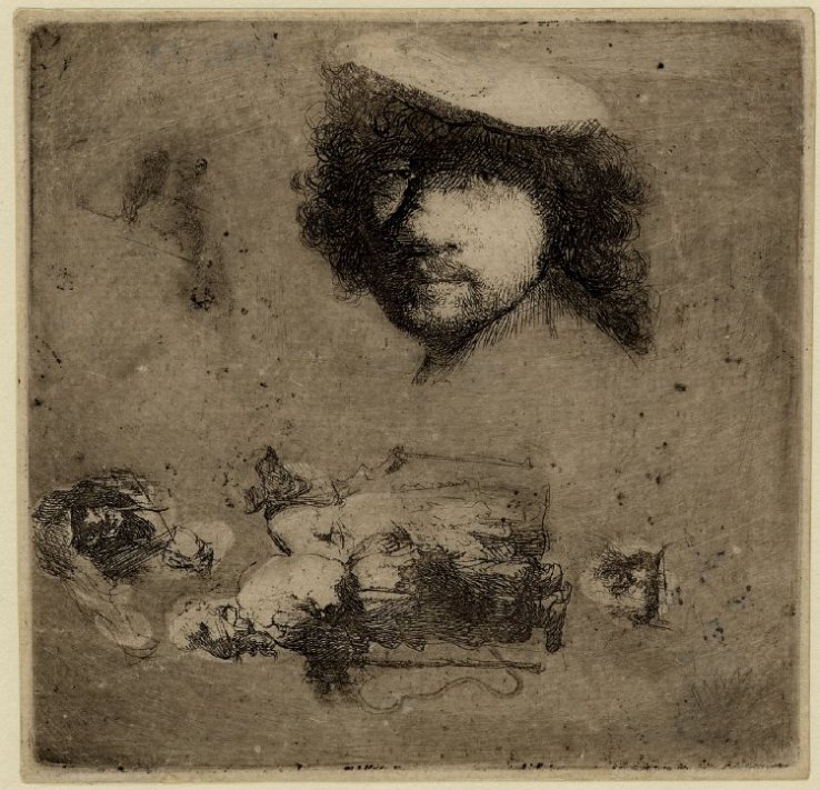
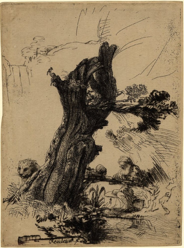
One of the earliest etchings in the little exhibition of his prints and drawings now at the British Museum, a large, showy Raising of Lazarus, made me wonder how he (or anyone else) could ever go beyond it. The lighting effects are so startling, the gestures though exaggerated so confident and so clearly set off from one another. A single action becomes a whole series of them. The later Rembrandt might cringe at the idea of making the main figure three times the size of the others, but we’re not having such thoughts now, caught up in marveling at the richness of light and dark tones jostling each other so energetically.

g 13 25 b177 lazarus small AN00037930_001_l copy 2.jpg
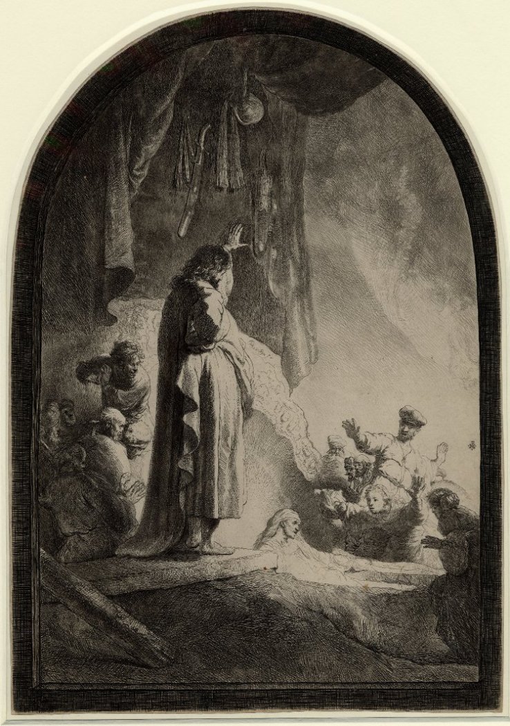
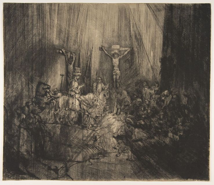
Ten years later he does the raising of Lazarus more quietly but with greater intensity, on a smaller plate with a reduced tonal range. Gestures are less dramatic, if they show up at all. Facial features are almost too small to pick out, but the tilts of the little figures’ heads are powerfully expressive instead, thrust forward, drawn back, lowered, turning aside—all these and more are employed in this small print. Christ isn’t even looking directly at Lazarus but slightly downward, pondering.*  Has anyone ever done a human group with such attention to the varied states of everyone in it?

This is a modest example, yet yields so much, modest but radical in the allotment of space, bolder than the early Lazarus in its use of blank spaces—all the active figures are confined in the lower left-hand quadrant; Lazarus is almost pushed out of the picture. Two blank spaces run almost the whole length of the scene; it is one big grave.

We want to claim that Rembrandt outgrew his obtrusive early virtuosity, and he did leave behind the showy Baroque kind, but he never ceased some form of virtuoistic display, though, as Artaud said of van Gogh, he was by the end in a different region from normal human perception, a place where he didn’t perhaps expect anyone to follow, doubtless a strange way to talk about two of the most popular artists in the whole history of art.

a 3 2 b63 antiope AN00021702_001_l copy 2.jpg

Even in the more thoughtless Baroque phase Rembrandt is capable of great delicacy and quiet richness, as in this sensuous nude, given a mythological twist by the shadowy rapist lurching out of the shadow, Jupiter and Antiope. Rembrandt was prone to make jokes of classical subjects—who could ever guess that the embarrassed middle-aged nude dipping her feet in a pond was Diana at the bath? But Jupiter is hardly there in the present picture, an afterthought, Rembrandt’s way of acknowledging a vestigial embarrassment at catching his model asleep, after what activity, not before? Yet the figure is raised by the classical reference and her languor could not be bettered. In a way hard to explain, the idea of Jupiter gives us permission to savour a wonderfully lengthened moment.

d 8 17 b129 prodigal AN00022493_001_l copy 2.jpg

Certain subjects recur in Rembrandt, one of them an encounter between a young man and an old one, like this father and his prodigal son no longer young. Why is this awkward meeting so beautiful, framed on one side by emptiness and on the other by unwanted bystanders kept at bay by narrow stairs which effectively confine them? There is no shortage of feeling, rather an excess, and the complex platform sets them off as on an altar. The space is like an allegory of their situation, which they have surmounted, at least for the present.

I have just realised that the lead figure on the right is carrying shoes and a coat, bringing them for the semi-naked prodigal, a dose of everyday reality, just what this artist revels in: in every twist of the father’s sleeve, in the creases in the stone steps, in three different arched openings, in headgear and shoes and every one of the endlessly varied lines cut by the graving tool.

e 9 18 b139 joseph telling dreams AN00022531_001_l copy 2.jpg
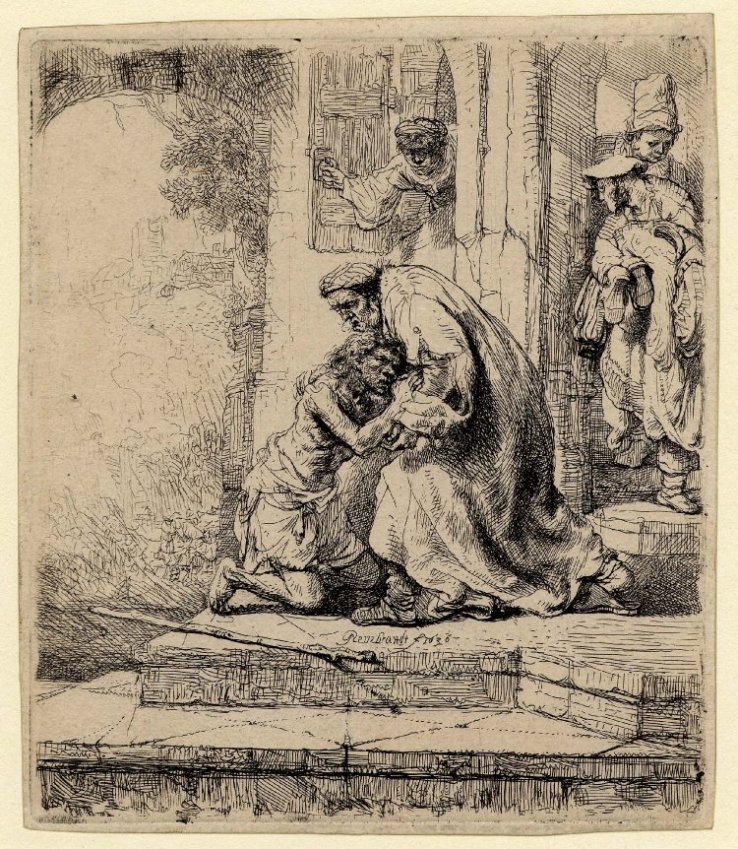
Another young man holding a whole cohort of old ones entranced with his tales, like Christ among the doctors, but this time Joseph recounting his dreams to the other prisoners, a subject easier to give a comic twist, in part by clothing them all in Egyptian finery. It is an exercise in filling up space, and he does it most ingeniously, including a bedroom setting as in Genesis, a kitchen visible in a slit at the edge and a dog obliviously licking itself. Joseph is the brilliant invention of a novelist, a little businessman who is believable as the soon-to-be administrator of the whole Egyptian harvest.

f 10 19 b140 adam & eve AN00462408_001_l copy 2.jpg

I suppose this counts as a comic scene too, though making light of the fate of humanity in this present world seems shallow in the extreme, yet what result do you expect to follow from leaving the spiritual destination of the world to the sagacity of inexperienced newlyweds?  Rembrandt is an unstoppable storyteller and Eve is one of his best inventions, her frailty signaled by letting the snake-dragon loom over her, by her bowed shoulders and a head drawn in like a tortoise, by her wonderfully trustful and mistrustful expression: she is used to listening to Adam yet she can’t accept what she is hearing. But it’s the vulnerability of those hips and knees, something that makes this an extremely lovable creature who can’t be blamed for what she has done. The couple are wonderfully lit in a big keyhole of light which is about to close in on them, and on the frolicking elephant, tiny in the distance.

h 17 34 b210 jerome w stump AN00038466_001_l copy 2.jpgRembrandt did old men repeatedly, St Jerome most often. He also had a strange fondness for old stumps which he saw (or anyway showed) as sheltering diverse forms of life and as in that way sponsors of youth. The outlandish disproportion between the saint and his tree expresses a truth but also functions as a kind of camouflage: the wise man disappears in the undergrowth and his lion knows to do the same.

k 22 49 b247 jerome in l.s. AN00045819_001_l copy 2.jpg

The best of all his renderings of his favourite saint puts Jerome in a wide landscape, not in flat Holland but precipitous Italy. It’s the gentlest, richest vision, of a long serpentine ridge with the lion standing, curved, on the turning point where it swoops downward, man and beast, stillness and movement, action and contemplation, yet of course the lion doesn’t move either, just expresses movement with the swerve of his body. The saint vanishes or hovers like a mirage, conveying that there aren’t any saints or lions in Italy, except if you think there are, or while you think there are.

i 20 46 b244 three crosses early 2.jpg

The highlight of the exhibition was the pairing of different stages of the same print which showed how flexible or molten Rembrandt’s idea of his subjects became, increasingly as he got older. The most startling transformation was performed on one of his largest prints, a rendering of the Crucifixion known as The Three Crosses which began as Rembrandt’s most complex crowd scene, with the turmoil of two dozen figures forming a hollow circle around the three crosses, something like Bruegel’s in Vienna, but seen from much nearer. At first it was done in drypoint, a technique Rembrandt increasingly favoured, which creates powerful but blurry effects because the this tool works more like a gouger than a sharp pen. So there’s something rich but impressionistic about the rendering of figures, and he concentrates on the architecture of the scene, controlled by strong lighting which makes an apse-like structure that incorporates all the figures into a single vertical space, with an effect murky and tumultuous at once.

j 21 47 245 three crosses later 2.jpgThen Rembrandt went to work on it, erasing some elements, like one of the two prominent figures in the foreground running away, and adding others, like the tall figure on horseback wearing a strange three tier-headdress like something out of Uccello. The right-hand thief has become a black smudge and the dense right-hand group a blur.  Strangest of all he has added strong diagonal scorings leading out of the picture toward both lower corners, matching the rays coming down from above in the top half of the picture, so that now you have a single explosion caused by the crucifixion, as if there’s been a great discharge of energy, an electrical phenomenon we would say if that were not pure anachronism in the age of Rembrandt.

Now a universal darkness has fallen on the whole scene except for a couple of weird flickers to the left of Christ. The air has been sucked out of the world along with the light, leaving it flattened and shrunken by the diagonal forces pulling downward, a space unreal, visionary, as if we’ve retreated into a mental realm, hugging the suffering depicted to ourselves more intimately.

Darkness had always had a strong aesthetic appeal for Rembrandt, particularly in prints. Colour disappears as darkness falls, and he liked pushing to the moments when less and less is visible, sometimes almost as a prank, to see how little he could get away with showing and still have a picture, but more often with serious purpose, to find out how much you could take away or occlude and still keep the whole surface tense with the expectation of meaning, which might need to be searched for, but was there to be found. Earlier, darkness might just signal experiment; later, solemnity appears more often. In the year after The Three Crosses a smaller Descent from the Cross by torchlight appears, in which the body of Christ occurs twice, once as a crumpled corpse, and again as a blank sheet. His shroud waiting for him on a stretcher at the bottom of the picture has such a strong presence it’s as if there are two of him, or two moments both present in the single image, which there’s an old instinct (familiar in many medieval narratives) to include within one frame.

l 23 54r b257 descent fr cross torchlight counter proofAN00058987_001_l copy 2.jpg

The sheet is so characterful, contains such subtlety of outline and feature, that it seems a depiction of a collected, resolved and tranquil state of mind, like a washing away of all the kinks and twists of everyday human character—to become a blank sheet again, a certain ideal conception of what happens to the individual at death. The prominence given to this empty container is preternaturally strong and purposeful–at the front and bottom of the space, yet canted away from strict horizontal, a relaxed, not a rigid disposition, one of the most beautiful details in all of Rembrandt. After all the toil and trouble, peace; after hideous cruelty, a slate wiped clean.m 25 56 b260 entombment w surface tint AN00059590_001_l copy 2.jpgThere’s a further, more resolved stage of the same process in the revised plate of the Entombment from the same year. Revision here has consisted of removing much detail by darkening it, while allowing faint suggestions of the main spatial divisions to remain, not quite consistently, to give a grand general sense of the entire space while narrowing the focus to a few of the figures formerly visible (in earlier stages of this print) and only to selected fragments of those who remain. The details that are left have become more precious: they are all that there is: expressions simplified are more solemn, surrounded by gloom they sink deeper into the viewer’s consciousness. Christ is the least evident of all of them—can that be right? Earlier it was even possible to overlook him, not now. In some technical sense the scene is lit by a candle which we cannot see, but that is an explanation we think of afterwards. Our first impression is that Christ’s limp body emits a strange glow, unnaturally intense like a firefly, the only point of light in the night sky, which is to say that in death he compels us more than ever. You can describe this effect to make it sound simple, and so it appears, but what it is still more, is focused, and wonderfully so, and it arises from Rembrandt’s understanding of human responses, and of the play of light and its absence, which is all brought to bear on a small stretch of inked paper, most overwhelming in those parts where nothing is there, no ink, just paper, the very instant when the artist’s absent hand is felt most of all. 


*Other impressions of the small Lazarus change Christ’s expression, which becomes less meditative.

The print of the late Descent from the Cross by torchlight shown here is a counterproof, in which the blank of the shroud is paler but stronger.

Rembrandt: thinking on paper at the British Museum until 4 August 2019


Oceania—art of the Pacific islands


DSC04652 copy.jpg

A moment of vertigo as you realise that by allotting a whole wall to a map of these scattered islands, you’ve drawn attention to the vast expanses of empty space between them.  Once you’ve left the land masses at either end of 6000 miles of ocean behind, there’s almost nothing there. It is the most dispersed series of human habitations on earth, given a flimsy coherence by the comforting (comforting and embarrassing) 18c names, reminders of European monarchs, like Caroline or Mariana, or far away and inappropriate places, like the Hebrides (now Vanuatu), Britain or Ireland (with New tacked on in front) and quaintest of all, Easter Island (now Rapa Nui) after the purely accidental day of European landfall.

The adventure properly begins with the ocean, represented in the recent exhibition at the Royal Academy by a huge, nearly featureless blue hanging, crinkled like a calm sea and cascading toward the viewer. This was followed by a vast space where three slender canoes were suspended in the dimness. The largest was never meant to touch the water, a soul-canoe, already full of crouching wooden passengers–fierce birds, quiet turtles and human figures knotted together at both ends, where they hung out over imaginary sea-water.

DSC04791 copy.jpg
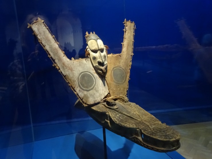
Around them were grouped embellishments of canoes: splashboards inscribed with wave patterns that turn into birds biting each other, or a menacing crocodile prow with a demonic face on a canvas shield looming over it (see opening image). There were also three navigation charts like a cross between maps and abstract art, made of sticks (the main stems of coconut-palm fronds) lashed together into lattices dotted with tiny shells tied on in asymmetrical sequences. It’s the asymmetry and minimal means that make them feel like abstract art, and the diagrammatic arrangements of lines and dots that recall maps.

Western observers cannot help trying to match up the pattern of shells with islands on a map (a German attempt illustrated in the catalogue), an effort that can only ever succeed in part, because ‘lines’ on these ‘charts’ represent ocean-swells not distances, a subject long studied by island navigators, and classified into four types according to various resistances like undersea ridges, island shapes and prevailing winds. The charts aren’t taken along on voyages (hence their picture-like scale) but studied ahead of time and used in teaching. They are only the tips of icebergs of esoteric knowledge which have drawn occasional Western sailors to devote years to fathoming them.

DSC04883 copy.jpg

The precarious situation of islands which barely stick out above the sea often finds an echo in the islanders’ art, in headdresses formed of thousands of tiny feathers loosely mounted on flimsy cane frames, forming gigantic quivering auras 7 feet across over the dancer’s head. These rarely survive and are meant to be thrown away after a single performance, like those much solider island products, the malangan carvings made for funerals, depicting big fish entangled in little fish and threading their un-fishlike tusks among the fins. Their painted gaudiness seems almost another sign of a short life, of going out ablaze. Malangans turn up surprisingly often in museum collections, apparently because their makers think that selling them to the anthropologists is just another kind of destruction.

DSC04682 copy.jpgFlimsiness, undependable materials and the prospect of a short life can also lead to delightfully casual effects, as they do in barkcloth masks stretched on light bamboo frames which are hard to control precisely. The resulting wobbliness of forms can look like beings who are changing shape before your eyes, as in the lopsided duck or bird above, who seems to make space for a large spider living on his forehead at the centre of a web that covers the bird’s face. Its enormous eyes are not used for looking at the everyday world but at something further off. The wearer can see only through the bird’s beak, which must give everyone, dancer and spectator alike, a dislocated idea of where reality will be found.

DSC04815 copy.jpg

Under the sea’s influence Oceanic art, like Shakespeare’s late plays, is possessed by the idea of transformation, of things turning into other things, as in a carved board of uncertain purpose that starts with a large moon-like face at the top and then becomes a trellis of small faces melting into others, and then larger, more indistinct ones like Rorschach blots, with mirror-selves upside-down below. The overall effect is not unlike the mazes of Northern interlace, and all the piercing makes every perception insubstantial.

Next to this screen happened to be another mythical transformation, in which a long-tailed bird dug its talons into the scalp of a man it intended to carry aloft or devour and subsume on the spot. Already its claws were turning into human hair combed into parallel ridges. The leaning form of this roof finial foreshadowed the gentle motion of the bird’s flight and its acceptance of the composite creature it had become.

DSC04670 copy.jpgTattoos, and especially Maori face-tattoos, are indisputably an art-form, but difficult to include in an exhibition consisting of objects anchored in one place. There’s a remarkable drawing made in England in 1818 by a Maori artist suffering climate and culture shock. He depicts his brother’s face-tattoo as a single exploded view which flattens out the parts of the design that would disappear around the corners on the cheeks or over the top of the forehead. He makes it easier to grasp how this process consumes a part of the body and transforms it into a work of art, or rather how the body and the design are fused into a new being and a new work, a deeper idea of what writing lines on the body might achieve than most tattooists dream of.

DSC04985 copy.jpgIn 1896 a museum director in New Zealand solved the problem of how to display tattoos in a gallery that conveyed their vividness and power. He commissioned a sculpture from a noted Maori artist that would give him a three-dimensional rendering of tattoos. The resulting work looks as if it is carved from a single piece of dark wood left largely uncoloured to represent with defiant strength the darkness of native New Zealand skin. It shows three fully rounded heads emerging from a flat background deeply carved with traditional patterns, stained red and including two fierce birds with mother of pearl eyes. The heads are arranged in rows, two men at the top, a woman at the bottom. The men stare straight ahead, sightlessly; the woman looks down but her eyes are closed. You can study the tattoos as the director intended, but the expressions of the three and their asymmetries are unnerving.

Tattooing is not universal across the islands. One of the most rewarding aspects of studying all these tiny self-contained cultures is finding out how un-homogenous they are. New Guinea alone, the largest land mass in Oceania, contains or contained over a thousand languages and a dizzying variety of forms. In the middle Sepik region on the north coast appeared one of the most surprising simulacra of a tattooed face, sitting atop a special stool which commemorated a famous orator. It wasn’t a stool for sitting on, but a kind of effigy for contemplating the departed, which envisages him expressing his power with circular designs that start from the eyes and spread hypnotically over the whole face, which takes on a new concave form to accommodate them. Are these lines the spreading ripples of the orator’s voice, a visual analogue for sound waves?

DSC04701 copy.jpgThere is often a strong impulse in Oceanic art to dissolve solid bodies and obliterate the distinctness of forms. One of the most perplexing works shows a human body become almost two dimensional, a graphic squiggle of concentric curvelets enclosing an essence receding toward the status of a dot. In a world without writing there is no letter C, but in a world with drawing there is certainly this empty but enclosing form of a shallow curve with more copies of itself within.

DSC04849 copy.jpg
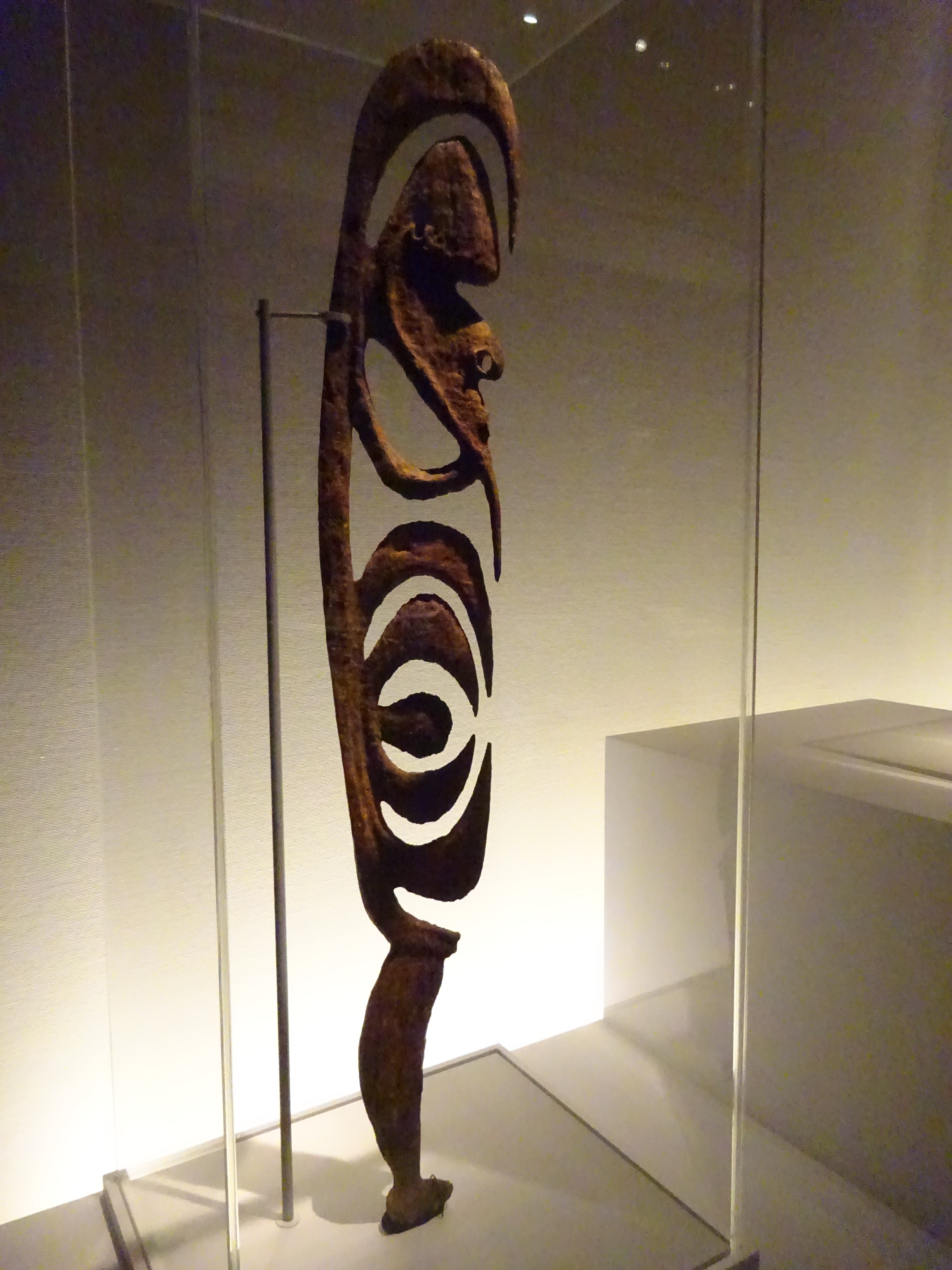
In the same company belongs the astonishingly featureless figure from Nukuoro in the Carolines whose head is a spinning top like one of Oscar Schlemmer’s, spherical at the back, narrowed to the point of a cone at the front, its chin. I imagine that I see on this ‘face’ the most delicate concentric tattoos and even almond-shaped openings in the pattern for the eyes. From Tahiti comes another way of blanking out the person with strong shapes and textures, ones which do not belong to personhood, large flat pearly shells instead of face, hands and breasts; stiff rectangles of alien substances covering the rest of the body. Appropriately this is a costume for the chief mourner at a funeral, someone who cuts off from all connection while the ordeal lasts.

DSC04935 copy.jpg

How is the deity A’a from remote Rurutu recognisable as a person at all? He has a head, sort of, and a body, but has been so colonised by parasites which he exudes like beads of sweat that he himself is obliterated. I had known him a long time before I’d been anywhere near the British Museum or had any idea what he looked like, except what I could glean from William Empson’s poem. Apparently he has functioned as a totem for many unbelievers who have little or no other contact with Oceanic art. He exercised his sway on the missionaries who brought him back to England instead of incinerating him, as had been their custom with the other idols which local people submitted to them to confirm their trust in the new creed, Christianity. The anthropologist Edmund Leach thought A’a’s visual power lay in his resemblance to an erect penis, an emblem of fertility, sweating lots of copies of himself which don’t resemble him exactly, but suggest increase, rather alarmingly.

He appeared in Roland Penrose’s exhibition of 1948-9, 40,000 years of modern art, after which the curator had a cast made. Seeing him in the Penrose studio, Picasso wanted one too, as did Henry Moore. Occasional visitors from Rurutu have come to see A’a in the British Museum, and a copy of him finally made it back to his birthplace and sits beside sports trophies in the mayor’s office. Recent scientific conclusions that he is made of sandalwood were debated by the island elders, who reaffirmed their adherence to the traditional belief that the material is pua wood, a species of tree noted for its sweet-smelling flowers.

DSC04845 copy.jpg


Homage To The British Museum

 There is a supreme God in the ethnological section;
A hollow toad shape, faced with a blank shield.
He needs his belly to include the Pantheon,
Which is inserted through a hole behind.
At the navel, at the points formally stressed, at the organs of sense,
Lice glue themselves, dolls, local deities,
His smooth wood creeps with all the creeds of the world.

Attending there let us absorb the cultures of nations
And dissolve into our judgement all their codes.
Then, being clogged with a natural hesitation
(People are continually asking one the way out),
Let us stand here and admit that we have no road.
Being everything, let us admit that is to be something,
Or give ourselves the benefit of the doubt;
Let us offer our pinch of dust all to this God,
And grant his reign over the entire building.


William Empson


In the exhibition A’a was shown with his back removed and his internal cavity exposed. I came at him from behind and received a tremendous shock. I did not know that he was hollow.

African sculpture — art versus anthropology


DSC03446

I used to think that Picasso and the other early modernists who raved over the African masks and carved figures they found in Parisian museums saw only formal designs and discarded the cultural baggage that came with them. They weren’t superstitious natives but aesthetes, who appropriated the geometrical discoveries they needed and ignored the rest. Now I think that this describes my attitude to African objects in the primitive days of the 1960s, not Picasso’s, who thought he recognised in African carvers fellow artists practising a kind of magic, standing between the spirit-world and their audiences like shamans and interpreting that dangerous reality to them. He credited the African objects with waking him to the true seriousness of art.

The divide between the artist’s vision and the anthropologist’s isn’t quite what I thought it was then, but it is still there. I even begin to think this painful split is not resolvable and bound to haunt anyone who becomes deeply interested in African sculpture. For it is sculpture that carries the serious weight of African art and above all sculpture in wood. Sculpture includes all sorts of useful objects–backrests, stools, musical instruments, containers for food—a full list would go on much longer and show that the concept enclosed in our word sculpture doesn’t really fit in Africa.

DSC03440.jpg

Take masks, one of the most numinous of African cultural forms, to which we bring associations from ancient Greek drama, tied to venerable texts, not appropriate to African cultures which were not literate in the time of the earliest surviving masks and so have left no contemporary interpretations. For the aesthete (perhaps for any museum-goer) it is convenient to think of African art existing outside history, like ghosts in a dream, or a continuous unchanging present. This is a cultural appropriation uncomfortably like looting in its own high-handed way. Sometimes it’s obvious that a mask has been shorn of its history—it had one, but the evidence was too bulky for the collector to bring that back as well as the mask proper, or the material was perishable (grass, feathers) and has decayed and disappeared. More often than not, the masks have functioned as part of a kind of theatrical performance, a masquerade that took place in the street or the field and played its part in agricultural or social cycles.

I have two books that represent the two poles clearly, one is Africa, the art of a continent, the catalogue of an enormous exhibition of 1995-6, the other is A History of Art in Africa, which in spite of its title is full of photos showing the art in use, smothered by and barely visible under the social hubbub, art sharing the space with anthropology. This reflects current discomfort with treating African masks and figures simply as museum pieces, which have left their lives in the villages behind.

Bits of Greek or Egyptian temples in the British Museum, Italian altarpieces in the National Gallery—these are also instances of dismembering culture to turn it into art. Photos in the great Africa catalogue isolate the works and make every detail visible, elevating them into a place of special clarity, transfiguring them. The current style of museum display, however, (in the British Museum in London or the National Museum of African Art in Washington) sinks them in a surrounding darkness from which they emerge eerily, uncertainly. Photos taken under those conditions convey the murk of clouded consciousness.

1f butterfly mask copy.jpg
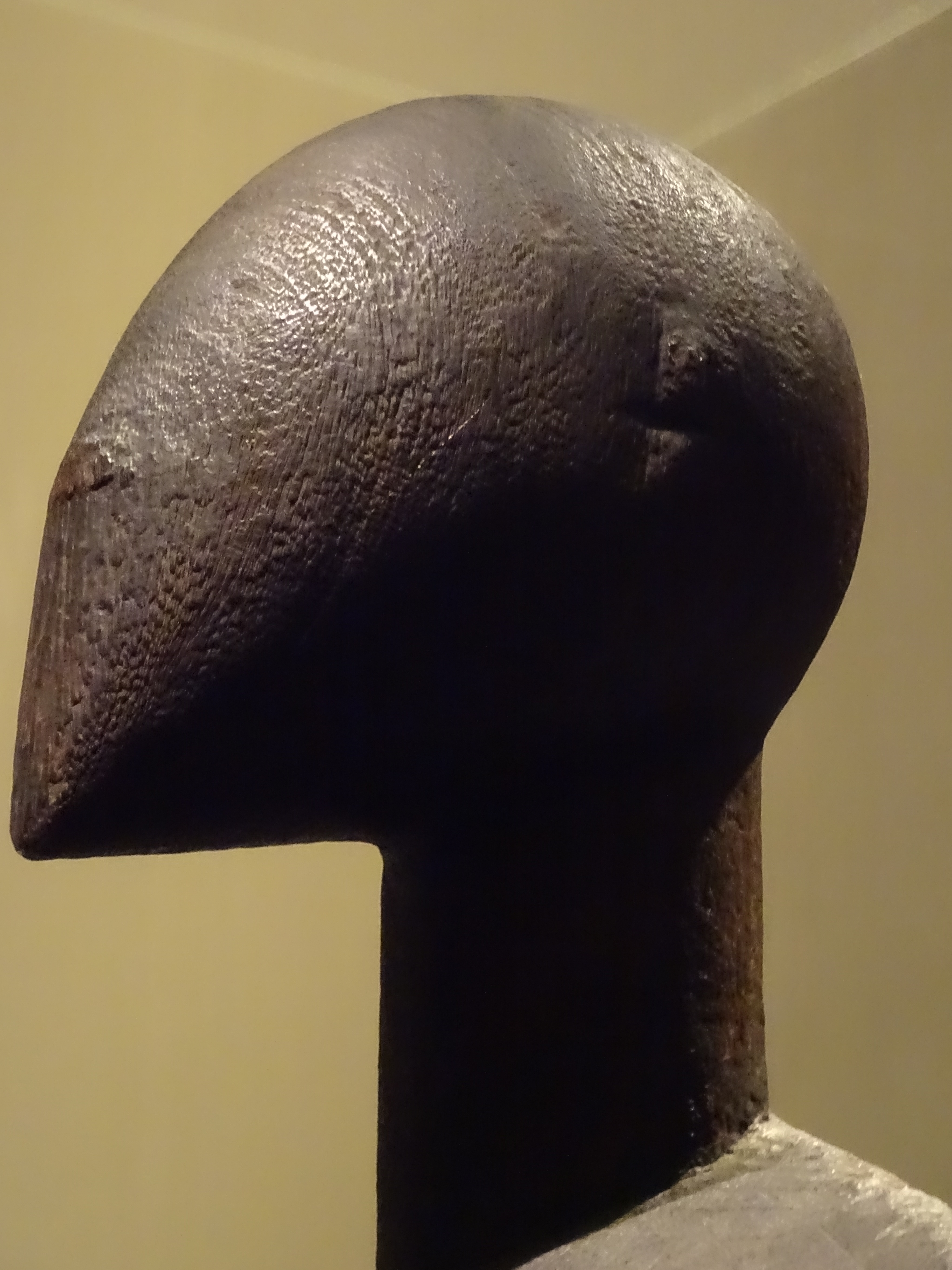
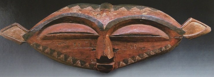
Its subjects exist outside history in a world ruled by metaphor, like a huge butterfly mask in Washington with four birds and three chameleons perched on it, stretching sideways for almost six feet in a shape unlike any face that ever was. Labels for such objects too often simply show the limits of knowledge—dates are the date it was collected, or a guess–‘late 19th/ early 20th century (?)’—how often have we met that? Then comes an interesting debate about which of two nearby groups is more likely as the source of the work. In the meantime more intriguing questions have slipped away—why a butterfly? why such an abstract, bird-like form of butterfly? why such strident tattooing over the whole wing-surface of the flimsy creature? and the inversions of size, small birds & large butterfly—is that just a picture of thought roaming free, or a more specific puzzle to be solved? No answers, only questions.

DSC03299 copy.jpg
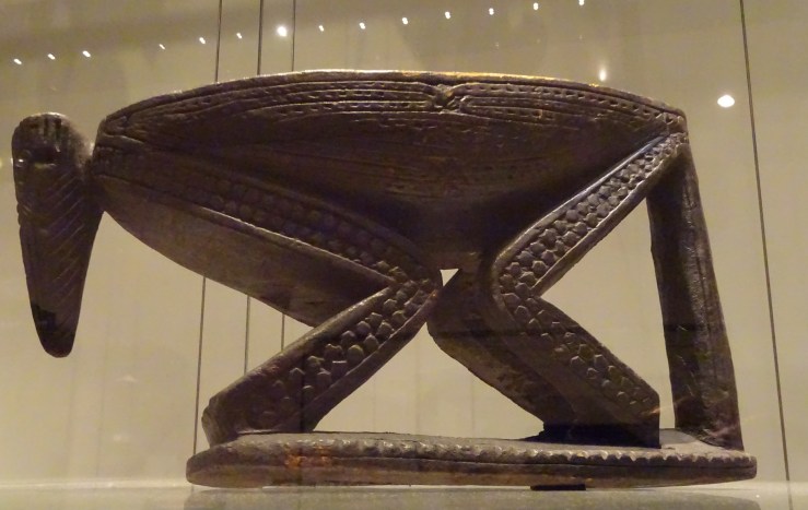
Ordinary objects are turning into animals, like a stool ingeniously composed of a long nosed beast which can fold its limbs into a stool with none left over or sticking out, an improbable completeness in disparate realities aligned. Less immediately perplexing are appliances embellished with a single or a couple of animal features, a big container with a head and a tail, or a backrest with a ram’s head at the top and two supports turning into his front legs, the rest of him nowhere to be seen or thought of as continuing underground.

1w ram backrest copy.jpgIt is wrong to view the animal features as embellishments or decoration of a useful object. They are all we need to turn a thing into a being. Even a modern Westerner, susceptible enough to the literal mindedness that runs deep in all art, will seize on the slightest signs that the inanimate is becoming animate to take the hint, carry it further and complete the conversion, even in the case where what I took for a large storage container made from a log is actually a slit-drum for sending long-distance messages by banging on its sides with wooden hammers. I reckoned it a giant ant-eater, so stretched-out was its body, nine feet long, but everyone agrees that the head is another ram’s head, and the tail a ram’s tail, so these proportions call for difficult digesting by the viewer. Or perhaps its mass is so powerful that it overcomes all objections by that fact alone.

DSC03438.jpg

There is a whole category of African mask which looks nothing much like any existing man or beast, such as an example in the British Museum which I mistook for a wolf (a non-African species), then decided must be a crocodile. These masks are even called Cubist in catalogues, on the theory that like Braque and his contemporaries the African artist has analysed the form of the animal’s head into purer geometrical solids, as a kind of intellectual feat or, more likely, in hope of striking terror in the viewer. A being of such heartlessly perfect forms, encountered in a masquerade, would be the last opponent to pay any attention to a plea.

DSC03376 copy.jpg

The same goes for the ridged human face with its features alarmingly protruded and separated from each other. Here again analysis immediately reveals itself as ruthlessness, all thinking finished, all results final. To the early twentieth century artist this work seemed to go further and more fearlessly than the West had ever dared.

1g ridged mask copy.jpgIt isn’t really in the same class-–creating fear or disturbance—but the famous mask with twelve eyes might be in its way just as intimidating. The rules of ordinary reality give way all at once without a chance to discuss them. Of all the objects in this series, this is the one which most needs to be seen in isolation for full effect, surrounded by a void, a true minimalist reduction.

DSC03461.jpg

The forms are superficially similar but the intention is as far away as possible in the chaos of cylindrical forms that dominates the mask now in Washington which uses discarded found objects to make the approximation of a straggly beard.  Spent cartridges may still carry the original threat of unassailable power, or the whole thing may be a joke on the bluster of the white man. Interpreting the humour of other cultures is a notorious trap for the unwary—is this dangerous aggression or hollow thunder? I lean to the first.

1m cartridge mask.jpgIt is rare to find reliable reports connected with a specific piece. The History of Art in Africa illustrates a mask that resembles an actual decapitated head with gaping nostrils and sagging mouth, whose teeth are apparently taken from executed criminals condemned by the mask, which functioned as judge and lawgiver until the late 1930s, when forced into retirement by a bureaucrat. Apparently this mask was regarded as so dangerous that it was brought to meetings wrapped in a black cloth. Its bangles each represent particular victims for whose deaths it was responsible.

There’s a familiar sort of fetish which carries even more ominous evidence of a long and violent history. These are the figures of dogs or men stuck full of blades until they bristle so thickly, like a gruesome distortion of the animal’s fur, that we wonder if there is room for any more exercises of the fetish’s power. Apparently the painful profusion is the sign of a figure that works, whose power has brought about all those desired outcomes. As in Kafka, excruciating pain is the precondition of enlightenment. In The Penal Colony the cult of pain ends badly, but ambiguously. The fetish stuck full of all-too-vivid jabs is one of the severest tests of Western understanding of African intentions. Who is the victim? Is there one or hundreds of them? I make the most twisted sense of these alarming objects, which give me a kind of kick, but which I doubt if I understand in their original sense at all.

DSC03313.jpg

Wonderful masks of tiered figures, much too heavy for one person to wear, again test our ability to enter the moods or states for which they were made. In this one a rider carrying among other gear the decapitated head of an enemy, sits on an overscaled head which is part of the same tree but now seems made of an entirely different material, lighter in colour and rough and granular like bread. Apparently this texture comes from many applications of sacrificial blood and palm wine, not the friendly feeding of the image that one finds in Indian temples, not intimate and domestic, but administered in fear and awe of the image’s power, proven over years of testing its ability to fulfil requests. In truth I can go only so far in enjoying this feature—I like the texture and the idea that one part of a work of art receives such destructive attention while the rest does not. To an African villager this outsider’s approach, stopping short of the most important element, the change that the image can bring about, must seem nonsensical.

DSC03457.jpg

Another impressive composite figure in the British Museum looks like a mask on legs, turned into a piece of furniture or stabilised into a permanent shrine which doesn’t move about. Looking more closely, we detect a strange deconstruction of the central figure. The large cavity where the dancer’s head would go, if it were actually a mask, is found in place of the main figure’s stomach, which is also a monstrous maw ringed with teeth. Just as incongruously, this man has four legs not two.

DSC03451.jpg
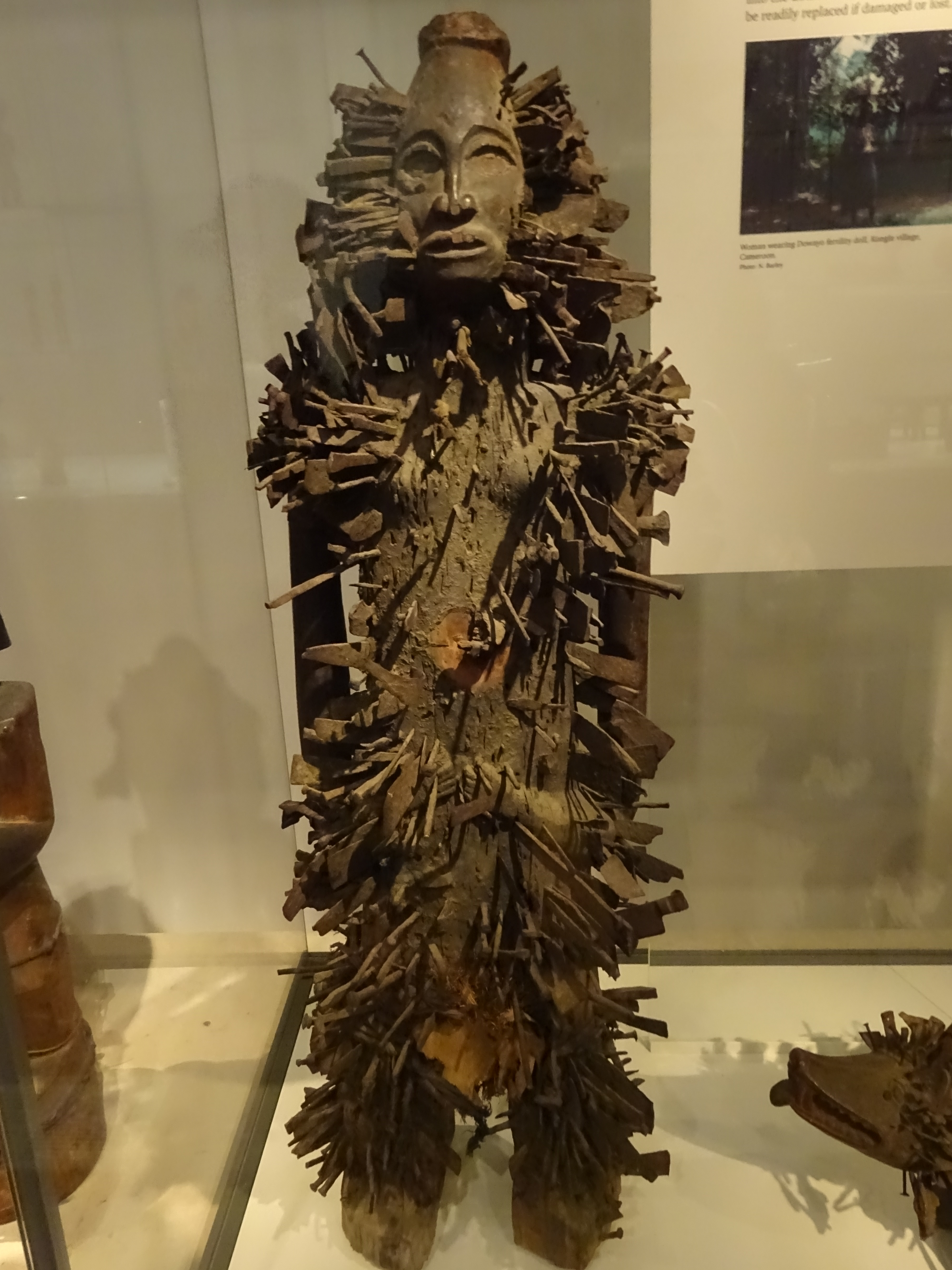
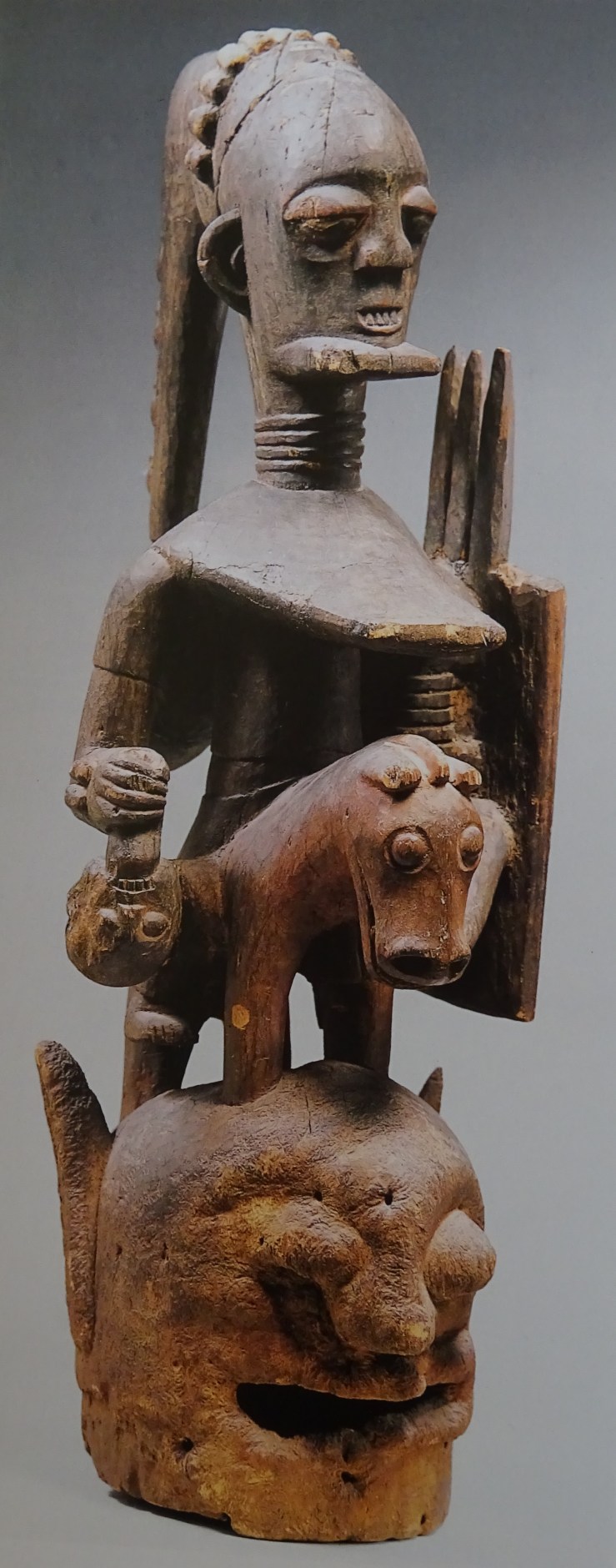
One of the group’s most intriguing features is the mixed character of the beings brought together and organised symmetrically. There’s a small elephant mounted on the large figure’s head, and two children or deputies whom he holds at arm’s length. It is a mysterious and powerful group which only runs into trouble when we attempt detailed interpretation. Is it a portrait of a particular family which would have been kept in their house, or a cosmological diagram commissioned by the tribe and taking part in its ceremonies, even briefly worn on someone’s shoulders as if it really were a mask? It’s the old problem of wanting to give an African object a history, and feeling that the more one insists, the more one is making it up.

Very few African objects look truly old, and often it seems to go with having been neglected. Some of the most venerable are grave figures raised to commemorate individuals. These are unusually tall and thin, because they are made from trees, because they are markers which need to stand out in a field of others like them, and because they haven’t eaten anything and are already part of the spirit-world. The main reason they look so venerable and carry their history so visibly is that no one is taking care of them, and they are left to decay like the other bodies buried at their feet.

DSC03320.jpg


Picasso 1932


DSC02683 copy.jpg

I can’t be the first to think that Picasso is too profuse, that he painted too much. One way of coping with an overpowering surfeit of work is to limit your focus in an almost arbitrary way, and to concentrate on everything produced in a certain year, for instance.  Picasso is one of the few if not the only artist with whom such a bizarre tactic makes sense. We are helped a lot by the fact that in the early 30s he is dating his paintings by the day. So the works in the Tate exhibition were usually labeled with a day’s date, and only after that, a title.

Luckily the curators were not strict about the boundaries: a few works from 1931 crept in, and a couple from 1933-34. There’s no great consistency or sublimity about 1932. It was the year of his first big exhibition: that might have stirred him to produce more, but there’s still a pleasing arbitrariness in the choice.

Picasso is notoriously restless, but repeats subjects he likes, repetitions that are always variations not copies. Some of the most enjoyable moments came in following transmogrifications of simple themes, like the 26 small pages of Sketchbook no. 17 in ultra thin pen-lines that summoned up beings like one-celled creatures seen under the microscope, who seemed to be floating or swimming when viewed sideways. In fact you could only have this experience in the catalogue, with a magnifying glass, but it was magical, and gave a more intimate sense of Picasso’s inventiveness than almost anything else in the exhibition.

DSC02769.jpg

Strangely enough, the supreme display of invention in the show began with a kind of copy, a copy of Grunewald’s famous Crucifixion in Colmar. Apparently it is doubtful that Picasso ever saw the work itself. In any case, he must have depended more immediately on a photograph, probably in black and white. Almost at once the painting got away and became something else, a meditation on cruelty or alienation and the dispersion of the self. Images of these dark drawings below follow the sequence Picasso followed, moving further, then nearer, then further again from recognisability, an oscillating approach to something that keeps threatening to disappear.

DSC02771 copy.jpg

DSC02774 copy.jpg

DSC02776 copy.jpg

At almost the same moment he was doing a series of little sketches of women playing ball on the beach, sometimes crowding and even stepping on each other. Some observers have detected conflict or ambivalence in Picasso’s ability to entertain these two subjects almost simultaneously, violent cruelty and Dionysiac release, and they have also read both extremes into one another.

DSC02767 copy.jpg

It remains a question to what extent simple themes like women playing or sleeping are carrying heavy metaphysical burdens in the work of 1932. Two famous nudes, Nude, green leaves and bust and Nude in a black armchair, provoked enthusiastic response in the art-dealer Kahnweiler, who thought them the best things Picasso had done, ‘as if painted by a satyr just after he had murdered a woman’, his way of expressing their frightening intensity.

2010_NYR_02410_0006_000(pablo_picasso_nude_green_leaves_and_bust).jpg

T J Clark connects the two paintings to Rimbaud’s ‘Je est un autre’ and Picasso’s ‘I am a woman’, by which he evidently meant more than just ‘the artist enters his subject’. Clark finds them a searching examination of desire and of the experience of sexual differentiation. The ideas are fascinating but the paintings do not support them. I am reminded of Leo Steinberg grappling with Michelangelo’s Last Judgment, imparting a powerful sense of struggle as he erects an intellectual structure that doesn’t match my experience of the painting. I have enjoyed the chase much more than most disquisitions I agree with, but I back off from the conclusions. Likewise with Clark—all this firepower is trained on bland and nerveless work. Picasso is not a colourist, a failing he can often conceal. In many of the larger pictures of this period, including these nudes, either horrid pastel shades predominate, or dull thickness of paint.

DSC02700 copy.jpg

So I found more enjoyment in the sculpture, which was perhaps a fresher medium to him at that moment, which in plaster or clay versions has a visceral immediacy that the larger paintings mostly lack. An interesting sub-genre crops up repeatedly, paintings that depict sculpture-like forms, another instance of Picasso’s grabbing onto sources in the world of art. In one of the most interesting of these, the paint itself was more lively, as if the idea of fresh clay had stirred him to a vivid rendering of its wetness and the variety of sheens on the surface, aspects of reality that he usually ignores.

DSC02694 copy.jpg

Sculpture also seems to be a realm where wit is licensed. The Woman in the Garden of 1925 is full of hilarious analogues in the world of construction to organic shapes and details. Here Picasso can play, an impulse which appears in his painting both before and after 1932, but in the exhibition it is usually sculpture or small and sketchy works which provoke a smile or introduce narrative complexity. At the end of the year a theme emerges, Rescue, which has its mythic reverberations, and which at least once reverses direction and becomes Rape. Here that alarmingly divided character surfaces again, who is unsure whether he is saviour or destroyer.

DSC02798 copy.jpg

DSC02799 copy.jpg


Picasso 1932 at Tate Modern from 8 March to 9 September 2018

Kahnweiler doesn’t identify precisely the paintings that have impressed him.  Clark thinks it likely that the two mentioned above are the ones that provoked the ‘satyr’ comment (repeated in a letter to Michel Leiris dating from the time in March 1932 when the two nudes were painted).

Soutine and suffering

1 93 soutine_food_table copy 2.jpg

Soutine is a neglected outlier in 20th century art, for reasons all too obvious. He constantly disturbs the calm and balance of his subjects, and does this so relentlessly that at first he seems wilful and arbitrary. Even in still lives the furniture teeters and threatens to fall, and if the vegetables don’t slide off the table, one wonders what keeps them in place. In Soutine there are no apples or pears, reliable geometrical solids, but gnarled peppers and ageing tomatoes which are losing their shape. The plates that hold them wobble, their edges indescribably vagrant.

Much worse is to come. Soutine delights in the corpses of small animals, small enough to fit on a table. There is something unseemly about bringing them into domestic settings, food perhaps, but not quite ready for the table, like the eviscerated rabbit in the Barnes collection whose posture reminds us of a human infant warding off a blow.

4 19 DSC00716 copy 2.jpg

Another still life at the Barnes contains Soutine’s most involuted reference to animal suffering at the table. This is one of his most deliberately awkward pictures and includes several nearly indecipherable objects—a stiff smoked herring propped against the wall or hanging from a rope and held in place by a long-handled wooden spoon (participant in many Soutine still lives), a lumpy, twisted turquoise form that might be a kind of pitcher judging by its top, which has a lip for pouring.

5 b 77 DSC00772 copy.jpg

But to interpret this strange form you really need to know another Soutine of a goose with a broken neck. Then it dawns on you that the turquoise monstrosity is shown upside down, with its pedestal in the air and its top dangling below, a duck’s head with open beak held onto its body by a thread, like the doubled-over goose’s head still attached to its body by its windpipe. The Barnes still life is a picture that gets grislier the more recognisable it becomes. Its most unrecognisable bit (just to the left of the upside down duck) is the misshapen form standing up in what looks like a bread basket. Is it a primitive carving of a dwarf figure, or a twisted ginger root, or a broken fragment of bread? Is there another Soutine somewhere that shows the same object from another angle and clears up the mystery? It’s only the duck that makes us think this might be the case. Or is the contorted figure a traveler in the basket-boat which is moving out of the picture?

Soutine’s magic springs from his visceral involvement in paint, deeper than almost anyone’s but largely missing from the Barnes still life, which was only able to help us (if it did) understand something about his attitudes toward his subjects. That is a kind of instruction, but the Soutine who wins allegiance revels in paint, and the rapture that this produces silences our misgivings at the idea (for instance) of an animal brought to the table with its fur intact in order to be attacked with forks, which hold it firmly in place.

9 46b 86 soutine hare w forks copy 2.jpg

Colours change or coruscate unpredictably, a ceaseless pulsation of life, a nature morte that is defiantly alive. The table-top comes near to matching the shape of the picture space, only slipping downward to show that there is motion after all in the motionless subject. To describe every sensation of motion in the tablecloth would take a long time. The most surprising is the wave motion of the scalloped and re-scalloped edge, which flirts with the lifeless horizontal of the bottom of the canvas.

b1 54b 91 soutine two dead pheasants copy 2.jpg

His involvement in paint sweeps all before it in a picture like Two Pheasants on a Table, the ultimate topsy-turvy of dead objects, where anguish and pathos are submerged or concealed in giddy sensations of motion, of the spinning and teetering table, of the flailing limbs and speaking facial expressions of the birds. As often, the colours are inappropriately and almost unbearably beautiful, blue on their backs, red on their mouths, cream on the shroud and green and ochre on the wall behind. Blurring in the forms and surroundings seems to describe our unwillingness to look straight at what lies in front of us. In this whole series of images of animals prone and animals hanging, strung up by their necks or their heels, Soutine diminishes his subject, the death (often in conditions like torture) of creatures, by choosing animals smaller than us and canvases smaller than those favoured by most of his contemporaries. This has an untoward effect, of slipping profound material past us before we realise what is happening.

Soutine once made what seems a crucial confession. He recounted an occasion in childhood (was he 8? or 10?) when he watched a butcher wring the neck of a goose. At the moment of death he had a powerful desire to scream, and at that moment the butcher looked at him and smiled, and the cry was stifled in his throat. Soutine said that all his paintings of dead animals and cuts of meat were attempts to release that strangled cry.

So in some sense many of the paintings are repetitions of a single experience. And of course much more than that, meditations on the universal facts of death and dissolution and the local experience of cruelty.

b2 16 DSC00713 copy 2.jpg

b3 16a 20 DSC00717 copy 2.jpgMost harrowing of all the variations on these themes are a series of dangling victims strung up in the throes of death or its bedraggled aftermath. One of the chickens uncannily resembles a familiar form of ample female nude met in Hellenistic sculpture. This one also appears to crane eagerly upward via a grotesquely elongated neck, at odds with the tranquillity of the torso beneath.

b4 21 DSC00718 copy 2.jpg

A whole series of grotesque possibilities are explored in this series. One loaded to excess with bitter ironies appears to dance, set off against a background in two shades of blue reminiscent of fabric patterns found in Cezanne and Matisse. Soutine delivers some of his sharpest shocks from within the world of painting. They are normally comforting colours but in this setting leave you with nowhere to turn, fooled by a background into letting down your guard in front of a horror, which combines an eighteenth-century minuet (in the crook of arm, wrist and ankle) with a bloody corpse (in the virulent colours of the body).

b7 24a 100 [x3] soutine dindon strung up copy 3.jpg

Others are less grotesque and more surreal, like a scene from Frankenstein’s laboratory, where a stream of ghostly bubbles escapes from the tormented body caught perhaps in the final spasm of death. The feet are dematerialised, on the way to becoming fog or smoke, and eerily beautiful. Mysterious activity goes forward, the neck caught between a threatening and mesmeric piece of machinery and a black ruff of feathers left behind in plucking the bird. It summons up Kafka’s Penal Colony, a world which writes obscure messages on its creatures. In other paintings victims are dangled head first–a rabbit stiff like the subject of a lynching, and another turkey spread eagled on an ornate chair until its head almost touches the floor. This unlikely moment gives rise to some of Soutine’s most exuberantly Baroque handling.

b10 29 DSC00726 copy 2.jpg

b11 30 DSC00727 copy 2.jpg

Soutine first forced himself on my notice on a visit to one of the world’s great museums,  a day full of frustration.  I was turning away from Picasso’s Three Dancers which had disappointed me by its coldness and distance, by its excessive size for what it was trying to say, and I noticed a small picture facing the Picasso that wasn’t ashamed of its paint, letting it run wild across its modest surface. It was a landscape by Soutine, and I rushed toward it, captivated by its love of paint. Not that it was just a painting about paint, without any other discernable subject, but that its meaning couldn’t be separated from its material presence. It wasn’t mainly propounding an idea or proposition. It seemed nearer to living, breathing experience than the more conceptual work on every side and I was grateful to it for having appeared at just that moment.

‘Chaim Soutine: Flesh’, an exhibition of 30+ paintings at the Jewish Museum, 5th Avenue at 92nd Street, New York, until 16 September, including all but one of those illustrated here.

Simon Schama Civilisations, episode 1

A disconcerting start, Schama talking about civilisation as collective memory while aerial images flash by of ancient public spaces in desert landscapes. Is it a version of that trick of modern cinema, a bit of the action before the film remembers to introduce itself? There’s a noticeable urgency in Schama’s voice and in a few seconds we see why.

Now come shocking images of a temple blown up with explosives and men taking sledgehammers to statues in a museum. Then the story of the guardian of the site at Palmyra who wouldn’t tell where the antiquities were hidden and details of his gruesome death. In rushed hindsight the disorienting plunge into the material at the beginning seems a brilliant stroke, and Palmyra will cast its shadow over all that follows: civilisation’s survival is precarious, and all civilisations come to an end. The episode at Palmyra can stand as an allegory or emblem of that.

Then we’re off looking for beginnings at the tip of Africa where our species first appeared, finding them in a small lump of iron-rich red ochre, on which is inscribed a repeating pattern from 70 thousand years ago, which Schama insists, against the archaeologists, is the first stirring of the impulse to make new forms that drives all art.

Then a brilliant link via red ochre to the cave at Altamira 7000 miles away in Spain where the same pigment is blown and painted onto walls to represent animals mythical to us but familiar to the first visitors to this place. We’ve been in the cave for a while marveling at more animals and imprints of human hands when we stumble on someone like one of the hired hermits in 18th century English gardens. He’s a scientist from the University of Huddersfield, weirdly illuminated by his computer screen and studying the cave’s echoes because he believes the paintings were originally accompanied by music. Now a brief concert of prehistoric music played on bull-roarers and hollow bird-bones.

Picasso is one of the modern artists who have praised their earliest predecessors, and Schama draws a thrilling parallel between Picasso’s bulls, almost a primitive obsession of his, and the drawings in the caves. This outlandish comparison is sprung on us through the evidence of our eyes—the resemblance between the two bulls is uncanny, and this sudden glimpse of the continuity of art creates something like religious awe.

Now we move to little objects, a lion man from Germany, a tiny woman’s head in bone (birth of the idea of beauty, Schama says, but that was already there among the animals), a scene of combat on almost microscopic scale on a gemstone found recently at a new excavation somewhere in Greece. This object is hard to see, hard to grasp the whole of, and all the more magical for this trick of slipping away.

I think it was at about this point that we begin to jump more promiscuously from culture to culture. The photography at Petra does a marvelous job of putting you there, showing crevasses from just above and deep inside, perfectly keyed to Schama’s words about the improbability of such elaborate culture in this place. He has great fun conjuring up the luxury resort built on the trade in expensive perfumes and attracting the different races of the region.

We also make a stop in China at a recently uncovered site which yields a forest of bronze heads of various sizes, grotesque and strangely compelling with their huge, wedge-shaped eyes. All in all, there is such a flood of impressions, such a trove of marvelous objects never seen before, that it would be impossible to give a coherent account without watching the whole pageant again. The effect is magical, magical and unencompassable, and ought to waken the most jaded palate and worn out eyes.

I was thrilled by my first viewing of this and hesitate to mention what didn’t seem exactly right to me. I was brought up on Kenneth Clark’s Civilisation, which I am watching alongside the new Civilisations, a name I thought trendy until I got a taste of how gigantically wide the new vision is; that exhilarating scope justifies the ‘s’, also necessary in a practical way to keep the two series straight. In anticipation I imagined Schama following the new normal for presenters, crowding the objects they talk about, walking breathlessly along while reciting carefully crafted text, whispering when pretending to respect some creature nearby, waving their arms, talking about their excitement or how lucky we are to have gotten into this exclusive location. Worst of all, standing in front of the work we came to see.

It was a great relief to find Simon Schama behaving more like Kenneth Clark than current presenters, as someone in awe of what he is talking about, not in chummy familiarity with it. His gestures weren’t the exaggerated dumb-show you sometimes get and are probably just what he would do if he were lecturing. But in the presence of the things themselves, I don’t need for presenters to supply animated movement, distracting me from the painting or building. Mostly Schama was not getting in the way, except when he stood behind the glass case the lion-man was in, so that you saw the sculpture and the much larger man behind, like a reflection in a mirror. This work is not humanised by measuring it against a visitor; it is momentarily degraded.

The choice of unfamiliar sites instead of old standbys, Altamira instead of Lascaux, Calakmul instead of Palenque, is invigorating and wakes one up. The sense of cultural production as part the rest of life, workers in Chinese fields, old Mayans and present Mayans in the same territory, both anchors and widens our view. Is it fanciful to think that Civilisations has learned from BBC nature programmes?

The first programme bodes extremely well for the series, which can be as inspiring in its different way as its predecessor. And yet… will there continue to be such studied avoidance of the most wonderful sites of all? Lascaux is far richer than the others and one of its marvels, the ‘Chinese pony’ did seem to flit quickly across the screen. In the course of writing that sentence it occurred to me that Lascaux has been so ravaged by visitors’ breath that only a replica is now shown, and that Palenque or Tikal which I would put in place of Chalakmul, are over-visited already. Still, the very best that these cultures have done is what got us interested in them in the first place. Leaving that out runs the risk of removing the soul from the body.

Since then I’ve seen Schama’s second programme, where the sequence of examples is even more eccentric and reaches a nadir of dull Dutch ordinariness with Jan van Goyen, whom Schama apologises for and then dwells on. The episode is redeemed in the end by Ansel Adams, whose luminous photos of Yosemite can support the unexpected weight Schama loads them with, leaving us in his debt again.