Jacob Lawrence’s Struggle

What a moment to be broadcasting the USA as ‘the greatest country the world has ever known’, just one of a stream of boastful claims collected in a news story called The Last Days of Pompeo.  Maybe there is a weird modesty in spreading this greatness over a long period, not just the last four years, in which Trump has been MAGA, Making America Great Again, mainly by repeating this ugly made-up word and claiming so emphatically he was doing it, that millions of his people believe it, and are already prophesying that they will go to their graves thinking it, simultaneously insisting that it has been stolen from them.

 It seems that the greatest president the world has ever known has driven them to an intensified sense of deprivation, not the expected satisfied fulfilment.  It is turning out that his final monument will be the biggest ever Lost Election, a void more compelling and lasting than any of his earlier ‘achievements’. 

Which brings me to an alternative version of American Greatness or – more modestly – Struggle, a series of small images which set out to tell the whole history from Columbus to the First World War and then drew back to cover only the country’s first sixty years, from the 1770s to the war of 1812 and its aftermath.

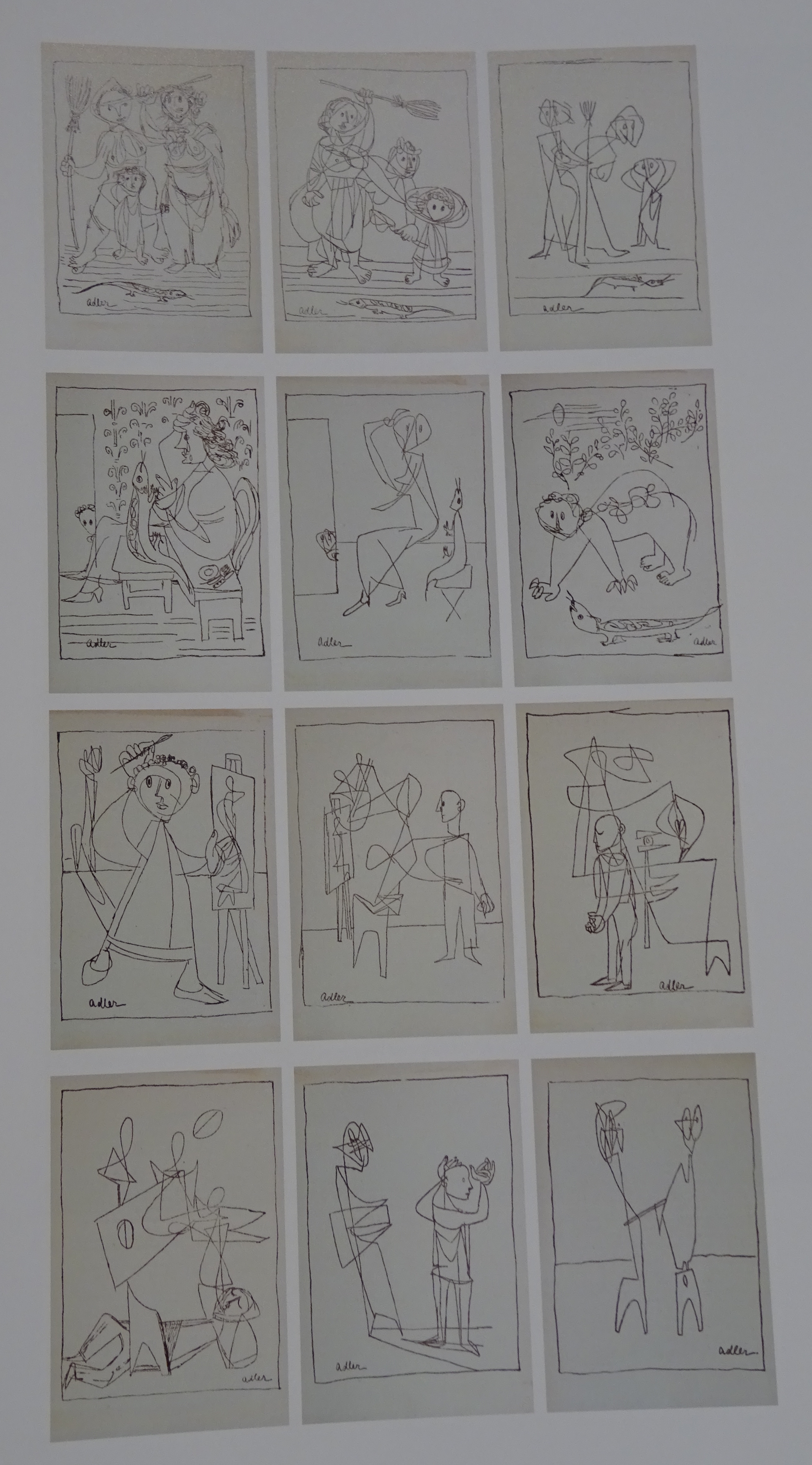
The teller of this tale is Jacob Lawrence, the best known African American artist of another tormented era like our own, when the country wrestled with threats or fantasies of Communist subversion orchestrated by a persuasive demagogue, Senator Joseph McCarthy, and the violent/non-violent struggle of the early Civil Rights movement, offspring of the unfinished Civil War, the central subject of Lawrence’s narrative, though it never appears there directly, an event or battle that keeps rearing its head in our present as a beast who remains shockingly un-dead.

Before and after the Struggle series Lawrence was a devotee of pictorial narrative.  Struggle is the most interesting and problematic of the ten series he eventually produced, partly by its tortuous circumstantial history, partly by its tricky subject matter.   It began as the story of the Negro presence in the U.S. (the terminology, no longer acceptable, of the late 40s, early 50s when it was conceived), was expanded to include the history of all Americans, shrank again to end before the Civil War in large part because the first thirty images Lawrence produced did not sell.   Is it fanciful to think that the series offers a more interesting challenge in its truncated form, where tensions seethe beneath the surface, seldom emerging in full view?

The American Struggle is Lawrence’s most interesting work because the influence of Cubism and Eisenstein’s montage, a filmic analogue to some of the distortions of Cubism, is both more glaring and more thoroughly digested than in his later work, so that radical formal experiment and urgent political material appear together, fused.

Lawrence spent a summer at Yaddo in 1954 when deep in planning, executing and naming the Struggle scenes.  Here he became friends with Jay Leyda, a pupil of Eisenstein’s who had just finished his remarkable Melville Log, conceived as a birthday present for the Russian film-maker.   This two-volume work was a piece of extreme formal experiment, a biography in the form of a collage, a collection of short bursts of vivid voices from Melville’s time, impinging in detail, cacophonous overall, requiring active untangling to make a comprehensible whole.

Leyda encouraged Lawrence in his preference for primary research in the Harlem branch library which had a notable collection of Black history material.  They collaborated in finding titles for Lawrence’s scenes that were fragments of longer texts, of which the titles gave a flavour, suggesting that each subject had a literary existence in parallel with its visual self.

Like the Melville Log, Lawrence’s American Struggle would be a work actively materialised from fragments by the viewer.  Like early Cubist constructions, the Struggle scenes sometimes don’t make complete sense initially.  Looking at them is almost a muscular form of study, taking them apart in order to understand how they go together.

Many of the scenes seem increasingly violent the better you know them.  But there may be a simpler explanation.  The first time I looked through the images after the riots at the Capitol in Washington on 6 January 2021, I saw them as nothing but clashing blades and forests of weaponry.  Maybe this only means that that element is there if you are susceptible to finding it, or in a state given to imagining conflict everywhere.

In the fifth image in the series, the Midnight Ride of Paul Revere, one of the most traditional subjects, blades are legion.  Sometimes they are knives, but they can just as well be shafts and glimmers of light, bits of the horse’s bridle, cactus-like leaves of low-growing plants, even (forms I can’t find other ways of interpreting) a walrus’s tusks. 

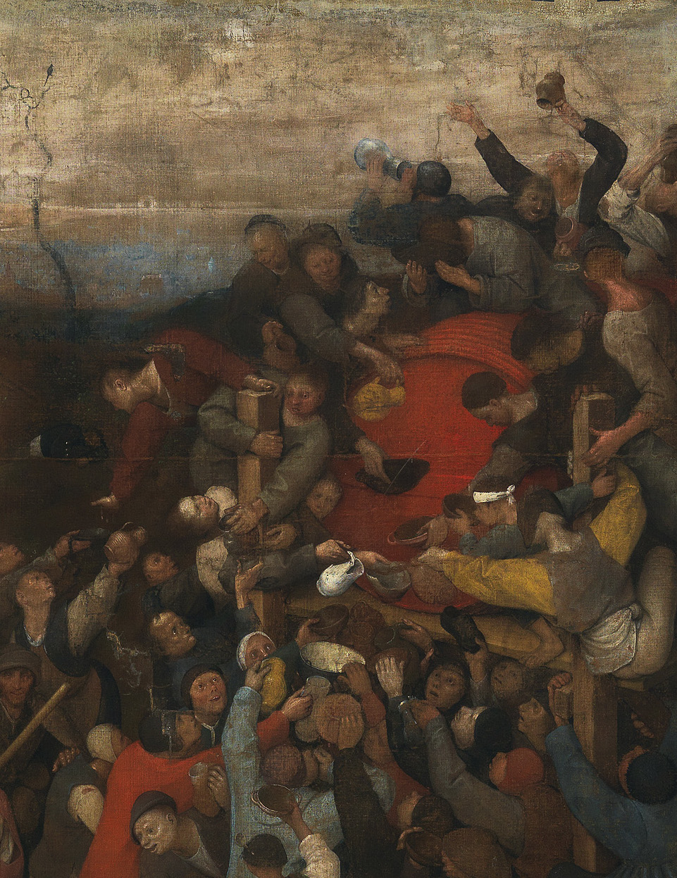
However long you look, however successfully you dissect the composite forms, they still revert to their strong clumping after your back is turned, like the triangular mass of figures wailing and defending themselves upper left in scene 2 (Boston Massacre), who resemble the damned in representations of Hell, or the cyclonic funnel rushing down to the left in scene 4 (Paul Revere’s Ride).  The clumping is not really intelligible but it is undeniably there, a force overriding whatever we might think.

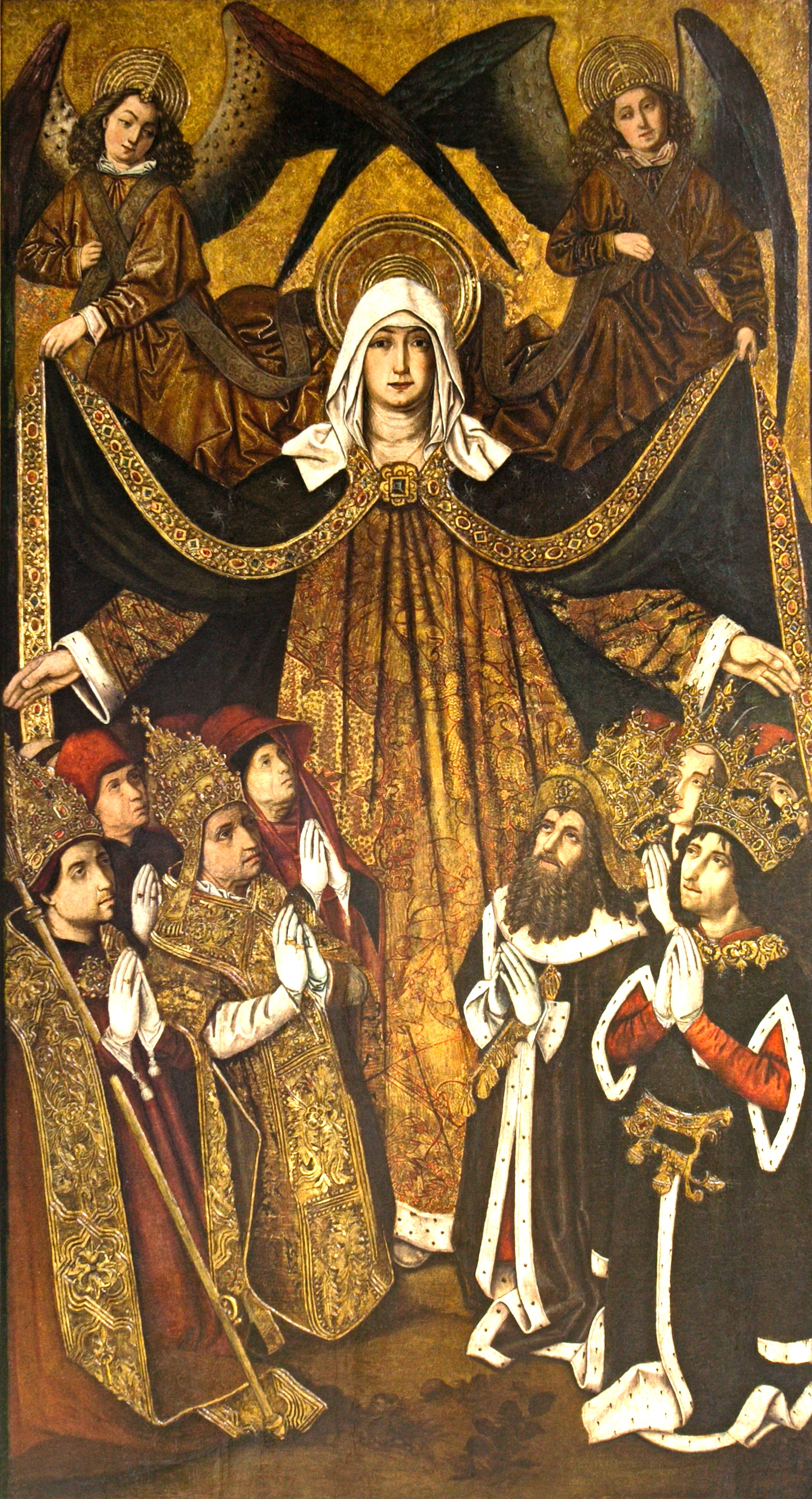
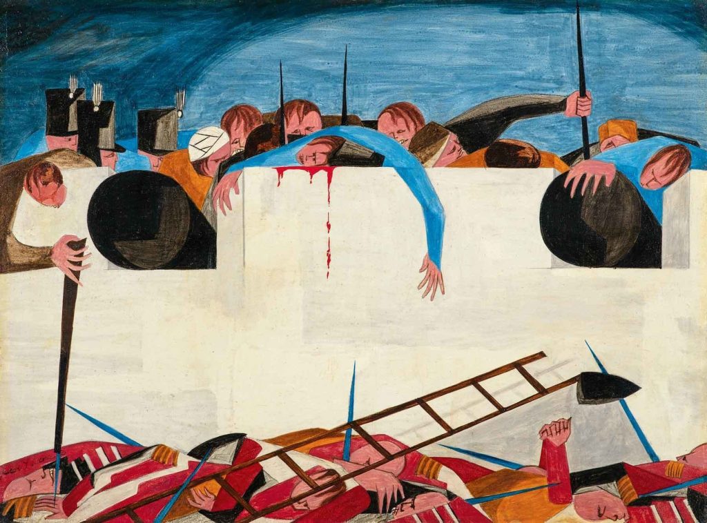
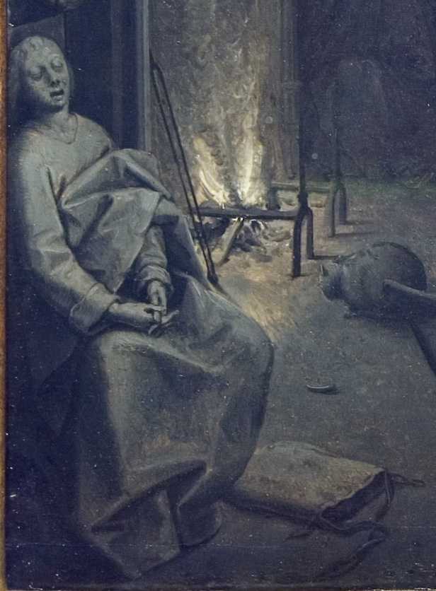
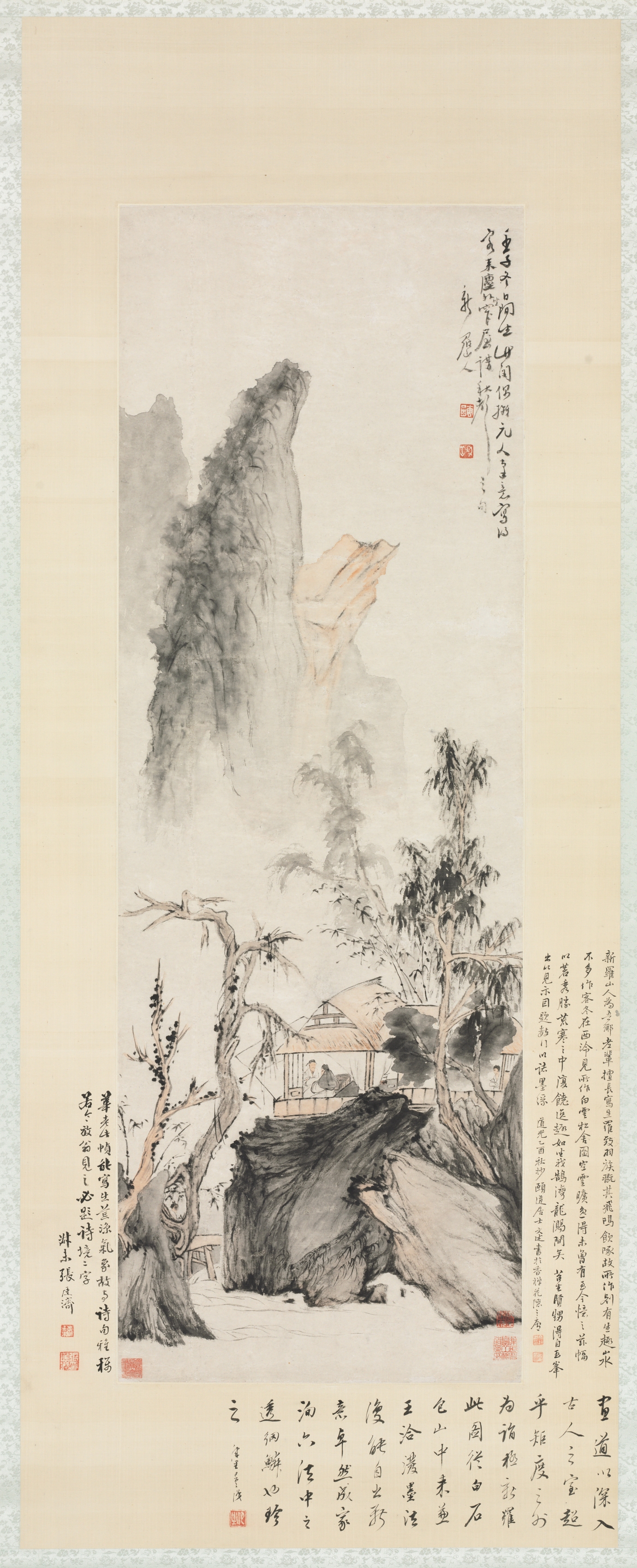
The next scene is the first vertical design in the series (see opening image), the most complete congestion or the most complex construction and the most obscure subject, A Petition by a slave named Felix which doesn’t look like the delivery of a piece of paper, as the first scene of all (Patrick Henry’s famous speech, which sparked the rebellion) doesn’t look like an event in a legislative hall, but among the damned in Hell (again), or Moses in Egypt (‘Let my people go’) .  The room is on fire, the wall is bleeding, the audience is beside itself and making threatening gestures in every direction.   The influence of Cubism is strong but obscure, more like a mask or veil for deep feeling than a means of direct expression.  Raised fists are everywhere, but detached from their owners, just a bunched motif (see second image above).

The familiar scenes, known by schoolchildren, are few and far between and invariably unrecognisable in Lawrence’s versions.  Like, above all, Washington Crossing the Delaware, a man in a fancy uniform standing up in a boat nearing the shore, of which my copy was so successful I was told to enlarge it in coloured chalk so that all the other children could enjoy it.  

Did this really happen?   In a literal sense, certainly not.  It was a furtive achievement carried out at night, not a natural subject for paintings, unless like Lawrence you formed the drama out of the choppy water tossing the tippy boats, a thoroughly decentred scene, cut to pieces by the pervasive movement of warring oars and rifles, while any heroes kept themselves hidden.

The next great set piece, The Constitutional Convention, is usually shown as a crowd of little, stumpy figures congratulating themselves when the arguing is over.  Lawrence concentrates on gear the delegates have taken off, their hats and coats, now a columned wall of shadows behind them, with their three-cornered hats as capitals.  At the base, a spaghetti of discarded swords whose crinkled handles stand out.  In the leftover slot across the middle of the scene two leaders in front are lying down like fallen heroes displayed in their coffins.  Dense masses of delegates peep over them as over parapets.   The leaders and two others languidly raise their arms to represent an exhausted vote. Drops of sweat stand out in everyone’s hair, replacing the displays of blood in the fighting.    Is this the heroic tedium of democratic procedures, have swords been trampled into useful legislation, and could we claim we’ve converted barbarism to safety?

Another sword had lurched forth a little earlier, signifying another ambiguous end to conflict.  It represents a cinematic close-up of the British commander Cornwallis admitting and denying defeat at once, signing the capitulation but refusing to give up his sword or attend the final ceremony.  He cannot deny the loss but hangs onto the main symbol of aggression and absents himself at the last moment, cancelling his own reality and leaving a legal vacuum.  Scene 13 Yorktown expresses the surreality of this attempt to deny full closure.  The hallucinatory wall of twenty-two cannonballs corresponds to the days of the American siege, and above them the open hand of the law meets the closed fist of hollow defiance.

Lawrence is notably alert to cross currents in the story.  Perhaps the only element more tortuous than the Black role in American life is that of Native Americans, one of the most ambiguous threads running through Lawrence’s narrative, never straightforward, ever more unnerving than we guess to begin with.  Native Americans first appear as a convenient disguise for rebellious colonists dressed up as Indians to licence wild behaviour in the Boston Tea Party, a conceit adopted two hundred years later by radical right-wingers to push a corporatist agenda popular only in the most twisted sense: government itself is the enemy. 

Lawrence’s Boston Tea Party is a kind of chaos, rebels and guards locked in a pinwheel in which it is impossible to pin down the participants.  Forces of the law are reduced to enormous forearms which grab hold of Indians’ mask-like faces.  We side with the Indians of course, their opponents don’t even have faces, but neither do the ‘Indians’, yet their painted-on masks and decoy-feathers seem more human and authentic than their opponents’ entire absence of characteristics.  To all the scenes where they occur, the Indians bring colour and the jitter of movement.  They embody sensory richness and the poignancy of choosing the wrong side – towards the end the great Indian orator Tecumseh repays the deception of treaty-breaking colonists by joining the British in the War of 1812.  Another tangle like the Tea Party, seen from the other side.   The powerful ox-blood-coloured skin of the Indians is set against the jangly baby-blue and white uniforms of the Americans.   Now who was more authentically the keeper of the land?  

Among the most poignant later scenes are a few from which human populations are missing, above all the scene called Nez Perce after the native trail across the northern limits of the country, which records another vanished population, the plentiful wild life that the various processes of human civilisation, both the fur trade and agriculture, will eventually crowd out. 

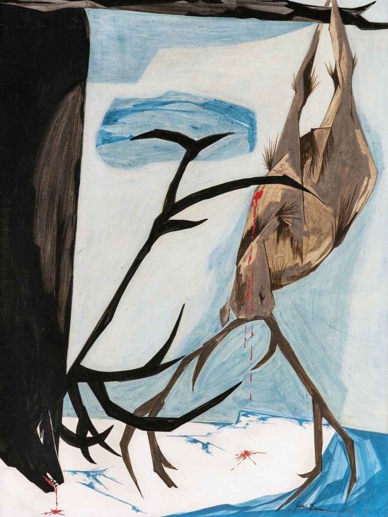
This composition is dominated by a misshapen crown of thorns made of the antler racks of two different species of elk strung up against an icy Arctic background.  The result is a scene both war-like and tranquil.  It is hard to believe at first that all the linear excitement belongs to the two animals and not to a larger force or idea.

The main lines of American expansion over seemingly endless expanses are buried here and there in Lawrence’s narrative, in Jefferson’s humanist project of exploration, concealing a strong appetite for dominance in a manipulative tolerance of natives that is crystallised in a telling instance.   An Indian woman given a job as an interpreter is thrown into contact with a long-lost brother now a chief with whom she is expected to negotiate, a rapturous reunion overshadowed by the white man’s bureaucracy. 

Lawrence shows old totems intact but it seems more likely one or both of the natives has been corrupted into different mindsets by contact with white men.  Maybe the strongest hint that all is not well are the primitive rigidities of all the figures here, native brother and sister, and the white technicians, momentarily on the fringes of the group.

The final scene with a missing population occurs when the series ends abruptly in a token image of the drive to settle the whole width of the continent.  This takes the relatively harmless and unbelligerent form of two covered wagons, two oxen and no settlers, unless big blood drippings on one of the wagons stand for the settlers’ ordeal.  Migration in various guises is the great subject of this phase of the nation’s growth, and Andrew Jackson, Trump’s favourite president, is the presiding genius of this section of Lawrence’s narrative.  He only ‘appears’ once in the Struggle series, quoted but not shown, as the victor in the Battle of New Orleans, a decisive triumph at the end of the War of 1812.  Technically the battle occurred after the Treaty of Ghent ending the war had been signed.   In the time it took news that the war was over to arrive from Europe, the glorious triumph occurred, and Jackson’s reputation was made.

The scene representing the battle is the most inert in the series.  Both sides are lifeless and exhausted, the Americans inside their fort at the top, the British lying crumpled beneath its wall at the bottom.  Nonetheless, the pointless victory helped propel Jackson to the White House and the place most Americans know him from, the front of a twenty dollar bill. 

Jackson’s greatest later claim to fame begins to seem less magnificent.  It starts with ignoring a Supreme Court decision that treaties awarding territories in the southeastern United States to Native Americans are valid and must be honoured, and continues with masterminding the forced removal of 70,000 native Cherokees, Creeks, Seminoles, Chickasaws and Chocktaws from Georgia, Alabama, Mississippi and Florida to Oklahoma.  Conditions in the seasons chosen for the move were harsh and unhealthy.  Imported European diseases, especially cholera, rampaged among the migrants.   Matching or paralleling the movement of willing European migrants westward is the reverse migration of the uprooted tribes, deported against their will from land they knew and belonged in to another they didn’t recognise.  It’s a less up-lifting tale than the usual epic of continued westward expansion, but the Trail of Tears, with many thousands of deaths on the journey and after, needs telling too.

Thomas Jefferson, rightly revered for many reasons, played a limited but crucial role in stripping Native Americans of lands and rights.  In 2020 there were cries in some quarters for tearing down the Jefferson Memorial in the centre of Washington, mainly I think for his role as a slave owner and an abuser of one of his female slaves in particular.  

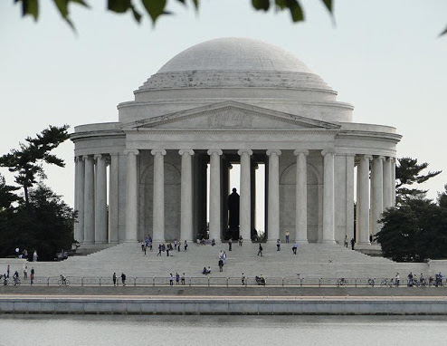
As a child I thought the Jefferson Memorial was one of the perfect things of the world.  As an adult I came to like it and other works of its architect John Russell Pope (like the National Gallery of Art on the other side of the Mall) less unconditionally, for their sleek, almost moderne classicism, just one of the entertaining riffs later designers have played on Roman themes. 

At the time of these demolition proposals it seemed to me that instead of tearing the Memorial down you could incorporate a memorial to Harriet Tubman in or beside or near the present one to Jefferson. This seemed a better idea than just substituting a Tubman Memorial.  Of course their lives didn’t overlap, but Tubman took brave steps to realise some of Jefferson’s ideals more practically than he ever found a way to do, so they belong together in a real sense, and there are sculptors/architects/artists who could express this continuity which would make his Memorial more meaningful than it is for some at the moment.  The new elements needn’t impinge grotesquely on the old, but they might. 

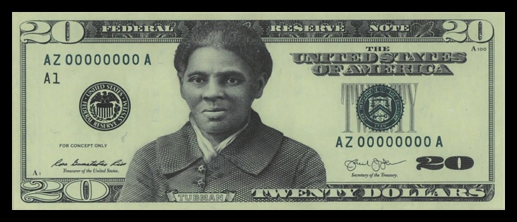
Andrew Jackson was also due to encounter Harriet Tubman, but then Trump was elected and the meeting was cancelled or kicked into the long grass.  Jackson was set to be replaced on the twenty-dollar bill by Tubman, when Trump’s Secretary of the Treasury put it off until 2028 ‘for technical reasons’.   Now might be a good time to resurrect this idea and put a woman, a black woman and a former slave on American money at last.

Painting Darkness: Bruegel and Rembrandt

rembrandt entombment sketch hi res.jpeg

My initial idea was to write about grisaille, that strange old custom of painting without colour, using only various shades of brown, or alternatively, of grey.

But then to add to that deprivation, another one, of light, and choose painters who try to paint the dark or in the dark, at night in which colour naturally disappears, so it is no longer just an artist’s trick but rendering a large area of reality commonly cut off from painting. This could be a huge undertaking, so I narrowed it to just two paintings by two of the greatest artists, Bruegel and Rembrandt, painting almost a century apart but both using the voluntary restrictions of a colourless world to provoke viewers to more intense scrutiny, like an intelligent version of the harder looking forced on someone stuck in a dark room and becoming slowly used to the new conditions.

Wallace Stevens says somewhere that good poems defeat the efforts of intelligence almost successfully. This comes as close to an explanation of my love of obscurity in art as anything I’ve ever heard or thought.

There’s something doubly perverse in setting out to collect and write about outstanding cases of obscurity in art—to share their unrecognised beauties, yes, but also, inevitably, to clarify them and end up making them less obscure, as if—horrid conventionality—the final goal in thinking about anything were always to make something clearer. Easy to accept that poetry doesn’t usually make things clearer, but prose is different–is it really acceptable to write an essay with the aim of making something un-clear?

Certain painters, Rembrandt above all, are drawn to depicting night and darkness while at the same time telling stories. And there’s a wonderful little Bruegel that takes place at night in a large room, half of which is packed with people (the crowd in the left background) you don’t even see at first. In some sense you never see them, they are so indistinct and so inessential to the main event, the Death of the Virgin lying in bed, the main piece of furniture in a room cluttered with others, and a stray figure or two, like a young man asleep beside the fire, often mistaken for St John, who usually has an important role in this traditional scene.

breugel_virgin lights.jpg

The great events here are the various candles and the fire, most of them scattered rationally but also pointlessly, as far as illuminating the main event goes. The brightest candle is outshone by a light which encompasses and dwarfs it and has no visible cause, the radiance of the about-to-be corpse that critics connect with the imminent appearance of Christ, which hasn’t happened yet but is spelled out in conventional sources.

breugel_virgin det ctr.jpg

So the painting shows a supernatural event on the verge of happening, but is also entirely (almost entirely?) explicable as an episode in the story of Light, how it travels and stops just short of a certain desired goal, how it sets out bravely and that is the end of that. How the destruction of certain modest lengths of wood has the incidental effect of putting a cat to sleep and showing human onlookers a big expanse of floor, the most collected view available of the context in which the great event is going to occur.

The most enigmatic element in the whole obscure scene is one of the painter’s slyest tricks. Someone has rigged up a little theatrical display for an audience of one, or maybe two or three. At the end of Mary’s bed propped on a cushion is a very early emblem of Christ’s crucifixion, a little model of His Body on the cross.

The picture simulates eyes getting used to the dark, and that is a metaphor for something wider or more universal, the search for knowledge. The experience of deciphering (almost successfully)–which is also what we do with any work of art, obscure or not—puts lots in play, as if much remains undecided, so it becomes a testing ground for something like experimental thinking.

rembrandt entombment sketch hi res det ctr.jpeg

Rembrandt puts much more in play than Bruegel—when you look closely, the elements of this picture of Christ’s Entombment in Glasgow do not look like anything that you’ve seen in reality before.

It’s making a fresh point about itself as a fiction, and it becomes a multiple reality. It’s at least two different things at once, a set of marks and a human story, a divergence extreme enough to make a chasm in perception, provoking an excitement that waited to be rediscovered by Cezanne.

The Glasgow Entombment creates insistent doubts we don’t find it easy to settle: are we standing in, or looking across the hollow of the grave? The level area the group has gathered in seems to drop off abruptly into a dark space we can’t fathom. How big is this void? It’s impossible to tell.

rembrandt entombment sketch hi res shroud wt.jpeg

I’ve just noticed today how the sensation of Christ’s weight pulling the shroud he is wrapped in down towards the earth is created – by two strong, wide, mainly black strokes drawn through and along the bottom of the pale sheet, which has a strong white highlight at its near edge, the largest area of pure white in the picture. Mary’s lap and Joseph of Arimathea’s forehead are the only other spots of white, and the forehead is markedly less intense.

rembrandt entombment sketch hi res tall L.jpeg

Fascinating how detail begins to be lost the further you go from the centre, but it’s not as simple as that.   Those to the left of Christ are less sharply defined, defined in fact by a different method, which is only partly accounted for by their being caught in the glare of the lamp or candle.   The tall man behind the kneeling woman (not everyone accepts that she is Christ’s mother) is seen in almost the same register as the servant holding the shroud, who is much more clearly defined. It’s almost as if it’s our attention which determines how characters will be shown. You move in different directions, up to the right of the central group, for example, and the mode of consciousness represented by the picture changes. Fascinating too how the indistinct crowd follows an almost invisible slope – the whole subject occupies a diagonal slash caught in a more pervasive darkness.  The rising trajectory of this indistinct extension is unaccountably pleasing, as are smaller tunnels of darkness behind the kneeling woman/ Mary and in front of the figure holding Christ’s feet.

rembrandt entombment sketch hi res slope R.jpeg
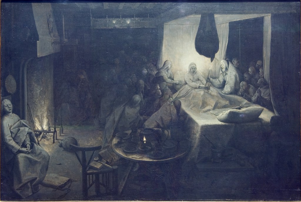
Exploring the picture is again analogous to getting used to seeing in the dark. It can be a long process, working out various relations in this composition, which intrigues us so much because it is so unclear.   It’s another subject showing, like the Death of the Virgin, people gathered round a prone figure, a quintessentially static subject.
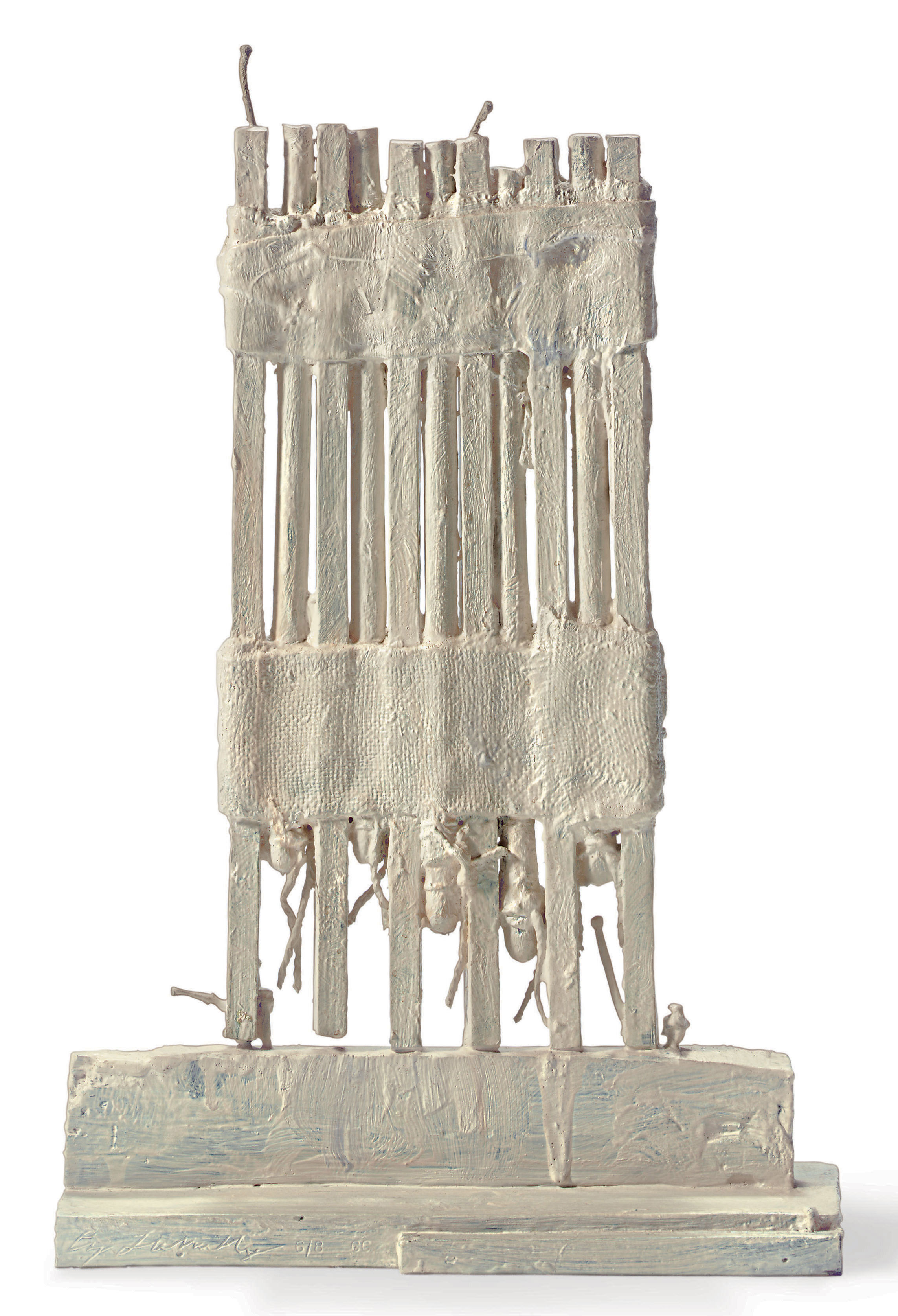
Christ has sunk to near the bottom of the space and dragged the rest with him. All the movement is downward, yet the light suggests otherwise, as if it is on the point of bursting out, and radiates upward, not downward.   Magical how far left the subject has moved, the picture is radically asymmetrical, unless you see it as a light half on the left balanced by a dark half on the right, but this equality doesn’t exist. The left is far stronger, no halves.

breugel_virgin sm rm.jpg

In Bruegel’s Death of the Virgin supernatural light has created a strangely perfect little room within the room, with top and bottom defined by their corners, and clear back and side walls, the two front walls removed, and partly indicated by bunched and dangling bed curtains. Just as weirdly asymmetrical as Rembrandt’s Entombment, with a wider range of definition in things represented, among which you cautiously pick your way, as usual in Bruegel, an inventory enhanced here by the struggle with continuing gloom.

The connection between Mary and the little crucifix is at the heart of the picture, and forms the top and bottom of a larger cross, whose arms are defined in living form by Peter and the female attendant, like a deliberate mistranslation of the crucifixion subject.   Christ is shown perversely lying on a comfortable bed in the form of a plump pillow. This is impressionistically rendered, with bold abbreviations (where are His hands?). As the exemplary Courtauld catalogue of 2016 points out, His feet have retreated until they are just two small blobs, the tiniest individuality paint can have. This crucifix is such a strange detail that you have a momentary fear you could have overlooked it.

bruegel crucifix det 2 DSC03878.jpg

If this is the threshold of a visionary moment, as some people think, then the sleeping figure may be important—what looks like a stupor is actually the disguise for a private vision, and an essential thread links the about-to-be ecstatically-raised Virgin and the young person lost in his vision, or not—could his oblivion be the dumb version of an out-of-body state, as common as sleep and at the furthest remove from the action, like a planet at the edge of its solar system?

breugel_virgin sleeper.jpg

The table and chair between him and the bed do indeed seem the impediments of an earthbound not a visionary mode. He is the furthest and not the nearest sharer of the great moment, on a par with the cat. I don’t like this interpretation, though, and would rather see him as human ordinariness getting on with daily life, harmlessly, and regardless of the earthshaking Assumption about to happen.

Pieter Bruegel the Elder, The Death of the Virgin, c 1562-65, 36.9 x 55.5 cm, Bearsted Collection, Upton House, Warwickshire (The National Trust)

Rembrandt, The Entombment Sketch, late 1630s-early 1640s, revised mid 1650s, 32.2 x 40.5 cm, The Hunterian, University of Glasgow

Curators in Glasgow have made a point of naming The Entombment a sketch and not a grisaille, because it incorporates reddish earth tones (unlike most grisailles), because it was named that way when Rembrandt had to sell it to pay his debts, because it hung for twenty years on a wall in his house and he kept reworking it (as extensive technical examination has shown). The figures on the left in the bolder mode of the 1650s are the strongest signs of the reworking, but new highlights and deletions are evident throughout. The painting is a striking instance of Rembrandt’s constant rethinking of his own ideas.

DSC03881.jpg

The Entombment, infrared reflectogram, showing bold black strokes defining forms

Jigsaws and Paintings


DSC04716.jpg

Am I fooling myself to imagine that you learn anything about a great painting by doing a jigsaw of it?   Of course that isn’t why you are doing it, an activity I rediscovered in the long winter evenings in Yorkshire but let creep into other seasons and times.   I wish I had a record of all the paintings I have done puzzles of.   They were a motley crew, many of which I wouldn’t have stopped in front of if I had ever seen them in the flesh. Doing puzzles of them isn’t like copying a painting or drawing a building, true meditations, which Ruskin used in order to know them better. But there are a few paintings I would love to have puzzles of, like Bruegel’s Tower of Babel. That one is fairly easy to find, but it would be tedious to explain here why I don’t just go out and buy them.

Then along comes the coronavirus and makes jigsaw puzzles seem a legitimate means of staying inside, so I order a couple online which include, at long last, that elusive favourite, The Tower of Babel. The others arrive promptly, but the Tower doesn’t, and it takes sleuthing to learn that the order has been cancelled. It seems I’m not the only one thinking of puzzles as a way of passing time.   Puzzles of real paintings are now going for 40 to 60 pounds, which probably explains why the one I ordered for £15 is never going to arrive.

DSC04671 copy

Two of them slipped under the wire though, one a Bruegel, perhaps the one I know least of all, a painting that the foreign-born director of the Detroit museum discovered unrecognised in a London shop? or gallery? in a year (1930) when the Great Depression had probably dealt a blow to the market.   So it’s one of those works which almost got away. When it was ‘found’ (i.e. recognised for what it was via an unlikely encounter) it got spirited to an unlikely, distant place.

What all this has to do with the painting is doubtful, but I like the thought of its return to London (in the immaterial form of a jigsaw) from which it had set off on the last stage of its journey.

Is anyone going to agree with me that there is something mysteriously attractive in this process of taking a composition apart and putting it back together, not in a studied or appropriate way but arbitrarily, by chopping it into 100s (1000 to be exact) of mechanically gnarled or irregular pieces which have nothing to do with any natural process of disintegration or decay? When canvases or wooden panels rot or suffer serious mistreatment they do not emerge as a lot of equal-sized fragments that can be joined together again by dumb persistence.

DSC04683 copy.jpg

Still, one could argue that this contrived unrecognisability produces interesting effects in spite of itself. In a sense all the new shapes produced by the mincing of the image do not exist in reality, outside the project of the puzzle, but trying to recognise them becomes an absorbing pursuit for as long as it takes to rule out all the false resemblances and recognise the true ones, those which will return you to the starting place that only a calculated perversity ever deprived you of.

The earnest puzzler never (or at least seldom) thinks he or she is the victim of a cheap trick. While the puzzlement lasts, the searcher believes in the problem and never gives up (until he does, temporarily) trying to recognise the unrecognisable, sharpening or blurring his eyes in one direction or another.

Some forms are easy to recognise, some are difficult, and some are impossible and need luck to end in the right place. For a long time I was satisfied with the quality of the reproduction of Bruegel’s painting my puzzle had employed. Then I stumbled on a detail of it in the catalogue of an exhibition it hadn’t formed part of. This was an eye-opener.

detroit illus det ctr.png

It seemed that the painting had been cleaned since the puzzle was created, revealing plenty of detail indecipherable in the puzzle. What I thought was a post with a jug nailed to it was actually a peasant taking a long drink. Smaller figures that had seemed just blobs wore interesting expressions and became distinct characters. The trees which punctuated the middle distance became teasing obstructions closing off our view of figures behind them and reminding us our vantage wasn’t as comprehensive as we thought.

detroit expressions.png

The amazing intricacy of interlocking couples was much easier to decipher. The title, Wedding Dance, had a meaning in human pattern much more gripping than we had grasped until now. At the right edge a mysterious figure replaced an impenetrable gloom. I felt I had seen him before, a supernatural intruder from a Victorian tale.   Should I just leave the mystery unsolved, which so far had nothing to do with anything else in the picture?

detroit myster fig.jpg

Now the bride and groom could be singled out, facing each other but dancing with other partners. Blank faces became expressions, women’s aprons became mountain landscapes, drawing showed beneath and through the paint over the whole surface, and the increase in incident, and in features of line and shape, was indescribable. I found myself poring over the newly penetrated surface over and over again.

Screen Shot 2020-04-07 at 16.16.09.png

I’ve forgotten to say that after finding the detail in a book I went to the website of the Detroit museum and was rewarded with a hi-res image that opened up all this further wealth, where the paint is mostly much paler and more transparent so you feel you are looking deep into the painting, and getting closer to the moments when Bruegel was adding paint to his drawing without obscuring it.

bruegel1_copy

In the end I credit the puzzle for its way of slowing me down and making the forms so familiar that I knew them inside out, at which point I had the luck to find there was more still in the re-united image, cleansed, clarified and revealing a whole other reality below the old surface, like seeing the sea bottom beneath an intervening depth of sea-water.

Chinese poet-painters self-isolating


265 1954.263 hua yen conversation in autumn d 1732.jpg

I was sending three Chinese paintings I had been absorbed by to a friend but thought I needed to append some text to give any idea of why I found them so exciting, so was going to photograph the three catalogue entries that told the stories of these three scholar hermits, self-isolating among streams and mountains or drinking themselves into cheerfulness in their orchid pavilions, a cumbersome plan.   And then I thought of a wonderfully simple idea for a blog when I couldn’t write one. I could just post the three pictures with the artists’ names, and anyone who wanted to could look them up on the website of the Cleveland Museum of Art where they would find high res images of each to download and ponder.

Then the idea collapsed. We really need those texts which I could point you to in Eight Dynasties of Chinese Painting, the giant catalogue of 1981 which sits there in my scholar’s hut reminding me of my foolhardy ‘travels among streams and mountains’ in that distant year, with its images all in grey and white that I can wake up again through the ‘miracle of technology’ (not so miraculous any more), and the lengthy text attached to each of them that I didn’t stop to read in 1981, but which now bring before me the fanatical absorption of those long-ago devotees of the wild brush strokes of these three practitioners of Chinese Baroque (as we call it now), but my main link with those paintings has become something very obscure with the passage of the extra years and the closure of all the libraries in the last few days, and that makes my simple project unworkable.

236 1955.36 chu ta landscape after kuo chung-shu 17c ch'ing.jpg

265 1954.263 hua yen conversation in autumn d 1732.jpg

268 1976.112 li shan five pine trees d 1747 copy.jpg

These three paintings are special in their deliberate clumsiness, in not joining up smoothly their different parts, in cultivating scratchiness to signal uncertainty but also haste which comes over as passion, a kind of excitement which is frustratingly careless about whether it conveys itself to the viewer.

The painter of the pines was asked to paint five different trees. I think they started with plenty of space between them but he decided to crowd them together until they became hard to distinguish. On top of that, he filled up the empty spaces with five poems. I don’t know what these poems say or even what their subjects are. At first I was annoyed with the catalogue for leaving out translations but came to feel that this incredibly irregular writing is more beautiful than if I could read the individual words.   The writing is poetry in itself, more intricate and sophisticated than the painting, of which it is a magical contrasting twin.

li shan five pine trees.png

The mynah birds are another work by the painter of the first landscape, birds I thought I had to include to help you believe that that landscape is a radical work that you will only appreciate by looking long and hard at the high-res form of.

Chu Ta (or Zhu Da as he is also spelled in roman) has lit up the time of my isolation and turned hours into instants.

237B 67-4-2_ZhuDa-MynahBirdsAndRocks_front.png


236 (its number in the catalogue of the exhibition)  Chu Ta, Landscape after Kuo Chung-shu

265  Hua Yen, Conversation in Autumn

268  Li Shan, Five Pine Trees     The detail from this painting is meant to fill the screen, but I don’t know how to achieve this effect in the blog.

237B  Chu Ta,  Mynah Birds and Rocks

237B 1953.247 chu ta fish and rocks


I need to make this larger by putting it on its side, with the bottom of the image on the left.

237B 1953.247 chu ta fish and rocks.jpg


Cy Twombly–‘white paint is my marble’


82 untitled bassano in teverina 1985 wood  plaster nails red pigment white paint 13 x 18 1:4 x 23 3:4 traces of poem (cf w analysis of the rose series of ptgs).jpg

Sometimes I wonder if these works of Twombly’s are really there at all. Maybe I am in similar doubt about some of my favourite poems.   One day I would like to give a kind of police report on Wallace Stevens’ ‘Notes Towards a Supreme Fiction’. At first, I could make almost nothing of it, then I thought it was the most marvellous thing, then I just didn’t get it all over again.

Twombly’s sculptures share something with this troublesome poem. At least Stevens’ poems all have titles. Twombly’s sculptures mostly don’t. All those missing titles are like unwritten poems, which have been allowed to escape unrecorded. And in some way, that is that, a condition there’s no cure for.  Ones that do have titles have inspired some of the most wonderful interpretations ever.  This artist’s so-called sculptures seem to attract philosophers as vinegar does fruit flies. You can’t see why they would, but there’s no denying that they do.

Giorgio Agamben, a formidable Italian thinker, who appeared in Pasolini’s Gospel film (as the disciple Philip) and whom I revere because he discovered two manuscripts of Walter Benjamin’s missing since 1940, produced one of the most beautiful and far-fetched pieces of interpretation that I know, inspired by a particularly messy Twombly which, in lieu of a title, has a few lines of Rilke attached, which are artlessly (ha!) scribbled on a little piece of cardboard at the base of a plaster mound that holds two sticks, one standing straight, the other leaning against it, the two crudely wired together after an earlier accident.

71 untitled wood wire plaster cardboard white paint graphite 1984.jpg

Rilke speaks of happiness sought by laborious ascent or happiness falling unexpectedly.   Agamben makes the two sticks an acting-out of these two motions, and sees in the two of them a picture of the difference between poetry and prose, poetry which can (and even must) always turn back, and prose which carries on. He makes the two sticks carriers of momentous meanings, which you can never un-see after you’ve followed his thoroughly poetic exposition.

15:18 untitled (funerary box for a lime green python) new york 1954 wood palm leaves twine house paint cloth 55 x 26 1:4 x 5.jpg

My other example is the sculpture called Untitled (Funerary box for a lime-green python) which consists of two palm leaves raised on slender sticks which spring from a narrow wooden box not really big enough to hold a large snake. Like Joyce giving Homeric titles to the chapters of Ulysses and then taking them away, Twombly unwished his whimsical title for this work that momentarily connected it with Egypt and animal gods. The Harvard philosopher Arthur Danto made the most serpentine game out of applying and taking away the name to and from the object.

How could I have allowed the critics to usurp the space before the works themselves have spoken?   In a real sense the untitled sculptures are the essential core of Twombly’s work as a sculptor who takes cast-off flotsam from the ordinary world and works magical transformations on them, turning them into something else entirely, without losing any fraction of their embarrassing crudity and imperfection. ‘White paint is my marble’ doesn’t mean as you might suppose that Twombly really sees himself as a rival of the Greeks. As often as not, he doesn’t even hide the underlying textures of his scrap of wood, now accorded a new importance without being allowed to leave its dismal past behind.

11:3 untitled new york 1980:1989 bronze white oil based paint edition of 8.jpgIn a twist that surprises us, Twombly allows a few casts in bronze or resin of some of the most memorable sculptures. The best thing about this is that the bronzes often look more battered or ruined than the original.

10 untitled new york 1953 wood wire twine nails house paint wax on fabric.jpg

The contrast between the wooden pan-pipes and the bronze ones is a clear case of these confusions.   The nails and bits of string sticking out in this sculpture, which are so hard to account for and so unmanageably alive, completely destroy the decorum that is such an important element of this most classical subject, and constitute another subversion of every unambiguous meaning. One of my favourite features of these endlessly baffling works is this final lack of resolution. You could, if you had the energy, go on puzzling at them for ever.

DSC03507 v2:8 batrachomyomachia 1998 wood acrylic paper ink pencil staples.jpg

Why are the actors in the Batrachomycomachia (Battle between the frogs and mice)–an absurd parody of epic which possesses the patina of being taken as a work of Homer’s for so many centuries–why are these low creatures represented by a box of kindling, stacked in ramshackle fashion (like all the battlefields we have known), that rises from its container as if from the lake where it took place, now drenched in the colour of raspberry yoghurt?

140:29 twombly vulci chronicle gaeta 1995 wood white paint 10 x 24 x 12 knuckle bones in wooden block.jpg

Why are their nearest relative in Twombly’s work, the Vulci Chronicle, so abject, sparse like the records of that distant time, only a few vertebrae which stand for (and are, now) whole beings, who formerly stalked the earth spreading terror?

I could never have dreamed up Danto’s wonderful interpretation of another palm-leaf sculpture, but having come across it, I can not now un-think it. Cycnus (whose name means swan) was a hero, sufficiently obscure, who attracted the attention of a great hero (his name forgotten) who failed to reckon with Cycnus’ mother’s powers, who could extract him from his armour like the butterfly from its brittle shell and let him fly away, so the hero finds only the empty husk.  Danto discovers perfect sense in the leaf as the bird and the block of wood as the earthbound prison of the armour.

35:1 cycnus rome 1978 wood palm leaf whte paint 15 7:8 x 9 1:2 x 2 1:8.jpg

In some sense it makes all the difference that Twombly himself became the man who wasn’t there, who left America so early for Rome, the old, universal seat of memory.   All of the sculptures are as much about not being able to remember essential elements as about successful recovery.   There is a whole series of Thickets which show one twig-like tree instead of a tangle, sometimes hung with forlorn tags listing the names of eight Sumerian cities, which survive now in very little but their names.   These thickets are missing most of their elements but have nonetheless been linked with the ram in the thicket which saves Abraham from sacrificing Isaac. I don’t know who first connected this ram and this thicket with the ‘famous Billy Goat of Ur’ (as Panofsky calls him), a deity or a sacrifice (according to your taste) now in the British Museum.   Scholars tell each other these are not the same animal or the same function, but Twombly piles up meanings rather than keeping them apart.   His most austere version of the thicket theme looks like a scaffold and is only a thicket by virtue of two plastic flowers raised four feet in the air through a grotesque inflation, but the evocative title remains all-important.  In some sense it’s all we’ve got.

61 thicket formia-rome 1981 wood plastic flowers nails wire white paint 48 1:4 x 11 3:8 x 16 1:2.jpg

One of the most moving recent realisations of a Theatre of Memory in Rome, William Kentridge’s Triumphs and Laments, creates a whole series of historical ikons by blowing up small ink drawings to monumental scale while keeping their calligraphic nonchalance, a magical preservation which wouldn’t last, for they were painted on the Tiber walls with washable pigments designed to fade.

34 ptg twombly untitled [say goodbye catullus to the shores of asia minor]1994 room w huge mural menil houston.jpg

Twombly’s largest painting, fifty-two feet long, now displayed in a barn in Houston made specially to contain it, is called Say Goodbye, Catullus, to the shores of Asia Minor (several previous titles, like memories that fail, were combusted on the bonfire of this one). I have come to wonder if Twombly’s sculpture isn’t an extended meditation on remembering and forgetting. He is said to have spent the nights reading and the days in the studio. The work brims over with references to Rilke, Seferis, Archilochus and Cavafy but no Stevens, Hopkins, Eliot.   Verses from more exotic languages are always transcribed in English. The biggest and most perplexing work in the exhibition at Gagosian, Grosvenor Hill, that got me looking at Twombly in the first place, was called A Time to Remain and a Time to Go Away, a bare-bones description of memory or of a relation to history.

DSC03484.jpg
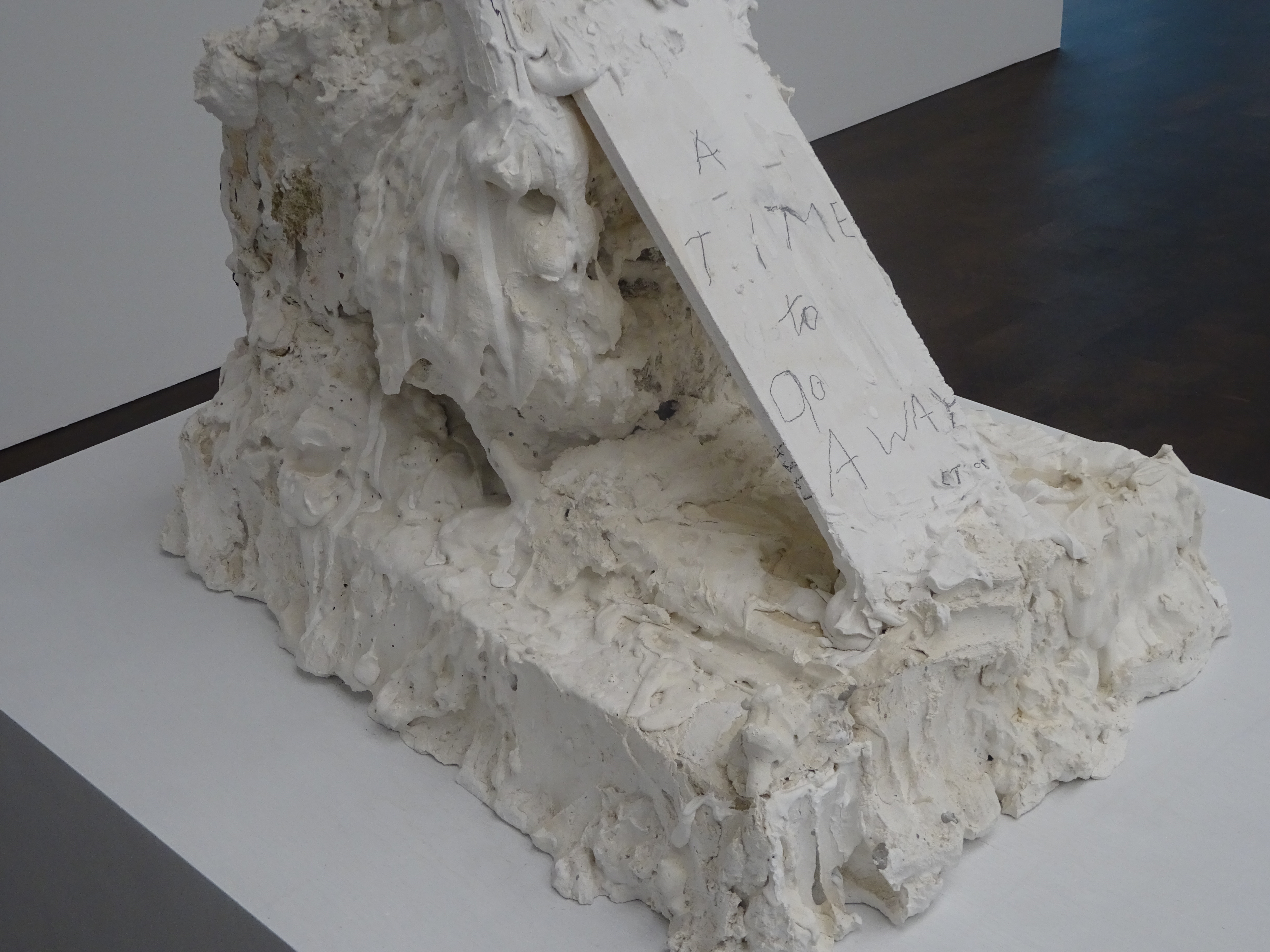
The work consists of another steep ascent and precipitous fall. A slender frame contains an exuberantly molten platform-mound of plaster heaving with life, but the overall impression is something like a guillotine waiting to descend. The childish quality of Twombly’s inscribings makes me think of a-semic writing, writing that looks like words but isn’t, a mode with which Twombly filled whole canvases in certain phases of his career.

DSC03481.jpg

Not in a literal sense, for he was immensely productive, he is the sculptor of figures missing, voyages cancelled, and settings abandoned by their inhabitants. Alongside the tombs, thickets, and scaffolds is a more mysterious subject to which I am drawn, the lump of plaster of geological character deposited on a cultural form like a brick or a box. What does it mean? Another memorial? Can it be thought, reason, art crushed dwarfed snuffed out by some mindless force?   Why would any viewer particularly like contemplating that? It is history as the energy that takes things away and hides them from view.

117:14 untitled jupiter island 1992 wood plaster 19 x 13 1:4 x 17 1:2.jpg


‘White paint is my marble.’ At once dumb and magical. It is impossible to believe in this substitution, metamorphosis, overturning. Yet you want it to be true–the imagination lives in and for such fictions.

Soutine’s People

0A C2a 18 detail herringDSC00715 copy.jpg

Soutine’s portraits are a different kettle of fish from all his other work—his ‘portraits’ of dead animals, often hung up as if in a butcher’s window, his still-lives which can also have the air of crucifixions, and his tortured landscapes.

The portraits are different because we are less forgiving of liberties taken in representing the ‘human form divine’ (Blake’s piercing phrase). It appears that we have studied the human face more intently than any other aspect of the visible world, as perhaps comes home to us most sharply in front of art.

That is where the limits of an artist’s powers of observation are exposed most cruelly.  That is where Soutine’s ‘distortions’ are likeliest to seem arbitrary. He was reputed not to like portraits as a type. Perhaps it is truer to say he didn’t like commissions. He had his own peculiar way of choosing sitters. His preferred subjects are the weak and powerless — children, mad women, the village idiot, a gypsy boy, and the most consistent and fascinating series of all — lowly, serving occupations like pastry cooks, bell-hops and maids — all subjects easily exploited, who weren’t likely to complain that they didn’t like the results, because he was paying them, not the other way around. So these pictures are very different sorts of document from what we usually mean by portraits, and lack the stiffness and falsity common in the form.

1A:T23 soutine child w toy c19.jpg

In Soutine’s hands even a child with a toy is an uncomfortable idea. Sitting can be a precarious activity in something which doesn’t look like a complete chair. Its top is glued to the child’s head, while its back seems to be trying to unseat him. His toy is another, smaller person falling backward or an angel pointing its wings downward. This is the part where Soutine’s famous abandonment of control in pursuit of the pure freedom of the brush breaks through.

3A:T32 soutine mad woman c19.jpg

The next sitter is called Mad Woman but has been reduced to childhood by her madness, and wears another elf’s hat, another elf or gremlin not a citizen of the adult world. Soutine’s women are often marked by twisted shoulders, a form of wrenching, involuntary movement. This girl is more completely shrunken into herself through spider-like compression.

4A:T53 desolation_chaim-soutine__45293__31854.1557531039-1

The older woman protected by her hat carries a feature almost unheard of in Soutine, an emotive title–Desolation. Would we know she was heartbroken without the prompt? It takes us no time at all to figure that her lopsided shoulders and twisted arms do not mean a disease of the spine but an expressive lunge into an unstable mental state, the real question being whether the unexpected torque is a momentary or an essential condition. It would be a hard pose to hold—Soutine’s people twist from one uncomfortable position to another, but there’s unexpected freedom in the variety.

5A:T59 soutine emile lejeune orangerie c22-3.jpg

While Desolation seems normative among Soutine portraits, the picture of his supporter and fellow painter Emile Lejeune stands apart for its light background and sprightly tonalities.   The sitter’s relaxed mood seems to have inspired confidence and made Soutine himself temporarily optimistic.   We read the dent in Lejeune’s face and his uneven ears as accident rather than meaning, a sign that the artist’s attention was focussed elsewhere, carelessness of a positive kind.

6A:T60 soutine gypsy c1922-23.jpg

By starkest contrast, darkness gathers round the gypsy boy like a portent. Maybe other observers wouldn’t have read extreme apprehension, vulnerability and the wish to disappear in the deep, dark eyes, but Soutine is alert to them, perhaps because susceptible himself.   This picture is usually dated to 1922-3, early for us already to be reading in it signs of what lies in wait for Europe in the following decade.

It isn’t just light and dark tonalities that make the mood in Soutine.   This picture of a very young pastry cook is the most tragic member of the most sustained series of Soutine portraits, devoted to a group with whom he has the most perfunctory relations, until he chooses to explore them, the service staff of the cheap hotels and restaurants he frequented in his summers in Cagnes on the south coast.

7A:T61 pastry chef ears c22-23 ca4.jpg

Another triangular face which shrinks away to nothing, a stillness signifying exhaustion or a complete absence of hope, ears painfully exposed and defenceless features, and the wonderful blankness of all the white, concealing a being erased, with a body made of air, beautiful in its way, with especially delicate lines marking its divisions. The chair suggests the cage of a timid animal.

8A:T62 soutine petit patissier c22-23 ca3.jpg

A jauntier version of the same plight, striking a more assertive pose but paper-thin, and again the strange motif of the red handkerchief like a blood-stain semi-hidden.

9A 2A:T27 pastry cook barnes c19

This outlying example in the pastry cook series from three or four years earlier cries to be included because it is the Soutine picture that the eccentric collector from Philadelphia, Dr Albert Barnes, saw in a dealer’s window, from which he found his way to Soutine’s studio and bought most of its contents (fifty-plus paintings) on the spot, bringing the painter to much wider attention.

It is the first of the group dressed all in one colour, or no-colour, which breaks out into a whole range of blue, purple, yellow, pink, registering light or recording creases, a crucial moment in Soutine’s attack on the coherence of objects, also seen in the ear that begins talking to its surroundings and finds itself resembling the chair back.

12A:T87 soutine garcon honneur c24-25.jpg

At some time around 1924 or 5, Soutine began to frequent more expensive hotels but continued to enlist the most down-trodden elements of their populations, who sometimes pick up the pretensions of the posher premises, so that this ‘garcon d’honneur’ – a maitre d’ or a room-service waiter? it doesn’t seem clear – is able to sit with no visible means of support through a feat of belief, an acrobat-functionary.

13A:T89 red bellboy c25 ca8

Another bellhop even turns his uniform into an identity, twisting it improbably into an imposing pattern.

15A:T95 petit patissier c27 ca6.jpg

The third in this series of arms-akimbo poses – sitting in mid-air, sitting awkwardly, standing uncertainly – defensive and assertive, salvaging a self in unpromising circumstances – looks battered but cocky, and Soutine has again found human depth in unexpected places.

10A:T67 soutine large hat c23-24

The twists of these three poses say a great deal about the strains of these lives.   Even more complex and tortured flexions turn up in female subjects who twist this way and that, misshapen by the stresses of no job, but by the general facts of feminine existence, another, more unwitting mad-woman.

16A:T147 soutine waiting maid c33 ca21.jpg

The females among the hotel-staff portraits are the most abject of all, like this lady’s maid who melts, sliding downward, whose indecisive mouth is one of the saddest human features ever painted.

17A:T152 soutine jeune anglaise orangerie c34.jpg

This so-called English girl is one of the lucky ones, who makes a crooked pose into nonchalance.

18A soutine young woman in white blouse 1923.jpg

But best of all is the one most defaced by the painter’s wilful abandon, who drags strength from what should have been ugliness.   Like many of his unschooled subjects, she comes out of the battle an unlikely victor, where every error in the symmetry is a bit of hard-won depth.  Flesh of horrid orange-pink, clothes of stains and smears, like a surface given life by dirt, yet it’s the serpentine pose that tells us most persuasively that we are rushing somewhere significant, unheard-of till now.

Bartolomé Bermejo

bermejo st michael.jpg

Bermejo remains a mysterious figure though widely regarded as the most important Spanish painter of the late Middle Ages. At a certain stage in planning a recent exhibition of his work in Madrid and Barcelona the organisers decided to make the accompanying publication a catalogue raisonné. It turns out that there are only sixteen surviving paintings, if you count multiple panels belonging to a single altarpiece as one. None of these composites survives complete or intact — dispersed, partly lost and in every case reliant on historians to reconstruct them.

The artist himself endured a similar fate. He was a person without a permanent address, probably a Jewish converso, sometimes keeping one step ahead of the Inquisition, which once convicted his wife of forgetting the words of the Creed. He worked in towns where he wasn’t a citizen and therefore needed a sponsor from the local painters’ guild in order to practice his trade at all. So his larger commissions are generally adulterated by the contributions of these less-talented sponsors, and I have included here only the central panels of larger works where Bermejo’s own hand is probably responsible for all of it.

Bermejo may also have been restless and unreliable on his own account, so that an excommunication clause was added to the contract in case he tried to get out of doing all the scenes himself. He was excommunicated for leaving before he’d started the smaller scenes of the St Dominic of Silos altarpiece.  Bermejo means red in Spanish (vermilion: orange-red), and no one knows if that was the colour of his hair or his complexion, the sign of a choleric temperament.

Oddly enough the painter’s earliest dated work, a depiction of St Michael tangling with the devil, is dominated by an atmospheric disturbance in red, the archangel’s cloak like a violent thunderstorm in the heavens. But the angel doesn’t lose his cool as he dispatches a Satan who’s the manageable size of a pet, and seems to be laughing and waving as much as signaling distress or begging for mercy. He is a weird anatomical enigma whose nipples are a second set of red eyes over a breathing hole and a second mouth full of sharp teeth. The saint is covered in metal and the monster is mainly made of it. The armour of both of them is extraordinarily ingenious but doesn’t look quite serious — a shield made of a lump of crystal, a polished breast plate that reflects the skyline of the Heavenly Jerusalem (not Seville, as I used to think).

DSC02814.jpg

But the really electrifying component is that red cloak more like a mountain range than a cloudscape, of folds magically lit with random bursts of light. And it is only the lining. Whenever the cape is at rest it shows as heavy gold brocade, a side of the garment now reduced to a twisted remnant like a broken pot. And finally there’s a drastic contradiction between the excitement of the cape and the angel’s trance-like languor.

The human-sized onlooker, like other similar Bermejo people, has barely looked up from his reading, or more likely he is somewhere else, not in the middle of the moment as we wrongly suppose. His composure is his distance.

He is a hangover from an earlier stage when donors could appear to witness the great highlights of Christian history because they weren’t taking place in ordinary time or recognisable landscapes. Bermejo’s most compelling pictures often occur in ritual space, a kind of no-place. One of the most powerful shows a local saint in ecclesiastical finery in a setting that is essentially a glorified niche, as if he were a statue decorating a Gothic building. The painting is finished off with a wooden canopy, a miniature taste of actual architecture which is permitted to cast real shadows onto the fantastic painted constructions below.

4 Saint Dominic of Silos enthroned as a Bishop.jpgHe is so shrouded in gilded paraphernalia that he ceases to seem much like a being of flesh and blood, if it weren’t for a few contrary traces. He is clean-shaven but there are signs that his beard is growing, silver stubble just beginning to show on his cheeks. And the six tiny statues (Virtues rather than the saints whom we expect) in little niches on ether side of his throne are fully coloured and demonstratively in motion. In the most extreme case, Temperance is pouring from a pitcher, and Bermejo has run together the dark colour of her cloak and a dark blot like a dragon’s tail on the saint’s cope, part of a pattern on the garment that is mostly hidden from us. So we are invited to imagine a spreading stain originating in an inadvertent spillage of Temperance’s remixed wine.

There is another sign of things getting out of hand at the highest point of the throne. The red jewel that crowns the saint’s mitre has started a fire at Charity’s feet which so far burns only her and hasn’t spread to the poor men sheltering under her.

The bishop’s throne becomes a niche, in this case a complicated diagonal and hierarchical form leading us in and at the same time creating a sense of the sacred as unapproachable, even as it shows the route to it, setting up a goal that’s straight in front of you, yet just beyond a boundary at which you must stop.

The image is neatly balanced between highly focal and impossibly complicated. The harder we look the less sure we are where the throne ends. Is the shrinking series of little figures, who are more lifelike (in the strange terms of the painting) than statues, just further extensions of this diagonal construction, impossibly rich emanations of the main body fighting hard against the idea that a painting is above all a flat surface?

DSC02821.jpg

One of the most ingenious touches is the ornate shepherd’s crook that the saint has leant crookedly against the side wall of his throne, partly blotting out Hope holding another staff that is breaking into leaf. In some sense his staff dotted with gold leaf-forms has got the better of hers and introduced a taste of the randomness of life and of unpredictable movement into the fixity of art, all of it taking place in a hall of mirrors devised by one of the most complete anti-naturalists in the history of art. Yet Bermejo is called Hispano-Flemish in recognition of all the evidence that he had studied realists like van Eyck, a thread not just distracting but pulling us off in quite the wrong direction. He borrowed postures and whole compositions and put them to uses the Northerners would have thought perverse and retrograde, creating hypnotic images in which we might just as reasonably find the sprit of Tibetan mandalas.

5 B.Bermejo_ret.Misericordia_Marededeu_4136.jpg

When Bermejo comes to depict the old subject of the Virgin of Mercy he inscribes it within a kind of pattern you might find embossed on a moth’s outspread wings: first the angels’ wings crisscrossing over the Virgin’s head and then the smaller Xs on their chests which wander off into the pile-up of cloth that seems to fill the spaces created by the swoops of the Virgin’s cape, swoops which form larger Xs with the down-tending diagonals of her arms. This mesmerising Rorschach-design with the Virgin’s mask-like face at its centre hovers over two diagonal wings of devotees, fused together by more of Bermejo’s trademark gold filigree, made of copes on the left and crowns on the right, the latter consisting of openwork which lets through the faces of the next row of devotees behind.

The most mysterious element of all is the Virgin’s undergarment, revealed by the angels’ lifting movement, an inner feature like the kernel of a shrine, another lining that steals the show from its covering. This undergarment is an amazing construction like antique patchwork, an assemblage of pieces of rich brocades in a variety of dusky tonalities, a ruin-collage of historical fabrics, like relics once owned and worn by various royal martyrs and spiritual heroes of past eras, a compost heap of much old virtue, and also wealth. It is one of the richest and most interesting passages in all of Bermejo, the Book of Kells and Arthur Rackham bundled up together. The patches often run diagonally against the orientation of the garment, creating the kind of multiple rhythm Bermejo favours, moving as so often against the grain of the natural world and the force of gravity.

Bermejo’s most powerful pictures are often not compositions at all, but patterns with a strong focus and ancillary detail radiating hieratically outward from that core or, if they are or initially appear as figure groups, they are shown at moments of utter immobility, emanating from a corpse whose attendants copy its stillness.

2 christ at tomb w 2 angels copy.jpg

Christ with two angels at the tomb seems an utterly simple, rock bottom sort of image, yet unaccountably mesmerising. There is a famous rendering of the Dead Christ in the Tomb by Holbein which Dostoevsky couldn’t dislodge from his mind. It shows the prone corpse in a narrow horizontal frame, constricted like a coffin. Holbein has spared us no detail of the grimness of physical death. The mouth sags open showing clenched teeth. The body is covered with suppurating sores, the eyes stare upward, hands and feet are stiffened in the moment when movement ceased and blackened by blood drawn there by the mode of death. Dostoevsky uses the painting in The Idiot to shake the faith of a naturally devout character.

Hans_Holbein-_The_Body_of_the_Dead_Christ_in_the_Tomb.jpg

In Bermejo’s painting Christ seems to have survived the crucifixion. No rigor mortis and just enough energy to point to the spear wound in his side. Critics even think he is squeezing the flesh to make the blood gush forth, but surely he is showing old blood, not producing more. Apparently there were active discussions going on when this was painted over whether bleeding in the three days between the Crucifixion and Resurrection was deserving of veneration or adoration (two distinct grades of devotion). Bermejo is thought to have come down on the side of veneration only, as shown by the inclusion of the gorgeous chalice (here his love of jeweled ecclesiastical metalwork breaks out unexpectedly) which is empty – that is to say, this blood isn’t suitable for the Sacrament.

The power of the painting comes in part from the diagonal composition which increases the surprising asymmetry of the two angels’ locations, their spacing and their roles – Christ leans on one and not the other. He has come part-way out of the tomb to tell us something, silently. He emerges fitfully from the gloom, a way of insisting on the incomplete state of our knowledge, an effect perhaps less powerful since the recent cleaning of this work, which has brought the flesh of the dead and the living into closer alignment. The angels’ flesh (ordinarily angels are not fleshly creatures) now looks so entirely that of bodies that will die, making the melancholy at-oneness of the three more complete.*

6 bermejo despla pieta copy.jpg

Bermejo’s last surviving painting is known as the Desplà Pietà, after the learned humanist who commissioned it and appears on the right, just below another representation of the Heavenly Jerusalem. It includes another innovative treatment of Christ’s corpse, a severe challenge to any painter’s naturalism and his spirituality. Those who want to find progressive tendencies in this painter spend time on the rich but gloomy landscape, full of a great variety of species that would have exercised the humanist patron’s scientific curiosity.

Here Christ’s body has the uncanny air of a ruin, powerfully mottled, as if stained by age, not like a statue, but not like any flesh I ever saw, not like old cheese either, but that comparison catches something of the living-unliving quality of this body. The dark smudge of hair on Christ’s chest is crucial to the effect, like a discolouration rather than a natural event.

There’s a naïve oddity shared with Christ and Two Angels at the Tomb. On his right arm Christ’s blood runs markedly uphill. Formerly it dripped down; now it is fixed in an unnatural position. This seems to contradict the figure’s more than relaxed posture with all tension gone, just as rigor mortis begins to replace it.

We notice a few signs of the old Bermejo – in the green lining of the Virgin’s cloak whose crinkled furls are put in competition with exemplary plants in the landscape. The cape can stand up in leaf-like forms which Bermejo continues to find more absorbing than actual leaves. And one telling sign of the new Bermejo: how do you tell a living from a dead body? Desplà’s beard is still growing and producing stubble – here Bermejo verges near that fearless realist Holbein.

*The illustration above shows Christ with two angels at the tomb before cleaning


This post was suggested by a small but fascinating exhibition which brought six Bermejos (including the Desplà Pietà) from Spain to London after the big Spanish exhibition of 2018-19 was disbanded.  


Vuillard and uncertainty


DSC01170.jpg

I didn’t intend to write about Vuillard again, but hadn’t anticipated how different the small (but much bigger) exhibition in Bath (appearing later in Edinburgh and Dublin) would be from the one last year in Birmingham. Birmingham was entirely caught up in the limited cast of characters of the household. Bath ranged outside and beyond the house, still keeping the view rigorously confined, Vuillard’s guiding feature being a voluntary confinement in which dislocations of vision can act with explosive force, freaks of perception which don’t necessarily lead to untethered or unfathomable emotions but into an emotional no-one’s land to which the right comparison might be Kafka.

DSC01162.jpg

The exhibition began in the home, with an awkward family scene in the weird green light of evening. Three generations are gathered round the table, along with two looming bottles like extra guests.

1 DSC01384 copy.jpg

We recognise the mother, grandmother, and daughter from our last outing with Vuillard. We could mistake the lone orange-bearded male for the artist himself, but the label steers us toward his brother, an unknown quantity.   The sister dominates, in a grotesquely twisted pose which reveals depths already familiar to the others, less so to us. She is wearing a dress like one in a portrait nearby, in a pattern like a lot of lively worms. Maybe she will explode.

ear.jpeg

Next to this dinner table is The Ear, one of the oddest little pictures Vuillard ever produced. It shows the head and shoulders of a young female bent over and concentrating on something on the floor. Is she tying her shoe or looking for something lost? We are already far ahead of ourselves, because she doesn’t really look like a person at all. Her ear we only recognise through the helping hand of the picture’s title: it looks more like a half-closed eye. Beneath it are two detached bits of brightly lit flesh which could be the tip of a nose and part of an upper lip. Otherwise, shadow, with traces of an eyebrow (doubtful) and cheek (obscured by strands of hair). Above the features, elements of a punk hairdo in black and orange stripes, plaited into a denser chequered pattern beyond. Over the invisible forehead dangles a big black spider of loose hair-strands.

Maybe this picture just goes to show how far Vuillard’s need to strangen the familiar features of the world could go. Here the supposed subject pretty well escapes, and solutions to the uncertainty leave plenty of uneasiness behind.

DSC01386.jpg

Very soon after comes another conundrum-picture that has an easier resolution. Two men in top hats seen close-up from behind. The sheen on one of the hats completely bisects the black mass, making it into two separate hats. But the deeper weirdness of this picture occurs further to the left. Instead of a hat, a giant black hand with four black fingers extended upward. This turns out to be another hat (or hair-do) after all, though one like a finger puppet mounted on a woman’s head, whose fainter body appears beneath. Like the others, this picture comes close to a visual joke. How can such a tiny sliver of reality constitute a subject? Well, it seems to. You go on enjoying the odd leftover spaces between the hats, and the contrast between the ‘brims’, if you can count the most nearly horizontal ‘finger’ a brim. The overlapping of the three bodies makes a nice consistency against the wild variations overhead.

Except in a formal sense, to call these male-female divisions an antagonism would be going too far. More interesting confrontations tend to take place indoors. Of all the fresh Vuillards in Bath, one called The Manicure perplexed me most.

DSC01137 2.jpg

The picture starts from another extreme lighting effect, with the source hidden between the two figures. It took me several tries to decipher the manicurist, whose face doesn’t really appear, though turned toward us.  Part of the explanation is that we are not on-axis with the couple, as we perhaps think, but skewed to their right. That is how the light can miss her face completely, leaving a dark mask more like a spinning top than a human head.

So the pleasure in this configuration comes from its inhuman weirdness. And then there’s the dark lump to the left of the central pair. In the end I see this lump as a balding father and his little girl, with a bright red ribbon in her hair. In the meantime I have thought her a pet monkey, or the two of them an African carving, or a piece of furniture with a cloth over it.

What is this love of occlusion, of hiding the subject in shadow, turning people into hulks or lumps, and blocking off the space between them? Wherever it springs from, it works. It invests humdrum activity with portent, in a space loaded throughout with inscrutable depths.

DSC01133.jpg

Other Vuillards thrive on blankness, not density, for a sense of a lot going on beneath a sparse surface. At first I took one of the most uncanny to be an expanse of sand leading to the forest-edge, with a track skirting it. At some point it dawned on me that this sand was not a beach but a wall blocking us off from the forest. And the traces of erased figures in the sand must have been marks on the wall, not occupants of the flatland. The two contrasting realms remain, one featureless, the other impenetrable. We think of other artists who value walls for their lack of content, like the Welshman Thomas Jones and the Catalan Antoni Tàpies.

In the exhibition the still life below gave an exaggerated impression of horizontality and of emptiness toward both ends, which doesn’t survive when it is isolated. I still think it is an exercise in dispersion and weightlessness, in spite of its magical vacancy having partly evaporated when it is removed from the peculiar space of the exhibition.

DSC01404.jpg

Publicity for the exhibition made a separate picture of the flowers in their  vase, a little composition which soon fell to pieces, set against the ‘flowers’ of the tablecloth — bigger, vaguer, more unstable. All the elements are spread wide, and won’t sit down or cohere. The satchel is the worst, levitating rashly in mid-air, deserting its rightful place.

DSC01149.jpg

As in Birmingham, prints in Bath showed Vuillard dissolving reality’s there-ness even more radically than in paint. The cover of a set of lithographs has another strange confrontation between a hulking man (in pyjamas this time) and a younger woman. The girl by herself is a miracle of vagueness. In a couple of the prints in this series figures at tables merge magically into the setting and each other.

DSC01173.jpg

One of the best discoveries of the exhibition was the reappearance of glue-based distemper, a medium first met in Vuillard’s work for the theatre and now, in its reappearance, freeing him back into the boldness of the 1890s with two paintings of 1910 and after, one of a Breton farmhouse above a garden like an embroidery, whose rich pattern dissolves into squiggles, separate segments, and finally into chaos.

DSC01174 2.jpg

For Vuillard perception is always verging on disorientation. This flirtation with unreason is one of his deepest promptings, an escape down the rabbit hole of perception into a phantasmagoria of forms that have freed themselves from the restraints of sense.

DSC01181.jpg

Looking closely at the work in distemper, you find such dissolutions as a children’s smock like icing on pastry, and its mother’s dress a snow flurry, in a familiar world become entirely strange.

DSC01179.jpg

Refugee Artists: Jankel Adler


11 adler mutilated tate.jpg

Jankel Adler was a Polish Jew who had made a reputation as an artist in Germany and got included in an early exhibition of modernist art staged by the Nazis in 1933 with the aim of importing hatred into the cultural sphere. Adler moved to Paris pretty well at once, while his wife stayed behind with their child. At the beginning of the war Adler joined the Polish army, was evacuated to Britain and suffered a heart attack that got him invalided out.

This troubled history lies behind the recent exhibition of his British work from the 1940s at the Ben Uri Gallery in Boundary Road. At the start of his career, Jewish themes had loomed large. Later, references to his roots became more complicated.

8 DSC09871.jpg

The most powerful painting included in this small but choice exhibition is called Beginning of the Revolt, a title that initially makes no sense. The first thing you notice is the strange abraded surface. The paint looks as if it has been cooked, causing it to pucker into small ridges which are then brought out by a wash of darker pigment that settles into the hollows. To begin with, you don’t know whether these are effects of nature or of art, a deliberate or accidental ruin, defacement that makes imagery already mysterious even harder to interpret.

The palette is almost monochrome but with all the variety that exists in the tones between black and white, enhanced by yellowing that may be simply patchy applications of varnish. Near the top, a single smear of rust, and a background of ochre, vagaries of tone which are intensely visceral and gripping.

DSC09872.jpg

DSC09873.jpg

After plenty of explanation that I will come to in a minute, I still find the image unfathomable. Is it a huge kneeling figure with Minotaur head and large eyes or nipples in its chest, holding standards that end in a wolf’s head on the right, and—the only clear element in the whole heap of matter—a bird falling backward on the left? Is the group sailing from right to left in a small boat? The overall effect is also like a stumpy branching tree anchored in a patch of earth that doesn’t look stable.

The result is muscular, energetic, strong, yet we learn from the label that this painting is Adler’s response to the uprising in the Warsaw ghetto of 1943, which was brutally put down. It is linked with three Adlers of the same period now in the Tate, all powerful in different ways—The Mutilated (opening image), No Man’s Land and Two Orphans, the last of which Adler painted for his friend Josef Herman, who lost the entire family he’d left behind in the Warsaw Rising, suffered a breakdown on getting the news, and was nursed back to health and productivity by Adler. The orphans are Herman and Adler, and the painting hung over the Hermans’ mantelpiece.

12 adler two orphans tate.jpg

This terrible and inspiring story seems more inspiring than terrible because, among other things, both of them produced much of their best work during and just after the war.

19 jankel-adler-illustration-to-kafka.jpg

There are explicit references to suffering in Adler’s illustrations to Kafka for example, including one of the torture machine from In the Penal Colony, and more interesting and ambiguous, a group of enigmatic figures in the thick and scumbled paint that seems to signal tragedy for this painter.

 He also found symbols which let him treat oppression and threat in less melodramatic ways. Birds appear in many guises and mean many different things. Finding them concealed where you don’t expect is one of the pleasures of Adler. Another of the largest paintings in the exhibition at the Ben Uri is perhaps an optimistic obverse to Beginning of the Revolt and shows a woman releasing a dove from a cage, to go out and report on conditions outside as in Genesis? or to embark bravely on a life in exile?

7 DSC09870.jpg

The other optimistic emblem that I see everywhere is a candle alight or a lamp raised up, again just as moving when you can’t be entirely sure it is there at all

4 DSC09867.jpg

23 jankel-adler-woman-holding-a-torch.jpg

Some of his still-lives are among his most puzzling pictures. A particularly delightful one shows a table-top dotted with semi-recognisable, angular forms, while above them floats an object or two objects of more neutral hue. Is it the tablecloth which has managed to slip free of its oppressors? or birds or fish dancing above the prosaic equipment of the meal, or ghosts of events that happened here, or clouds in the sky? I favour grave-clothes of a corpse that has flown, which now do a Baroque pantomime à la Wallace Stevens.

1 7.22.19 jankel adler DSC09856.jpg

Adler’s friend, the avant garde writer Stefan Themerson, has the answer. In 1948 he published an eccentric pamphlet with 13 illustrations by Adler masquerading as a story for children and called Jankel Adler/ an artist seen from one of many possible angles. It tells the story of the boy Jankel Adler who in 1899 believed for a minute that one of his friends had been turned into a green lizard. Themerson takes off from this mythic event to mount a hilarious defence of human imagination, in which Shakespeare Lizard writes Hamlet in 1923 and Adler Lizard paints his pictures with objects no one’s ever seen before, that are nonetheless real and definitely exist, a wonderful argument for Adler’s way of dealing with painful realties in ambiguous symbols made from everyday materials.

9 DSC09879  Stefan Themerson, Jankel Adler: an artist seen from one of many possible angles 1948.jpg

A Newly Discovered Bruegel

Bruegelsanmartin copy.jpg

A few years ago I stumbled across a reference to a new Bruegel which had been found in an obscure Spanish collection and, soon after its discovery, ended up in the Prado.

The first question was: could it be real? Could a very large painting by this painter go unnoticed for all those years?  Its subject was unheard-of and the composition inconceivably grotesque—it showed a tangled mountain of people glued together in an acrobatic mass. There were lots of them, of all different ages, trying to get their hands on wine squirting from a huge red barrel in a tiny stream, all the figures pushing forward a wide variety of containers, pitchers, bowls, hats, broken and intact, some just potsherds, the vessels a digest of the extreme human variety that jostled for space.

I was convinced almost at once of its authenticity and its large contribution to our knowledge of the artist. The painting is full of memorable poses, which fix themselves in the mind as weird but true snapshots of human types caught in extremis, stretched to the limit in pursuit of a clear goal near at hand. Typically, some of the best are seen from behind, a condition often treasured by Bruegel because it guarantees unselfconsciousness and thus a kind of authenticity. Maybe that is the main secret of the strange subject, that it combines people revealing themselves exuberantly while packed into unheard-of nearness, more like a nest of writhing snakes than any previously-known depiction of a human gathering.

Bruegel st martin detail.jpg

Bruegel has set himself an impossible, and, we might have thought before seeing how he would set about it, absurd, challenge—to build a multi-storey building consisting of human forms with no superstructure for them to cling to except the cradle on which the barrel is raised.

Bruegel uses a shifting perspective as he did in the Vienna Tower of Babel in order to show densely crowded figures viewed from above extending laterally and viewed head-on extending vertically. As in the Suicide of Saul it seems the most natural thing in the world for whole ranks of figures to be making the same gesture in series, reaching frantically upward to hold out their bowls toward the source of oblivion.

This is furthest from a still or quiet crowd–most of them are frantic–but there is also a complete spectrum of those turning away from the scramble because they are busy drinking, have already passed out or have noticed another goal, the knightly figure in the lower right corner, who is distributing something more valuable than cups of wine. St Martin on horseback has attracted a small crowd of cripples and the destitute anxious to get a piece of the voluminous cape he is slicing up with his sword.

In the distance are magical glimpses, caught as if through keyholes, of a rider at a gate and a scattering of tiny figures in the open space at the foot of the castle on the horizon. The most convincing and precious features of these sketched-in elements are the delicacy of the drawing and the transparent thinness of the paint.

One of the best discoveries of the magical enlargements on the Inside Bruegel website is seeing how often Bruegel puts the paint on so thinly it is like drawing itself and lets his underdrawing show through, invariably carried out with great confidence, without slips or mistakes.

bruegel wine of st martins day.jpg

The Wine of St Martin’s Day is painted on linen with something like tempera instead of oil, a technique known from both the beginning and the end of his career in the Brussels Adoration and the Naples Blind Leading the Blind. It looks (and is) fragile and evanescent, the colour more transparent and fleeting than usual. Why he used this frail medium in his largest painting by far – 2½ times the size of the otherwise largest Procession to Calvary — seems impossible to know.

The subject is the least substantial:  an experience of passing intoxication, another instance of religion subverted by folk indulgence, human beings behaving with the carelessness of may-flies, aptly captured in the dodgiest, most ravishing form, a work that is at once the painter’s most daring and most throwaway.

bruegel st martins day.jpg