Giovanni Pisano’s pulpit in the Cast Court at the V & A

DSC02973.jpg

Something catches your eye that you’ve passed many times without seeing. Why now, suddenly?

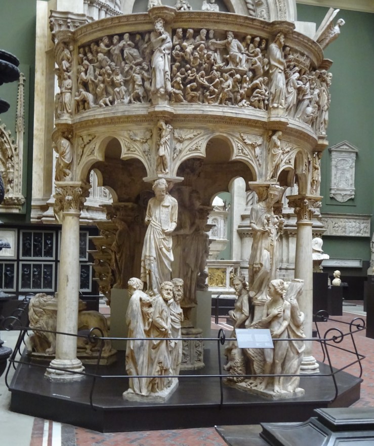
The suddenness is wonderful and the work completely absorbing. In order to see it at all you have to block out a lot else, a diverting cacophony of other works, a jumble of forms and sizes never meant to be seen together, apparently assembled to no coordinate plan. That’s the beauty of the V & A Cast Court, of course, a host of juxtapositions only permissible because nothing here is real.

++DSC02250.jpg

But once you’ve singled one out, the unreality doesn’t count. The plaster isn’t dirty, but it isn’t clean—it does a reasonable job of imitating the worn and mottled look of marble. Sometimes there are signs of its having been coloured—mostly with stone colours, grey and brown. By a fortuitous twist, the roughness of plaster and traces of varnish suit this particular sculptor uncannily well, who was one of the first carvers to make something positive and expressive of irregularity and even of flaws in execution.  

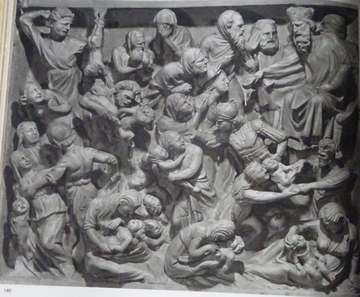
Above all, my new favourite is a conglomerate and the separate parts aren’t precious individually. Not that there aren’t wonderful strokes of invention and plenty of arresting details. On that day it seemed the most gripping large work of sculpture in the world, challenging one of the most powerful plastic statements ever, the great altar at Pergamon, which it couldn’t match for scale and violence, but in narrative variety maybe it came out ahead and had the giddy spectator reaching for parallels like the dramatic profusion of all the novels of Balzac.

+ presenta surging fwd DSC01911.jpg

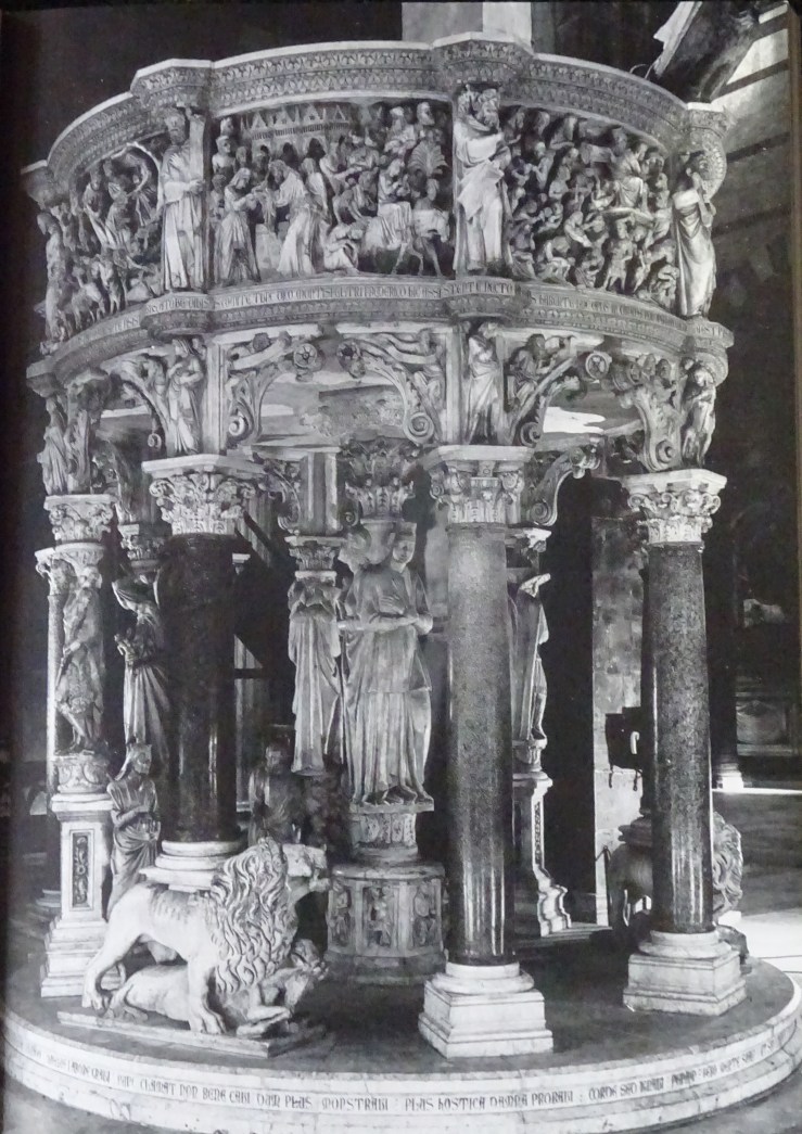
The work I am looking at is Giovanni Pisano’s pulpit for Pisa cathedral executed in 1302-10 with a fair amount of studio help, a fact which makes some critics compare it unfavourably with an earlier, overlapping project by the same sculptor, a pulpit for the parish church of S Andrea in Pistoia, much smaller than this later work, with more of Giovanni’s own carving in the intimate reliefs, which are placed, as they are in Pisa, furthest from the observer.

pistoia massacre innocents DSC03239.jpg

It seems that Pisano may have learned from the earlier experiment that the small scale work was somewhat thrown away when mounted well above head-height. So in Pisa he painted with a broader brush and put his energy into a greater proliferation of larger figures at ground level. That is where the best invention occurs in the Pisa pulpit.

+ groups DSC03037.jpg

Pulpit is a seriously demeaning name for this marvelous crowd of carved figures who form a cross between a forest and a pavilion full of sculptural movement.

The whole is cylindrical in form, with a richly carved roof (the wide band that contains the reliefs) supported on 8 peripheral columns which converge on a single central support. There is a curving stair for reaching the roof attached to one end, the route which priests and deacons would use to turn the large construction into a humble pulpit, as if its whole purpose was to give them an elevated perch from which to teach and preach.

The phenomenal sculptural energy of the assemblage devotes itself to disguising the supporting columns with an ingenious set of caryatid-like beings. In two cases these are single human figures on pedestals who allow capitals to be planted on their heads.

+DSC02980.jpg

In the most thrilling instances – two of them, adjacent – a larger figure appears to bear the brunt but is surrounded by a crowd of four figures approaching life size. These two clusters are the most gripping or enigmatic elements of the whole, one composed of women, the other of men, many of them carrying emblematic objects, like a set of scales or a dead lion suspended upside down. The men are all accompanied by their daemons, three winged animals and an angel.

The moments before you figure out or are told what any of this means are precious, and something to hold onto, even after you have identified the four medium-sized women as Virtues and the four men as Evangelists, the larger female figure dominating the others not Charity – she suckles two infants – but Ecclesia, the Church, and the larger man, Christ.

ecclesia w dove whispering DSC03244

At the V & A Ecclesia has lost one of her main accoutrements, a big dove that whispers aggressively in her ear. This idea of inspiration from above occurs repeatedly in the smaller series of sibyls at the level of spandrels supporting the reliefs, one of which (in Pistoia) looks like the inspiration in turn of a memorable sibyl by Michelangelo on the Sistine ceiling.  Ecclesia may have got separated from her dove after the fire of 1595 when the pulpit was taken to pieces and radically deconstructed, when the parts got scrambled and relations between them were lost, at a time when other sculptural elements probably disappeared.  Interest in returning the pulpit to its original state grew in the 1860s, around the time this cast was made.  The current presentation of the work in Pisa (seen further below) dates from Bacci’s reconstruction of 1926.

DSC03015.jpg

There are many satisfying symmetries buried in the scheme, one female nude and one male, the one based on a famous classical type of modest Venus, now representing Temperance (work out how), the other an unclassical, anxious Hercules, wiry not beefy, a striking antithesis to the familiar Neapolitan giant leaning on his club, worn out by carrying his huge muscles, set against our slender Hercules who contains a nervous soul.

st michael DSC03428.jpg

He is paired with St Michael, a Christian knight. They represent spiritual and worldly heroism respectively, we are told. The two are placed symmetrically in most reconstructions, but they make an odd pair. The saint is sleek and elegant. His wings take some working out and look unnervingly like living tissue. Common opinion holds that this figure cannot be Giovanni’s, and the  choice usually lands on Tino di Camaino, one of Pisano’s ablest pupils who went on to a successful career in which the smoothness of St Michael is frequently repeated.

pisano pulpit end DSC01932.jpg

DSC03443.jpg

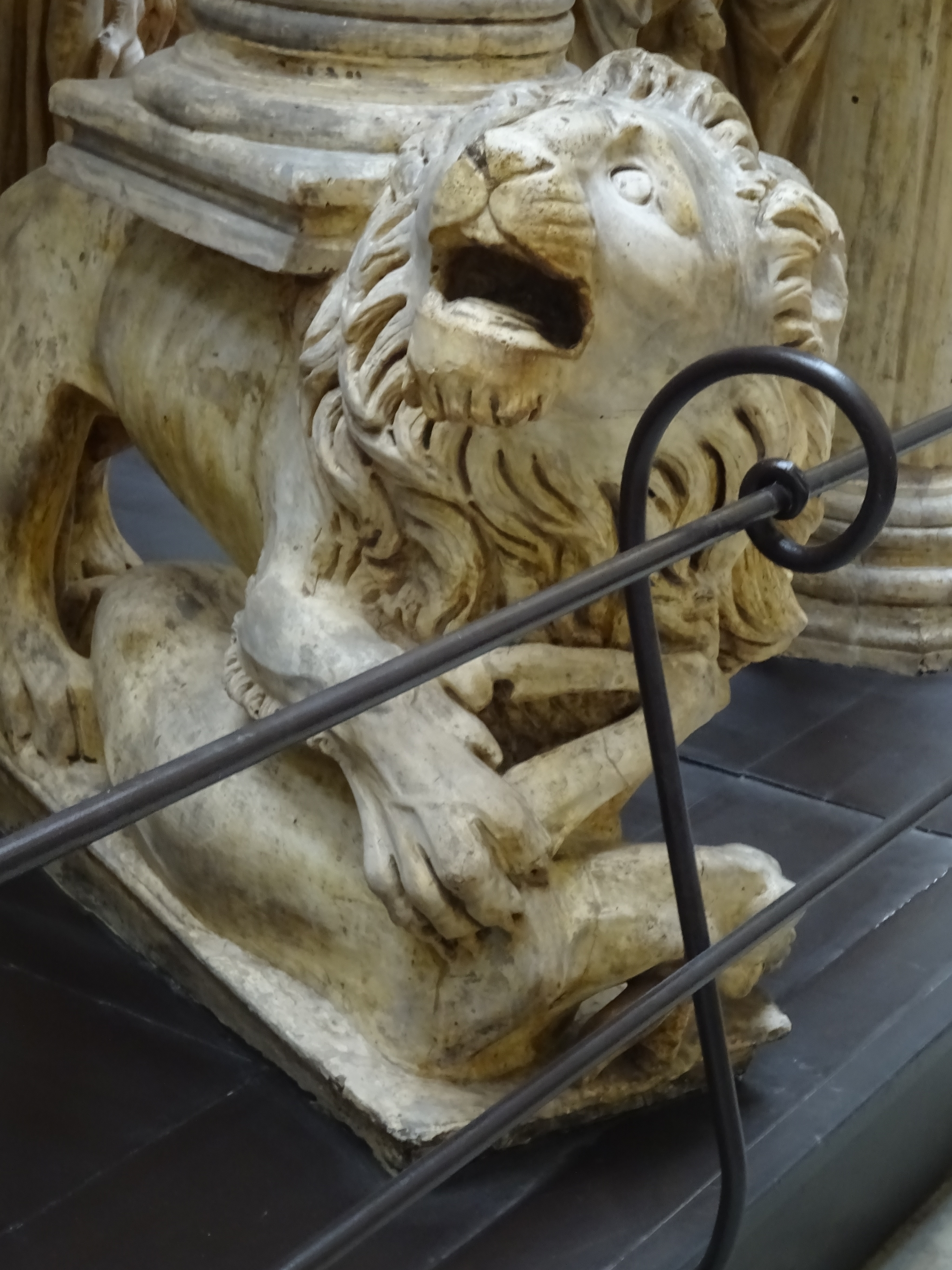
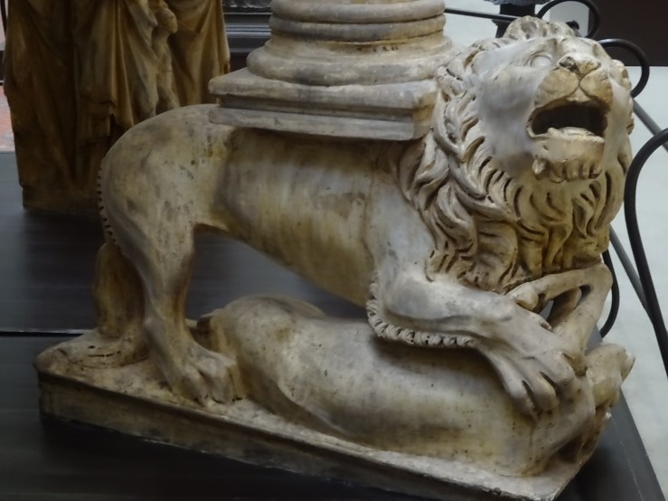
The earliest secure attribution to Giovanni Pisano consists of two eagles on the Fontana Maggiore in Perugia (see below) where he worked under his father Nicola. They are extraordinarily lively, engaged in harsh dialogue with each other. A similarly intense interest in the life of beasts keeps turning up throughout Giovanni’s career. In the Pisa pulpit we have the little winged sprites trapped between the Evangelists, the oversized eagles squeezed in between female Virtues and, most alarming of all, the two lions, caryatids, looking up from the prey they are in the middle of tearing to pieces. This ferocity extends the range of emotion captured in the monument to include vivid and convincing rage. Giovanni’s animals usually convey a serious interest in the place of primitive urges in the whole territory of consciousness, not just playing around the edges of the page as in medieval manuscripts.*

+DSC02931.jpg

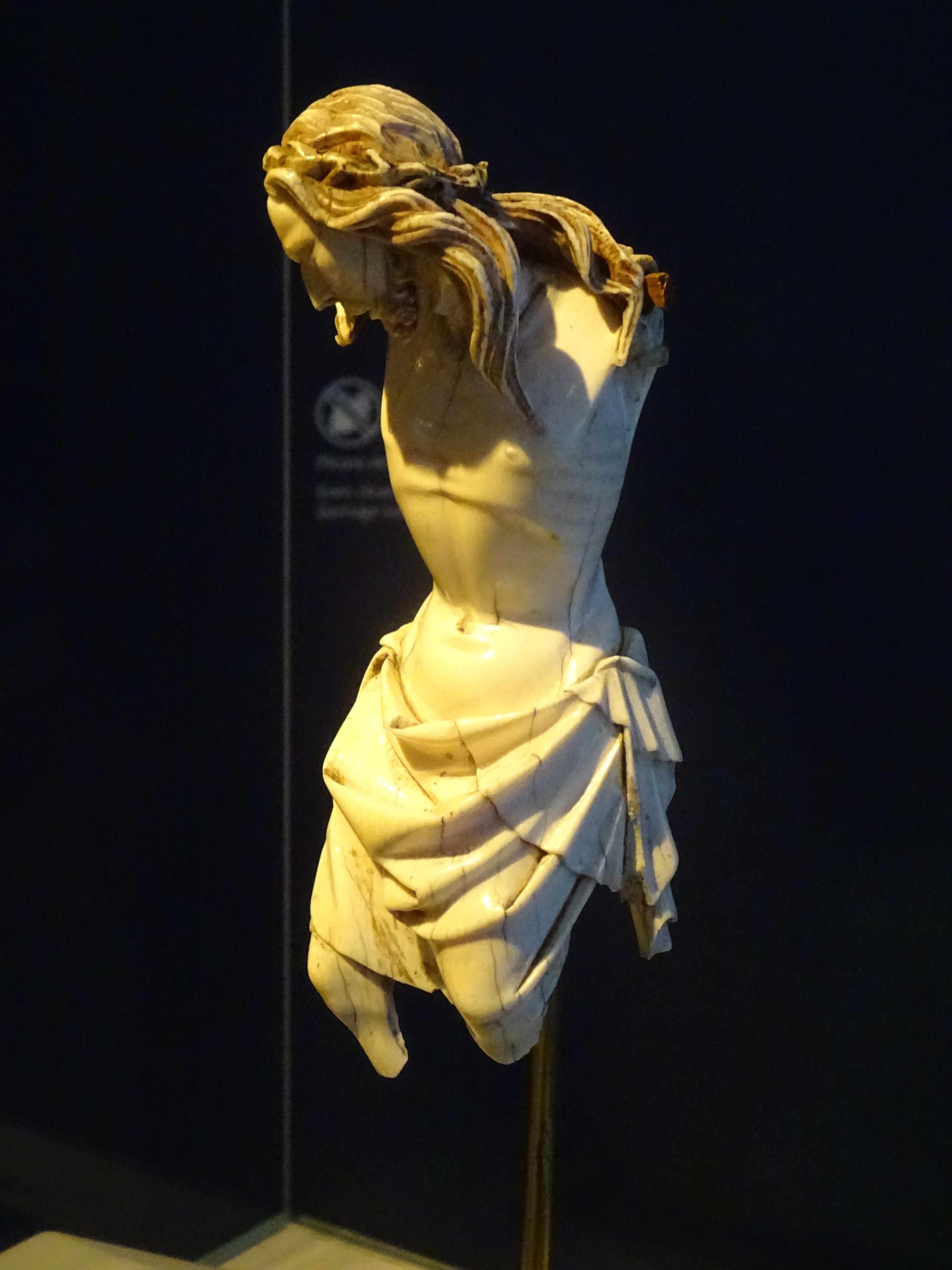
Besides the wonderful replica of one of Giovanni Pisano’s crowning works in the cast court, the V & A possesses two precious fragments securely attributed to this sculptor whom Henry Moore ranked with Michelangelo as the greatest of Italian artists. The rarest is an ivory Christ from a crucifix, in which we find both the energetic movement familiar in his work in the writhing hair played against the crown of thorns, and his characteristic focus on the expressive power of the rib cage.

DSC03225.jpg

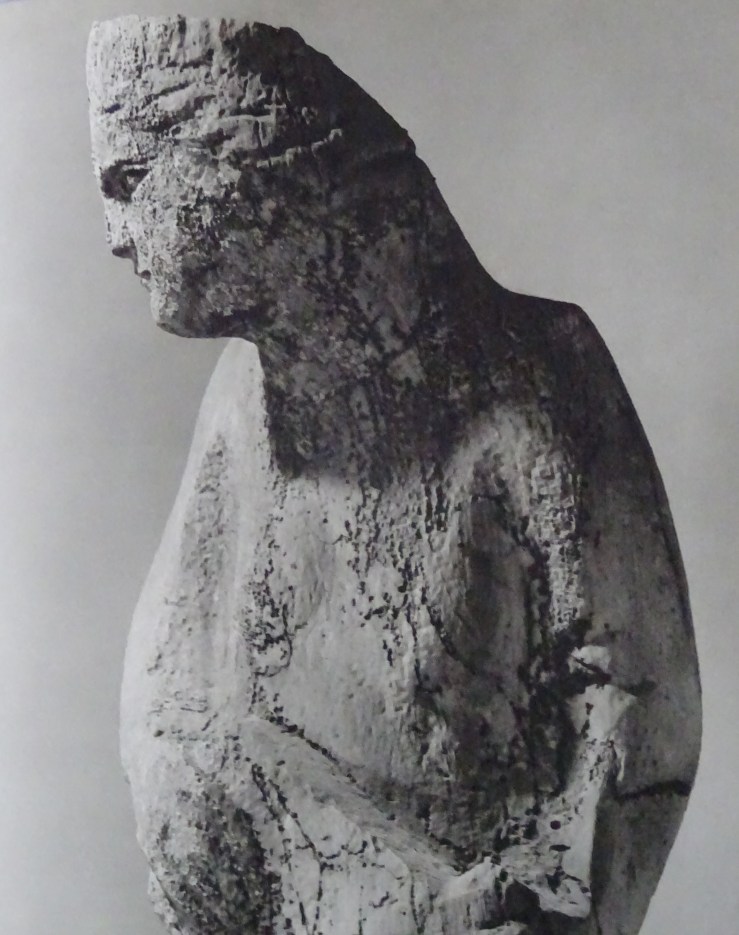
The other fragment is a bust-length piece from the projects Moore regarded as the summit of Giovanni’s achievement. These were the figures, half-figures and sculptural groups which had been exposed to the weather on the Pisa baptistry and the façade of Siena cathedral.  The effects of weathering and the modern preference for Giovanni over his father Nicola are strongly connected.  Henry Moore almost admits to reading the wear and tear visible on the outdoor pieces as a kind of fortuitous boldness, as if Giovanni’s characteristic expressionist urgings are pushed further by the weather, as if its ferocity could be attributed to the sculptor, or was, without conscious agency or intention, causing the sculptor to become more himself than ever, or calling into existence the sculptor Pisano would have been if he were Moore’s contemporary. Something similar is at work in my fierce resistance to the idea that Giovanni Pisano is a Gothic sculptor.  He is so much fresher than that, and there is something sound and true in the magic that weather has worked on the outdoor sculpture, which shows us the direction in which to push or read the indoor work to see the depths that lie there waiting to be coaxed forth by sympathetic, anachronistic eyes.

DSC02951.jpg

Michael Ayrton thought the Siena figures the most philosophically ambitious and monumental in scale of all his work, a group of fourteen prophets and sibyls in dialogue and contention with one another, passionate, visionary drama of immense historical and psychological scope. The V & A’s chunk of the Hebrew prophet Haggai from that facade is a powerfully expressive piece in which discoveries made earlier in the project about how to convey intense meaning and precise impressions over distance were developed further, involving bold use of the drill to show agitation of the features, and especially the beard, which revealed the movements of the soul.

Along with these bold textural effects went the famous tensed and craning neck, which Moore was perhaps first to intuit was more than a means of projecting the head beyond the parapet on a façade, but a novel expression of a figure’s intellectual fire as well.  Pisano brought this discovery down from the higher reaches of buildings and we find it again in Ecclesia and a couple of her Virtues.

DSC03413.jpg

And we even come upon a miniature equivalent of bold and sketchy textures for conveying expression from afar on the smaller scale of the relief, admittedly more tellingly present on the pulpit in Pistoia than in Pisa.

pisano pulpit w inscriptions DSC03404.jpg

Giovanni Pisano was a complex and fascinating character, revealed most nakedly in two features which were completely omitted when the V & A cast of his Pisa pulpit was made, long inscriptions which remain ambiguous and difficult to interpret to this day. The upper one, which appears just below the reliefs, is generally regarded as boastful. The second, longer and running at floor level, is seen by Pope-Hennessy as a complaint lodged against an envious world. Ayrton reads it very differently, as a despairing confession of failure by an artist who has fallen short of an unattainable goal. Did he end frustrated and defeated by the world, or tragically uncertain of his own genius?


DSC03405

The two inscriptions are printed in full, in Latin and English translation, in Pope-Hennessy’s Italian Gothic Sculpture.  The translation of the second inscription in Ayrton’s Giovanni Pisano Sculptor, a rewarding collaboration with Henry Moore and an Italian photographer, does not come out in the same place and isn’t even spoken by the same imagined speaker. 

*One of the most surprising items in the Pisani literature is a 9-page analysis of the extra lion footprints on the lion’s pedestal, signs of a struggle, according to the authors.  Palozzi, L & Bergkvist, G, 2018, ‘A brief cross-disciplinary study of lion paw prints in Giovanni Pisano’s Pisa Pulpit (1302–10): On the seventh centenary of Giovanni Pisano’s death’, Source (notes on the History of Art), vol. 37, no. 4, pp. 215- 224. https://doi.org/10.1086/699963

Trying for the most ferocious illustration, I inadvertently chose the lioness.  My own inspection of these wonderful animals had not extended as far as the ground they stand on.  With understandable satisfaction, the authors of this article observe that they seem to be the first in its 700 years of existence to notice these features of the lion’s marble pedestal: two complete footprints, one facing in the lion’s direction of travel, the other backward, and various signs of the scuffle with the prey impressed in the soft soil, apt at recording such marks.  They analyse both the accuracy and the purposeful inaccuracy of this lion’s anatomy, and make a fascinating case for the significance of the two paw-prints in the history of art.  They see them as Giovanni’s way of releasing his lion from its limited role as a support for a pulpit by suggesting an existence for him outside the frozen posture over his victim.  The prints encourage us to imagine him moving as we do freely through the grove.  These easily overlooked traces of the activity of the lion, perhaps an afterthought of the sculptor’s, can be seen as one of his boldest subversions of the conventions of liturgical equipment, and a source of guilty enjoyment to those who happen to notice them.  Once again, Giovanni Pisano is moving toward freeing the artist and his work from subservience to a patron, the Church.

5 pisano V&A footprints DSC03414.jpg

Neither the makers nor the later keepers of the plaster cast seem to have noticed or taken care to preserve these paw-prints, which have evidently got further scuffed and filled in over time. Recent photographs of the indentations in the marble original in Pisa show another kind of defacement, which has smoothed whatever Pisano carved into a series of  blob-shaped hollows, in which it is remarkable that Palozzi and Bergkvist could recognise the lion’s prints.

Untitled.jpg

Fig. 3. Giovanni Pisano, lion hunting his prey, 1302–10 (top view with detail of paw prints below). Carrara marble; print A: 5 ⅛ in. (13 cm); print B: 4 . in. (12 cm). Pisa Cathedral. Photographs: Ivan Bianchini.  The detail shows the metacarpal pad (MC) and the pads of digits II–V of paw print A, and the metatarsal pad (MT) and the pads of digits III–V of paw print B.

Translation/ explanation of caption: Metacarpal = front paw, metatarsal = back paw.  The two prints almost touch at their back edges.  The left-hand, front-paw print faces inward toward the lion’s body, pointing upward toward 10 o’clock; the right-hand, rear paw points downward toward 4 o’clock.  The front paw is 5 inches wide; the rear paw 4 inches.  Unless the whole thing was a private joke, when new the prints must have been more detailed, and more recognisable.

It is a detail, and a small piece of the puzzle, but one more sign of Giovanni Pisano’s study of his subjects from life, centuries before this became commonplace.

+ lions DSC02212.jpg


Lee Krasner at the Barbican


DSC09787 bird talk 1955.jpg

Lee Krasner spent a lot of time and energy interpreting and promoting the work of her husband. In a real sense Jackson Pollock was worth it, but it was thrilling to see in the recent exhibition at the Barbican that Krasner was producing at the same time a rich variety of work not in the least cowed by or under the spell of the Dionysian Pollock.

It is work of great intellectual depth and force, of ceaseless searching and renewal, so demanding and various that one visit wasn’t enough to take it all in.

DSC09741 u 1947.jpg

The exhibition began with the so-called tiny paintings, small in themselves and full of further levels of tinyness, little knots of activity scattered over the canvas. Labels spelled out the theory of this organisation, that small things can become monumental depending on context and your own focus. So you grasped from the start that Krasner was a visionary who saw metamorphically, which set you up to expect transformations in which all is not what it seems.

DSC09754 nude study fr life 1940.jpg

Soon after, we came to her student work, charcoal nudes called life studies, that started looking like Michelangelo and moved on to Picasso-like fractures, a radically disruptive idea of taking dictation from nature. At this point did any of us dream that the end of it all would be the beginning?

After the impinging nearness of the nudes came unlikely wartime collages meant for window displays and populated by bombs, bombers, scientific instruments and scientists’ laboratories, full of fractious life. This was the period in which she met Pollock, as she oversaw a group of mainly male artists in a bold, practical project.

DSC09779.jpg

DSC09784 burning candles 1955.jpg

Soon after the war she is doing something even more imaginative with collage, slicing up compositions she is dissatisfied with and forming them into powerful explosions which still carry narrative force, bursts of light, tangles of undergrowth, tumult in the heavens. Unlike most of her contemporaries, she went on giving descriptive or allusive titles to her pictures, which told viewers to look for rich imagery in seeming abstraction. Not just ‘seeming’ perhaps, for Krasner shows that these canvases can be both pure construction and individualised narrative at once.

One of the best surprises was to move from one side to the other of the square donut of the upper storey at the Barbican, from the small, dense collages of 1954 to large, free Pollock-sized ones of the very next year.

Both sets, the small and the large, are among her best works, and those viewers who thought they saw suspiciously Pollock-like scribbles in one of the larger set called Bald Eagle were right. Here Krasner cannibalised her own rejected canvases and one of Pollock’s too, which plays the part of the bird.

DSC09789.jpg

In these pictures it’s more evident that new work is made from the ruins of the old, that new energy springs from the destruction of what went before, through ripping, shredding or cutting without much respect for earlier effort.

So certain colours have special meanings, and red is a kind of bloodshed in Bird Talk for instance (opening image). In this room Milkweed provided a measure of this—its cool colours seemed out of place.

Krasner’s best years in paint were difficult years with Pollock. One of the most exciting and disturbing rooms contained four violent paintings on bodily themes from just before and just after Pollock’s death, which occurred when Krasner had escaped briefly to Paris. You could fill a much larger room with the anguished work of that year and the next, among the most wonderful things Krasner ever did.

DSC09803 three in two 1956.jpg

This is where my attention finally wore out, after these pictures in flesh tones and grey, which might be evenly divided between anger and grief, but there’s nothing balanced about them. They are barely controlled, which makes them so uncomfortably exciting. They keep calling themselves back to order, and the canvas gets more and more crowded with colliding forms. They are sometimes said to derive from Picasso’s Demoiselles, to which they seem worthy rivals.

krasner cauldron 1956 cat p 110.jpg

Perhaps Krasner had already been shifting to soberer palettes in works like Cauldron (not in exhibition), but when we moved to the lower floor at the Barbican we were in a surprising new monochrome-world which might at first seem a diminishment, but resulted in a pair of masterpieces on a grand scale, a calm cloudscape or vast Northern expanse called Polar Stampede, and the wildest depiction of movement, The Eye is the First Circle, which incorporates whirlwind vortexes and heroic striding figures, a range of diffuse and focused motion which accompanies you as you walk past it. Did Krasner have in mind Pollock’s largest canvas, the regular/irregular Mural, meant for Peggy Guggenheim’s New York flat, Krasner’s seething crowd played against Pollock’s orderly procession?

DSC09817 the eye is the first circle 1960.jpg

The almost-grisaille effect of Krasner’s umber paintings lets the formal power of the composition come out more clearly, but there’s also a more prosaic explanation of the source of this unexpected swerve in her work. The larger canvases are possible because she has moved into Pollock’s much bigger studio at their Long Island house. And the absence of colour has its source in her insomnia—she takes to painting at night by artificial light, doesn’t like what happens to colour in these conditions and hits on brown as a tone unspoiled by them.

There are more new departures in the 1960s and 70s, ‘flower’ paintings like Through Blue of 1963, made with a broken right arm which left her manipulating paint with her fingers, leading to great density of surface, and a spate of cartoon-like canvases including Courtship and Mister Blue of 1966.

DSC09842 imperfect indicative 1976.jpg

The exhibition ended with a startling return. Rooting around in the studio, a British friend found a large cache of charcoal nudes from student days. Krasner meant to destroy them, but looking more closely, felt she was being directed to turn them into something new. Instead of tearing, this time she cut them up with scissors. Out of this destruction came remarkable and unnerving works, in part her revenge on a teacher she had both revered and resented. He had once torn up one of her drawings.

The results of the butchering are tantalysing and confusing, like a Baroque ceiling with figures tumbling out of the corners, like Michelangelo’s lounging or sprawling figures anchoring an indistinct turmoil of other figures, like a series of movements only beginning to clarify themselves, and suggesting as so often in Krasner’s canvases that much bodily business remains to unfold.

DSC09840 future indicative 1977.jpg


Nicholas Hilliard magnified


11 35 hilliard eliz ham hse 86 x 66 c1595-1600 .jpg

English writers of Nicholas Hilliard’s time considered him the equal of Michelangelo and Raphael, a preposterous claim, you may think.  The greatest Italian miniaturist, Giulio Clovio, had set a precedent, though, of linking the extremely large and the decidedly small by mimicking the range and layout of the Sistine ceiling in the Farnese Book of Hours, in a series of illuminations on Biblical subjects at a scale not far from Hilliard’s, whose portraits of Elizabeth and her courtiers are tiny by whatever standards of the miniature you apply.

One justification for the comparison is that both scales stretch unmercifully the ability of human senses to take them in. Every observer can see at once that Michelangelo has exceeded human scale and challenged mind and eye to comprehend all that confronts them. It is less obvious that we can’t appreciate the wealth of Hilliard’s images trusting to normal sight. There is plenty to see without magnification, but once you have seen what enlargement brings, ‘life size’ doesn’t seem enough.

So in the recent exhibition at the National Portrait Gallery magnifying glasses were supplied, and wielding one you could switch between normal and enhanced vision. There’s also a further layer of difficulty—to save the delicate watercolours from damaging amounts of light they can’t be strongly or evenly lit, even for a special exhibition like this, so some parts are inevitably cast in shadow.  It is even worse in permanent displays, at the V & A for example, where I experienced an epiphany the other day caused primarily by poor lighting. Among the most lyrical passages in Hilliard’s wonderful Treatise is a description of how rubies become burning fires by candlelight–it seems he was prepared to have his work seen under trying or unusual conditions.

1 4 hilliard leicester silver vam diam 4.4cm 1571-74.jpg
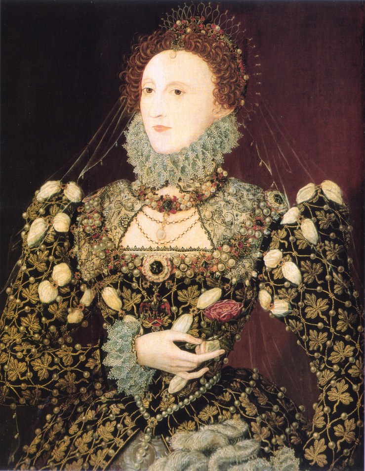
Thus, in at least two ways we can’t experience Hilliard’s work fully when standing directly in front of it. This sounds a drawback and so it seems at first, but I’ve come to feel it as a kind of richness—Hilliard dawns on you in stages, slowly. In one of his earliest surviving works, a circular bust-length image of Leicester, the Queen’s favourite, a painting less than two inches across, the background seems an anonymous grey to the naked eye, but is known to have had special attention lavished on it, to be founded on a base of silver which has been selectively burnished to bring it out in patches, probably with an instrument like a weasel’s tooth mounted on a stick, as described in Hilliard’s treatise The Arte of Limning.

This detail emerges first under magnification looking like Islamic script, before being recognised as a dusky brocade pattern, an effect so subtle and recessive one marvels at the attention required to produce it. If you want to appreciate fully the concentrated craft of this artist you need to read his short and wonderfully quirky treatise, with all its detail about washing colours, behaving suitably with aristocratic sitters and understanding the mystical properties of the five main types of precious stone, which Hilliard seems to believe are the ultimate sources of colour in its purest form.

The treatise wasn’t printed until the early 20c, though it had already had a considerable influence in manuscript. Hilliard himself has come into much clearer focus as recently as 2019 with the publication of Elizabeth Goldring’s biography, which is particularly strong on the formative role of two long stays on the Continent, first as an 8-12 year-old and then two further years around the age of 30.  Among Goldring’s riskiest, most charming speculations is the idea that Hilliard was introduced to Holbein and Dürer, later his idols, as a nine year old in Germany. My skepticism grows weaker when I remember the impression a year in California made on me at age 5 and as I hear of my ten year old grandson’s response to a month in China.

2 11 hilliard self vam diam 41cm 1577.jpg
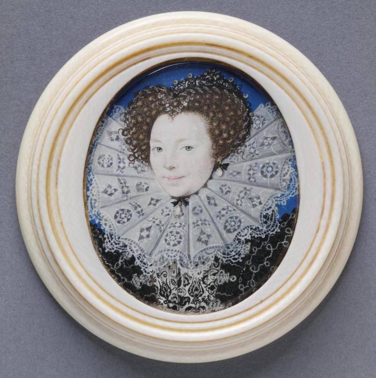
Hilliard’s self-portrait inscribed with a date of 1577 takes on a new meaning when placed in his French period when it was painted, where he saw artists accorded higher status, and was welcomed into learned circles around writers like Ronsard, newly identified as one of his sitters. Hilliard’s little self-portrait shows him as another gentleman, not a mere artisan, a claim picturesquely fleshed out in the treatise. The liveliness of expression in the features, especially the eyes, the hair and the set of the mouth, is extended by the flying bits of the clothes, as if rocked by a breeze, and the dematerialised edges of the ruff, which will become an even more outlandish feature of many later Hilliard portraits, where regular pattern and an opposing force are locked in endless struggle.

3 8 Henri III 50 x 37 1576-8.pngPerhaps the most astonishing fruit of Hilliard’s time in France is the recently discovered miniature of the young king Henri III which combines hieratic flatness with subtle traces of red around the eyes, of blue shadow in the temples, with odd life in hair, jewels and lace–lace a little universe in itself, melting away to nothing at the edges and tangling to thickets in its densest parts.

As in many later Hilliards, the jewels and especially the pearls have probably lost most over time. One of Hilliard’s cleverest devices was adding a silver highlight or underlay to give the sparkle or translucency of jewelry, sparkle which has dulled to dark grey as the metal pigment oxidised, an effect seen in several different forms on Henri’s chest.


4 30 Hilliard Elizabeth lute 46 x 40 c1575 .jpg

Eventually Hilliard became known best for his highly ritualised representations of the English queen. One of his earliest royal portraits is among the most informal. It shows her in motion, actually doing something, playing the lute with an expression of relaxed pleasure, after stepping down from the throne, now looming like a ghost of itself whose enigmatic crowned pomegranates split open at a slightly lower level than her central head, which seems to wear the throne as an accidental headdress like a piece of clothing she meant to take off.

5 hilliard? elizabeth phoenix npg 78.7 x 61cm c1573-76.jpg

Hilliard’s own actual hand in large images of the queen generally associated with him is in doubt. These, like the Phoenix portrait in the National Portrait Gallery which you could compare to the miniatures during the exhibition, are undeniably powerful. They convert the living person into an intimidating piece of machinery, mostly stone and metal, with brief and isolated tracts of marbleised flesh peeking out from the jeweled defences. It is a kind of divinity, surpassing mortality by hardening and stiffening itself. Especially after more delicate and ethereal styles of transformation in the miniatures, this doesn’t seem very Hilliard-like, but by comparison crude and inflexible, and above all earthbound, entirely without lightness and freshness, a travesty of the brightness and liveliness recommended in the treatise when one is representing gold and silver in paint.

Hilliard didn’t do many full-length figures or miniatures which evoked a wider world. His one-time pupil Isaac Oliver was more interested in doing that, and probably better at it. Oliver’s portrait of Lord Herbert of Cherbury stretched out at full length like Shakespeare’s Jaques in the wood is the most appealing of several of these. Hilliard falls down badly trying to extend a sylvan scene into the distance, starting from a lounging nobleman. Hilliard is wonderful for rich flatness, not for miniaturised Italian renaissance scenes like Oliver’s. That is probably the source of Horace Walpole’s insensitive preference for Oliver over Hilliard.

6 64 hilliard youth among roses vam 135 x 73 c1587.jpg

When Hilliard does melancholy in a woodland setting on his own terms the result is magic of a sort outside Oliver’s ken. It shows a spindly youth leaning cross-legged on a tree all in black and white. He’s been standing there so long and so quietly that wild roses have grown over him and he has become a figure of myth, decorated by entirely natural embroidery, most beautiful on his white stockings but almost as effective on his black cape, so nonchalantly draped, where thorns show more plainly but still un-fiercely, setting the idea of pain gently in motion. More reserved than other treatments of such subjects, it reaches further contemplative depths than they do, the narcosis of a person willing himself to become a plant. It stands out among all Hilliard’s subjects for transcending the social limitations of most portraits. Like other Hilliard subjects, this person remains unidentified (not for want to trying), for different reasons and with different result from all the others, a kind of nirvana.

DSC08670.jpg

George Clifford, Earl of Cumberland, in jousting armour after a successful day of mock-war of a pseudo-historical kind, is an entirely different image of the transcendence of individual identity. He is eaten up in emblems which compare the queen and his role at court to the motion of heavenly spheres. Hilliard’s best contribution to this enlargement is the juxtaposition of two closely allied blues, that of the sky and that of the coat he has put on over his armour.

So he resembles the weather, but keeps his own distinctness. He is outdoors where he can see heavenly bodies and they can see him, but clings to his pasteboard shield with its powerful pictures of them. It is a convincing portrayal of the magic of heraldry, at bottom a kind of faith in imagery.

Most miniatures were meant to be worn around the neck or pinned to the clothes, as the secret concealed inside a locket or as an image hidden beneath a neckline or flaunted on a sleeve. There’s the famous story of Cecil’s portrait, which the queen borrowed, then pinned to her shoe and walked around displaying. Tiring of that, she moved it to her elbow.

8 18 hilliard unkn wo in room tiny 57 x 46 c1589 Q.jpgThe youth in the woods and the queen’s champion in jousting gear were too big to wear, but still intended for intimate settings, hence their name, cabinet miniatures. Occasionally Hilliard produced full-length figures of a wearable smallness, a whole new order of impossibility. This one of an unknown lady is less than two inches across and just over two inches high. It is impossible to show her life-size, when her most teasing intricacies disappear, like the 5-pointed star-jewel in her hair, which some have used to identify her as the woman in Sidney’s Astrophil and Stella, or the subtly shaded folds in her skirt or the criss-cross details at the edges of the black over-skirt. I never noticed the red ostrich feathers on her sleeves (if they are feathers) until I enlarged her many times.

Now comes the pinnacle of Hilliard’s art, his way of concealing a whole world of variety in a feature of dress that is both monochromatic and repetitive, the lace ruff that reaches its apogee in female portraits where the ruff is engaged in a contest with the outer limit of the whole image, the edge of the blue background, the uniform tone which we take for granted, which Hilliard’s treatise together with the astonishingly detailed chapter on his technique in the exhibition catalogue alert us to the extreme difficulty of achieving. This feature must have meant far more to alert contemporaries than it ever can to us, who see it as an artificial, indoor kind of sky, magically intense perhaps, but intense like an allegory, not reality—until, that is, it runs against the diffuse outer reaches of one of these ruffs like a planet’s orbit. At the edge the ruff turns green like the sea or the sky as it ends.

9 15 hilliard pembroke npg diam 54cm 1585-90.jpgThe miniature above goes about as far as you can go in stretching the image to the frame, engorging the space completely, except where the hair takes over at the top, and on the right where the same ruff that lies flat against the background tilts upward, as if it has brushed against and been deflected by the wooden frame. This asymmetry, actually slight, is subtly disorienting, as if something within the image is moving, as the right-hand half of the picture becomes restive.

9a 15 macro lace 08648.jpg

There’s a heraldry of ruffs which I won‘t venture into, of crosses, circles, x’s and more complex patterns. Hilliard took tremendous pains over the extra layers he applied to the lace after it appeared complete, adding highlights and also perhaps smoky interiors. Recently these have been explored microscopically, leading to fuller accounts of how these complex structures were arrived at. I’m particularly taken with the honeysuckle that mixes itself with the roses in this one, and with the connection between the sitter Mary Sidney, the dedicatee of the Arcadia and its completer, perfecter and publisher after the death of her brother Philip, and Hilliard’s ideas about the possibilities of emblems as narrative and anti-narrational instruments.

9b 15 macro honeysuckle 08651.jpg

My other instance of a ruff as a geometrical riddle is an oval miniature in a circular frame, which plays with curved forms inscribed within one another and alternating schematically between dark and light, between black, near-black, white and near-white. When I saw this one at the V & A its top and bottom were in shadow, so the part below the ruff was pure black, as was all above the hair, making the whole a much purer version of simple forms enclosing and repeating one another. The image is bilaterally symmetrical but extremely eccentric divided horizontally. If you blur your vision you get three crescents enclosing the oval of the face, which has a disturbingly unstable location in the larger oval, again suggesting movement. Goldring finds the sitter’s gaze coquettish, and she or her publisher uses it above her own biographical details as if she meant to borrow its expression. This image in chaste black and white seems just as enigmatic as the famous young men seen against a whole universe of flames or reaching up to twine fingers with a hand sent down from heaven. The meaning of all three is safely locked inside.

10 hilliard unknown lady vam 46 x 39mm 1585-90 .jpg


Coda on the Queen:

In an obvious way the summit of Hilliard’s efforts is his many representations of the queen, which triumph by leaving reality far behind and convert her into a field of jewels, often in a star-burst pattern (see opening image).  Her ruff sometimes verges toward immaterial froth or quintessence, shadowed here by a flimsy veil like an aura which floats beyond the reach of her clothes. Again you should try to imagine all the grey as glitter and the pins ending in crescent moons as pearls or diamonds jumping out of her hair like sparks of her vitality. This larger oval from Ham House was a highlight of the exhibition.

11a 35a hilliard eliz raying jewels vam 65 x 33 1595-1600.jpg

The smaller one with a grey (originally silver) curtain behind from the V & A is purer and more concentrated, though another of Hilliard’s inventions, coloured resin mounded up to represent jewels, has worn less well. The aura created by the ribbed veil is outstanding, but Hilliard has stopped believing in the queen’s youth.


Hilliard’s Arte of Limning can be hard to get hold of.  In the London Library catalogue a complete online copy is hiding under this heading:  Introductory Note on Nicholas Hilliard’s ‘The Art of Limning’, Walpole Society, 1911

Rembrandt’s prints

b 5 4 b78 self beggar rt angles AN00022116_001_l copy 2.jpg

Rembrandt is one of those rare artists like Michelangelo, Picasso and very few others who breaks the bounds and goes beyond all rivals in three different mediums. His achievements in the cold, dull realm of printmaking are perhaps the most astonishing of all.  He found there ranges of tone so varied and extensive it is like colour, a world so full of shades you can’t feel there’s anything missing, and so to talk of black-and-white seems almost obtuse.

6a b85 lazarus AN00022150_001_l.jpg
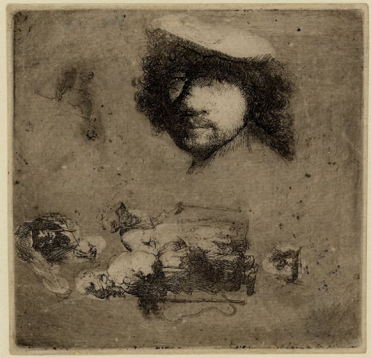
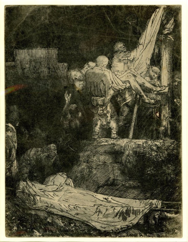
One of the earliest etchings in the little exhibition of his prints and drawings now at the British Museum, a large, showy Raising of Lazarus, made me wonder how he (or anyone else) could ever go beyond it. The lighting effects are so startling, the gestures though exaggerated so confident and so clearly set off from one another. A single action becomes a whole series of them. The later Rembrandt might cringe at the idea of making the main figure three times the size of the others, but we’re not having such thoughts now, caught up in marveling at the richness of light and dark tones jostling each other so energetically.

g 13 25 b177 lazarus small AN00037930_001_l copy 2.jpg
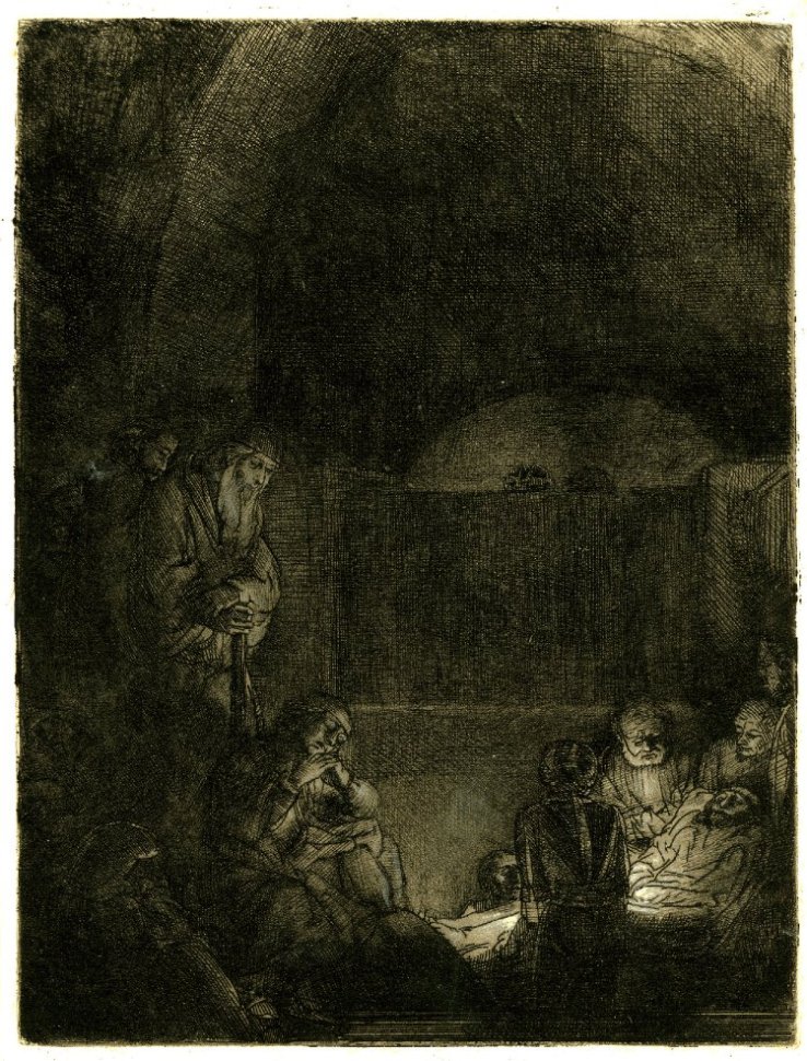
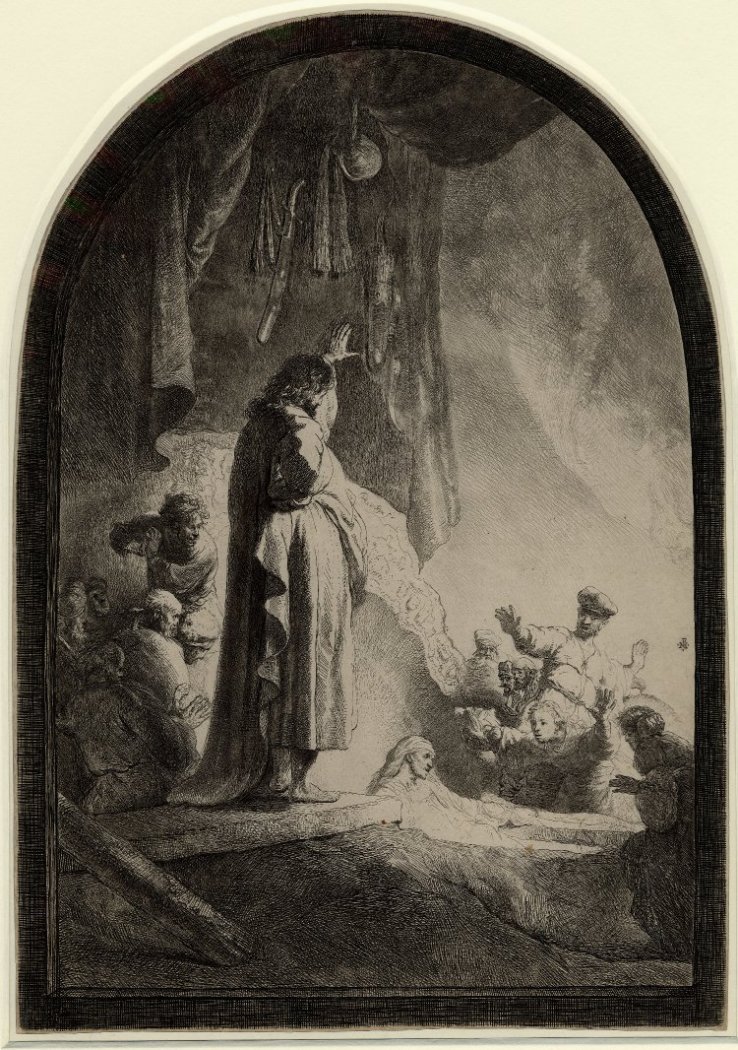
Ten years later he does the raising of Lazarus more quietly but with greater intensity, on a smaller plate with a reduced tonal range. Gestures are less dramatic, if they show up at all. Facial features are almost too small to pick out, but the tilts of the little figures’ heads are powerfully expressive instead, thrust forward, drawn back, lowered, turning aside—all these and more are employed in this small print. Christ isn’t even looking directly at Lazarus but slightly downward, pondering.*  Has anyone ever done a human group with such attention to the varied states of everyone in it?

This is a modest example, yet yields so much, modest but radical in the allotment of space, bolder than the early Lazarus in its use of blank spaces—all the active figures are confined in the lower left-hand quadrant; Lazarus is almost pushed out of the picture. Two blank spaces run almost the whole length of the scene; it is one big grave.

We want to claim that Rembrandt outgrew his obtrusive early virtuosity, and he did leave behind the showy Baroque kind, but he never ceased some form of virtuoistic display, though, as Artaud said of van Gogh, he was by the end in a different region from normal human perception, a place where he didn’t perhaps expect anyone to follow, doubtless a strange way to talk about two of the most popular artists in the whole history of art.

a 3 2 b63 antiope AN00021702_001_l copy 2.jpg

Even in the more thoughtless Baroque phase Rembrandt is capable of great delicacy and quiet richness, as in this sensuous nude, given a mythological twist by the shadowy rapist lurching out of the shadow, Jupiter and Antiope. Rembrandt was prone to make jokes of classical subjects—who could ever guess that the embarrassed middle-aged nude dipping her feet in a pond was Diana at the bath? But Jupiter is hardly there in the present picture, an afterthought, Rembrandt’s way of acknowledging a vestigial embarrassment at catching his model asleep, after what activity, not before? Yet the figure is raised by the classical reference and her languor could not be bettered. In a way hard to explain, the idea of Jupiter gives us permission to savour a wonderfully lengthened moment.

d 8 17 b129 prodigal AN00022493_001_l copy 2.jpg

Certain subjects recur in Rembrandt, one of them an encounter between a young man and an old one, like this father and his prodigal son no longer young. Why is this awkward meeting so beautiful, framed on one side by emptiness and on the other by unwanted bystanders kept at bay by narrow stairs which effectively confine them? There is no shortage of feeling, rather an excess, and the complex platform sets them off as on an altar. The space is like an allegory of their situation, which they have surmounted, at least for the present.

I have just realised that the lead figure on the right is carrying shoes and a coat, bringing them for the semi-naked prodigal, a dose of everyday reality, just what this artist revels in: in every twist of the father’s sleeve, in the creases in the stone steps, in three different arched openings, in headgear and shoes and every one of the endlessly varied lines cut by the graving tool.

e 9 18 b139 joseph telling dreams AN00022531_001_l copy 2.jpgAnother young man holding a whole cohort of old ones entranced with his tales, like Christ among the doctors, but this time Joseph recounting his dreams to the other prisoners, a subject easier to give a comic twist, in part by clothing them all in Egyptian finery. It is an exercise in filling up space, and he does it most ingeniously, including a bedroom setting as in Genesis, a kitchen visible in a slit at the edge and a dog obliviously licking itself. Joseph is the brilliant invention of a novelist, a little businessman who is believable as the soon-to-be administrator of the whole Egyptian harvest.

f 10 19 b140 adam & eve AN00462408_001_l copy 2.jpg

I suppose this counts as a comic scene too, though making light of the fate of humanity in this present world seems shallow in the extreme, yet what result do you expect to follow from leaving the spiritual destination of the world to the sagacity of inexperienced newlyweds?  Rembrandt is an unstoppable storyteller and Eve is one of his best inventions, her frailty signaled by letting the snake-dragon loom over her, by her bowed shoulders and a head drawn in like a tortoise, by her wonderfully trustful and mistrustful expression: she is used to listening to Adam yet she can’t accept what she is hearing. But it’s the vulnerability of those hips and knees, something that makes this an extremely lovable creature who can’t be blamed for what she has done. The couple are wonderfully lit in a big keyhole of light which is about to close in on them, and on the frolicking elephant, tiny in the distance.

h 17 34 b210 jerome w stump AN00038466_001_l copy 2.jpgRembrandt did old men repeatedly, St Jerome most often. He also had a strange fondness for old stumps which he saw (or anyway showed) as sheltering diverse forms of life and as in that way sponsors of youth. The outlandish disproportion between the saint and his tree expresses a truth but also functions as a kind of camouflage: the wise man disappears in the undergrowth and his lion knows to do the same.

k 22 49 b247 jerome in l.s. AN00045819_001_l copy 2.jpg

The best of all his renderings of his favourite saint puts Jerome in a wide landscape, not in flat Holland but precipitous Italy. It’s the gentlest, richest vision, of a long serpentine ridge with the lion standing, curved, on the turning point where it swoops downward, man and beast, stillness and movement, action and contemplation, yet of course the lion doesn’t move either, just expresses movement with the swerve of his body. The saint vanishes or hovers like a mirage, conveying that there aren’t any saints or lions in Italy, except if you think there are, or while you think there are.

i 20 46 b244 three crosses early 2.jpg

The highlight of the exhibition was the pairing of different stages of the same print which showed how flexible or molten Rembrandt’s idea of his subjects became, increasingly as he got older. The most startling transformation was performed on one of his largest prints, a rendering of the Crucifixion known as The Three Crosses which began as Rembrandt’s most complex crowd scene, with the turmoil of two dozen figures forming a hollow circle around the three crosses, something like Bruegel’s in Vienna, but seen from much nearer. At first it was done in drypoint, a technique Rembrandt increasingly favoured, which creates powerful but blurry effects because the this tool works more like a gouger than a sharp pen. So there’s something rich but impressionistic about the rendering of figures, and he concentrates on the architecture of the scene, controlled by strong lighting which makes an apse-like structure that incorporates all the figures into a single vertical space, with an effect murky and tumultuous at once.

j 21 47 245 three crosses later 2.jpgThen Rembrandt went to work on it, erasing some elements, like one of the two prominent figures in the foreground running away, and adding others, like the tall figure on horseback wearing a strange three tier-headdress like something out of Uccello. The right-hand thief has become a black smudge and the dense right-hand group a blur.  Strangest of all he has added strong diagonal scorings leading out of the picture toward both lower corners, matching the rays coming down from above in the top half of the picture, so that now you have a single explosion caused by the crucifixion, as if there’s been a great discharge of energy, an electrical phenomenon we would say if that were not pure anachronism in the age of Rembrandt.

Now a universal darkness has fallen on the whole scene except for a couple of weird flickers to the left of Christ. The air has been sucked out of the world along with the light, leaving it flattened and shrunken by the diagonal forces pulling downward, a space unreal, visionary, as if we’ve retreated into a mental realm, hugging the suffering depicted to ourselves more intimately.

Darkness had always had a strong aesthetic appeal for Rembrandt, particularly in prints. Colour disappears as darkness falls, and he liked pushing to the moments when less and less is visible, sometimes almost as a prank, to see how little he could get away with showing and still have a picture, but more often with serious purpose, to find out how much you could take away or occlude and still keep the whole surface tense with the expectation of meaning, which might need to be searched for, but was there to be found. Earlier, darkness might just signal experiment; later, solemnity appears more often. In the year after The Three Crosses a smaller Descent from the Cross by torchlight appears, in which the body of Christ occurs twice, once as a crumpled corpse, and again as a blank sheet. His shroud waiting for him on a stretcher at the bottom of the picture has such a strong presence it’s as if there are two of him, or two moments both present in the single image, which there’s an old instinct (familiar in many medieval narratives) to include within one frame.

l 23 54r b257 descent fr cross torchlight counter proofAN00058987_001_l copy 2.jpg

The sheet is so characterful, contains such subtlety of outline and feature, that it seems a depiction of a collected, resolved and tranquil state of mind, like a washing away of all the kinks and twists of everyday human character—to become a blank sheet again, a certain ideal conception of what happens to the individual at death. The prominence given to this empty container is preternaturally strong and purposeful–at the front and bottom of the space, yet canted away from strict horizontal, a relaxed, not a rigid disposition, one of the most beautiful details in all of Rembrandt. After all the toil and trouble, peace; after hideous cruelty, a slate wiped clean.m 25 56 b260 entombment w surface tint AN00059590_001_l copy 2.jpgThere’s a further, more resolved stage of the same process in the revised plate of the Entombment from the same year. Revision here has consisted of removing much detail by darkening it, while allowing faint suggestions of the main spatial divisions to remain, not quite consistently, to give a grand general sense of the entire space while narrowing the focus to a few of the figures formerly visible (in earlier stages of this print) and only to selected fragments of those who remain. The details that are left have become more precious: they are all that there is: expressions simplified are more solemn, surrounded by gloom they sink deeper into the viewer’s consciousness. Christ is the least evident of all of them—can that be right? Earlier it was even possible to overlook him, not now. In some technical sense the scene is lit by a candle which we cannot see, but that is an explanation we think of afterwards. Our first impression is that Christ’s limp body emits a strange glow, unnaturally intense like a firefly, the only point of light in the night sky, which is to say that in death he compels us more than ever. You can describe this effect to make it sound simple, and so it appears, but what it is still more, is focused, and wonderfully so, and it arises from Rembrandt’s understanding of human responses, and of the play of light and its absence, which is all brought to bear on a small stretch of inked paper, most overwhelming in those parts where nothing is there, no ink, just paper, the very instant when the artist’s absent hand is felt most of all. 


*Other impressions of the small Lazarus change Christ’s expression, which becomes less meditative.

The print of the late Descent from the Cross by torchlight shown here is a counterproof, in which the blank of the shroud is paler but stronger.

Rembrandt: thinking on paper at the British Museum until 4 August 2019


Picasso 1932


DSC02683 copy.jpg

I can’t be the first to think that Picasso is too profuse, that he painted too much. One way of coping with an overpowering surfeit of work is to limit your focus in an almost arbitrary way, and to concentrate on everything produced in a certain year, for instance.  Picasso is one of the few if not the only artist with whom such a bizarre tactic makes sense. We are helped a lot by the fact that in the early 30s he is dating his paintings by the day. So the works in the Tate exhibition were usually labeled with a day’s date, and only after that, a title.

Luckily the curators were not strict about the boundaries: a few works from 1931 crept in, and a couple from 1933-34. There’s no great consistency or sublimity about 1932. It was the year of his first big exhibition: that might have stirred him to produce more, but there’s still a pleasing arbitrariness in the choice.

Picasso is notoriously restless, but repeats subjects he likes, repetitions that are always variations not copies. Some of the most enjoyable moments came in following transmogrifications of simple themes, like the 26 small pages of Sketchbook no. 17 in ultra thin pen-lines that summoned up beings like one-celled creatures seen under the microscope, who seemed to be floating or swimming when viewed sideways. In fact you could only have this experience in the catalogue, with a magnifying glass, but it was magical, and gave a more intimate sense of Picasso’s inventiveness than almost anything else in the exhibition.

DSC02769.jpg

Strangely enough, the supreme display of invention in the show began with a kind of copy, a copy of Grunewald’s famous Crucifixion in Colmar. Apparently it is doubtful that Picasso ever saw the work itself. In any case, he must have depended more immediately on a photograph, probably in black and white. Almost at once the painting got away and became something else, a meditation on cruelty or alienation and the dispersion of the self. Images of these dark drawings below follow the sequence Picasso followed, moving further, then nearer, then further again from recognisability, an oscillating approach to something that keeps threatening to disappear.

DSC02771 copy.jpg

DSC02774 copy.jpg

DSC02776 copy.jpg

At almost the same moment he was doing a series of little sketches of women playing ball on the beach, sometimes crowding and even stepping on each other. Some observers have detected conflict or ambivalence in Picasso’s ability to entertain these two subjects almost simultaneously, violent cruelty and Dionysiac release, and they have also read both extremes into one another.

DSC02767 copy.jpg

It remains a question to what extent simple themes like women playing or sleeping are carrying heavy metaphysical burdens in the work of 1932. Two famous nudes, Nude, green leaves and bust and Nude in a black armchair, provoked enthusiastic response in the art-dealer Kahnweiler, who thought them the best things Picasso had done, ‘as if painted by a satyr just after he had murdered a woman’, his way of expressing their frightening intensity.

2010_NYR_02410_0006_000(pablo_picasso_nude_green_leaves_and_bust).jpg

T J Clark connects the two paintings to Rimbaud’s ‘Je est un autre’ and Picasso’s ‘I am a woman’, by which he evidently meant more than just ‘the artist enters his subject’. Clark finds them a searching examination of desire and of the experience of sexual differentiation. The ideas are fascinating but the paintings do not support them. I am reminded of Leo Steinberg grappling with Michelangelo’s Last Judgment, imparting a powerful sense of struggle as he erects an intellectual structure that doesn’t match my experience of the painting. I have enjoyed the chase much more than most disquisitions I agree with, but I back off from the conclusions. Likewise with Clark—all this firepower is trained on bland and nerveless work. Picasso is not a colourist, a failing he can often conceal. In many of the larger pictures of this period, including these nudes, either horrid pastel shades predominate, or dull thickness of paint.

DSC02700 copy.jpg

So I found more enjoyment in the sculpture, which was perhaps a fresher medium to him at that moment, which in plaster or clay versions has a visceral immediacy that the larger paintings mostly lack. An interesting sub-genre crops up repeatedly, paintings that depict sculpture-like forms, another instance of Picasso’s grabbing onto sources in the world of art. In one of the most interesting of these, the paint itself was more lively, as if the idea of fresh clay had stirred him to a vivid rendering of its wetness and the variety of sheens on the surface, aspects of reality that he usually ignores.

DSC02694 copy.jpg

Sculpture also seems to be a realm where wit is licensed. The Woman in the Garden of 1925 is full of hilarious analogues in the world of construction to organic shapes and details. Here Picasso can play, an impulse which appears in his painting both before and after 1932, but in the exhibition it is usually sculpture or small and sketchy works which provoke a smile or introduce narrative complexity. At the end of the year a theme emerges, Rescue, which has its mythic reverberations, and which at least once reverses direction and becomes Rape. Here that alarmingly divided character surfaces again, who is unsure whether he is saviour or destroyer.

DSC02798 copy.jpg

DSC02799 copy.jpg


Picasso 1932 at Tate Modern from 8 March to 9 September 2018

Kahnweiler doesn’t identify precisely the paintings that have impressed him.  Clark thinks it likely that the two mentioned above are the ones that provoked the ‘satyr’ comment (repeated in a letter to Michel Leiris dating from the time in March 1932 when the two nudes were painted).