Imaginary Journeys

85 comprehensive archaeo map of angkor

There’s a famous Borges story about a map that’s exactly the same size as the territory it covers, which sounds perfect but results in all kinds of problems which he methodically describes, of users tripping over it trying to match it up with the countryside lying somewhere underneath, even punching holes in it to pin down the comparison between actuality and concept.

Anyway, I take this impossible situation as a metaphor for my current predicament, in which the topics I want to pursue are falling over each other and becoming so hopelessly tangled that I am losing track of both of them (at the moment) or all of them (in the longer term).  I have a terrible feeling that in trying to keep them all alive I’m going to lose the lot.

The most recent chapter in this struggle to hold onto things which are undergoing headlong expansion has me standing helpless on the sidelines as a five-day visit to Cambodia morphs into an encounter with hundreds of Indian temples spread over large tracts of the sub-continent, which could swallow up several lifetimes. The story begins with another attempt to go somewhere in the midst of the so-called pandemic which is currently engulfing the whole world and subtracting most of what went before.

Twenty years ago I spent five days at Angkor in the middle of the Cambodian jungle. They have expanded in memory ever since, until I can hardly believe my notebooks from that time that tell me how long I spent in each temple complex and how much time I took out for meals or quick swims.   Can it possibly be true that it all fit into five days, including flights to and from Bangkok?

DSC04791 7.26 ta prohm pediment invasive kapok roots

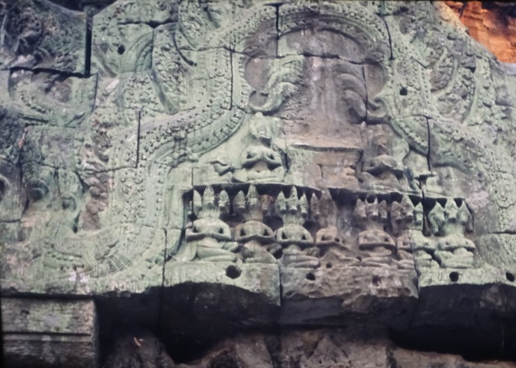
Over the years since, I have often wished I could fit in a return, a dream I never gave up until now. Yet now seems the time to take this trip, now that I have all the time in the world. It will not be as easy as re-visiting the old exhibition of Chinese paintings in Cleveland, but it will explode into a greater variety of forms.   I will start with images, projecting my slides wall-size and getting lost in carved detail lit by late evening sun.   I will track down all the subjects represented there that I didn’t bother with at the time, like the row of deities with horses’ heads sitting cross-legged on a pediment at Ta Prohm, the famous wild temple, where they sit right next to a parasitical kapok tree which has rooted itself in an open gallery it now towers over and to which it provides structural assistance, unless it is quietly taking the walls to pieces.

DSC04795 7.24 ta prohm pediment w 3-headed (horses?) squatting figs x 7

Not so easy to find out who these horse-men are.   I’m not getting far beyond the old guidebooks. I am also amazed at how few pictures there are to look at. In those pre-digital days I came back with ten rolls of film from three weeks in India, four hundred images that seemed a lot at the time.

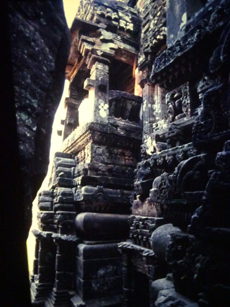
But from Cambodia, seven shots from Banteay Samre, five from Banteay Kdei, ditto for Bakong, and these were among my favourites.   Even so, I see fresh details in the heavily indented platforms at Banteay Samre which the best plans I have leave out. I need better ones and don’t know where to look.

DSC04812 8.16 bayon upper platform w railings & view down into crevice

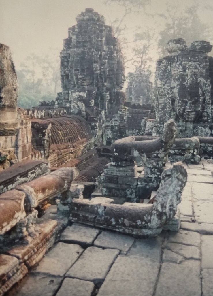
I have had the famous guide by Maurice Glaize on my computer for years, finally begin looking at it now, and discover that it’s better than the guides I used, at least for detail about archaeologists’ reconstructions of the sites.   He found Bakong a chaotic jumble and rebuilt it into the most satisfyingly rational temple of all.   I even wonder if it hasn’t become a peculiarly French dream of order.   After all, Glaize has misgivings about my favourite temple, Bayon, like two buildings inhabiting the same space, a circular plan imposed on a rectangular, which results in one strange, unenterable space after another, mysteries that intrigue me, which Glaize has to hypnotise himself to see the irrational beauty of.

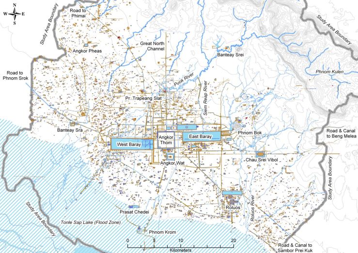
The Lidar surveys of the last decade and a half at Angkor have multiplied the number of ancient features many times. The whole territory stretching sixty kilometres from end to end is freshly crowded with ancient roads, canals, village ponds, embankments, neighbourhood temples and house groups that constitute the largest pre-industrial settlement in the world, all revealed beneath the surface by something like radar. I have long looked forward to tracing whatever of this is visible on the ground, but I still haven’t got a better plan of the discoveries than the A4 image I found online ten years ago. The whole expansion remains discontinuous from aesthetic appreciation of the sites.   One real enhancement for me in the meantime has been the addition by Helen Jessup, an art historian, of the free-standing sculptures found in or near the temples over the years, including a great Harihara from Ashram Maha Rosei (now in Paris) and a large sleeping bronze Vishnu found near a well at West Mebon, a site still reachable only by boat (now locked up for its own safety).

DSC04776 5E banteay shrei space betw 2 pediments

My recent ‘trip’ to Angkor has laboured under these various burdens. I imagine that I need digital images of the sites to study the remains properly, images I could pore over at home the way I did in the aftermath of my actual travels, including a memorable visit to Rome with students, after which I discovered Richardson’s New Topographical Dictionary of Ancient Rome which multiplied archaeological sites in the city many times, including whole new sorts of survival like ancient gardens, and which extended that trip for several weeks after most of those who had been there thought it was finished.

Weirdly enough–the great perplexity of the moment–my current trip to Cambodia was extended and confused by the Encyclopaedia of Indian Temple Architecture, which I first met in a remainder bookshop, since closed, like many others.

In those days, just before our first trip to India, this encyclopaedia suggested lots of new places to visit, very convenient to our starting point in Goa. But was Goa the chicken or the egg? Did the book dictate the landing place, or did Goa make sense of the book as a purchase that might have a real point for the travellers?

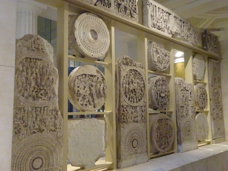
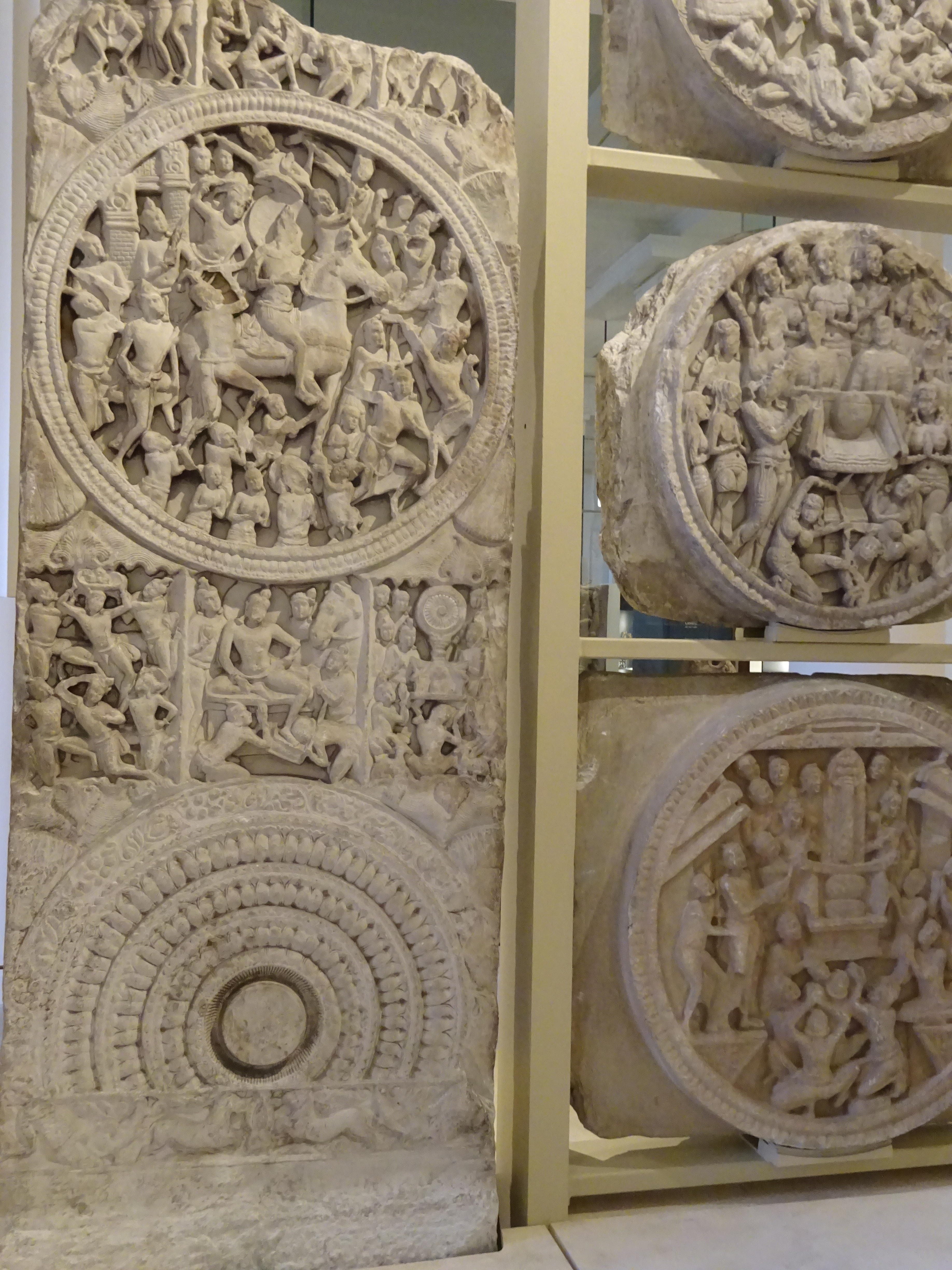
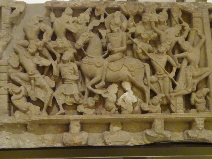
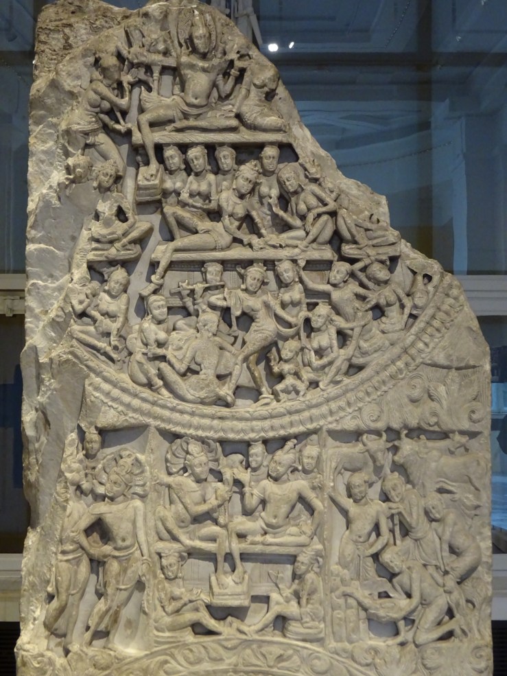
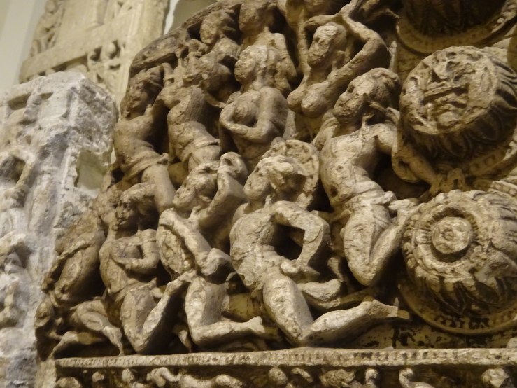
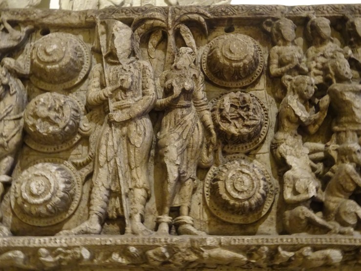
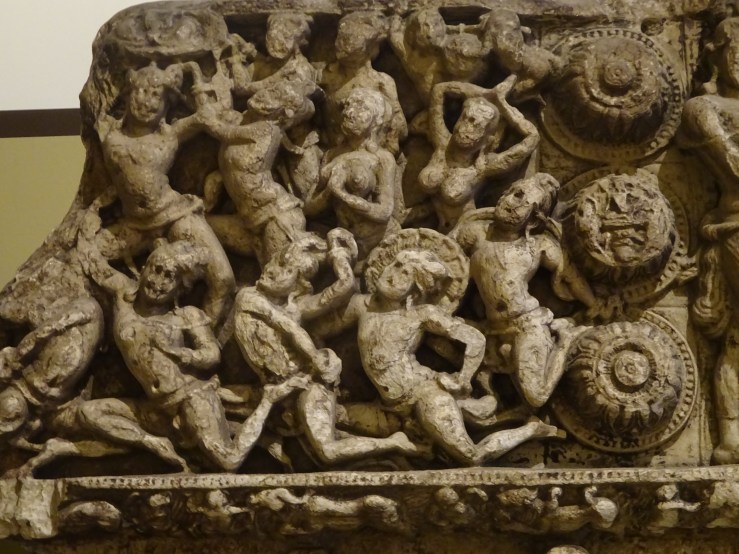
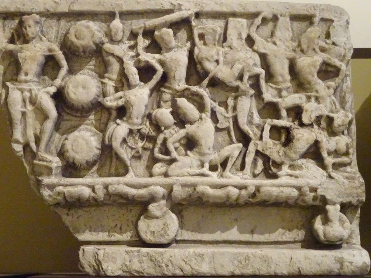
Whichever came first in the first place, in the second (the imaginary revisit to Angkor) the role of the Indian Encylopaedia has been more tortuous. I had a craving for more detailed and systematic treatment of Khmer remains, more like what you got in that two-volume set I bought on March 7, 1998 which covered South India, Upper Dravidadesa, Early Phase, which sounded specific enough, threateningly so.   I had no idea where Dravidadesa was, which didn’t sound like a place, but more like a demon.   I still don’t have a clear one, except that I know there is also a ‘Lower’ and that between them they account for all of the southern half of India. It is one of the most baffling but oddly enticing features of these volumes that you are thrown into a sea of Sanskrit terms and expected to do your own swimming.  What good is a glossary at the back of the book (which he hasn’t even found yet) to the happy reader who falls into the swamp below?

Located to the south and east of the Saciyamata hill, this west-facing Vaisnava complex stands on a broad jagati consisting of khura-kumbha, kalasa, kapotapali ornamented with candrasalas and ardhapadmas, antarapatta animated by kirttimukhas emitting effulgent foliage, a second japotali ornamented with hamsas and candrasalas, and an upper vasantapattika with acanthus-pattern showing distinct buds.  Sub-shrines survive on the northeast, southwest and southeast corners, each set above a broad plain bhitta-slab and a simple manca consisting of kumbha, kalasa and patta with acanthus.

I am still learning about my love of obscurity, where it comes from, what purposes it serves, how far it extends. It continues to puzzle me that there should be such allure in difficulty, and in feeling that you don’t understand very much about a certain human production that must have been created to communicate, perhaps not straightforwardly, perhaps not without persistent dark spots that may never go away, perhaps believing that complete clarity isn’t interesting and can’t be true.

Anyway, in the present instance it took me a long time to notice that I liked the uncertainty created by this unnecessarily complete fog of unfamiliar terms. I looked up a few Sanskrit words, and got a partial sense of what we were talking about. I drew the line at looking up more than a few. Then I forgot the meanings of the ones I had got, which weren’t always clear anyway.   Sometimes the glossary gave you only another Sanskrit word, presumably a more common one that the one you were trying to unravel. But the longer I did it, the better I liked the Sanskrit. There was a kind of intelligibility or recognisability about some of these words, a deep resemblance between this language and ones I vaguely knew.

The Encyclopaedia was split into Text and Plates. I decided it worked better to look at the images for a temple or a few temples first, and then at the text. That gave you parts, like doorways or roof structures, that you wanted to see discussed, and you could focus on those.

DSC04817 8.25 T32 view up to C tower fr crevice

At Angkor I had particularly liked temples that looked like or were mountains, because they were so ruined they seemed to be reverting to a more primitive state, or because they incorporated actual living rock, like Bayon above all, so that there really was a symbiosis between natural and architectural form, which fit right in with Khmer myths that imagined all creation emerging in an eruption from a particular mountain at the centre of the world.   I hadn’t yet made the connection between two of the Indian temples I liked best and the idea of buildings as mountains or other large natural features.

DSC04853 building becoming a rockface vs hill:eclipse

Somehow, without understanding what I was doing, I was letting my interest shift from Cambodia to India, from my inadequate sources for Angkor to the better ones I knew for India. I didn’t remember specifically at that point that Cambodian religions and architectural forms had come from India in the first place, so there was something natural and right about following the trail backward to India, like tracing the Ganges to its source in the Himalayas.

My interest in Cambodia had started in India.  Cambodia was only an offshoot, an interlude in a lecture about Indian architecture.  And that is why I ended up spending only five days in Cambodia. It represented a digression within something larger. And that also explains why I was bound at some point to retreat back to India. When it happened, the retreat irritated me no end, and I raged. ‘Why am I giving up the very trip I wanted to take most of all?’   As you will see, it was only one of a series of defeats, ceding one subject after another to my knack for forgetting what I had come for, losing sight of the initial goal and replacing it with a substitute.


The Year of Magical Thinking


DSCN2597

I think there is a book called The Year of Magical Thinking. That title catches something about the present moment. Without realising it and incapable of facing it, I am being driven crazy by two things, one old and one new, which I conflate or confuse, ‘magically’.   Neither of them will ever go away.   In one case this is the best guess of the best-informed people. In the other it’s the demonised, despairing fear of those who can’t imagine a way out.

Trump and the virus are the two components of the looming apocalypse, two diseases that have so far induced mainly paralysis in those whom we would like to count on in fending them off. I wish I could write usefully about what it’s like to live with all (or most) of your usual routes blocked. The sudden prohibition of physical movement is easier to manage than the limits on thinking imposed by nascent authoritarian governments in Britain and America. But at least we probably understand better than we used to the plights of the German and Russian populations of the 1930s.

DSCN2599

My own answer is a kind of surrender, or, more palatably, an escape inward. Normally I would turn to art. Now this must be carried on at at least one remove (I don’t think I have seen ‘at at’ in a sentence before).   So I have shut myself off in the hut we built a couple of years ago at the bottom of the garden to take the overflow of books from the house. We had long needed to get rid of these books that I couldn’t make up my mind to do without. The opportunity was finally provided by a gigantic ceonothus which, like all its tribe, threw out branches with the thickness of trunks, that it couldn’t support and allowed to sag to the ground.   So it took up more and more space, a whole sub-region of its own. Its displays of bloom became more astonishing as it ate up more of the garden; then, after a last outpouring, it died.

DSCN2530

That cleared the way for the hut, a wooden building of exotic cedar, not ceonothus-wood, but nonetheless a reincarnation of that awkward and insidious plant.   Esther imagined the hut as a windowless cupboard without enough room to sit comfortably among the stacks. She didn’t see the need for yet another study. Colin, who helped us plan it, came up with the useful principle that to make sense of the expense, the building should be as big as the space allowed, not inconspicuous.   On the drawings he called it ‘garden library’, which probably eased its passage. So here we are, three years later, and the hut has assumed a new role as another world, the only foreign destination I’m allowed since I got the letter from the hospital advising me not to leave the house for any reason.

The garden is small, sixty feet long, not counting the jungle of camellias E has made of the yard beside the extension. The hut eats into the sixty feet, but this distance has expanded since the virus and now takes longer to traverse, looking at clouds through the branches or a plant never noticed before or a bloom that wasn’t there yesterday.

The hut is ‘another place’. I guess you could do this with different rooms too. In my first flat in my first job I had a study that I seldom went into. When I wrote my dissertation in a huge rush, I did it at the kitchen table staring at a blank wall. I thought I needed something like a prison cell and never considered working at the beautiful old desk my parents had given me at thirteen to make me take study more seriously.

For its first year the hut had been an embarrassment. Now that I had this beautiful work space, I wasn’t writing anything worthwhile.   I had struggled with a book project for two years, amassing more and more material which remained stubbornly in the form of a featureless pile. Esther pushed the idea of writing smaller pieces, but I was stuck on the grandeur of big designs, a book which synthesised a great deal and emerged as one thing.

Dreadful to say, my subject was Scale, scale in buildings, in plants, in books, in everything under the sun from microscopic to galactic. I could get the size of nothing right – the first chapter wandered on for sixty-five pages and incorporated models of the solar system, Bruegel’s paintings of the Tower of Babel and Lutyens’ Liverpool Cathedral, bigger than St Peter’s but stuck at the stage of a giant model.

tumblr_lf2tuiRGP41qgpvyjo1_1280

It took me a year to accept that Esther had found the solution – a building the size of a hut rather than a cathedral, a blog rather than a book.  I think she had been leading by example with her own blog (at esthermenell.com) for a whole year before I recognised the writing on the wall and began to copy her.

So the virus should have crowned the new mode with an extra validation. The world had shrunk and miniatures were more the thing than ever. But no, from believing in the blog with a foolish faith, I had slumped back into complete disbelief. How could such tiny things matter in a global cataclysm that was sweeping all before it?   I had been defeated by questions of Scale yet again.

Jigsaws and Paintings


DSC04716.jpg

Am I fooling myself to imagine that you learn anything about a great painting by doing a jigsaw of it?   Of course that isn’t why you are doing it, an activity I rediscovered in the long winter evenings in Yorkshire but let creep into other seasons and times.   I wish I had a record of all the paintings I have done puzzles of.   They were a motley crew, many of which I wouldn’t have stopped in front of if I had ever seen them in the flesh. Doing puzzles of them isn’t like copying a painting or drawing a building, true meditations, which Ruskin used in order to know them better. But there are a few paintings I would love to have puzzles of, like Bruegel’s Tower of Babel. That one is fairly easy to find, but it would be tedious to explain here why I don’t just go out and buy them.

Then along comes the coronavirus and makes jigsaw puzzles seem a legitimate means of staying inside, so I order a couple online which include, at long last, that elusive favourite, The Tower of Babel. The others arrive promptly, but the Tower doesn’t, and it takes sleuthing to learn that the order has been cancelled. It seems I’m not the only one thinking of puzzles as a way of passing time.   Puzzles of real paintings are now going for 40 to 60 pounds, which probably explains why the one I ordered for £15 is never going to arrive.

DSC04671 copy

Two of them slipped under the wire though, one a Bruegel, perhaps the one I know least of all, a painting that the foreign-born director of the Detroit museum discovered unrecognised in a London shop? or gallery? in a year (1930) when the Great Depression had probably dealt a blow to the market.   So it’s one of those works which almost got away. When it was ‘found’ (i.e. recognised for what it was via an unlikely encounter) it got spirited to an unlikely, distant place.

What all this has to do with the painting is doubtful, but I like the thought of its return to London (in the immaterial form of a jigsaw) from which it had set off on the last stage of its journey.

Is anyone going to agree with me that there is something mysteriously attractive in this process of taking a composition apart and putting it back together, not in a studied or appropriate way but arbitrarily, by chopping it into 100s (1000 to be exact) of mechanically gnarled or irregular pieces which have nothing to do with any natural process of disintegration or decay? When canvases or wooden panels rot or suffer serious mistreatment they do not emerge as a lot of equal-sized fragments that can be joined together again by dumb persistence.

DSC04683 copy.jpg

Still, one could argue that this contrived unrecognisability produces interesting effects in spite of itself. In a sense all the new shapes produced by the mincing of the image do not exist in reality, outside the project of the puzzle, but trying to recognise them becomes an absorbing pursuit for as long as it takes to rule out all the false resemblances and recognise the true ones, those which will return you to the starting place that only a calculated perversity ever deprived you of.

The earnest puzzler never (or at least seldom) thinks he or she is the victim of a cheap trick. While the puzzlement lasts, the searcher believes in the problem and never gives up (until he does, temporarily) trying to recognise the unrecognisable, sharpening or blurring his eyes in one direction or another.

Some forms are easy to recognise, some are difficult, and some are impossible and need luck to end in the right place. For a long time I was satisfied with the quality of the reproduction of Bruegel’s painting my puzzle had employed. Then I stumbled on a detail of it in the catalogue of an exhibition it hadn’t formed part of. This was an eye-opener.

detroit illus det ctr.png

It seemed that the painting had been cleaned since the puzzle was created, revealing plenty of detail indecipherable in the puzzle. What I thought was a post with a jug nailed to it was actually a peasant taking a long drink. Smaller figures that had seemed just blobs wore interesting expressions and became distinct characters. The trees which punctuated the middle distance became teasing obstructions closing off our view of figures behind them and reminding us our vantage wasn’t as comprehensive as we thought.

detroit expressions.png

The amazing intricacy of interlocking couples was much easier to decipher. The title, Wedding Dance, had a meaning in human pattern much more gripping than we had grasped until now. At the right edge a mysterious figure replaced an impenetrable gloom. I felt I had seen him before, a supernatural intruder from a Victorian tale.   Should I just leave the mystery unsolved, which so far had nothing to do with anything else in the picture?

detroit myster fig.jpg

Now the bride and groom could be singled out, facing each other but dancing with other partners. Blank faces became expressions, women’s aprons became mountain landscapes, drawing showed beneath and through the paint over the whole surface, and the increase in incident, and in features of line and shape, was indescribable. I found myself poring over the newly penetrated surface over and over again.

Screen Shot 2020-04-07 at 16.16.09.png

I’ve forgotten to say that after finding the detail in a book I went to the website of the Detroit museum and was rewarded with a hi-res image that opened up all this further wealth, where the paint is mostly much paler and more transparent so you feel you are looking deep into the painting, and getting closer to the moments when Bruegel was adding paint to his drawing without obscuring it.

bruegel1_copy

In the end I credit the puzzle for its way of slowing me down and making the forms so familiar that I knew them inside out, at which point I had the luck to find there was more still in the re-united image, cleansed, clarified and revealing a whole other reality below the old surface, like seeing the sea bottom beneath an intervening depth of sea-water.

Chinese poet-painters self-isolating


265 1954.263 hua yen conversation in autumn d 1732.jpg

I was sending three Chinese paintings I had been absorbed by to a friend but thought I needed to append some text to give any idea of why I found them so exciting, so was going to photograph the three catalogue entries that told the stories of these three scholar hermits, self-isolating among streams and mountains or drinking themselves into cheerfulness in their orchid pavilions, a cumbersome plan.   And then I thought of a wonderfully simple idea for a blog when I couldn’t write one. I could just post the three pictures with the artists’ names, and anyone who wanted to could look them up on the website of the Cleveland Museum of Art where they would find high res images of each to download and ponder.

Then the idea collapsed. We really need those texts which I could point you to in Eight Dynasties of Chinese Painting, the giant catalogue of 1981 which sits there in my scholar’s hut reminding me of my foolhardy ‘travels among streams and mountains’ in that distant year, with its images all in grey and white that I can wake up again through the ‘miracle of technology’ (not so miraculous any more), and the lengthy text attached to each of them that I didn’t stop to read in 1981, but which now bring before me the fanatical absorption of those long-ago devotees of the wild brush strokes of these three practitioners of Chinese Baroque (as we call it now), but my main link with those paintings has become something very obscure with the passage of the extra years and the closure of all the libraries in the last few days, and that makes my simple project unworkable.

236 1955.36 chu ta landscape after kuo chung-shu 17c ch'ing.jpg

265 1954.263 hua yen conversation in autumn d 1732.jpg

268 1976.112 li shan five pine trees d 1747 copy.jpg

These three paintings are special in their deliberate clumsiness, in not joining up smoothly their different parts, in cultivating scratchiness to signal uncertainty but also haste which comes over as passion, a kind of excitement which is frustratingly careless about whether it conveys itself to the viewer.

The painter of the pines was asked to paint five different trees. I think they started with plenty of space between them but he decided to crowd them together until they became hard to distinguish. On top of that, he filled up the empty spaces with five poems. I don’t know what these poems say or even what their subjects are. At first I was annoyed with the catalogue for leaving out translations but came to feel that this incredibly irregular writing is more beautiful than if I could read the individual words.   The writing is poetry in itself, more intricate and sophisticated than the painting, of which it is a magical contrasting twin.

li shan five pine trees.png

The mynah birds are another work by the painter of the first landscape, birds I thought I had to include to help you believe that that landscape is a radical work that you will only appreciate by looking long and hard at the high-res form of.

Chu Ta (or Zhu Da as he is also spelled in roman) has lit up the time of my isolation and turned hours into instants.

237B 67-4-2_ZhuDa-MynahBirdsAndRocks_front.png


236 (its number in the catalogue of the exhibition)  Chu Ta, Landscape after Kuo Chung-shu

265  Hua Yen, Conversation in Autumn

268  Li Shan, Five Pine Trees     The detail from this painting is meant to fill the screen, but I don’t know how to achieve this effect in the blog.

237B  Chu Ta,  Mynah Birds and Rocks

237B 1953.247 chu ta fish and rocks


I need to make this larger by putting it on its side, with the bottom of the image on the left.

237B 1953.247 chu ta fish and rocks.jpg


Buddhist sculpture from Amaravati in the British Museum


K77 00708.jpg

Like many of the most thrilling human products the Buddhist stupa at Amaravati is something of a puzzle. It is one of the greatest Indian architectural works, but it has been thoroughly dismembered and partially destroyed. Now it seems a building made almost entirely of sculpture, but this must always have been the case to a degree. It was one of the largest structures in India, half-again the size of the more famous Sanchi, and indescribably richer.

In its heyday it was a curious paradox, a circular construction 192 feet in diameter with lavish gates and high walls concealing the dome-like central mass, which appeared to be half sunk in the earth, and thus even huger than one could immediately perceive. But there was no way in, and no enterable interior space. It was a big container for a small body of precious material, physical relics of the Buddha or his saints, a tooth, a bone, a piece of clothing.

The stupa at Amaravati took centuries to build, from the first century BCE until the third after, and many centuries to forget its existence, including its whereabouts, so that it could be stumbled on by a local ruler in search of building materials in the late 18c. Within eighty years the site had become unrecognisable again, and the best carved remnants had been divided between the British Museum in London and the Government Museum in Chennai/Madras, with a scattering further afield.

1  4.6.18  146 images DSC amaravati view fr hall c 00828.jpg

About 120 of the best fragments of the wrecked monument came to London c 1860 and languished for twenty years, suffering further in an unsympathetic climate in a polluted city, until they found a home in the British Museum. It wasn’t until 112 years after that that they were provided with the clean, dry air of their present large glass box.

I reckon that now we are seeing about half the pieces of limestone which the Museum has, which were known in the early days as the Elliot Marbles, after one of the officials who helped preserve them from the neglect and interference that dogged them after their un-burial, called that in hopes that some of the Elgin Marbles’ prestige would rub off on these non-Greek non-marbles.

external wall inner surface reconstruc best view DSC02782.jpg

It’s well nigh impossible to calculate how much of the original wealth survives.   The outer railing just over 600 feet long was ten feet high and two feet thick, coated inside and out with carving from top to bottom.

DSC02790.jpg

In the early stages both the uprights and the crossbars between them were filled with giant stylised lotus blooms carved with concentric rings of identical petals. Even these chaste designs underwent an evolution from incised flatness to richly shadowed depth. By the second century the inner and outer faces of the railings had begun to be treated differently, the outer to be embellished with grotesque dwarves in the triangular crevices between the circles of the lotus blooms and the straight sides of the posts, while on the inner faces the central circular forms were taken over by scenes teeming with carved figures.

There must be missing stages between the concentric lotus and the riot of activity in the scenes as we have them, whose carvers are full of ideas about what to do when fitting stories into circular spaces.   It is such an exciting development, filling all those round surfaces with dozens of figures packed in and busy at this or that.   At first it feels like an overload, hard to take in quickly as one passes.

K11  great depart complete, K24 sliver, K26, K28 DSC02762.jpg

There’s a wonderful density in the British Museum display, a concentrated taste of an experience which went on for much longer in the inner passage at Amaravati, one crowded disc after another, for the cross-rails are just the right length to fit in a roundel, giving you roundels on the posts separated by roundels on the bridges between them, resulting in a continuous chain of roundels.   The crowded room at the British Museum starts with an extensive mock-up (seven units long) of the high exterior wall, the outer edge of the monument, behind which lay the narrow corridor via which you would circle the great dome in clockwise direction. But in London the corridor is hard to imagine, and for obvious reasons even the mock-up of its outer boundary isn’t curved.

Behind or inside it lies another mock-up, a replica of the other boundary of the crucial corridor, a second wall about as long as the first, of the base of the drum of the dome, made of big stone panels each of which has its own stupa in miniature carved in such deep relief that they seem to stand full-bodied forth. On top of this row of miniature stupas, four feet tall but still miniature in the larger context, lies another of the greatest treasures of the monument, a row of foot-high friezes full of carved life which would have run as far as you could see, until it curved out of sight around the corner.

gen stupa slabs 00755.jpg

Mounted high on the wall above are pieces of the big decorative borders that ran along the curve of the dome as it climbed and disappeared toward the apex. Like the other elements, these borders are presented flat not curved, and so, some of the life has gone out of them. But you get the idea.

On the way to the reconstruction of the passageway you’ve already been distracted by compelling displays of marvelous reliefs from earlier periods which don’t fit into the diagram of the building’s parts in logical sequence.

K100-104 DSC02736.jpg

If you enter at the left-hand end, right in front of you is a patchwork of four of these pieces from an earlier phase, in a simpler mode than the intricate richness that prevails in most of the surviving carving.  The spirit of most of the other carving is so un-classical, so un-pared down, in some way so reckless. By contrast, the spirit of these early panels, in spite of voluptuous nudity and mysterious incident, is calm and collected, planted firmly on the earth and striving always for essential qualities.

K100 king, 103 depart DSC02737.jpg

Some writers find Greek and Roman echoes in these panels, but these four reliefs are classical in a broader sense, in being big-boned and bare in parts, but keeping a few hints of intricacy in their subsidiary place, like the skirts and nets swirling round the legs of the Universal King and his company. Here is a convincing idea of kingship, expressed in attitude, not action, in a ruling symmetry that leaves room for deviations in detail. Every being and appliance has its space, free of interference, respecting the integrity of the parts. Symmetry can seem mechanical, but this is a world pervaded by an uncanny rightness.  Yet it is a place that leaves room for mystery or enigma.

K57 gt depart DSC02729.jpg

Versions are legion of the Great Departure, when the prince who will become the Buddha leaves home on a sudden impulse, setting off in the middle of the night to roam the world seeking the truth. The story comes equipped with many charming details: his servants – often represented as plump dwarfs – muffle the horse’s feet, one dwarf per hoof, so as not to wake the city’s sleepers. Sometimes he is accompanied by crowds of excited acolytes who would presumably cancel out the quiet of the muffling.

K103 riderless gt departure DSC02303.jpg

Not in our version here, which leaves out all that, and the primary element as well. Here the horse is riderless and must stand in for the prince, for we are still in that time where a spiritual shyness prevents us from seeing the Buddha even in the phase before he has assumed his mature identity. Not just the riderless horse, but the umbrella with no one to shelter under it, expresses the Buddha’s way of not being there too. It is pure accident but appropriate that two flying attendants are now present only in a detached arm and a stranded hand.   We know what the missing figures would look like because more garrulous versions survive and fill in the gaps. So the flying hand, instead of a blemish, can become a mystic sign.

In the same vein, we know what lay above the Chakravartin or Universal King, who is another stand-in for the Buddha in the times when he couldn’t be seen. Above the King’s umbrella, which escapes the scene’s frame, are two tiny animals, one trying to sleep, the other sitting upright. They aren’t palace pets but deer, who are code for the forest in which Buddha gives his first sermon. We don’t need to know more. Buddha wouldn’t be there in the scene above, only his empty throne which fills the space between the deer like a big solid block. It’s a scene we have already imagined, stirred into thought by a discreet sign.

K60 tree & throne DSC02361.jpg

There’s a kind of safety in focusing on these single scenes, especially those of the calm earlier periods. But the essence of Amaravati is the exuberant carving of later pillars which are alive to an almost alarming degree, on which the lotus blooms have been thoroughly eaten away by a filigree of figures and scenes, which are themselves surrounded by further scenes, which look as though they are clamouring to get in, spreading hungrily onto more of the remaining surface as time goes on.

K14 inner det top 00745.jpg

Trying to imagine the progression from those chaste lotus foci to the uproar of the later scenes with their surprising depths of carving, all at a scale heading toward miniature, you might hypothesise something like the example below (a crucial piece which isn’t displayed) that I came upon in Robert Knox’s invaluable catalogue of 1992, when I was far enough into the subject to recognise it instantly as the missing piece in the long progression from austerity to abundance. The scenes it shows are formulaic and repetitive – the Elevation of the Bodhisattva’s Headdress above and the Adoration of His Begging Bowl below.

K5 both faces fr knox  DSC02803.jpg

The revolution doesn’t come in these staid motifs but in the outrages against the very idea of a pillar, embodied in the gouging away of a considerable depth of stone to make little shadow-boxes or rooms for these events to take place in. The spaces are small but the energy is frenetic, and show every participant carried away by enthusiasm. The pillars are on the way to becoming scenes of passion instead of dumb, well-behaved posts.

K12 inner roundel 00729.jpg

We could follow a gradual process of encroachment on the stone, leading to the final destination in the ruined pillar which confronts the Buddha with the wife and son he ran away from, who accost him on his triumphal return to his birthplace, a moment of contradiction in spite of the crowds of devotees, a moment which includes two delightful lapses into the everyday at the bottom of the circle, toy animals on wheels that belong to the child, who happen to be the very same noble animals that accompany kings in Buddhist legend, the elephant and the horse.

The most sophisticated developments in filling round forms with narrative come in the crosspieces between posts, a stage of embellishment which occurs later in the sequence.

K25 00730.jpg

One of the boldest solutions to the conundrum of the unanchored space is fractured vertically, as if the building where it happens had split in two, leaving teetering fragments, leaning toward a gap, almost an abyss, and hanging overhead like a threat. The two main foci, a standing man and a lounging woman, are both oblivious, undressed and self-absorbed. The man looks like a Renaissance courtier, the woman like a classical goddess, stretching languorously on a chair-bed of wondrous complexity.

The circle is divided confidently into unequal halves, the larger half, crowded, the smaller one spaced out, with room for a fish pond, vertical like a miniature cliff-face, in the foreground. There is architecture galore at the back – where is all this space conjured from? — and there are unheard-of depths in the crevasse between man’s world and woman’s.

The long friezes on top of the walls of the inner corridor give us narratives in a very different mode from the roundels, as if unrolling events from a spool rather than impacting them in a tangle, a tangle which makes everything present at once, though often with multiple centres and their own ways of doubling back.

Unrolling sounds simpler, but the friezes facing each other on opposite sides of the corridor are not always moving in the same direction, or even moving forward at all, as if this long thin thread of narrative didn’t hold these sculptors’ interest for long, or it may be that relentless forward movement doesn’t agree so well with contemplation? In any case, the best long reliefs seem prone to dropping the thread.

K55 DSC02676.jpg

It’s hard not to be influenced by the damage old carved stones have undergone. You may even find yourself brooding on the suffering of the old artifacts, which are not, of course, sensitive beings. But it matters greatly to me that one of these pieces has a different, more ruined colour and texture from all the others, which seemed to mark it as inferior but before long came to seem a badge of honour. Later I learned that this stone had got separated from the others after arriving in London, and ended in a barber’s yard in Great Montague Street near the museum, so that a curator heard of it while having his hair cut and then arranged its purchase.

K55 DSC02682.jpg

This bit of frieze seems the richest of all in its subject matter, which separates large and complicated scenes with exotic couples, one under an extraordinary palm tree, their faces now cruelly erased, but preserving the beguiling Robinson-Crusoe-flavour of something from an entirely different clime.

K55 frieze palm tree couple DSC02341.jpg

Then there are the bulging lotus bosses, an extremely tactile form of punctuation marking parts, with the tiniest, most obscure scenes in the central bulges of the rows of three. These seem almost a taunt by the sculptor, who boils down the idea of the roundel so frequent at Amaravati, to indecipherable smallness. These figured bosses have driven one critic to claim that these little kernels contain the secret of the whole relief, even arguing that the knob which shows a flying horse is the Great Departure, and thereby trumps the most moving of the large scenes, Siddhartha sending back his horse and groom, who are both heartbroken at this new sacrifice (see first frieze segment).

K55 L end frieze flying figs DSC02335.jpg

The crowning challenge of the piece is that it lacks its other half, now housed in the Government Museum at Chennai. Placing the two of them together, you find that the central scene is that old standby the Elevation of the Turban, now split between the two places, of which we have almost exactly half the gladness in London, expressed in rows of ecstatic figures swimming or flying through the ether in syncopated tiers.

I think we might be disappointed in the result if we were to link the two halves of this relief. The jagged edges match, yet the hard-bought ruin and mysterious depths of the London piece would have to put up with the dull smoothness of its mate in Chennai and with its bland emptiness instead of the jammed excitement of our figures standing on ground made wobbly by the creatures moving to a contrary current under their feet.

K59 battle v ruined DSC02334.jpg

Next to the London half of the Turban frieze is presently mounted an even more fragmentary and ruined subject, with unknown gods and rulers threatening each other, raising heavy weapons overhead or striking dance postures in the midst of conflict, their limbs reduced to spidery thinness which lets us peer even further into the depths that open beneath features that have become almost abstract since their decay made it impossible to be sure what they represent. The traveler down this corridor would always have got plenty of raking views. In that perspective the most timeworn relics of Amaravati sometimes seem the most satisfactory, all their complexity reduced to a final uncertainty.

K59 DSC02684.jpg


Cy Twombly–‘white paint is my marble’


82 untitled bassano in teverina 1985 wood  plaster nails red pigment white paint 13 x 18 1:4 x 23 3:4 traces of poem (cf w analysis of the rose series of ptgs).jpg

Sometimes I wonder if these works of Twombly’s are really there at all. Maybe I am in similar doubt about some of my favourite poems.   One day I would like to give a kind of police report on Wallace Stevens’ ‘Notes Towards a Supreme Fiction’. At first, I could make almost nothing of it, then I thought it was the most marvellous thing, then I just didn’t get it all over again.

Twombly’s sculptures share something with this troublesome poem. At least Stevens’ poems all have titles. Twombly’s sculptures mostly don’t. All those missing titles are like unwritten poems, which have been allowed to escape unrecorded. And in some way, that is that, a condition there’s no cure for.  Ones that do have titles have inspired some of the most wonderful interpretations ever.  This artist’s so-called sculptures seem to attract philosophers as vinegar does fruit flies. You can’t see why they would, but there’s no denying that they do.

Giorgio Agamben, a formidable Italian thinker, who appeared in Pasolini’s Gospel film (as the disciple Philip) and whom I revere because he discovered two manuscripts of Walter Benjamin’s missing since 1940, produced one of the most beautiful and far-fetched pieces of interpretation that I know, inspired by a particularly messy Twombly which, in lieu of a title, has a few lines of Rilke attached, which are artlessly (ha!) scribbled on a little piece of cardboard at the base of a plaster mound that holds two sticks, one standing straight, the other leaning against it, the two crudely wired together after an earlier accident.

71 untitled wood wire plaster cardboard white paint graphite 1984.jpg

Rilke speaks of happiness sought by laborious ascent or happiness falling unexpectedly.   Agamben makes the two sticks an acting-out of these two motions, and sees in the two of them a picture of the difference between poetry and prose, poetry which can (and even must) always turn back, and prose which carries on. He makes the two sticks carriers of momentous meanings, which you can never un-see after you’ve followed his thoroughly poetic exposition.

15:18 untitled (funerary box for a lime green python) new york 1954 wood palm leaves twine house paint cloth 55 x 26 1:4 x 5.jpg

My other example is the sculpture called Untitled (Funerary box for a lime-green python) which consists of two palm leaves raised on slender sticks which spring from a narrow wooden box not really big enough to hold a large snake. Like Joyce giving Homeric titles to the chapters of Ulysses and then taking them away, Twombly unwished his whimsical title for this work that momentarily connected it with Egypt and animal gods. The Harvard philosopher Arthur Danto made the most serpentine game out of applying and taking away the name to and from the object.

How could I have allowed the critics to usurp the space before the works themselves have spoken?   In a real sense the untitled sculptures are the essential core of Twombly’s work as a sculptor who takes cast-off flotsam from the ordinary world and works magical transformations on them, turning them into something else entirely, without losing any fraction of their embarrassing crudity and imperfection. ‘White paint is my marble’ doesn’t mean as you might suppose that Twombly really sees himself as a rival of the Greeks. As often as not, he doesn’t even hide the underlying textures of his scrap of wood, now accorded a new importance without being allowed to leave its dismal past behind.

11:3 untitled new york 1980:1989 bronze white oil based paint edition of 8.jpgIn a twist that surprises us, Twombly allows a few casts in bronze or resin of some of the most memorable sculptures. The best thing about this is that the bronzes often look more battered or ruined than the original.

10 untitled new york 1953 wood wire twine nails house paint wax on fabric.jpg

The contrast between the wooden pan-pipes and the bronze ones is a clear case of these confusions.   The nails and bits of string sticking out in this sculpture, which are so hard to account for and so unmanageably alive, completely destroy the decorum that is such an important element of this most classical subject, and constitute another subversion of every unambiguous meaning. One of my favourite features of these endlessly baffling works is this final lack of resolution. You could, if you had the energy, go on puzzling at them for ever.

DSC03507 v2:8 batrachomyomachia 1998 wood acrylic paper ink pencil staples.jpg

Why are the actors in the Batrachomycomachia (Battle between the frogs and mice)–an absurd parody of epic which possesses the patina of being taken as a work of Homer’s for so many centuries–why are these low creatures represented by a box of kindling, stacked in ramshackle fashion (like all the battlefields we have known), that rises from its container as if from the lake where it took place, now drenched in the colour of raspberry yoghurt?

140:29 twombly vulci chronicle gaeta 1995 wood white paint 10 x 24 x 12 knuckle bones in wooden block.jpg

Why are their nearest relative in Twombly’s work, the Vulci Chronicle, so abject, sparse like the records of that distant time, only a few vertebrae which stand for (and are, now) whole beings, who formerly stalked the earth spreading terror?

I could never have dreamed up Danto’s wonderful interpretation of another palm-leaf sculpture, but having come across it, I can not now un-think it. Cycnus (whose name means swan) was a hero, sufficiently obscure, who attracted the attention of a great hero (his name forgotten) who failed to reckon with Cycnus’ mother’s powers, who could extract him from his armour like the butterfly from its brittle shell and let him fly away, so the hero finds only the empty husk.  Danto discovers perfect sense in the leaf as the bird and the block of wood as the earthbound prison of the armour.

35:1 cycnus rome 1978 wood palm leaf whte paint 15 7:8 x 9 1:2 x 2 1:8.jpg

In some sense it makes all the difference that Twombly himself became the man who wasn’t there, who left America so early for Rome, the old, universal seat of memory.   All of the sculptures are as much about not being able to remember essential elements as about successful recovery.   There is a whole series of Thickets which show one twig-like tree instead of a tangle, sometimes hung with forlorn tags listing the names of eight Sumerian cities, which survive now in very little but their names.   These thickets are missing most of their elements but have nonetheless been linked with the ram in the thicket which saves Abraham from sacrificing Isaac. I don’t know who first connected this ram and this thicket with the ‘famous Billy Goat of Ur’ (as Panofsky calls him), a deity or a sacrifice (according to your taste) now in the British Museum.   Scholars tell each other these are not the same animal or the same function, but Twombly piles up meanings rather than keeping them apart.   His most austere version of the thicket theme looks like a scaffold and is only a thicket by virtue of two plastic flowers raised four feet in the air through a grotesque inflation, but the evocative title remains all-important.  In some sense it’s all we’ve got.

61 thicket formia-rome 1981 wood plastic flowers nails wire white paint 48 1:4 x 11 3:8 x 16 1:2.jpg

One of the most moving recent realisations of a Theatre of Memory in Rome, William Kentridge’s Triumphs and Laments, creates a whole series of historical ikons by blowing up small ink drawings to monumental scale while keeping their calligraphic nonchalance, a magical preservation which wouldn’t last, for they were painted on the Tiber walls with washable pigments designed to fade.

34 ptg twombly untitled [say goodbye catullus to the shores of asia minor]1994 room w huge mural menil houston.jpg

Twombly’s largest painting, fifty-two feet long, now displayed in a barn in Houston made specially to contain it, is called Say Goodbye, Catullus, to the shores of Asia Minor (several previous titles, like memories that fail, were combusted on the bonfire of this one). I have come to wonder if Twombly’s sculpture isn’t an extended meditation on remembering and forgetting. He is said to have spent the nights reading and the days in the studio. The work brims over with references to Rilke, Seferis, Archilochus and Cavafy but no Stevens, Hopkins, Eliot.   Verses from more exotic languages are always transcribed in English. The biggest and most perplexing work in the exhibition at Gagosian, Grosvenor Hill, that got me looking at Twombly in the first place, was called A Time to Remain and a Time to Go Away, a bare-bones description of memory or of a relation to history.

DSC03484.jpg
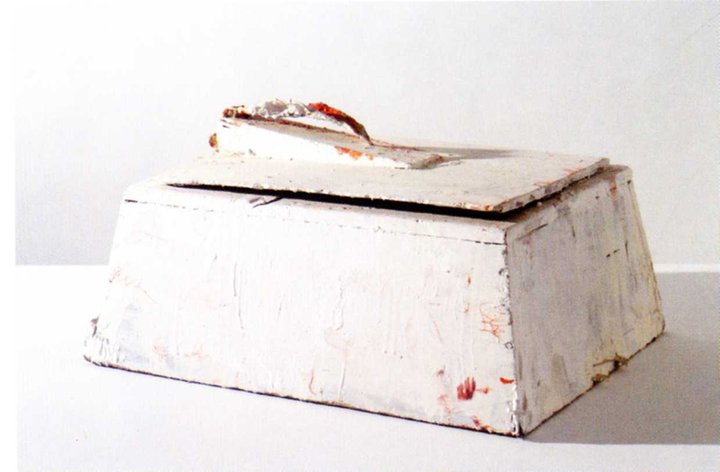
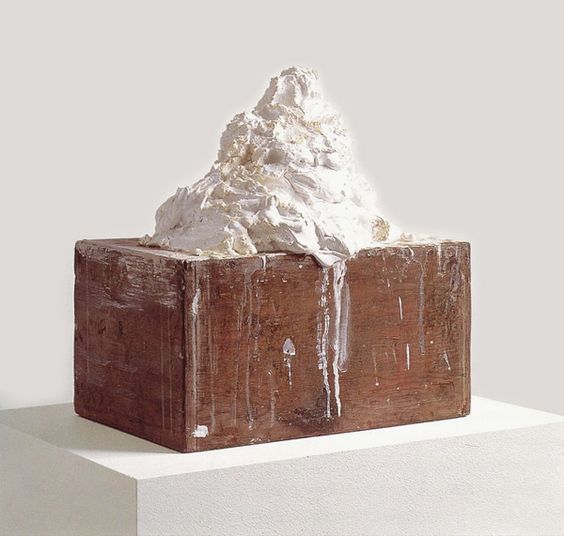
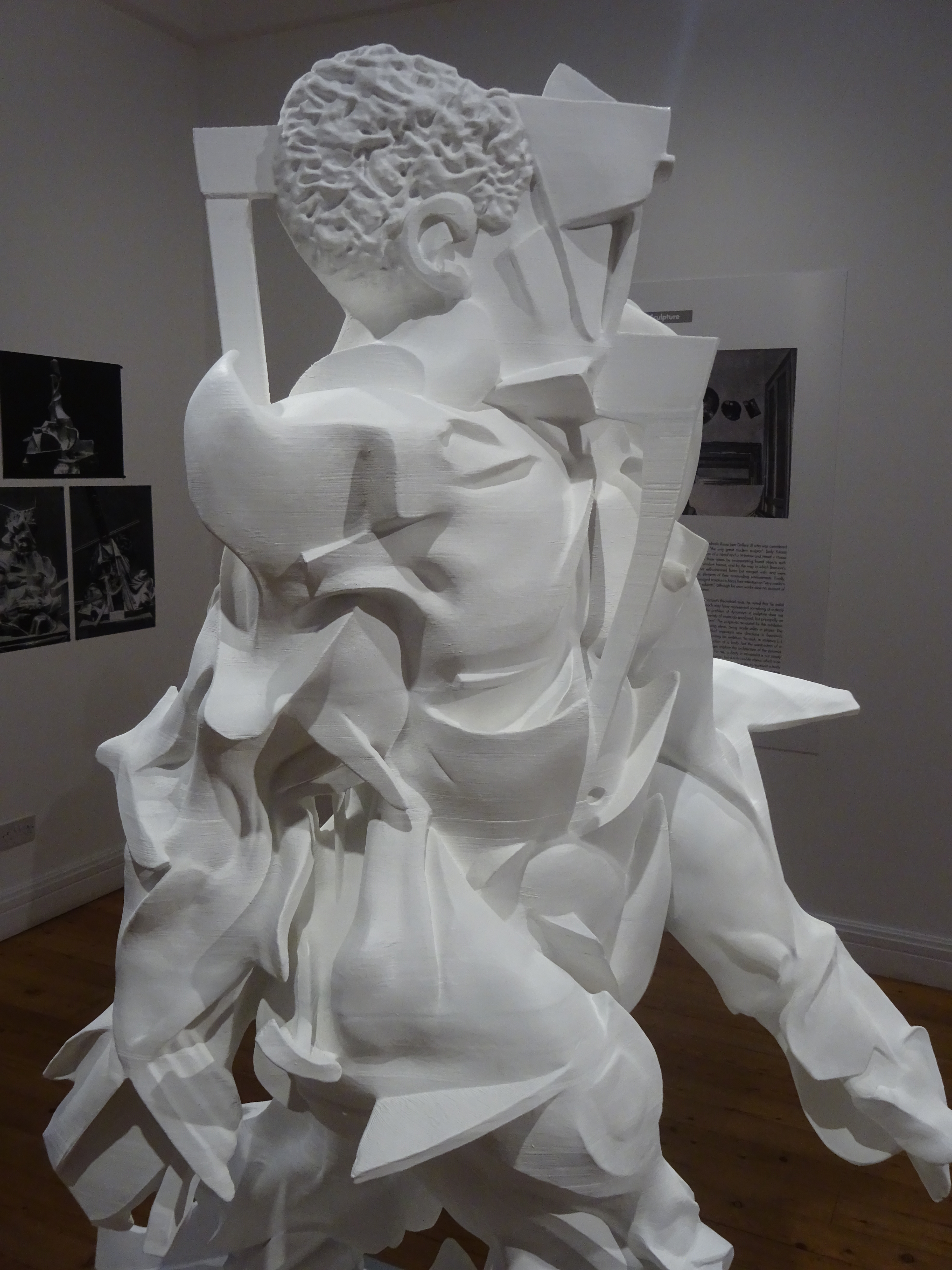
The work consists of another steep ascent and precipitous fall. A slender frame contains an exuberantly molten platform-mound of plaster heaving with life, but the overall impression is something like a guillotine waiting to descend. The childish quality of Twombly’s inscribings makes me think of a-semic writing, writing that looks like words but isn’t, a mode with which Twombly filled whole canvases in certain phases of his career.

DSC03481.jpg

Not in a literal sense, for he was immensely productive, he is the sculptor of figures missing, voyages cancelled, and settings abandoned by their inhabitants. Alongside the tombs, thickets, and scaffolds is a more mysterious subject to which I am drawn, the lump of plaster of geological character deposited on a cultural form like a brick or a box. What does it mean? Another memorial? Can it be thought, reason, art crushed dwarfed snuffed out by some mindless force?   Why would any viewer particularly like contemplating that? It is history as the energy that takes things away and hides them from view.

117:14 untitled jupiter island 1992 wood plaster 19 x 13 1:4 x 17 1:2.jpg


‘White paint is my marble.’ At once dumb and magical. It is impossible to believe in this substitution, metamorphosis, overturning. Yet you want it to be true–the imagination lives in and for such fictions.

Boccioni’s Lost Sculptures Reborn


6 DSC03083 2 speeding 3 synthesis copy.jpg

The Italian Futurists set themselves one of the most impossible goals in sculpture—to capture movement itself, not just a moving body but the idea of movement transcending any actual movement. In painting this sometimes came out in stuttering images like time-lapse photography, so the moving body appeared in multiple images minutely separate from each other, more a conception than a depiction of motion, not Boccioni’s way, whose cyclist or footballer interpenetrated his surroundings via atmospheric planes until the very idea of distinct entities was called in question.

Baroque sculptors like Bernini had approached the problem through the sculptural group—Apollo chasing Daphne, who turns into a laurel tree before our eyes, a half-completed process in the resulting sculpture, which showed a set of intermediate stages all at once, a feat which required detailed inspection to appreciate the full complexity of the ‘movement’.

The-Ecstasy-of-St-Teresa1.jpg

Or in Bernini’s astonishing later work, the Ecstasy of Saint Teresa, a combination of a violent frozen motion (the angel’s), and the liquefaction of a human body expressed as a lengthy tremor in her clothes (the saint’s), a piece of virtuoso carving which represents a spiritual orgasm as a rippling motion that one can hardly believe the sculptor has been able to render in stone, which doesn’t actually move.

This famous ecstasy perhaps comes nearest in earlier centuries to what Boccioni was trying to do in the series of striding figures who culminated in Unique Forms of Continuity in Space, an unwieldy title expressing the high metaphysical ambitions of this exorbitant work.

1 'Unique_Forms_of_Continuity_in_Space',_1913_bronze_by_Umberto_Boccioni.jpg

In its bronze form (actually coppered brass in the two earliest cases), varnished deep brown or polished to a golden sheen, this is Boccioni’s best-known work and probably the most powerful thing any Futurist ever did. As far as most of us knew, Unique Forms of Continuity stood there in lonely eminence, a single outrageous extravagance Boccioni never tried to repeat.

A recent exhibition at the Estorick collection in North London restored the missing context of this well-known work in the most vivid way. It has long been known to students of Boccioni that at his premature death the sculptor left behind a studio full of large plaster sculptures which led up to or grouped themselves around Unique Forms.

Soon after his death his family moved from Milan to Verona and entrusted Boccioni’s unwieldy sculptures to Piero da Verona, apparently a friend, but not an artist who appreciated Boccioni’s work (Marinetti calls him an ‘envious passéist’). He kept them for 12 years, but then consigned them to the local dump where they were immediately broken up.*

2 unique forms plaster.jpg

After learning of this, Marinetti let out horrified laments, bought the surviving plaster of Unique Forms in 1928 and commissioned the first bronze casts in 1931. Until now, that was that. About ten years ago, so I was told, the digital artists Matt Smith and Anders Raden got the idea of using surviving photos of the vanished works to reconstruct them. The useful pamphlet which accompanied the exhibition leaves out the genesis of the project in detail—who thought of it, how they gathered support and how the work proceeded. There are a few glimpses—apparently, important photos were discovered late in the process, but we don’t know which, or why they were important.

8 DSC03082 series of three copy.jpg

Four sculptures were reconstructed, three large striding figures and a fascinating ‘portrait’, smaller and more self contained, which looks as if it’s based on Boccioni’s drawings and prints with his mother as subject. There are three other important missing sculptures and we can only guess why further reconstructions weren’t undertaken, a lamentably ungrateful response to one of the most imaginative applications of new technology to understanding works of art.

For this ingenious project, in some ways more like a geekish prank than solemn academic research, fills me with wonder, and I want to know more about it than the current publication allows. It’s no accident that none of the sculptures were cast in bronze or any other durable substance in Boccioni’s lifetime, and thus remained easy prey to destruction. In the Technical Manifesto of Futurist Sculpture Boccioni expresses strong aversion to both marble and bronze, which belong to the static sculpture of the past. In the Manifesto he lists his preferred materials (glass, wood, cardboard, iron. plaster, horsehair, leather, cloth, mirror, electric lights, etc) and mocks the idea that plastic works should consist of a single material.

3 DSC03127 copy.jpg

I think I can guess why Smith and Raden didn’t tangle with Head + House + Light or Fusion of a Head and a Window, both from 1911, which exhibit more unruly combinations of more diverse materials, like braided human hair to represent human hair and forests of wooden slats for the decomposing window frame.

The wilder assemblage of assorted materials seems a literalism Boccioni was leaving behind, but there are still inescapable paradoxes in reproducing his works in a single material. Old photos show that the jutting elements of Synthesis of Human Dynamism were carried out in painted wood with the nail-heads exposed not concealed.

13 DSC03109 synthesis human dynamism copy.jpg

Synthesis is regarded by Smith and Raden as the earliest of the works they have reconstructed, furthest from Unique Forms, treated throughout as the goal to which the process of creation uniting the four striders always unconsciously strove, a teleology I tried to resist, wanting to find virtues in the ‘earlier’ ones which Unique Forms had to sacrifice in pursuit of its more philosophically pure notion of dynamism. In the end I relented, and admitted that the series made more sense as a single progress than as four paths to different goals.

DSC04746 copy.jpeg

The results of the experiment, four three-dimensional digital models, are a modern equivalent of the plaster casts of the nineteenth century, which reproduce a work of art with uncanny accuracy in a different, preferably very different, place from its actual location. In the present case they replace not stone, but plaster, with… not plaster but a kind of ghostly, metaphysical plaster, ‘cast’ from the ‘originals’, which are photographs, taken from random angles and distances by a ragbag of photographers, whose own idiosyncrasies we (or the digital artists) must work out and try to take account of.

After dedicated efforts to get sizes and proportions right, all the data are converted by 3D printing into a kind of neoclassical perfection, or what Boccioni’s sculptures would have looked like if they were fabricated in the marble he despised. It turns out that the hardest things to reproduce in milled foam or neutral, anonymous laminate are the imperfections of the plaster, the scuffs and smudges left by the life of the studio, the gouges and tiny craters left by the sculptor’s tool or the space created by the falling-out of a minute pebble.

21 DSC03194 synthesis 'left arm' copy.jpg

Apparently Boccioni wasn’t above adding or deepening shadows on the plaster with grey paint. Once or twice in the old photos we catch him at it. In the Manifesto he explains how to make edges fade to infinity or forms pass through each other by such means, not major principles of his practice like centrifugal organisation, spiral rather than pyramidal form, or the abolition of the special value of the profile. Still, the grey paint played its part in the great Bergsonian drama and was sometimes the safest way to make sure a certain element appeared to move in two directions at once.

11 DSC03073 copy.jpg

The largest, earliest and gawkiest of the striding figures, Synthesis of Human Dynamism stands out among the four for lack of smooth synthesis, one of Boccioni’s watchwords, as opposed to the heartless analysis of traditional sculpture.   He is scathing about the conventional nude as a subject, the body stripped bare, which he intends to replace with atmospheric planes that connect and intersect, rendering the mysterious sympathies and affinities that create reciprocal influences between bodies. In this early stage there is a bulky muscular figure trapped in a geometric armature from which the bodily elements struggle to emerge. You keep recognising various components but don’t understand the logic that fuses them together or splits them apart.   The number of parts is overwhelming, and whatever Boccioni says, it feels just as disunified as analytical cubism at its most fractured.

12 DSC03074 copy.jpg
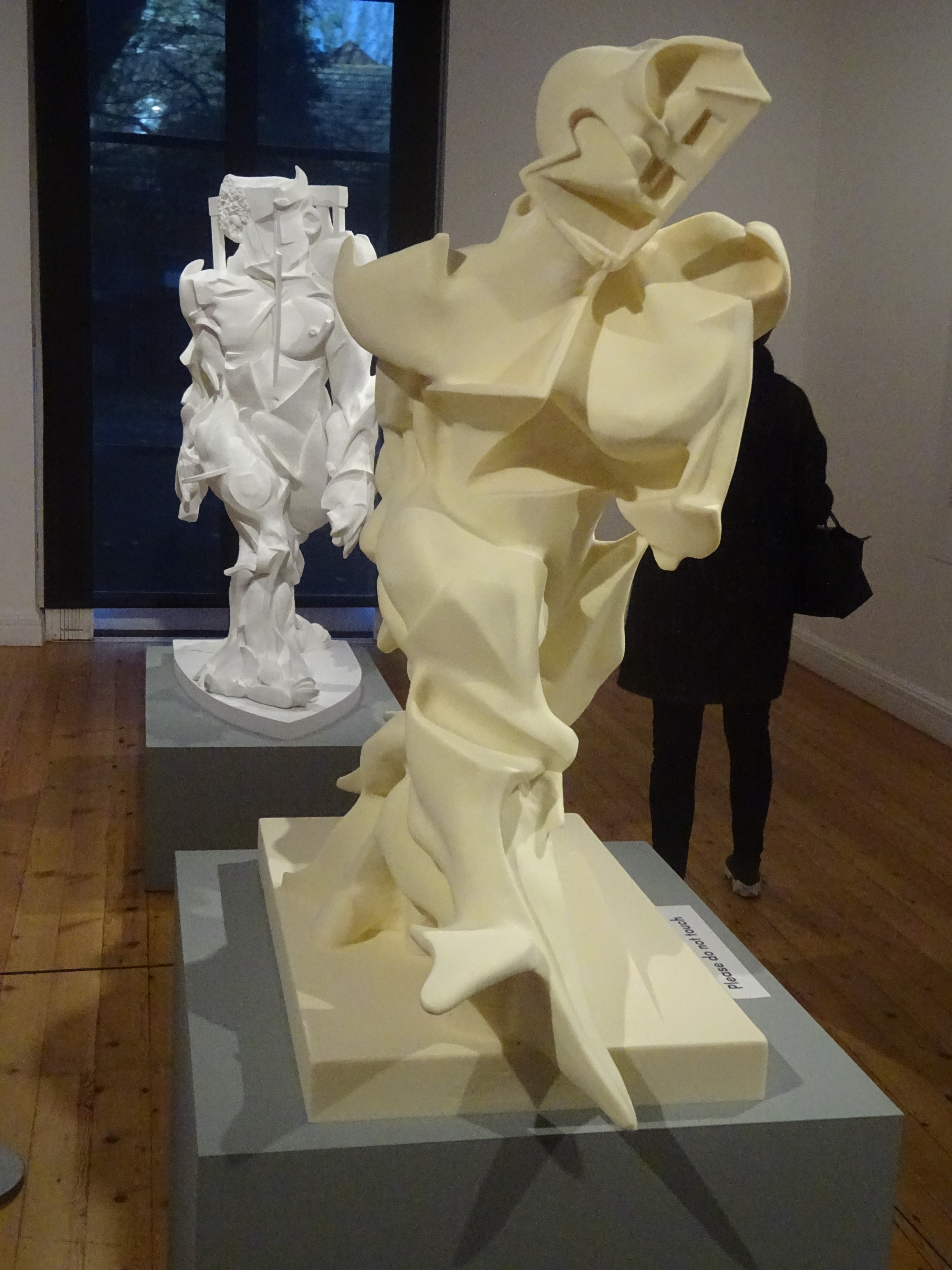
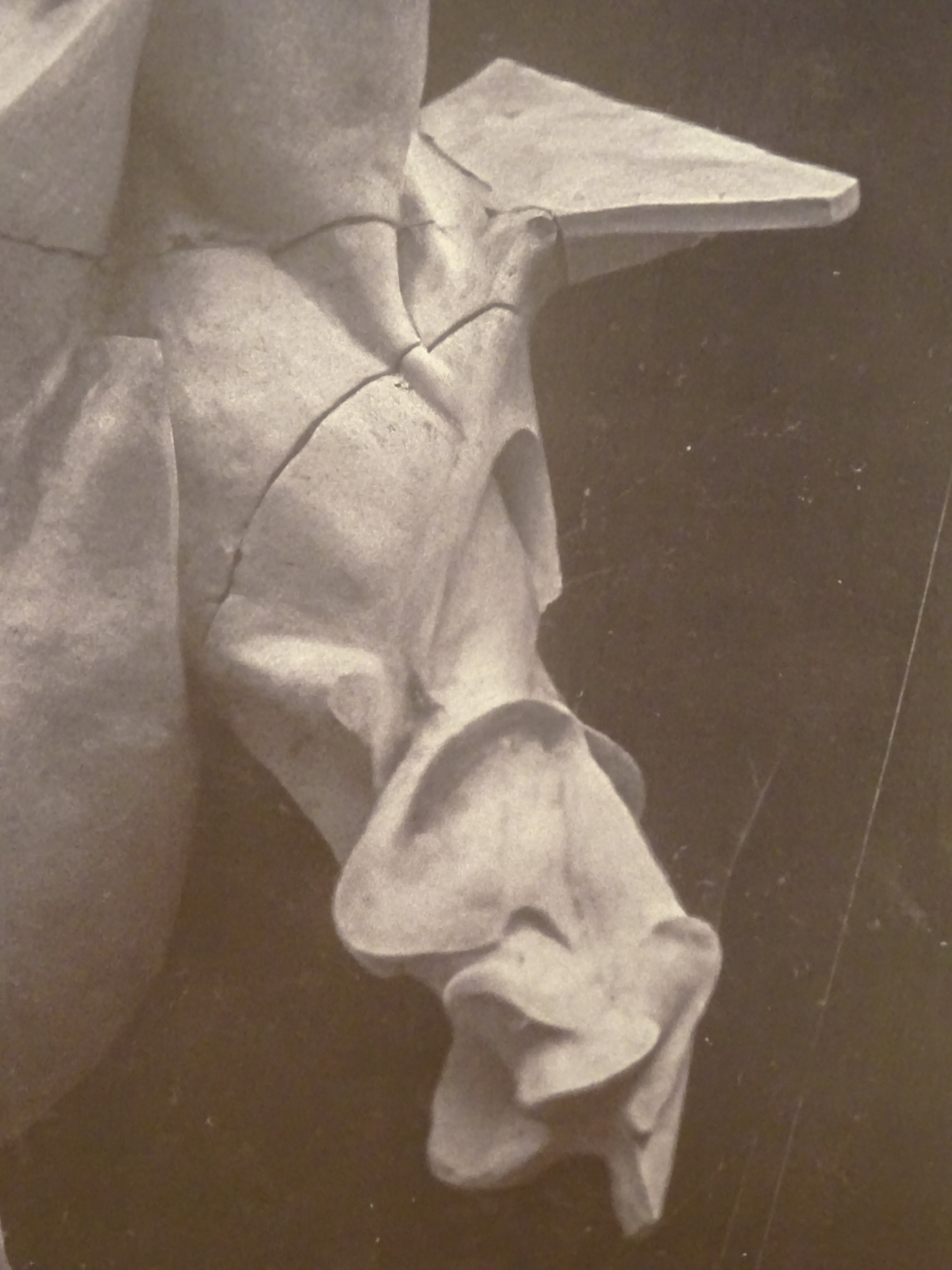
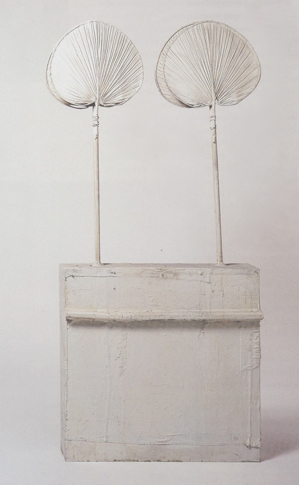
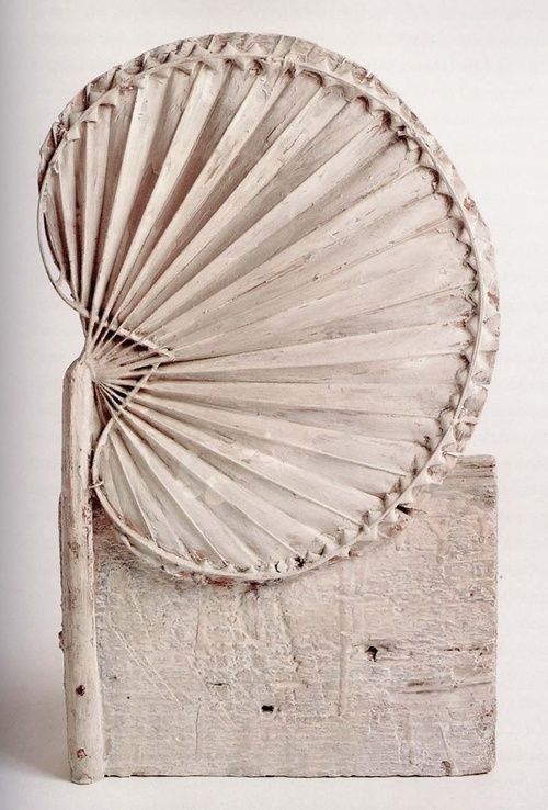
From certain angles the ‘feet’ of the giant look covered in feathers, and the work’s whole effect seems one of the most disunified ever, diverse as only forms produced by a centrifuge could ever be in the real world.

The next figure, Speeding Muscles, seems less tormented or riven by conflict. The forms themselves and transitions between them are smoother and the motion is more like melting than breaking to pieces.

14 DSC03077 copy.jpg

Again there are surreal penetrations of one disparate form by another, in this case a skull and a multi-storey building, which can’t help looking comical in its slow collapse. Two of the striders are a stark plaster-white, while this one is the colour of pale brown sugar. We assume it has been coloured, while the other two have been left the natural colour of the material, milled foam or 3D printing.   It seems that the contrary is the case – the white is an added paint layer, and the pale sugar colour is ‘natural’.   The more granular texture of this one, which makes it look as if it were actually made of sugar, introduces the alien naturalism of a material never seen before.

15 DSC03085 speeding muscles copy.jpg

The idea of 3D printing will become more familiar, and then the laminate structure so easily visible in Synthesis–which makes me think it is the ultimate hypothetical object, more glue than primary substance, a truly metaphysical ‘thing’, ‘printed’ like a statement, whose nearest analogue in the real world is a living tissue made of words–then that self-division into a series of selves will seem the most normal thing in the world.

18 DSC03080 copy.jpg

The third strider, Spiral Expansion of Muscles in Movement, has trumped the more accessible lower-level transpositions and lost various resemblances to ordinary objects.   Yet Boccioni can’t escape entirely into his description of all his works as bridges between two infinities, inner and outer.   From the most comprehensive vantage Spiral Expansion still looks a lot like a muscular human body taking off its clothes, a more complex and articulated stage of existence than a nude just lying around, but another conglomerate that hasn’t really found a use for its complexity.

One of Anders Raden’s other projects gives back the Venus de Milo’s missing arms, while Boccioni removes the arms entirely from his figures, as largely extraneous to pure concepts of human dynamism. The number of copies of Unique Forms has crept up since the 1960s and is now hard to calculate, but Boccioni never pursued the idea of multiples, as Matt Smith has done for some time on his website, offering various sizes of one of the striding figures he has reconstructed. The display at the Estorick included a set of small models of all four striders, reproduced to a consistent scale and laid out in a diagonal line to make comparisons easier.  I wondered afterward how Boccioni would feel on seeing his difficult journey reduced to toy size.

19 DSC03152 copy.jpg


*This appears to be only the latest version of the sculptures’ fate. They’ve also been destroyed by a violent storm after the open-air exhibition of 1916, or turned over to the sculptor Virgilio Brocchi, whom Boccioni had portrayed in an important transitional work, who negligently let workmen clear them (Boccioni’s sister’s account). Further inconsistencies, like the various dates assigned to the destruction, remain to be sorted out by further research.

DSC03137 copy

Fourth reconstruction: Empty and full Abstracts of a Head, 1912/ 2019


Early Paolozzi: Hollow Gods


14 paolozzi frog eating a lizard 57 DSC02865 copy.jpg

For a few years in the mid 1950s Eduardo Paolozzi stumbled into a magical zone where he got closer to the roots of sculpture (and of poetry) than any of his contemporaries.

He was a self conscious, but not a particularly intellectual artist. In his collages of the late 1940s he played with references to Hellenistic sculpture in violent activity or tangled groupings. Apparently he wasn’t too interested in archaeology, but he was profoundly drawn to ideas of physical ruin and dreamed of contemporary objects that had been mysteriously buried and then unearthed.

The paper collages can be a lot of fun, but in this thrilling little exhibition at Hazlitt Holland-Hibbert in Bury Street they seemed a trivial backdrop to the depths of his sculptures, sculptures whose relations to surrealism were deeper and harder to fathom than the obvious ones of the paper work.

untitled 54 collage w screenprint 1951? DSC02843 copy.jpg
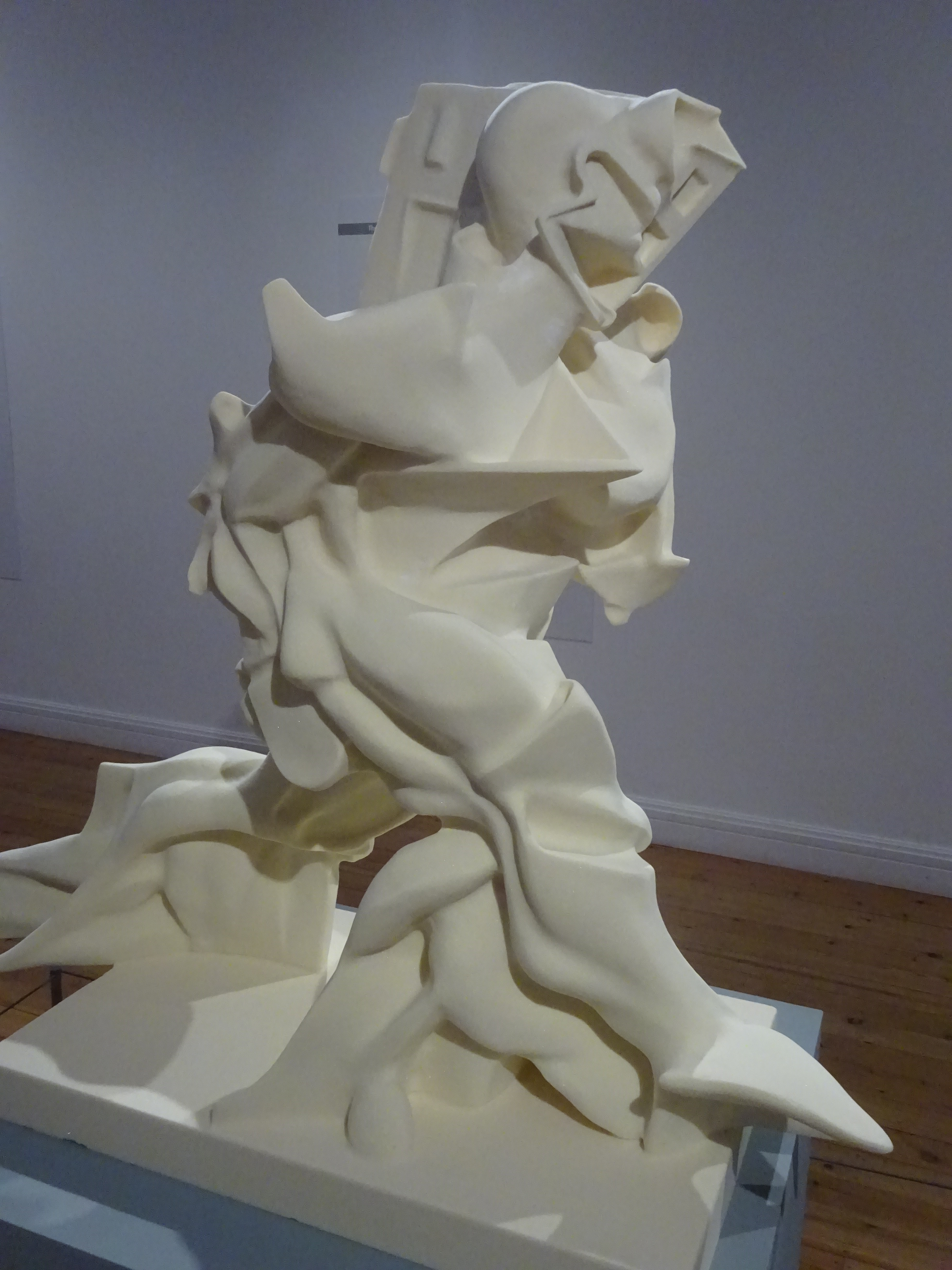
Paolozzi himself drew attention to the diversity of his sources, even reading a list during a lecture at the ICA to show the whimsical range of all the various objects which had caught his eye. It’s amusing and deliberately alarming, but it sets us barking up a lot of wrong and non-existent trees.

Here is his full list, of which we can feel Paolozzi getting tired before he has finished:

Dismembered lock/ toy frog/ rubber dragon/ toy camera/ assorted wheels and electrical parts/ clock parts/ broken comb/ bent fork/ various unidentified found objects/ parts of a radio/ old RAF bomb sight/ shaped pieces of wood/ natural objects such as pieces of bark/ gramophone parts/ model automobiles/ reject die castings from factory tip sites/ CAR WRECKING YARDS AS HUNTING GROUNDS.

12 paolozzi figure 57 DSC02830 copy.jpg
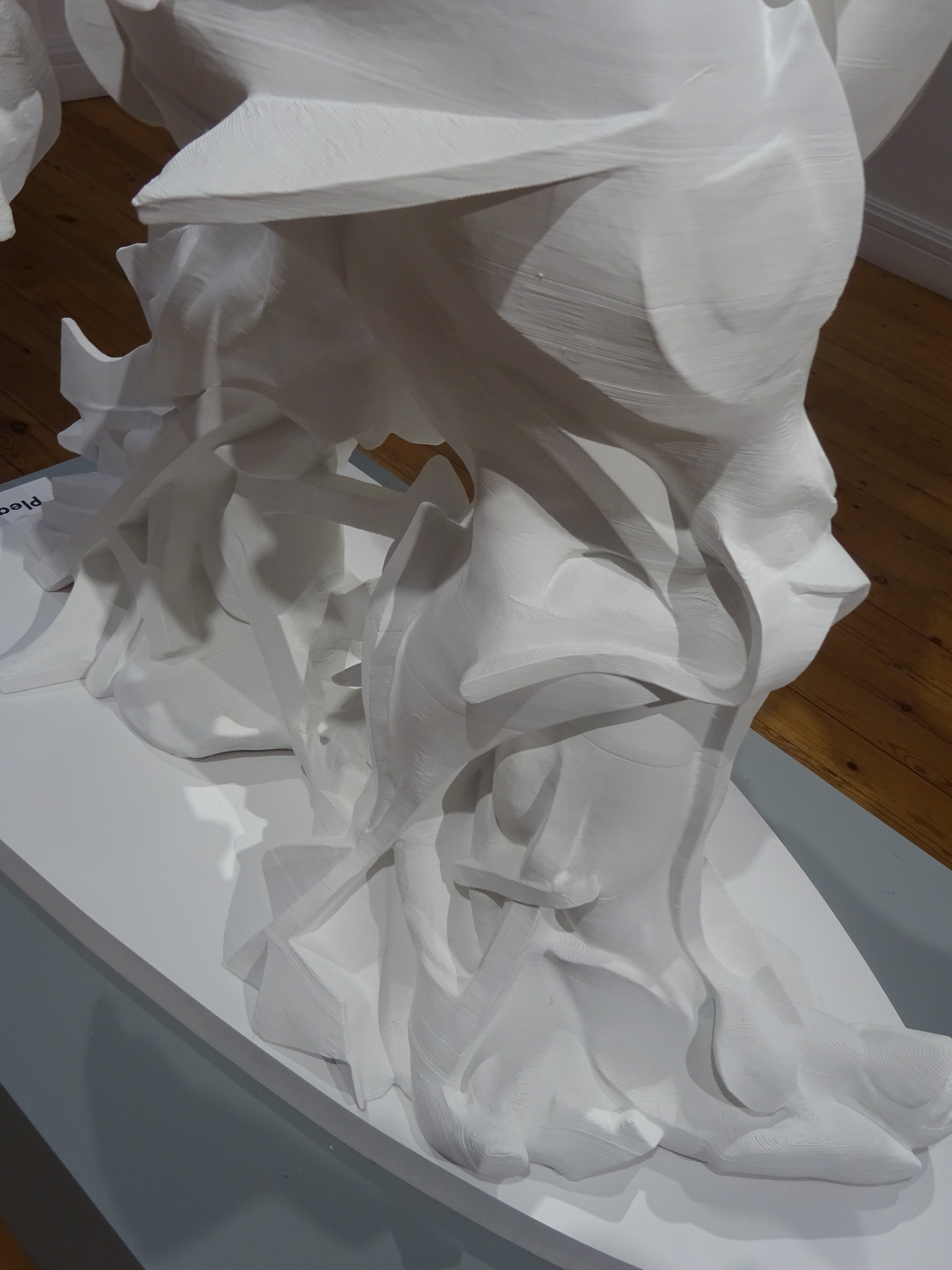
The trouble is that none of these things are there any more in the sculpture, only impressions such as you might capture in hot wax or castings in a single material that levels out the variety, as if you had buried them all in the same earth (or metal, for they are now all uniformly a messy, unbeautiful bronze). So they are like the things in Wallace Stevens’ poems, tantalising ghosts of their sisters in ordinary reality or even worse, barely recognisable, partly overlaid by something else, no longer nameless because turned to liquid and run out across the flat background sheet. And many of Paolozzi’s ‘things’ are only parts of things—handles, tubes, eyes (as in hooks and eyes), washers, circuit boards, many of them only vaguely familiar to un-mechanical man.

12 paolozzi figure 57 DSC02837 copy.jpgIn some sense it is a true entry into this hidden realm of Paolozzi’s activity to plunge right into the phantasmagoric textures without allowing an overall orientation to start with, but it is also a misrepresentation because you do recognise the figure before you get swamped by the detail, which may be the essential experience of these works, but isn’t the starting place.

There have been times when I wished all the pieces had nice clear names like the first two do—Bird or Table–only bird in a travesty-sense, or table like a children’s toy, but starting out comfortably at home and not adrift.

2 paolozzi table 49 DSC02823 copy.jpg
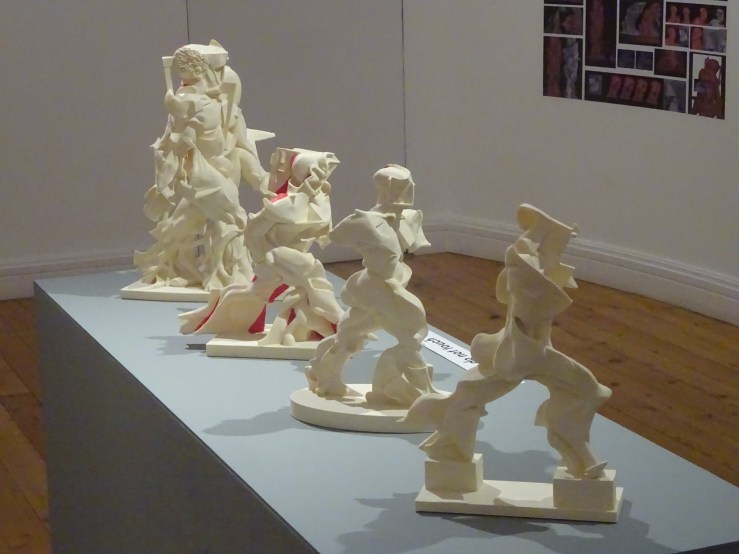
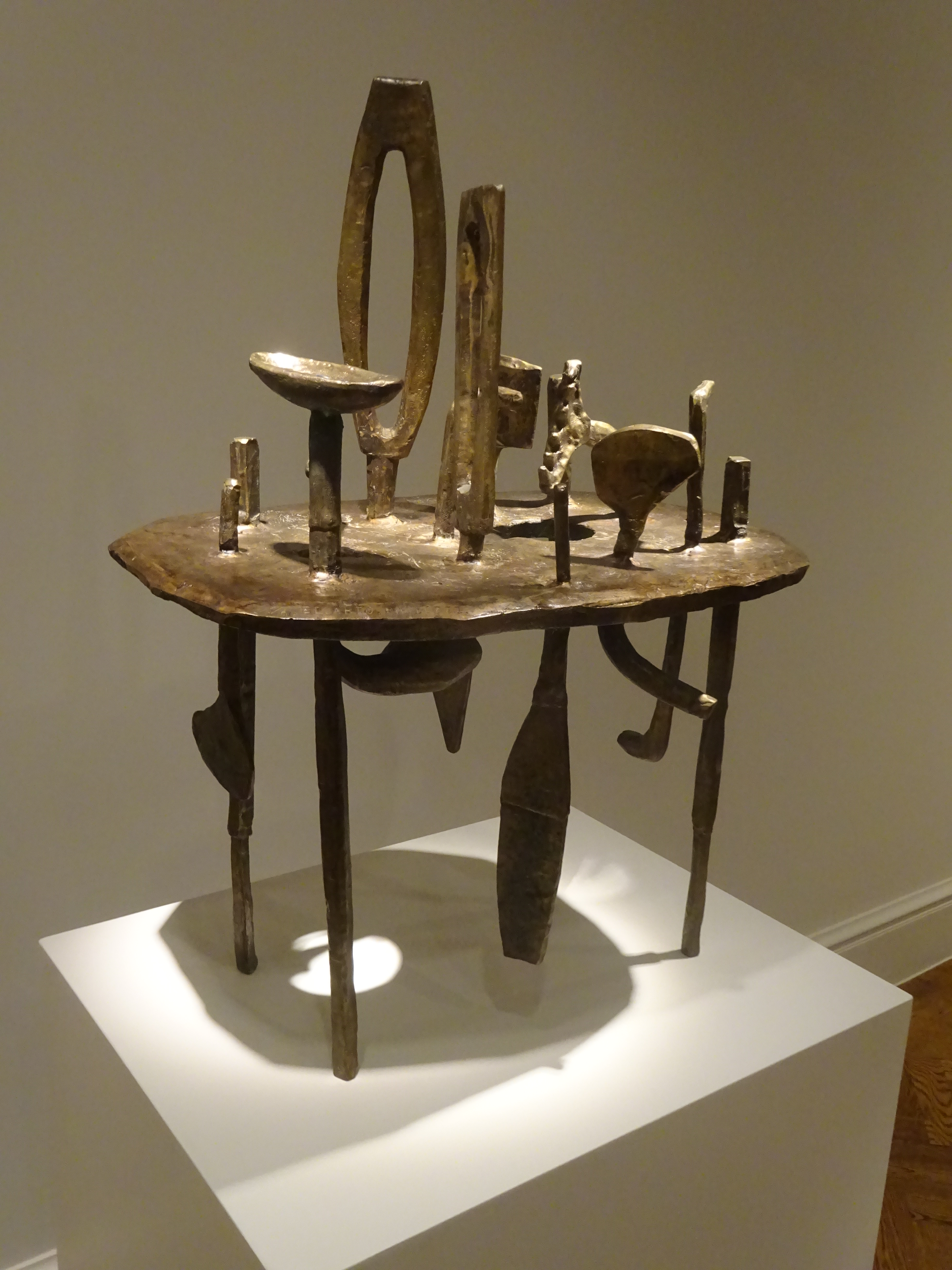
So I set about naming the strange beings: limping man, hideous puckered man, triangulated man (or lopsided man, semaphore man, glued-together man, splat-man—all names for one of my favourites, so a good place to start). He is off-centre, deliberately so, and seems to be sliding sideways. I can’t explain why this unworkable geometry is so compelling, or why I love the idea of an uncountable number of pieces so unreliably bound together.

7 paolozzi figure 56 DSC02875 copy.jpg

7 paolozzi figure det feet 56 DSC02881 copy.jpg

When you step to one side and get an end-on view it’s almost incomprehensibly different, an unexpectedness which happens so reliably in walking round these works that it comes to define them.

8 Robot 56 DSC03294 copy.jpg

8 Robot 56 DSC03300 copy.jpg
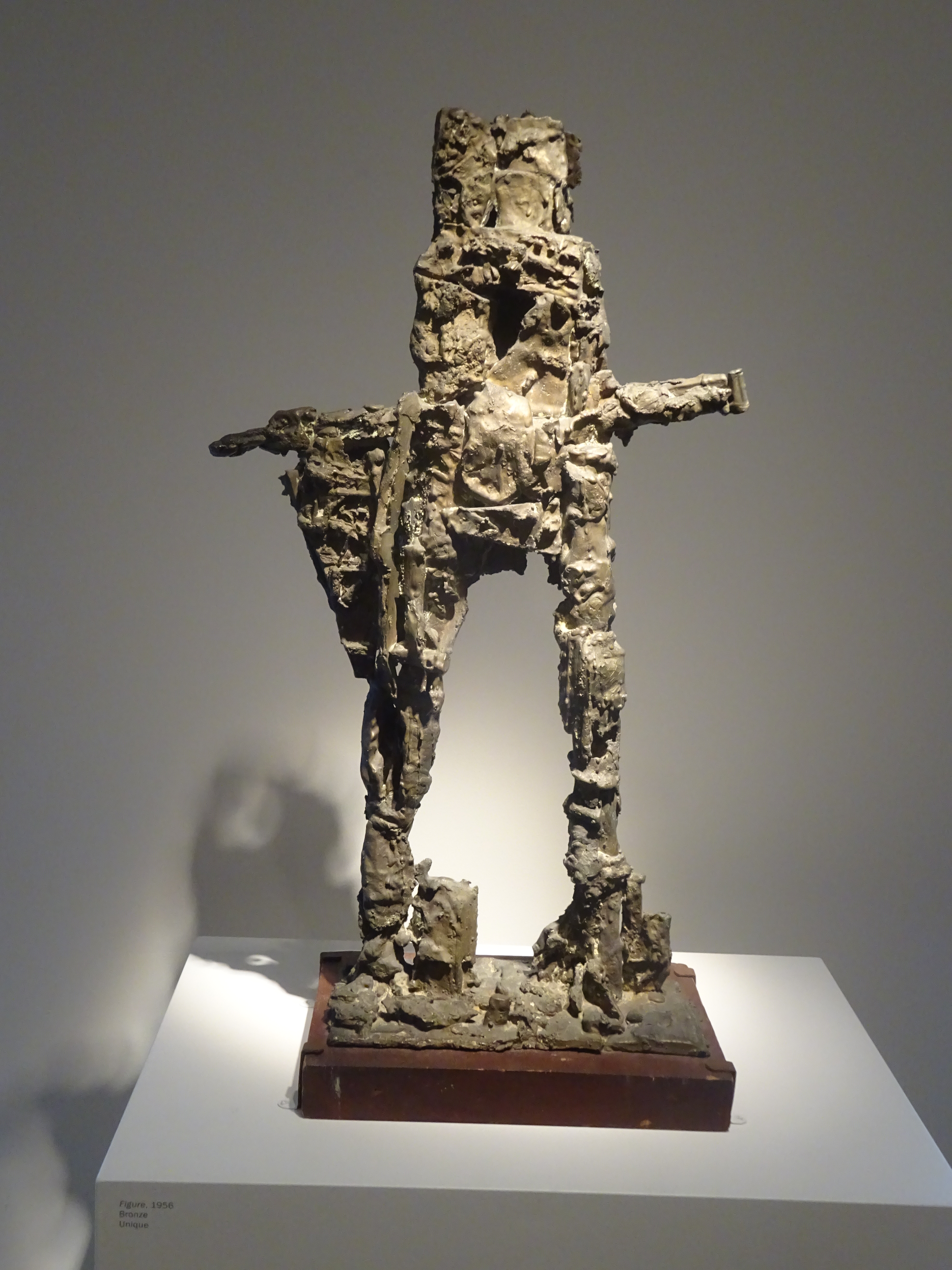
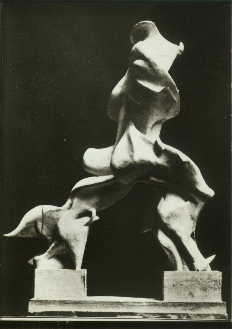
There’s Robot, whom I know as toga-man or Roman senator, who unfurls a scroll in front view but shocks us from the side and behind where he looks uncannily like Snoopy the cartoon-dog, but then you notice punctures in the dog’s head which allow you to thread the object like a Chinese landscape on a scroll, where you get lost in a series of miniature interiors.

9 paolozzi shattered head 56 DSC02908 copy.jpgThere are sculptures to which accidents seem to have happened, like Shattered Head, for whom I’ve invented a narrative, in which he was intact and harmonious to start with, but was dropped on a hard surface and smashed, after which he was carelessly reassembled, so that the openings in his face are no longer in the right places, but we read them as eyes and nostrils anyway, now grotesquely misplaced as we have sometimes seen with badly wounded veterans.

9a damaged warrior 56 DSC02912 copy.jpg
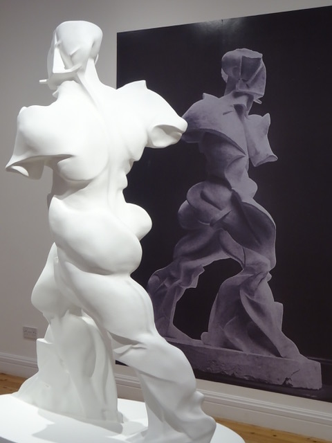
There’s even one called Damaged Warrior, ambiguous name—is it the sculpture or the man who has suffered? He is Truncated Man, sliced in two by a bomb or by the artist’s decision, but how could you choose to cut this torso in just this way?

Moving around him, you come to a view in which he is a cabbage unfurling at the top, most beautifully and unexpectedly, yet completely shattering the figure’s integrity. One of the greatest joys of sculpture is finding unexpected views, and with the alertest workers it often seems there is almost no end to the metamorphic, kaleidoscopic shiftiness of the unfolding reality.

9a damaged warrior 56 DSC03289 copy.jpgI can’t remember any work by other sculptors which goes further or gets separated more radically from likelihood. Yet Paolozzi soon grew tired of the endless transformations. Perhaps the various discontinuities are too great to go on thinking up new ones forever, and there’s an almost inevitable urge to return to the world of everyday possibility, but while it lasts, Paolozzi’s 5-year excursion into fully three-dimensional surrealism is without equal.

13 paolozzi little king 57 DSC02827 copy.jpg

Go on to 10, 12, 13, 14, 16–more to come, I hope

13 paolozzi little king 57 DSC02829 copy.jpg

16 paolozzi st sebastian iv 57 DSC02893 copy.jpg16 paolozzi st sebastian iv 57 DSC02896 copy.jpg


Giovanni Pisano’s pulpit in the Cast Court at the V & A

DSC02973.jpg

Something catches your eye that you’ve passed many times without seeing. Why now, suddenly?

The suddenness is wonderful and the work completely absorbing. In order to see it at all you have to block out a lot else, a diverting cacophony of other works, a jumble of forms and sizes never meant to be seen together, apparently assembled to no coordinate plan. That’s the beauty of the V & A Cast Court, of course, a host of juxtapositions only permissible because nothing here is real.

++DSC02250.jpg

But once you’ve singled one out, the unreality doesn’t count. The plaster isn’t dirty, but it isn’t clean—it does a reasonable job of imitating the worn and mottled look of marble. Sometimes there are signs of its having been coloured—mostly with stone colours, grey and brown. By a fortuitous twist, the roughness of plaster and traces of varnish suit this particular sculptor uncannily well, who was one of the first carvers to make something positive and expressive of irregularity and even of flaws in execution.  

Above all, my new favourite is a conglomerate and the separate parts aren’t precious individually. Not that there aren’t wonderful strokes of invention and plenty of arresting details. On that day it seemed the most gripping large work of sculpture in the world, challenging one of the most powerful plastic statements ever, the great altar at Pergamon, which it couldn’t match for scale and violence, but in narrative variety maybe it came out ahead and had the giddy spectator reaching for parallels like the dramatic profusion of all the novels of Balzac.

+ presenta surging fwd DSC01911.jpg

The work I am looking at is Giovanni Pisano’s pulpit for Pisa cathedral executed in 1302-10 with a fair amount of studio help, a fact which makes some critics compare it unfavourably with an earlier, overlapping project by the same sculptor, a pulpit for the parish church of S Andrea in Pistoia, much smaller than this later work, with more of Giovanni’s own carving in the intimate reliefs, which are placed, as they are in Pisa, furthest from the observer.

pistoia massacre innocents DSC03239.jpg

It seems that Pisano may have learned from the earlier experiment that the small scale work was somewhat thrown away when mounted well above head-height. So in Pisa he painted with a broader brush and put his energy into a greater proliferation of larger figures at ground level. That is where the best invention occurs in the Pisa pulpit.

+ groups DSC03037.jpg

Pulpit is a seriously demeaning name for this marvelous crowd of carved figures who form a cross between a forest and a pavilion full of sculptural movement.

The whole is cylindrical in form, with a richly carved roof (the wide band that contains the reliefs) supported on 8 peripheral columns which converge on a single central support. There is a curving stair for reaching the roof attached to one end, the route which priests and deacons would use to turn the large construction into a humble pulpit, as if its whole purpose was to give them an elevated perch from which to teach and preach.

The phenomenal sculptural energy of the assemblage devotes itself to disguising the supporting columns with an ingenious set of caryatid-like beings. In two cases these are single human figures on pedestals who allow capitals to be planted on their heads.

+DSC02980.jpg

In the most thrilling instances – two of them, adjacent – a larger figure appears to bear the brunt but is surrounded by a crowd of four figures approaching life size. These two clusters are the most gripping or enigmatic elements of the whole, one composed of women, the other of men, many of them carrying emblematic objects, like a set of scales or a dead lion suspended upside down. The men are all accompanied by their daemons, three winged animals and an angel.

The moments before you figure out or are told what any of this means are precious, and something to hold onto, even after you have identified the four medium-sized women as Virtues and the four men as Evangelists, the larger female figure dominating the others not Charity – she suckles two infants – but Ecclesia, the Church, and the larger man, Christ.

ecclesia w dove whispering DSC03244

At the V & A Ecclesia has lost one of her main accoutrements, a big dove that whispers aggressively in her ear. This idea of inspiration from above occurs repeatedly in the smaller series of sibyls at the level of spandrels supporting the reliefs, one of which (in Pistoia) looks like the inspiration in turn of a memorable sibyl by Michelangelo on the Sistine ceiling.  Ecclesia may have got separated from her dove after the fire of 1595 when the pulpit was taken to pieces and radically deconstructed, when the parts got scrambled and relations between them were lost, at a time when other sculptural elements probably disappeared.  Interest in returning the pulpit to its original state grew in the 1860s, around the time this cast was made.  The current presentation of the work in Pisa (seen further below) dates from Bacci’s reconstruction of 1926.

DSC03015.jpg

There are many satisfying symmetries buried in the scheme, one female nude and one male, the one based on a famous classical type of modest Venus, now representing Temperance (work out how), the other an unclassical, anxious Hercules, wiry not beefy, a striking antithesis to the familiar Neapolitan giant leaning on his club, worn out by carrying his huge muscles, set against our slender Hercules who contains a nervous soul.

st michael DSC03428.jpg

He is paired with St Michael, a Christian knight. They represent spiritual and worldly heroism respectively, we are told. The two are placed symmetrically in most reconstructions, but they make an odd pair. The saint is sleek and elegant. His wings take some working out and look unnervingly like living tissue. Common opinion holds that this figure cannot be Giovanni’s, and the  choice usually lands on Tino di Camaino, one of Pisano’s ablest pupils who went on to a successful career in which the smoothness of St Michael is frequently repeated.

pisano pulpit end DSC01932.jpg

DSC03443.jpg

The earliest secure attribution to Giovanni Pisano consists of two eagles on the Fontana Maggiore in Perugia (see below) where he worked under his father Nicola. They are extraordinarily lively, engaged in harsh dialogue with each other. A similarly intense interest in the life of beasts keeps turning up throughout Giovanni’s career. In the Pisa pulpit we have the little winged sprites trapped between the Evangelists, the oversized eagles squeezed in between female Virtues and, most alarming of all, the two lions, caryatids, looking up from the prey they are in the middle of tearing to pieces. This ferocity extends the range of emotion captured in the monument to include vivid and convincing rage. Giovanni’s animals usually convey a serious interest in the place of primitive urges in the whole territory of consciousness, not just playing around the edges of the page as in medieval manuscripts.*

+DSC02931.jpg

Besides the wonderful replica of one of Giovanni Pisano’s crowning works in the cast court, the V & A possesses two precious fragments securely attributed to this sculptor whom Henry Moore ranked with Michelangelo as the greatest of Italian artists. The rarest is an ivory Christ from a crucifix, in which we find both the energetic movement familiar in his work in the writhing hair played against the crown of thorns, and his characteristic focus on the expressive power of the rib cage.

DSC03225.jpg

The other fragment is a bust-length piece from the projects Moore regarded as the summit of Giovanni’s achievement. These were the figures, half-figures and sculptural groups which had been exposed to the weather on the Pisa baptistry and the façade of Siena cathedral.  The effects of weathering and the modern preference for Giovanni over his father Nicola are strongly connected.  Henry Moore almost admits to reading the wear and tear visible on the outdoor pieces as a kind of fortuitous boldness, as if Giovanni’s characteristic expressionist urgings are pushed further by the weather, as if its ferocity could be attributed to the sculptor, or was, without conscious agency or intention, causing the sculptor to become more himself than ever, or calling into existence the sculptor Pisano would have been if he were Moore’s contemporary. Something similar is at work in my fierce resistance to the idea that Giovanni Pisano is a Gothic sculptor.  He is so much fresher than that, and there is something sound and true in the magic that weather has worked on the outdoor sculpture, which shows us the direction in which to push or read the indoor work to see the depths that lie there waiting to be coaxed forth by sympathetic, anachronistic eyes.

DSC02951.jpg

Michael Ayrton thought the Siena figures the most philosophically ambitious and monumental in scale of all his work, a group of fourteen prophets and sibyls in dialogue and contention with one another, passionate, visionary drama of immense historical and psychological scope. The V & A’s chunk of the Hebrew prophet Haggai from that facade is a powerfully expressive piece in which discoveries made earlier in the project about how to convey intense meaning and precise impressions over distance were developed further, involving bold use of the drill to show agitation of the features, and especially the beard, which revealed the movements of the soul.

Along with these bold textural effects went the famous tensed and craning neck, which Moore was perhaps first to intuit was more than a means of projecting the head beyond the parapet on a façade, but a novel expression of a figure’s intellectual fire as well.  Pisano brought this discovery down from the higher reaches of buildings and we find it again in Ecclesia and a couple of her Virtues.

DSC03413.jpg

And we even come upon a miniature equivalent of bold and sketchy textures for conveying expression from afar on the smaller scale of the relief, admittedly more tellingly present on the pulpit in Pistoia than in Pisa.

pisano pulpit w inscriptions DSC03404.jpg

Giovanni Pisano was a complex and fascinating character, revealed most nakedly in two features which were completely omitted when the V & A cast of his Pisa pulpit was made, long inscriptions which remain ambiguous and difficult to interpret to this day. The upper one, which appears just below the reliefs, is generally regarded as boastful. The second, longer and running at floor level, is seen by Pope-Hennessy as a complaint lodged against an envious world. Ayrton reads it very differently, as a despairing confession of failure by an artist who has fallen short of an unattainable goal. Did he end frustrated and defeated by the world, or tragically uncertain of his own genius?


DSC03405

The two inscriptions are printed in full, in Latin and English translation, in Pope-Hennessy’s Italian Gothic Sculpture.  The translation of the second inscription in Ayrton’s Giovanni Pisano Sculptor, a rewarding collaboration with Henry Moore and an Italian photographer, does not come out in the same place and isn’t even spoken by the same imagined speaker. 

*One of the most surprising items in the Pisani literature is a 9-page analysis of the extra lion footprints on the lion’s pedestal, signs of a struggle, according to the authors.  Palozzi, L & Bergkvist, G, 2018, ‘A brief cross-disciplinary study of lion paw prints in Giovanni Pisano’s Pisa Pulpit (1302–10): On the seventh centenary of Giovanni Pisano’s death’, Source (notes on the History of Art), vol. 37, no. 4, pp. 215- 224. https://doi.org/10.1086/699963

Trying for the most ferocious illustration, I inadvertently chose the lioness.  My own inspection of these wonderful animals had not extended as far as the ground they stand on.  With understandable satisfaction, the authors of this article observe that they seem to be the first in its 700 years of existence to notice these features of the lion’s marble pedestal: two complete footprints, one facing in the lion’s direction of travel, the other backward, and various signs of the scuffle with the prey impressed in the soft soil, apt at recording such marks.  They analyse both the accuracy and the purposeful inaccuracy of this lion’s anatomy, and make a fascinating case for the significance of the two paw-prints in the history of art.  They see them as Giovanni’s way of releasing his lion from its limited role as a support for a pulpit by suggesting an existence for him outside the frozen posture over his victim.  The prints encourage us to imagine him moving as we do freely through the grove.  These easily overlooked traces of the activity of the lion, perhaps an afterthought of the sculptor’s, can be seen as one of his boldest subversions of the conventions of liturgical equipment, and a source of guilty enjoyment to those who happen to notice them.  Once again, Giovanni Pisano is moving toward freeing the artist and his work from subservience to a patron, the Church.

5 pisano V&A footprints DSC03414.jpg

Neither the makers nor the later keepers of the plaster cast seem to have noticed or taken care to preserve these paw-prints, which have evidently got further scuffed and filled in over time. Recent photographs of the indentations in the marble original in Pisa show another kind of defacement, which has smoothed whatever Pisano carved into a series of  blob-shaped hollows, in which it is remarkable that Palozzi and Bergkvist could recognise the lion’s prints.

Untitled.jpg

Fig. 3. Giovanni Pisano, lion hunting his prey, 1302–10 (top view with detail of paw prints below). Carrara marble; print A: 5 ⅛ in. (13 cm); print B: 4 . in. (12 cm). Pisa Cathedral. Photographs: Ivan Bianchini.  The detail shows the metacarpal pad (MC) and the pads of digits II–V of paw print A, and the metatarsal pad (MT) and the pads of digits III–V of paw print B.

Translation/ explanation of caption: Metacarpal = front paw, metatarsal = back paw.  The two prints almost touch at their back edges.  The left-hand, front-paw print faces inward toward the lion’s body, pointing upward toward 10 o’clock; the right-hand, rear paw points downward toward 4 o’clock.  The front paw is 5 inches wide; the rear paw 4 inches.  Unless the whole thing was a private joke, when new the prints must have been more detailed, and more recognisable.

It is a detail, and a small piece of the puzzle, but one more sign of Giovanni Pisano’s study of his subjects from life, centuries before this became commonplace.

+ lions DSC02212.jpg


Soutine’s People

0A C2a 18 detail herringDSC00715 copy.jpg

Soutine’s portraits are a different kettle of fish from all his other work—his ‘portraits’ of dead animals, often hung up as if in a butcher’s window, his still-lives which can also have the air of crucifixions, and his tortured landscapes.

The portraits are different because we are less forgiving of liberties taken in representing the ‘human form divine’ (Blake’s piercing phrase). It appears that we have studied the human face more intently than any other aspect of the visible world, as perhaps comes home to us most sharply in front of art.

That is where the limits of an artist’s powers of observation are exposed most cruelly.  That is where Soutine’s ‘distortions’ are likeliest to seem arbitrary. He was reputed not to like portraits as a type. Perhaps it is truer to say he didn’t like commissions. He had his own peculiar way of choosing sitters. His preferred subjects are the weak and powerless — children, mad women, the village idiot, a gypsy boy, and the most consistent and fascinating series of all — lowly, serving occupations like pastry cooks, bell-hops and maids — all subjects easily exploited, who weren’t likely to complain that they didn’t like the results, because he was paying them, not the other way around. So these pictures are very different sorts of document from what we usually mean by portraits, and lack the stiffness and falsity common in the form.

1A:T23 soutine child w toy c19.jpg

In Soutine’s hands even a child with a toy is an uncomfortable idea. Sitting can be a precarious activity in something which doesn’t look like a complete chair. Its top is glued to the child’s head, while its back seems to be trying to unseat him. His toy is another, smaller person falling backward or an angel pointing its wings downward. This is the part where Soutine’s famous abandonment of control in pursuit of the pure freedom of the brush breaks through.

3A:T32 soutine mad woman c19.jpg

The next sitter is called Mad Woman but has been reduced to childhood by her madness, and wears another elf’s hat, another elf or gremlin not a citizen of the adult world. Soutine’s women are often marked by twisted shoulders, a form of wrenching, involuntary movement. This girl is more completely shrunken into herself through spider-like compression.

4A:T53 desolation_chaim-soutine__45293__31854.1557531039-1

The older woman protected by her hat carries a feature almost unheard of in Soutine, an emotive title–Desolation. Would we know she was heartbroken without the prompt? It takes us no time at all to figure that her lopsided shoulders and twisted arms do not mean a disease of the spine but an expressive lunge into an unstable mental state, the real question being whether the unexpected torque is a momentary or an essential condition. It would be a hard pose to hold—Soutine’s people twist from one uncomfortable position to another, but there’s unexpected freedom in the variety.

5A:T59 soutine emile lejeune orangerie c22-3.jpg

While Desolation seems normative among Soutine portraits, the picture of his supporter and fellow painter Emile Lejeune stands apart for its light background and sprightly tonalities.   The sitter’s relaxed mood seems to have inspired confidence and made Soutine himself temporarily optimistic.   We read the dent in Lejeune’s face and his uneven ears as accident rather than meaning, a sign that the artist’s attention was focussed elsewhere, carelessness of a positive kind.

6A:T60 soutine gypsy c1922-23.jpg

By starkest contrast, darkness gathers round the gypsy boy like a portent. Maybe other observers wouldn’t have read extreme apprehension, vulnerability and the wish to disappear in the deep, dark eyes, but Soutine is alert to them, perhaps because susceptible himself.   This picture is usually dated to 1922-3, early for us already to be reading in it signs of what lies in wait for Europe in the following decade.

It isn’t just light and dark tonalities that make the mood in Soutine.   This picture of a very young pastry cook is the most tragic member of the most sustained series of Soutine portraits, devoted to a group with whom he has the most perfunctory relations, until he chooses to explore them, the service staff of the cheap hotels and restaurants he frequented in his summers in Cagnes on the south coast.

7A:T61 pastry chef ears c22-23 ca4.jpg

Another triangular face which shrinks away to nothing, a stillness signifying exhaustion or a complete absence of hope, ears painfully exposed and defenceless features, and the wonderful blankness of all the white, concealing a being erased, with a body made of air, beautiful in its way, with especially delicate lines marking its divisions. The chair suggests the cage of a timid animal.

8A:T62 soutine petit patissier c22-23 ca3.jpg

A jauntier version of the same plight, striking a more assertive pose but paper-thin, and again the strange motif of the red handkerchief like a blood-stain semi-hidden.

9A 2A:T27 pastry cook barnes c19

This outlying example in the pastry cook series from three or four years earlier cries to be included because it is the Soutine picture that the eccentric collector from Philadelphia, Dr Albert Barnes, saw in a dealer’s window, from which he found his way to Soutine’s studio and bought most of its contents (fifty-plus paintings) on the spot, bringing the painter to much wider attention.

It is the first of the group dressed all in one colour, or no-colour, which breaks out into a whole range of blue, purple, yellow, pink, registering light or recording creases, a crucial moment in Soutine’s attack on the coherence of objects, also seen in the ear that begins talking to its surroundings and finds itself resembling the chair back.

12A:T87 soutine garcon honneur c24-25.jpg

At some time around 1924 or 5, Soutine began to frequent more expensive hotels but continued to enlist the most down-trodden elements of their populations, who sometimes pick up the pretensions of the posher premises, so that this ‘garcon d’honneur’ – a maitre d’ or a room-service waiter? it doesn’t seem clear – is able to sit with no visible means of support through a feat of belief, an acrobat-functionary.

13A:T89 red bellboy c25 ca8

Another bellhop even turns his uniform into an identity, twisting it improbably into an imposing pattern.

15A:T95 petit patissier c27 ca6.jpg

The third in this series of arms-akimbo poses – sitting in mid-air, sitting awkwardly, standing uncertainly – defensive and assertive, salvaging a self in unpromising circumstances – looks battered but cocky, and Soutine has again found human depth in unexpected places.

10A:T67 soutine large hat c23-24

The twists of these three poses say a great deal about the strains of these lives.   Even more complex and tortured flexions turn up in female subjects who twist this way and that, misshapen by the stresses of no job, but by the general facts of feminine existence, another, more unwitting mad-woman.

16A:T147 soutine waiting maid c33 ca21.jpg

The females among the hotel-staff portraits are the most abject of all, like this lady’s maid who melts, sliding downward, whose indecisive mouth is one of the saddest human features ever painted.

17A:T152 soutine jeune anglaise orangerie c34.jpg

This so-called English girl is one of the lucky ones, who makes a crooked pose into nonchalance.

18A soutine young woman in white blouse 1923.jpg

But best of all is the one most defaced by the painter’s wilful abandon, who drags strength from what should have been ugliness.   Like many of his unschooled subjects, she comes out of the battle an unlikely victor, where every error in the symmetry is a bit of hard-won depth.  Flesh of horrid orange-pink, clothes of stains and smears, like a surface given life by dirt, yet it’s the serpentine pose that tells us most persuasively that we are rushing somewhere significant, unheard-of till now.